Neon Revival
Journal for Better Bus Stop Competition
CULTURAL REVIVAL
The rapid economic growth in post-war Hong Kong gave rise to the use of neon signages around the city. The narrow streetscapes and frequent night activities were perfect for neon signs, and they inadvertently became an aesthetic symbol of Hong Kong.
Since the turn of the millennium, with the increase in production and maintenance cost, as well as stricter building codes, not to mention the light pollution, neon signs are slowly fading in Hong Kong. Worse, there are few actions aimed at conserving this cultural heritage in the city. This project aims at reviving a lost tradition, and bring more colors to the city.
LIMITED ACCESSIBILITY
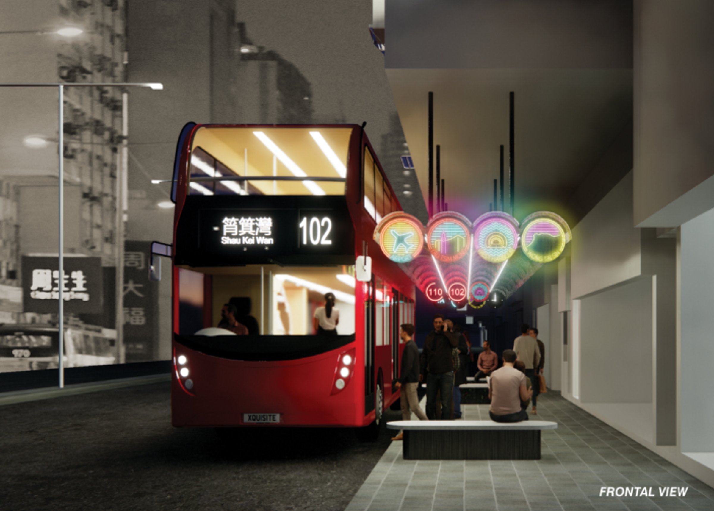
Bus is a crucial public transport in Hong Kong, with over 5000 double-decker buses and hundreds of bus routes circulating the city every day. A major artery like Nathan Road is filled with bus stops along the entire linear strip.
Yet, the visibility of the bus stop is limited with the existing bus stop signages. It is also hard for passengers to identify which bus stop to queue, as a single bus stop can include more than 10 different bus routes. The narrow pedestrian stripe (3.5m) also made bus stops incredibly crowded and hard to navigate. This made designing an effective bus shelter difficult due to the lack of space to create.
OVERHANGING SOLUTION
Due to the narrow urban fabric in Hong Kong, it is common to see buildings along streets to cantilever out to increase floor area. This creates a semi-covered pedestrian stripe. This unique setup in Hong Kong creates an opportunity to create a bus shelter without columns - by suspending the canopy along the existing building cantilever. This scheme is especially beneficial for the narrow pedestrian walkway that is common in Hong Kong. Low obstructions give a free-flowing space for passengers to queue.
In the absence of columns as spatial dividers, seatings are placed as a soft boundary to separate passengers queuing up for different bus routes. Seatings perpendicular to the vehicle circulations allows passengers to naturally view the arrival of bus.
LOCALITY AND MODULARITY
LED Signages made to homage the old neon advertising signs are located at each end of the bus shelter. While neon signs come in a wide variety of combinations of shapes, but for creating modular, replicable signage, circular signs are used.
The large, clear signs provide passengers clear information of the destination areas as well as the type of routes available at the bus stop. This improves navigation for passengers arriving at the bus stops. The signs are also interchangeable with other district signs according to the bus routes available, depending on the location of the bus shelter.
District signs are made in a clear manner, using local landmarks and colors for easier identifications. With cross-harbor buses using different tunnels, color combinations are used to denote the difference.
Inside the bus shelter, there are secondary LED signs that show the waiting time for bus routes, providing all-rounded information for passengers in queue.
MATERIALITY
A lightweight construction showcase the overhanging nature of the design. Curved perforated aluminum sheets provide ample sunshading during the daytime, and give great reflections of LED signages and interior lighting.
Translucent materials are placed above the perforated layer to waterproof the structure, as well as allowing smooth sunlight into the shelter during the daytime.
While this project is inspired by the aesthetics of neon signs in Hong Kong, the reliability and cost for such signs are not desirable. Instead, LED lighting is used to create a similar visual effect using less electricity and with a lower production and running cost.