
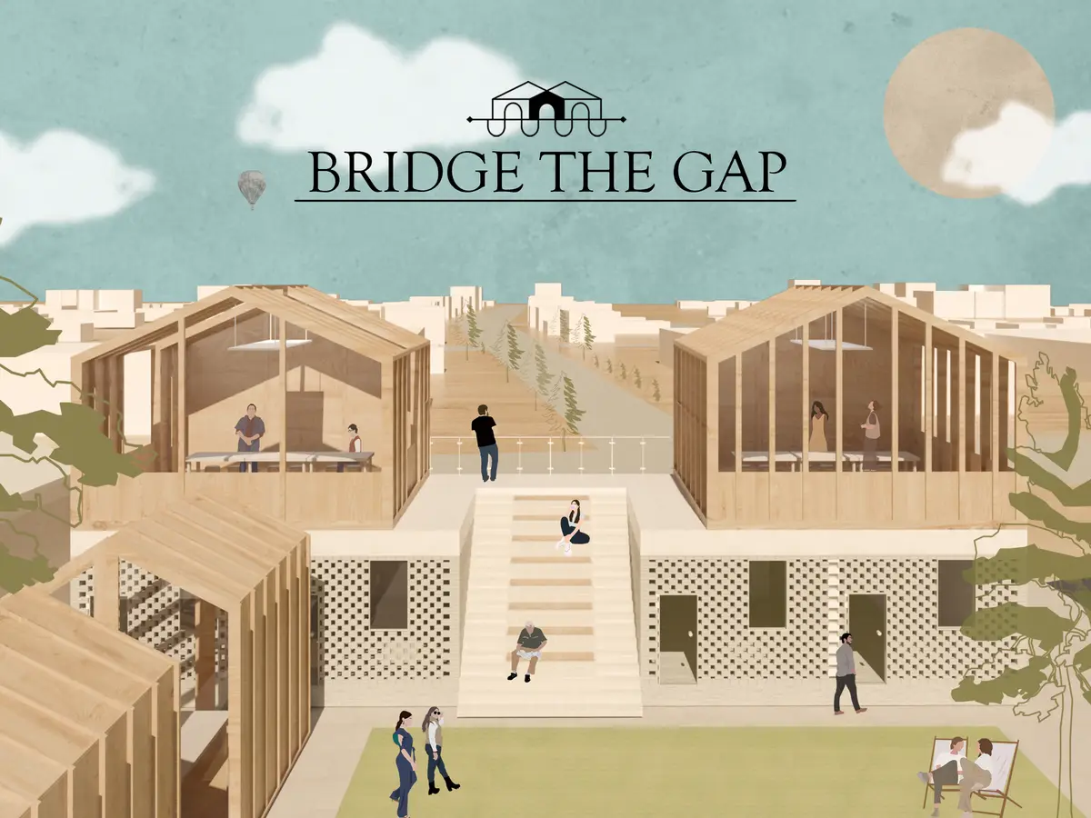
BRIDGE THE GAP
Why can't we really understand the works in the art of the museum?

What was the concept behind the project?
The concept of the "house of art" project is to "bridge the gap". Why is it that when people go to a museum and look at the exhibits, they cannot fully understand the work as the artist intended?
We believe that the answer lies in the gap between the artist and the viewer who have no choice but to meet the work as a media.
Visitors have no choice but to grasp the intention of the work by just looking at the exhibition that spreads out in front of them.
In order to solve this problem, we propose a 'house' for everyone to reduce the physical and psychological distance between the artist and the viewer, communicate with each other, and share their thoughts with the concept of 'bridge the gap'.
What was the intent behind the organization of elements across various levels (Architectural, Site, Urban)?
In terms of city, you can see that our site is a bit far from center of the city. However, I think that many people who are artistic and remarkable will find our building, which has a classical architectural beauty in a modern building.
It is our intention to naturally accept the influx of the surrounding population that has filled a given site with buildings and roads as much as possible. We don't want people to find art difficult.
It is our intention to naturally accommodate the influx of the surrounding population that has maximally filled the given site. The wall of the contemporary art museum, full of thick concrete, feels like a solid block between the artist and us. So, although it looks very difficult, we have applied the elements of a gable and arch that have long existed in architecture and art history throughout the building. By recreating it in a modern space, we aimed to have the visitors flow naturally into the art, and to place the artists in the city as well.
How many iterations were tried to arrive at the final outcome?
The process of striving to match the proportions of the spatial composition as closely as possible while taking into account the height restrictions on the ground produced many process variations.
In order to increase the work efficiency of the artist, the ratio of exhibition space and work space was adjusted to about 1:2. The added working room is located in an efficient position along the flow of poplution, and through modularization, it has a stable shape repeatedly. In addition, the location of the stairs and the location of the main entrance and exit were changed in order to accommodate the flow of visitors who came to see the work.
Which methods of design investigation?
Polish Gothic architecture is based on brick construction. Churches were often decorated with intricate patterns, usually with openwork gables anchored underneath. Using this material, I focused on gable design and bricks, and chose an arch with a design that is compatible with gabble. The arch has both classic and modern beauty in its structural efficiency and beauty of curves, and I thought it would be suitable to express the harmony between Gothic and Modernist architecture.
How was the programme condensed into final?
We focused on narrowing the distance between writer and audience. Therefore, communication between writers and viewers is a big part of programs.
The community space located between the exhibition building and the residence building is the main communication space, and the artist's work room and the audience's participation space are surrounded around the central square. By meeting the artist in the participation space, visitors can hear the explanation of the work directly from the artist, improve their understanding of the work, and experience becoming an artist through art experiences.
What / How were the materials chosen?
The main materials are used brick and concrete. Although these two materials have quite different personalities, we thought that it was appropriate to use both materials as we aimed to naturally embrace art by blending classical and modern architecture naturally.
Bricks used in classical architecture create a sense of coziness and grandeur in a spacious space. And I thought that concrete is the most ideal material for attracting people because it is cool and smooth, and it is the most used in modern architecture.

Popular Articles
Popular articles from the community


Ayodele: Earth-Built Housing That Pushes Back Against Accra's Concrete and Asphalt
A modular earth-built housing block for central Accra stacks family units around shared courtyards, craft studios and planted roofs.


3XN, B+H and ZHUBO Design Shape the Shenzhen Natural History Museum as a Walkable Geological Landscape
Beside Yanzi Lake in Shenzhen's Pingshan District, a 105,300 m² museum folds its galleries under a public roof that behaves like a river-carved hillside.

Cambra Buró Sets a Kuwaiti Coastal Villa on a Sculpted Travertine Plinth and Lets the Upper House Float
In Abu Al Hasaniya, Kuwait, a 3,000 sqm seaside villa pairs a heavy stone base with clay, cork and walnut to work with the Gulf climate.

The Student Center As A Modular Space: A Timber Grid That Behaves Like a Street in Amsterdam
Shortlisted at Overseas Oasis 2020, a stacked wooden frame holds cafés, shops, studios and terraces in parts that can serve shifting demands.

Similar Reads
You might also enjoy these articles
Ayodele: Earth-Built Housing That Pushes Back Against Accra's Concrete and Asphalt
A modular earth-built housing block for central Accra stacks family units around shared courtyards, craft studios and planted roofs.

SHED: A Folded Canopy That Turns a Roadside Fuel Stop into One Continuous Roof
Winner of Overhaul 2020, this service station drapes a single faceted roof over pumps, shop and café, pinning its sharp corners into the lawn.

The Infinity Park: A Figure-Eight Park That Tries to Breathe for Its Neighbourhood
A sculptural lung and visitor-triggered oxygen bollards make people the park's breath, and show how narrow a carbon-only idea of clean air can be.
The Student Center As A Modular Space: A Timber Grid That Behaves Like a Street in Amsterdam
Shortlisted at Overseas Oasis 2020, a stacked wooden frame holds cafés, shops, studios and terraces in parts that can serve shifting demands.

Explore Exhibition Design Competitions
Discover active competitions in this discipline


The Global Benchmark for Architecture Dissertation Awards

VR headsets Storefront design competition
Comments (0)
Please login or sign up to add comments
No comments yet. Be the first to comment!