
From site photos to community colouring pages
A Participatory Design Workflow
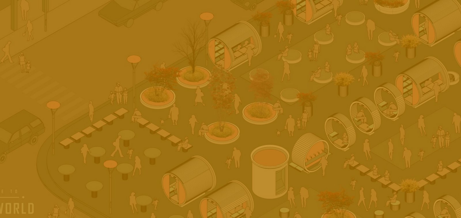
Architects and urban designers often talk about 'meeting communities where they are'. In practice, this is difficult when the only resources we provide are plans, sections and renders, which require visual literacy. Colouring pages change this. By converting familiar site photographs into clean line drawings, participants of all ages can explore colour concepts, indicate preferences, and provide feedback in minutes. This article sets out a complete, field-tested workflow for converting photos of places into printable colouring sheets, facilitating inclusive workshops and translating participants' colouring choices into design decisions.
Why do colouring pages work for participatory design?
Colouring sheets are accessible. They reduce the cognitive load involved in interpreting perspective, scale and notation. A façade that may seem abstract in Revit becomes clear when simplified into outlines: the entrance is the entrance, the canopy is the canopy, and the tree is the tree. This makes them ideal for facilitating richer conversations.
- Democratised authorship: anyone with a pencil can become a co-designer of the palette and pattern.
- Fast iteration: you can create dozens of colour schemes in an hour, each expressing a different mood or identity.
- Memory anchor: participants take the sheets home or photograph them, so the project stays in their minds after the meeting.
- Evidence: coloured sheets are artefacts that you can analyse by counting recurring choices, clustering palettes or quoting notes scribbled in the margins.
Unlike sticker-dot voting or abstract preference surveys, colouring pages encourage people to engage with the composition of elements directly, revealing constraints and opportunities that might otherwise be overlooked.
The core workflow at a glance:
Photo → Outline → Clean up → Print/share → Facilitate → Synthesise.
You can perform the conversion using desktop software or online. For speed on community projects, many teams use a browser-based tool — searching for 'Convert Photo to Coloring Page Online' will produce options that create a crisp, high-contrast outline in seconds. The key lies not in the tool, but in the criteria you apply at each step. Let's take a closer look.
Step 1: Select the right photo.
Not all photographs make good colouring pages. Start with images that:
- Tell a clear story. One main subject is better than a busy streetscape. For a façade, show the entrance, signage and any canopy. For a small plaza, capture the seating, planting and edges.
- Strong edges are important. Noon sun and deep shadows can confuse edge detectors. Aim for diffuse light or slightly overcast conditions to ensure legible contours.
- Minimise occlusions. Parked cars, temporary fencing and backlit pedestrians can create clutter. If you must include people, make them small and peripheral.
- Match the scale of your decisions. If the community is choosing the mural colours, don't take the photo from across a boulevard. Get closer so that the mural fills a third to half of the frame.
Take a short series of shots: wide, medium and close-up. You’ll probably turn two or three of these into colouring sheets: one overview and one or two focused elevations.
Step 2: Convert the photo into an outline.
Aim for an output that is:
- Binary or near-binary. The best colouring pages have clean black lines on a white background.
- Prioritise edge detection over posterization. It is better to have a simplified contour than to trace every brick.
- Aim for a high resolution of at least 300 DPI for A4/A3 printing. It is even better if the tool exports vector (SVG).
These are typical settings that work across tools:
- Edge/threshold: Start at around 70–80% strength and increase until the secondary noise disappears, but the primary edges remain.
- Smoothing: Medium. Too much creates rubbery shapes, while too little results in jagged pixels.
- Detail limit: Cap tiny features (such as lattice or foliage noise) to avoid visual snow.
If possible, export to SVG. Vector art can be scaled cleanly, keeps file sizes small and makes the next step — line editing — far easier. If you’re stuck with PNG, use 300–600 DPI and ensure the background is pure white.
Step 3: Clean up the line art.
Think of this as setting the 'reading level' of your sheet. Young children and busy adults benefit from fewer, thicker shapes, while older children and design students can handle more detail.
- Trim the noise. Delete any stray specks or micro-gaps that will print as hairlines.
- Unify line weights. A consistent stroke width (e.g. 1.5–2.0 pt for A4 size paper) ensures the page remains legible and can be printed on home printers.
- Simplify the foliage. Replace complex tree crowns with a few cloud-like shapes and a trunk — people love colouring in large organic shapes.
- Flatten the glass and turn the reflections into simple frames. Participants will colour the panel, not the reflection.
- Outline the 'colourable' regions. Make sure that the doors, panels, planters and walls are all bounded shapes, so that the coloured pencil doesn't 'leak' visually.
Add light, dotted guides for areas where exact edges aren’t critical (e.g. planting zones). Avoid placing text labels inside colourable regions; place them just outside with arrows if necessary.
Step 4: Prepare for printing and digital sharing.
Community workshops rarely operate entirely digitally. Expect a combination of printouts and phone calls.
- Paper sizes: A4 is the most common size, but you should also bring some A3 paper for participants with small motor skills or for detailed elevations.
- Margins: Leave a generous margin of 12–18 mm to ensure that the edges are visible when the clipboard is in use.
- Optional legend panel: a tiny box for the participant’s name, age group, palette name (e.g. “Sunset Brick”) and a short comment.
- Alternative text (if you are also publishing online): Use functional descriptions such as 'Facade outline of library entrance — convert photo to colouring page online example'.
- Sharing QR: A small QR code in the margin links to a digital copy that can be downloaded later, helping parents to reprint at home.
Step 5: Facilitate an inclusive session.
A good sheet is half the battle; effective facilitation is the other half.
Set the scene. State the purpose in plain language. 'We're exploring colour ideas for the new entrance canopy and ground-floor façade. There are no wrong answers.'
Provide a range of palettes and freedom. Offer a few pre-made palettes (e.g. 'Coastal Warm', 'Brick Heritage' and 'Playground Brights') as coloured pencil bundles, plus a full set for custom experiments.
Use time boxes. Ten minutes for the first pass prevents perfectionism. Then invite a second pass to focus on the details.
Prompt gently.
Questions that unlock insight:
- “Imagine this corner on a cloudy day. Which colours would keep it looking cheerful?”
- “Which parts shouldn't be bright?”
- 'Does this feel like our neighbourhood, or is it somewhere else?'
Offer alternatives. Not everyone likes colouring in. Provide sticky notes for comments or a simple voting strip for choosing from pre-coloured references.
Take photographs and collect them. With permission, take a photo of each sheet before people leave and tape them to a wall grid so participants can see how their ideas join together.
Step 6: Turn the findings into design decisions.
Transform stacks of colouring sheets into evidence that your clients and the community can recognise.
- Use the cluster-by-palette logic to identify recurring families (e.g. earth + warm accent; cool neutrals + bright door; monochrome + timber).
- Map the elements. Note which components consistently receive accent colours, such as the canopy edge, entry door and planter rims.
- Quantify gently: '24 out of 38 sheets opted for a warm accent at the entrance, while 21 out of 38 preferred a neutral upper façade.' Keep the counts descriptive, not pseudo-scientific.
- Build a translation board. For each cluster, prepare a small study projecting the elevation with three colourways, plus swatches labelled with durable manufacturers' codes, if available.
- Close the loop by bringing the translation board back to the community for confirmation. Show how the coloured pages shaped the options.
Case vignette: The Library Corner
The project team renovating a neighbourhood library wanted to make the entrance feel more open and welcoming. To achieve this, they photographed the corner from three angles: a wide shot capturing the canopy and both streets, a medium shot of the door and book drop, and a close-up of the edge of the planter next to the bench. After converting and cleaning up the images, they printed A4 versions for children and A3 versions for adults with limited dexterity.
At a Saturday fair, around 60 people spent two hours colouring in sheets. Many children brightened up the canopy, while the upper facade remained quiet. Teenagers experimented with gradients, while several parents emphasised the bench and planter rim to 'frame' the entrance. Back in the studio, the team categorised the results into three groups: 'Warm Canopy + Neutral Field', 'Cool Canopy + Warm Door', and 'Monochrome + Timber Accents'. The client approved a warm accent canopy with a neutral background, which was nearly identical to the community's most popular choice. Later, a small plaque inside the lobby thanked residents for 'co-designing the library's colours'. Attendance at after-school programmes increased the following semester, and an unexpected downstream benefit was the emergence of a parent volunteer group around the planter beds.
Pitfalls and how to avoid them
- If participants stall, your line art is probably too busy. Trim the details and thicken the stroke.
- Provide narrow prompts. If you only hand out one palette, people will feel shepherded. Offer a range of options and signal freedom to diverge.
- Provide colour choices in context.
- Briefly explain durability and maintenance so that bright, hard-to-maintain choices are not chosen out of ignorance.
- Data tunnel vision. Counting sheets is useful, but also listen to the stories in the margins: 'This looks safe', 'Reminds me of my old school', 'Too loud for mornings'.
- Token participation: if you collect sheets and then disappear, trust will erode. Always come back with the translated options.
- Provide larger paper, thicker markers and seating to address accessibility gaps. Consider providing low-vision alternatives with high-contrast boundaries.
Ethics: Representation and Authorship
Use recognisable places in colouring pages. Obtain consent where faces or private signage appear in photos. Do not imply that participants 'approved' a design if they only coloured in early concept sheets. Give the community appropriate credit in presentations and, where feasible, in the built environment.
Toolkit and file hygiene
- Use a smartphone or mirrorless camera to capture the image. Level the horizon to reduce skew in outlines.
- Convert: a web tool or desktop workflow (edge detection, thresholding, simplification). Many teams start with the browser option for speed — typing 'Convert Photo to Coloring Page Online' is often enough to find a suitable converter — then refine it in vector software.
- Edit: Vector editor (Illustrator, Affinity Designer or Inkscape) for controlling the stroke and cleaning up the region.
- Distribute print shop PDFs in A3 and A4 sizes, plus a web page or drive link with downloadable sheets.
- Archive: Store raw photos, SVG/AI masters, PDFs and a short README noting the settings used (e.g. threshold, stroke weight). Consistent naming conventions will help when you set up similar workshops in the future.
Beyond facades: other use cases
- Wayfinding experiments: outline floor plans or corridor perspectives and let users colour in signage bands and door frames.
- Playground equipment: convert catalogue images to outlines and gather preferences for climbing structures and surfacing palettes.
- Underpass murals. Turn panoramic shots into long strips for group colouring, then create a collage of favourite motifs to form a concept wall.
- Temporary activation: for festivals, provide blank outlines of vendor fronts to create prototypes of awnings and stall identities.
Measuring impact without overcomplicating matters.
- Track participation (sheets completed and age ranges).
- Quantify patterns by tagging each sheet with a palette family.
- Note the qualitative remarks (comfort, identity and memory) and link them to colour choices.
- Compare the before and after sentiment when you return with the translated options. Even simple surveys with smiley, neutral and frown options help.
Keep the methods simple; the strength of this tool lies in its speed and accessibility, not its statistical rigour.
What should you show a client or editor?
When pitching or reporting, make sure you include the following:
- One or two original photographs.
- They have converted the line drawings, cleaning and preparing them for print.
- A mosaic of 12–20 coloured results, demonstrating diversity and clustering.
- A translation board with two or three derived palettes applied to the elevation.
- A one-page narrative covering the following: aim, method, participation, insights and decision.
This sequence provides an overview of the process, evidence and outcome.

Popular Articles
Popular articles from the community

VEIVE Architects Builds a Mountain Hostel That Disappears into a Hangzhou Hillside
On the Huihang Ancient Trail in Xiangjian Village, a shelter of wood, steel, and rammed earth roots itself in the rural landscape.
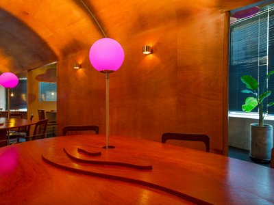
Indiesalon Carves a Plywood Cave into a Seoul Bistro's Second Floor
Munhwa Bistro's second Seongsu branch wraps diners in a laminated timber vault laced with colored light and mirror illusions.
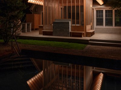
BLDUS Turns a 250-Square-Foot Screened Porch into a Pine Forest Temple in East Hampton
A gabled cedar pavilion mimics the rhythm of surrounding pines, anchoring a 1990s wooded home to its hollow in Long Island.
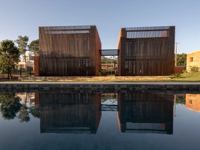
BAUEN Builds Two Rammed Earth Volumes in Paraguay Inspired by the Ovenbird's Nest
In San Bernardino, a house of compacted earth channels the instinct of a constructive bird to shelter life from the Paraguayan summer.

Similar Reads
You might also enjoy these articles
317studio Turns an 87 m² Classroom into a Forest Clearing for Scouts in New Taipei City
A rope canopy, student-made specimens, and campfire geometry replace rows of desks in this Scouting classroom in Xizhi District.
24 7 Arquitetura Builds a Timber Pavilion as a Family's First Act on a 5,000 m² Brazilian Plot
In Jaguariúna, a prefabricated glulam house nestles among mature trees as the opening move of a larger residential masterplan.
1+1>2 Architects Build a School from 900 Blocks of Hmong Stone on Vietnam's Rocky Plateau
On a barren valley in Ha Giang province, a community quarried its own stone to raise a kindergarten and primary school rooted in Hmong identity.
100A Associates Builds a Volcanic Stone Retreat on Jeju Island Rooted in Ritual and Restraint
Watarstay [Wa:Tar] in Bongseong-ri channels Jeju's basalt, reed, and hemp into a 150 m² hospitality space shaped by contemplation.


Comments (0)
Please login or sign up to add comments
No comments yet. Be the first to comment!