

Shire Space Research Wraps a Hangzhou Studio Office in a Continuous Timber Framework
A wood-driven workspace for brand Pinchu merges display, meeting, and office functions into one cohesive material gesture in Hangzhou, China.
Most brand showrooms treat display and work as separate regimes: glossy product zones up front, generic desks in the back. The ORIGINAL CONCEPT Studio Office in Hangzhou, designed by Shire Space Research for wood products brand Pinchu, refuses that split entirely. Instead, a single timber framework runs through the entire floor plate, turning structure into shelving, partitions into display walls, and the act of working into an extension of the brand itself.
The project is compact, and that constraint is precisely what makes it interesting. Rather than zoning the plan into discrete rooms, the designers let one material system do multiple jobs at once. Plywood, solid timber, board-formed concrete, and veined stone each appear where they are needed most, but wood dominates. The result is an interior that reads as a single, inhabitable piece of furniture rather than an office with things in it.
A Framework That Does Everything
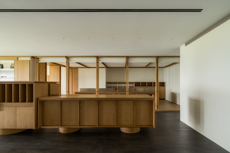
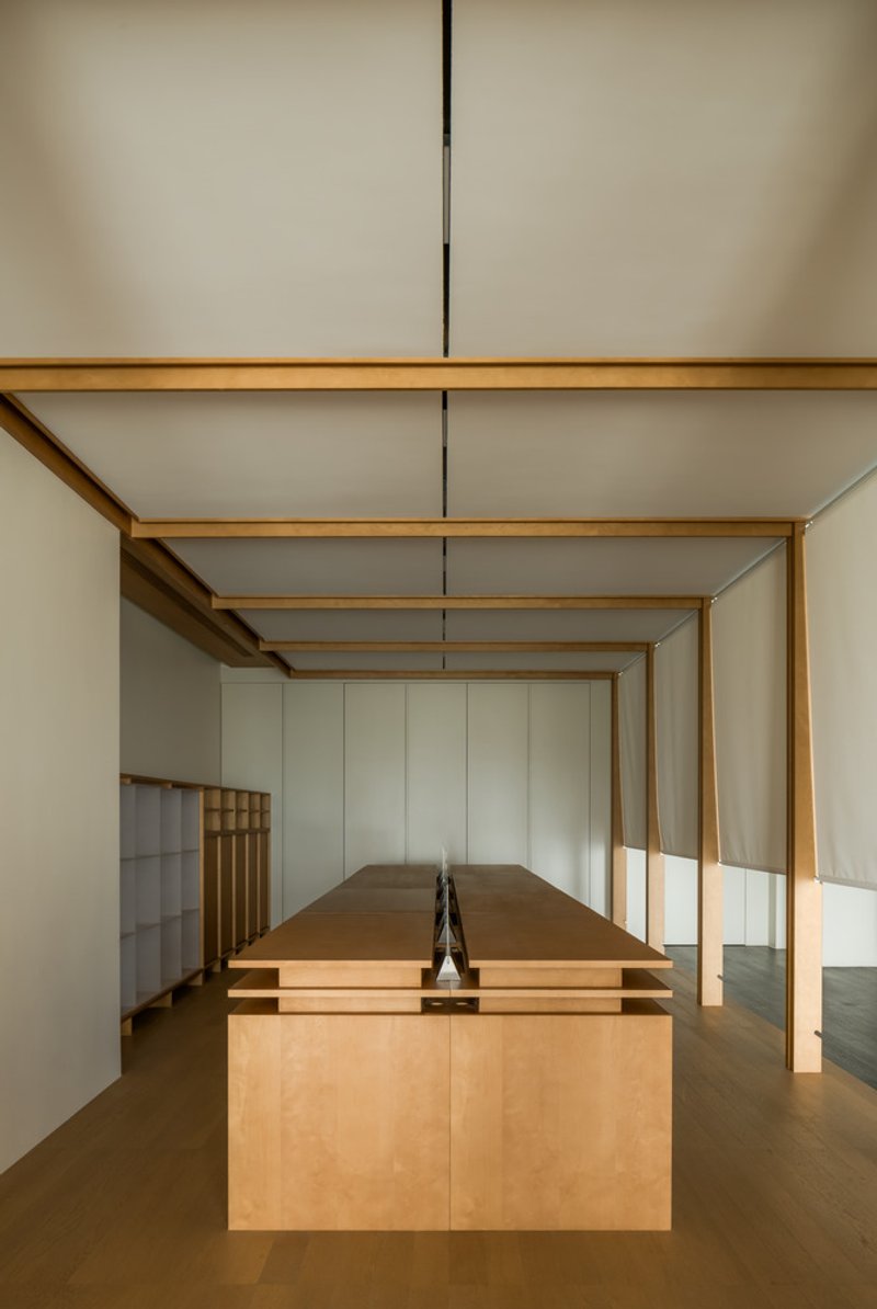
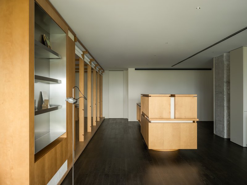
The most immediate move is the overhead timber frame that spans the central area. It is not merely decorative lattice work. The frame defines circulation, suspends pendant lighting, and frames the plywood island below it like a canopy over a market stall. The island itself doubles as a meeting table and a sample selection surface, with an embedded lighting slot that lets clients inspect wood finishes under controlled conditions. It is a clever bit of dual-use engineering disguised as warm, approachable carpentry.
The archway proportions created by the frame recall domestic thresholds more than office architecture, which seems intentional. Pinchu sells wood products, so the entire space functions as a life-size material sample. Every joint, edge profile, and surface finish is both workspace infrastructure and product demonstration.
Stone and Concrete as Counterpoints
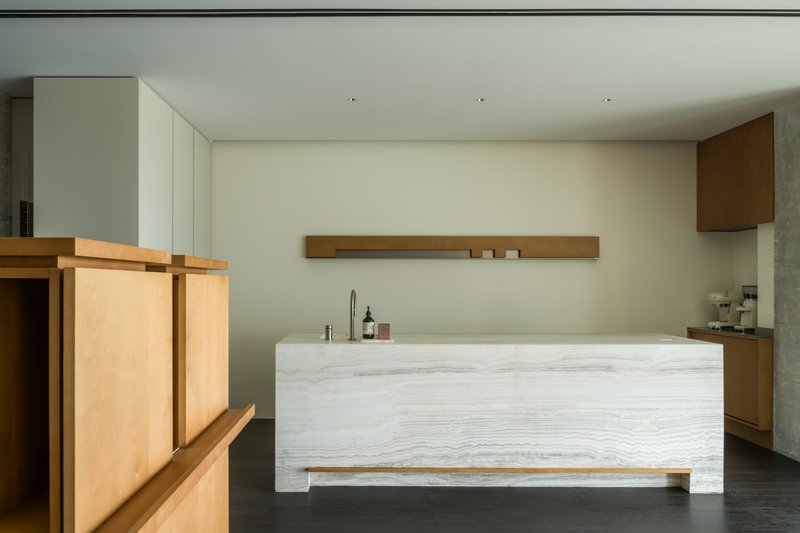
Against all that timber warmth, the designers introduced two deliberate interruptions. A board-formed concrete wall appears near the kitchenette zone, its rough texture acting as a visual anchor that grounds the lighter plywood surfaces around it. Behind it, a veined stone counter provides the water bar area with a sense of permanence and weight that wood alone could not deliver.
The pale veined wood cladding on the freestanding counter is a nice piece of material diplomacy: it bridges the mineral heaviness of the stone and the lightness of the plywood shelving behind it. These transitions are handled without trim pieces or fussy reveals. Materials simply meet, and the eye moves on. That restraint keeps the compact plan from feeling cluttered with competing details.
Reception and Display as One Gesture
The curved plywood reception desk sits at the junction of display shelving and the main circulation path, so arriving visitors are immediately surrounded by product without feeling like they have walked into a retail store. The shelving behind it is deep enough for actual storage but arranged with the restraint of a gallery. Nothing is crammed in; every object on the shelf has room to breathe.
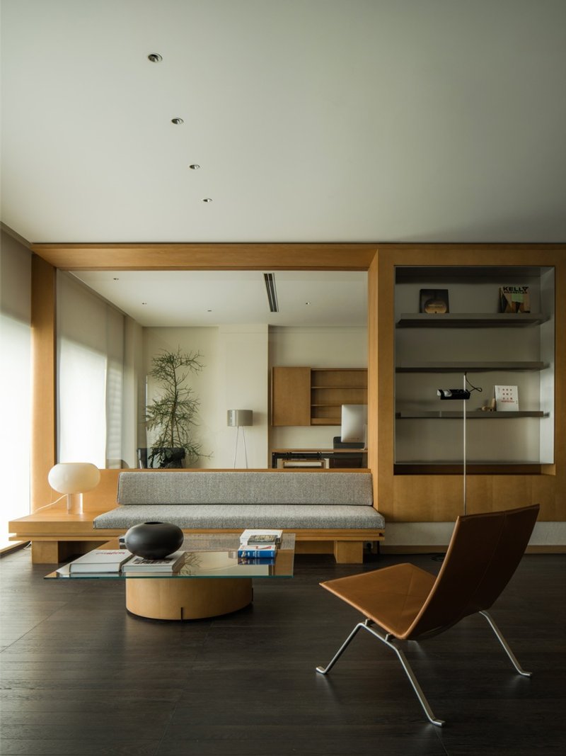
Further inside, a living-room-like zone with a grey upholstered bench and timber-framed openings provides a softer register. Recessed ceiling lights replace the pendant fixtures of the central area, signaling a shift from active display to quieter conversation. The built-in shelving here reads as domestic rather than commercial, reinforcing the idea that Pinchu's products belong in homes, not just showrooms. It is a subtle but effective piece of brand storytelling embedded directly into the floor plan.
The Details That Hold It Together
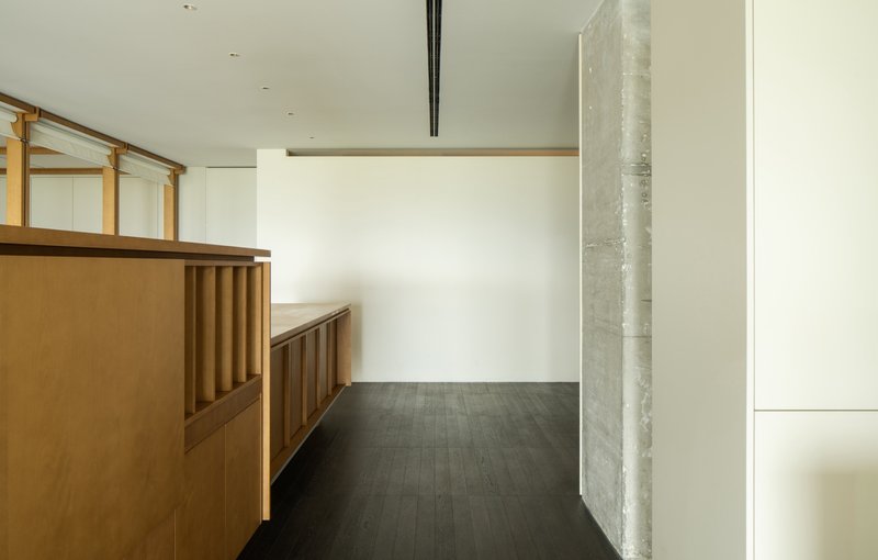
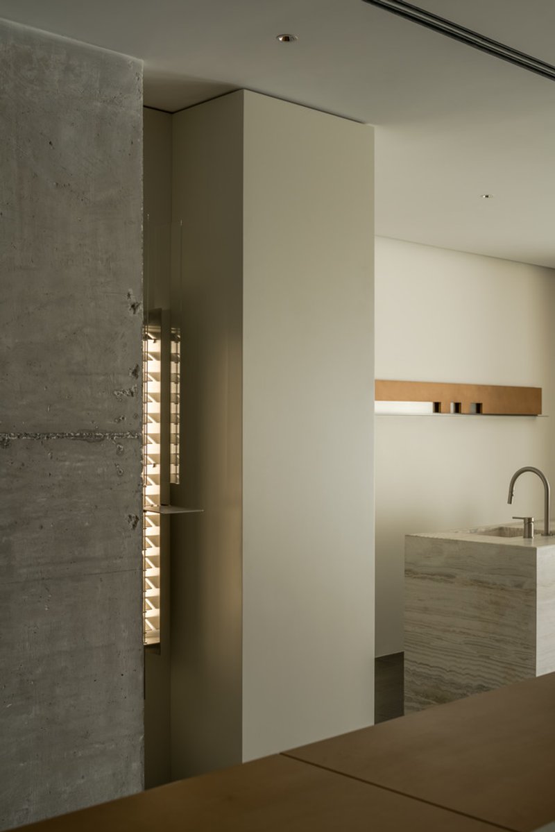
A board-formed concrete column beside a built-in timber bench reveals the project's attention to the moments between zones. The bench integrates storage below its seat, and the white wall behind it provides a clean backdrop that lets the concrete and timber textures speak without competition. These in-between conditions, where one material hands off to another, are where the design is most confident.
Dark flooring throughout acts as a continuous ground plane that unifies all the material episodes above it. Without that consistent base, the interplay of plywood, concrete, stone, and upholstered furniture could easily fragment. The flooring color also pushes the eye upward toward the timber framework and the objects on display, which is exactly where a wood brand wants attention to land.
Why This Project Matters
Small brand offices rarely get this level of spatial thinking. The common approach is to commission nice furniture, paint the walls, and call it done. Shire Space Research treated this modest program as a genuine design problem: how do you make a workspace that simultaneously sells a product, hosts meetings, supports daily office tasks, and communicates a material philosophy? The answer here is disciplined restraint. One framework, three supporting materials, no wasted moves.
The ORIGINAL CONCEPT Studio Office also demonstrates that brand identity does not require signage or graphic walls. When the product is wood and the architecture is wood, the medium is the message. Every surface Pinchu's clients touch during a visit is itself a proof of concept. That alignment between what a company makes and what its space is made of remains one of the most persuasive arguments interior architecture can offer, and this project executes it with quiet precision.
ORIGINAL CONCEPT Studio Office by Shire Space Research. Hangzhou, China. Completed 2023. Photography by Here Space Photography.
About the Studio
Share Your Own Work on uni.xyz
If projects like this are the kind of work you want to make, uni.xyz is a place to publish your own, find collaborators, and enter design competitions.

Popular Articles
Popular articles from the community
Rojkind Arquitectos and Think Parametric Build a Glueless Pavilion from 67 Interlocking Panels
A serpentine fiber-cement installation in Chapultepec Park celebrates a decade of architectural media in Mexico City.
20 Most Popular Furniture Design Projects of 2025
Modular street systems, parametric benches, and insect hotels: the furniture design projects that captivated architects on uni.xyz in 2025.
Fausto Terán and Toro Fuse Japanese Craft with Mexican Tradition in a Lakeside Retreat
Nakamura House pairs Shou-Sugi-Ban charred pine with handmade clay tile at the foot of Atlangatepec Lagoon in Mexico.
HCCH Studio Wraps a Shanghai High-Rise Office in Curved Walls of Translucent Glass
A 1,000 square meter fit-out in Lujiazui replaces the typical tech-office palette with layered glass, micro-cement, and quiet rigor.

Similar Reads
You might also enjoy these articles
Olio Towers: A Mid-Rise for Performers That Fuses Housing, Rehearsal, and Stage
Located blocks from Houston's Theater District, this modular tower stacks living units around a central performance atrium.

Oasis: Modular Green Housing Carved into Dhaka's Urban Fabric
A shortlisted Plugin Housing entry reclaims unauthorized settlements in Dhaka with stepped concrete volumes, green roofs, and ventilation-driven design.

Black Hole: A Floating Megastructure for the Post-Physical Era
Emiliano Mazzarotto envisions a spherical, self-scaling arena where e-sports, digital hotels, and holographic stadiums replace traditional public space.
Compact & Sustainable Living in Piraeus: A Four-Level Family Home Built Around Light and Air
A narrow townhouse in one of Greece's densest port cities uses a central atrium and passive strategies to house three generations under one roof.


Explore Architecture Competitions
Discover active competitions in this discipline


The International Standard for Design Portfolios


The Global Benchmark for Architecture Dissertation Awards


The Global Benchmark for Graduation Excellence


Challenge to reimagine the Iron Throne
Comments (0)
Please login or sign up to add comments
No comments yet. Be the first to comment!