
Yo Parking Proposal: A Slender Tower That Negotiates Heritage and Urban Density
Anton Kuzmin's competition entry threads a ribbed residential tower into a dense urban block, balancing street-level heritage with vertical ambition.


Drop a slender residential tower into a tight urban block and every decision becomes a negotiation: how tall, how wide, how close to the historic neighbors, how visible from the street. This proposal for the Yo Parking 2019 competition answers those questions with a ribbed, vertically articulated form that rises confidently from a low-rise context without bulldozing the existing streetscape. The tower's narrow footprint and textured facade suggest a building designed not to dominate but to coexist, finding its presence through proportion and material rhythm rather than sheer mass.
Designed by Anton Kuzmin, the project occupies a constrained site within a dense urban grid characterized by midrise buildings, rooftop gardens, and historic frontages with arched facades. The challenge is familiar but unforgiving: insert meaningful residential density on a parking lot without erasing the character that makes the neighborhood worth living in. Kuzmin's response is a tower that twists and tapers, using horizontal louvers and a ribbed structural envelope to modulate its visual weight as it climbs.
A Narrow Footprint in a Dense Block
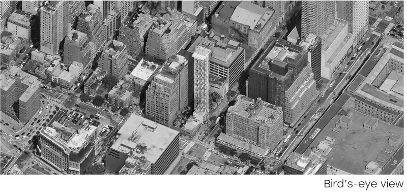
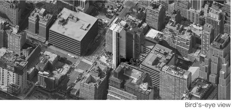
Seen from above, the tower's most striking quality is its slenderness. The aerial views reveal how tightly the surrounding block is packed: midrise apartment buildings, courtyard gardens, and a patchwork of rooftop terraces fill nearly every available parcel. Into this grain, the tower slots itself with a footprint narrow enough to preserve sightlines and daylight access for its neighbors. The ribbed facade reads as a series of vertical fins from this vantage point, breaking the building's mass into a finer visual texture that echoes the granularity of the block below.
The oblique aerial is particularly telling. It shows the tower emerging from the urban grid not as an alien object but as a logical vertical extension of the density already present. The building's orientation appears deliberate, aligning with the street grid while allowing its sculpted profile to catch light differently throughout the day. Surrounding rooftop greenery hints at an ecosystem of outdoor spaces the tower neither overshadows nor ignores.
Street-Level Dialogue with Historic Facades
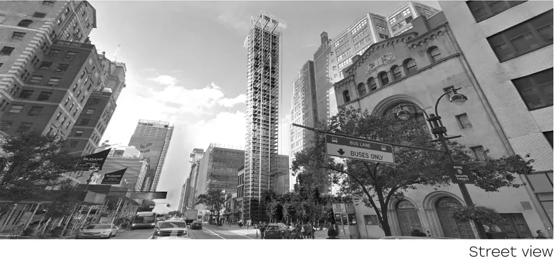
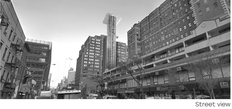
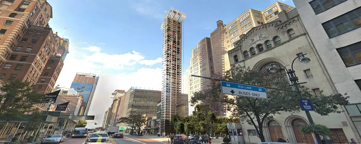
At ground level, the project's real test plays out. The street corner view positions the tower directly behind a historic arched facade, and the juxtaposition is handled with care. Rather than mimicking the stone arches or retreating behind a glass curtain wall, the tower asserts a clearly contemporary identity through its ribbed envelope, while its setback and proportional restraint allow the older building to hold the street edge. Tree-lined sidewalks reinforce the pedestrian scale, creating a layered transition from the intimate streetscape to the vertical gesture above.
The winter street elevation strips the scene to its structural essentials. Bare trees frame the tower against a muted sky, and the low-rise neighbors read as a continuous datum from which the tower departs. The horizontal banding of the facade is legible even from a distance, giving the building a rhythm that prevents it from reading as a monolithic slab. It is a composition that acknowledges the existing urban fabric as a baseline, not an obstacle.
Horizontal Louvers and a Twisted Profile
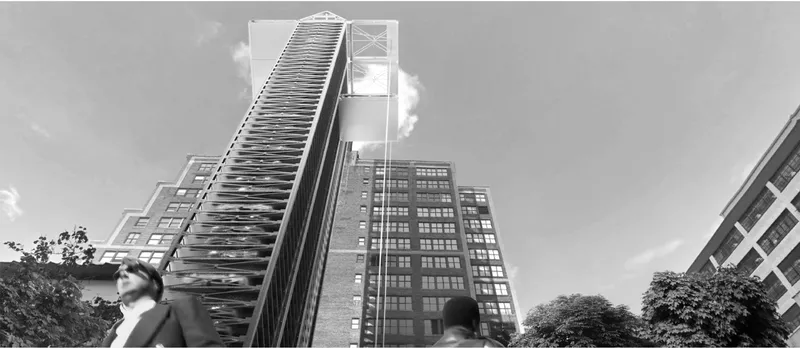
The upward view reveals the building's most expressive move: a subtle twist in the tower's profile, articulated through layers of horizontal louvers that wrap the facade. Against scattered clouds, the louvers create a moiré-like effect, shifting in visual density as the eye travels up the building. This is more than decoration. The louvers likely manage solar gain and control views, but their formal contribution is equally important. They give the tower a kinetic quality, a sense that the building is in motion even while standing still.
The twist itself distinguishes the tower from a simple extrusion. By rotating the floor plates or the facade plane incrementally, Kuzmin introduces a sculptural dimension that makes the building read differently from every angle. It is a strategy that earns visual interest without relying on ornament, and it ensures the tower registers as a designed object rather than a speculative volume maximized for floor area.
Why This Project Matters
Urban infill projects are often caught between two failures: excessive deference that produces forgettable background buildings, or aggressive formalism that treats context as irrelevant. Kuzmin's proposal navigates this tension with intelligence. The tower is tall enough to deliver real density on a constrained site, slender enough to respect its neighbors' access to light and air, and detailed enough to reward close looking. The ribbed facade, horizontal louvers, and subtle twist are not stylistic indulgences but calibrated responses to orientation, scale, and urban grain.
What makes the entry compelling within the Yo Parking 2019 brief is its refusal to treat a parking lot conversion as a blank slate. The surrounding block, with its historic arches, rooftop gardens, and established street trees, is treated as design input rather than backdrop. The result is a tower that belongs to its site without imitating it, proving that density and character need not be traded against each other.
View the Full Project
About the Designers
Designer: Anton Kuzmin
Enter a Design Competition on uni.xyz
uni.xyz runs architecture and design competitions year-round that reward proposals with spatial conviction and real site intelligence.
Project credits: "Proposal for Yo Parking by Anton Kuzmin Yo Parking 2019 (uni.xyz).


Popular Articles
Popular articles from the community


Aquadapt: An Underwater Habitat That Rewrites Its Rooms by the Hour
Curved modules ring the seabed while one shell shifts from breakfast room to cinema, farm and football pitch as residents' needs change.

Singing Woman: An Opera House That Performs Before the Curtain Rises
Ovidiu Cristian Pavel's conceptual opera house translates Estonia's choral identity into a sculpted waterfront landmark facing the Baltic Sea.


graciastudio Turns a Viewless Tijuana Lot Inward Around a Courtyard of Concrete, Timber and Trees
In Tijuana, Jorge Gracia's GA2 House stacks a timber-clad private floor over exposed concrete and replaces a missing view with a planted interior patio.

The Amber Palace Opera: A Geological Fiction Surfaces on Tallinn's Baltic Waterfront
Pierre Brillard reimagines a Baltic legend as a public landscape, opera house, and waterfront promenade rooted in Tallinn's coastal identity.

Similar Reads
You might also enjoy these articles

Cube Design Draws an Ecological Corridor Between Two Shenzhen Hills with the Nankai Building
Beside Shenzhen's container docks, the Nankai Building pairs stacked balconies with a climbing green screen to connect two hillsides across its height.

Praksis A and Studio Sted Bend a Red Timber Cabin Across the Granite of Norway's Southern Coast
On the southern Norwegian coast, a 105 m² cabin follows the rock on slender posts, pairing red cladding outside with pine, brick and plywood within.

David Ortega Stacks a Two-Story Mexico City Penthouse Around a Steel Stair and a Pergola-Shaded Roof Terrace
In Colonia Roma, a 300 m² penthouse uses oak joinery, a planted steel stair and a slatted roof pergola to make a new-build apartment feel like a house.

PARALELA and LB2 Thread a Public Walkway Through the Base of a Las Condes Residential Tower
In Las Condes, Santiago, the Hamlet Building gives its fenceless ground floor to a 70-metre wooded passage linking two streets and the metro.

Comments (0)
Please login or sign up to add comments
No comments yet. Be the first to comment!