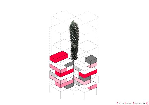
4Cactus adaptabilityGiven the minimum dimensions required, non-hierarchical spaces are appealed and the server spaces are suppressed. The furniture, easily interchangeable, will be the ones that define the character of spaces, a priori without a preliminary use and with a big flexibility. In turn, common areas and orchards are essential to create a neighborhood community.
1Special MentionREBERBARRibs and beer are the main elements that inspired the designers of the studio YUDIN Design in creating the brand identity for the pub REBERBAR. The authors of naming and logo, the designers Aleksandr and Vladimir Yudin, developed the visual identity through the creation of various items associated with it: t-shirts and staff uniforms, trays and undercoats.
0BERGAMOTFor the brand identity of the restaurant BERGAMOT, The designers of the studio YUDIN Design were able to express in the logo their inspiring elements (the classical Italian arches, the pizza/citrus slices, the Japanese folding fan) on which they developed the visual identity with elements as coasters and business cards in different colours and sizes.
0FISH & CHIPSTo emphasize the menu innovations of the street food fish, YUDIN Design offered the name, created logo and brand identity, and finally developed the corporate legend! The visual identity system carried out by Aleksandr and Vladimir Yudin concerns various personalized elements as napkin holders, wipes, takeaway boxes, caps and staff uniforms.
0PAN JA PANTo create the brand identity of the sushi delivery service in Chernivsti, YUDIN Design had to make it more national and got a very original idea, creating the logo from graphic sushi and making it very similar to the typical Ukrainian ornaments. The visual identity is developed with business cards, delivery boxes, t-shirts for the staff ad other promo items
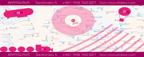
0BON Bratislava ManufakturThis logo and the other identical elements were created for the rebrand of an old confectionery. The designers Aleksandr and Vladimir Yudin decided to use the typical shades and colors that remind a lollipop. Because the factory has its own caf? shop, the designers proposed also how to interpret the logo in different items and promo materials.
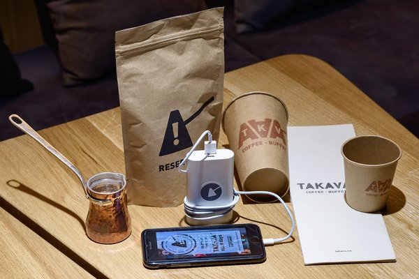
1Special MentionTAKAVA coffee-buffetFor the brand identity of the new coffee shop TAKAVA, the designers YUDIN Design, Aleksandr Yudin and Vladimir Yudin, used the shape of the traditional Turkish coffee pot called cezve. They proposed full and short kinds of the logo using the letter A in the shape of the cezve. Also the name of the caf? in the Ukrainian language means "the right coffee".