


Packaging
Design and development of packaging systems for products, brands, and commercial goods.



Coppercraft Distillery
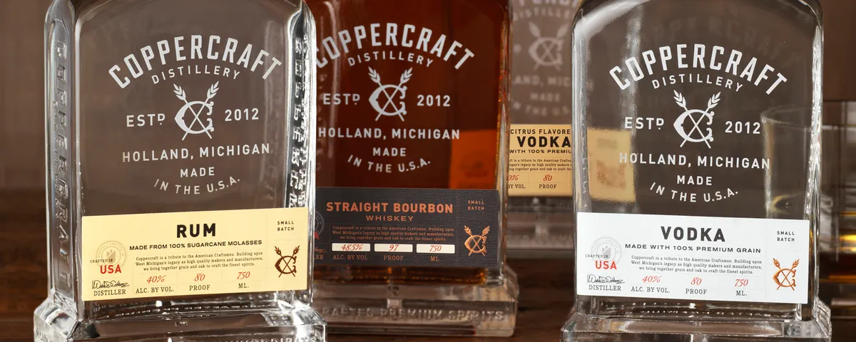
Every bottle of Coppercraft Premium Spirits is a tribute to the American Craftsmen. They asked CF Napa to develop their story and packaging that would capture the legacy of their West Michigan tradition: makers & manufacturers; creators & curators; designers & developers. A legacy that embraces hard work and celebrates our community of family and friends.
Alley 6 Craft Distillery
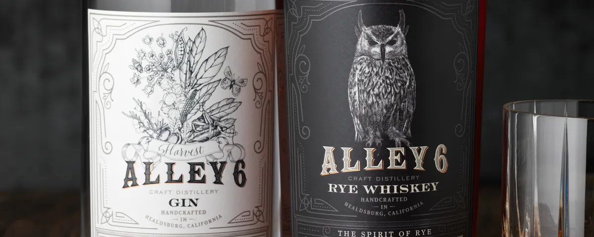
Alley 6 Craft came to CF Napa to design packaging for their craft spirits. The solution was a design that captured the artisanal nature of their distillery that produces small batch productions from their Alembic Copper pot stills. The foil accents mimic the copper stills and every bottle's batch information, bottle number and bottling date is hand-written.





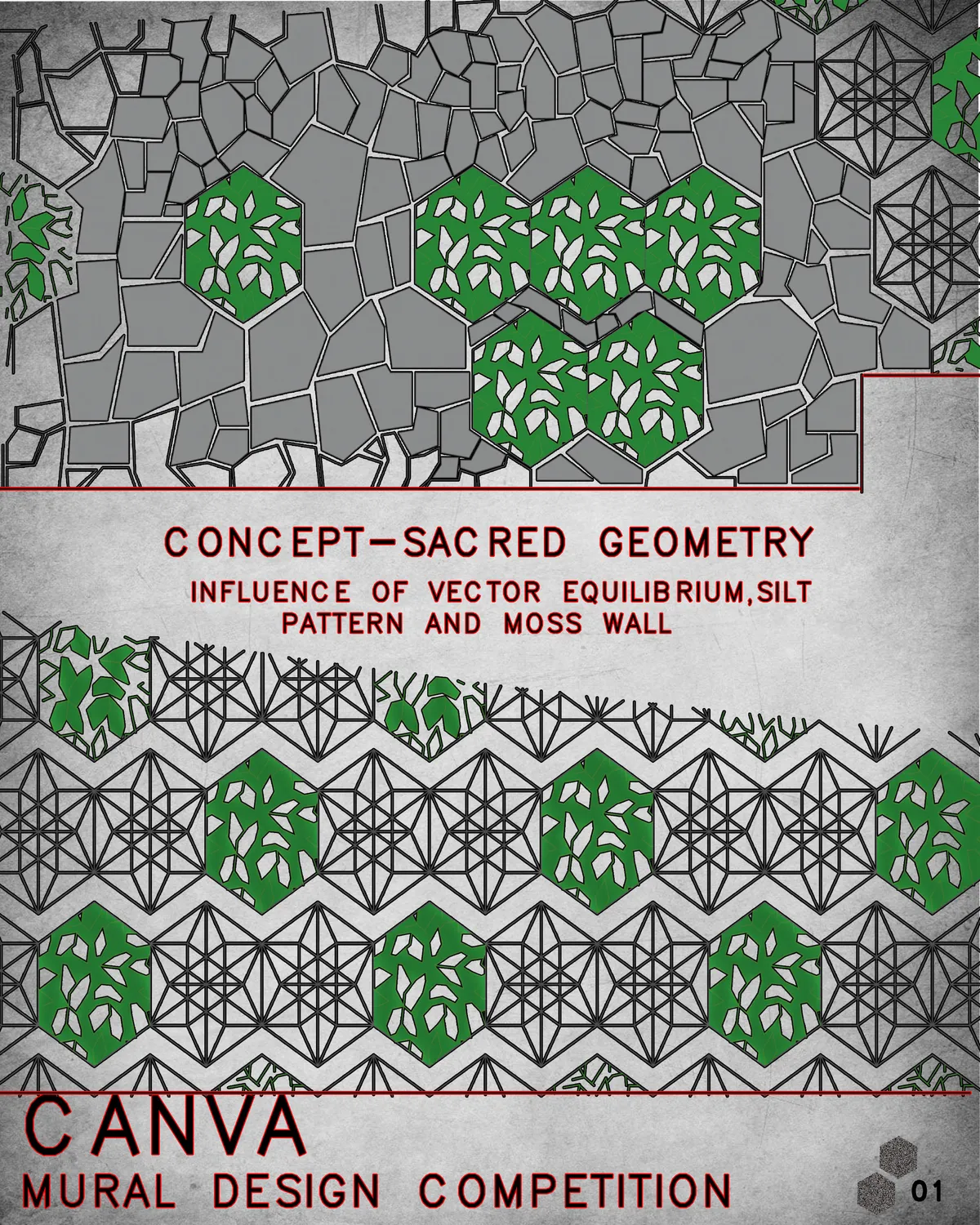
canva mural wall design
a design for the clubhouse wall with the concept:sacred geometry a

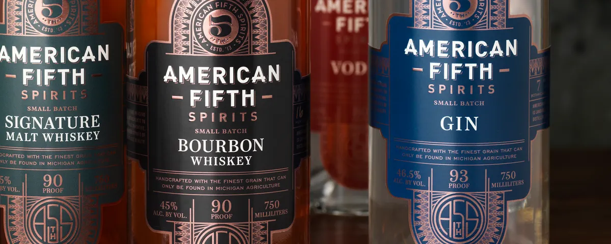
American Fifth Spirits
American Fifth Spirits distill hand-crafted spirits of remarkable quality utilizing local ingredients. Our design solution was inspired by the art deco architecture found throughout Lansing and Michigan. We created an art deco framework foiled in copper foil on the labels combined with a rich color palette.
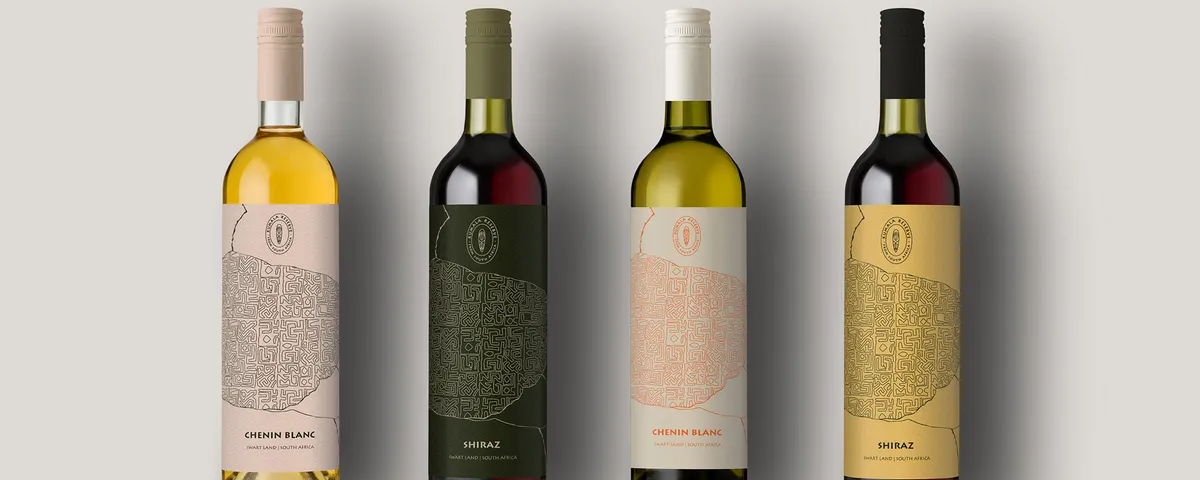
Rebranding - Kumala Reserve
The rebranding of Kumala Reserve is one of my school projects. The purpose of the rebranding was to truly link its country of origin - South Africa by highlighting the originality and associating the brand with ancient South African art.


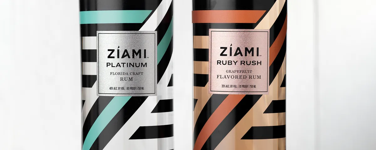
Ziami
Florida Rum Company came to CF Napa to develop their new Rum brand Ziami. Distilled from Florida-grown Sugarcane, they sought to captivate mixologist and seasoned connoisseurs. The brand needed to be fresh and authentic, while being true to its Florida roots and at home in any Miami Beach nightclub.
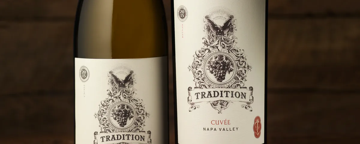
Tradition
The client came to CF Napa to redesign their brand packaging to feel more authentic, premium & to capture their winemaking experience. Our solution uses a historic engraving of an eagle sitting atop an ornate framework that encompasses a cluster of grapes. The label utilizes a stock certificate-like design that leverages a vintage date seal and "T" monogram.


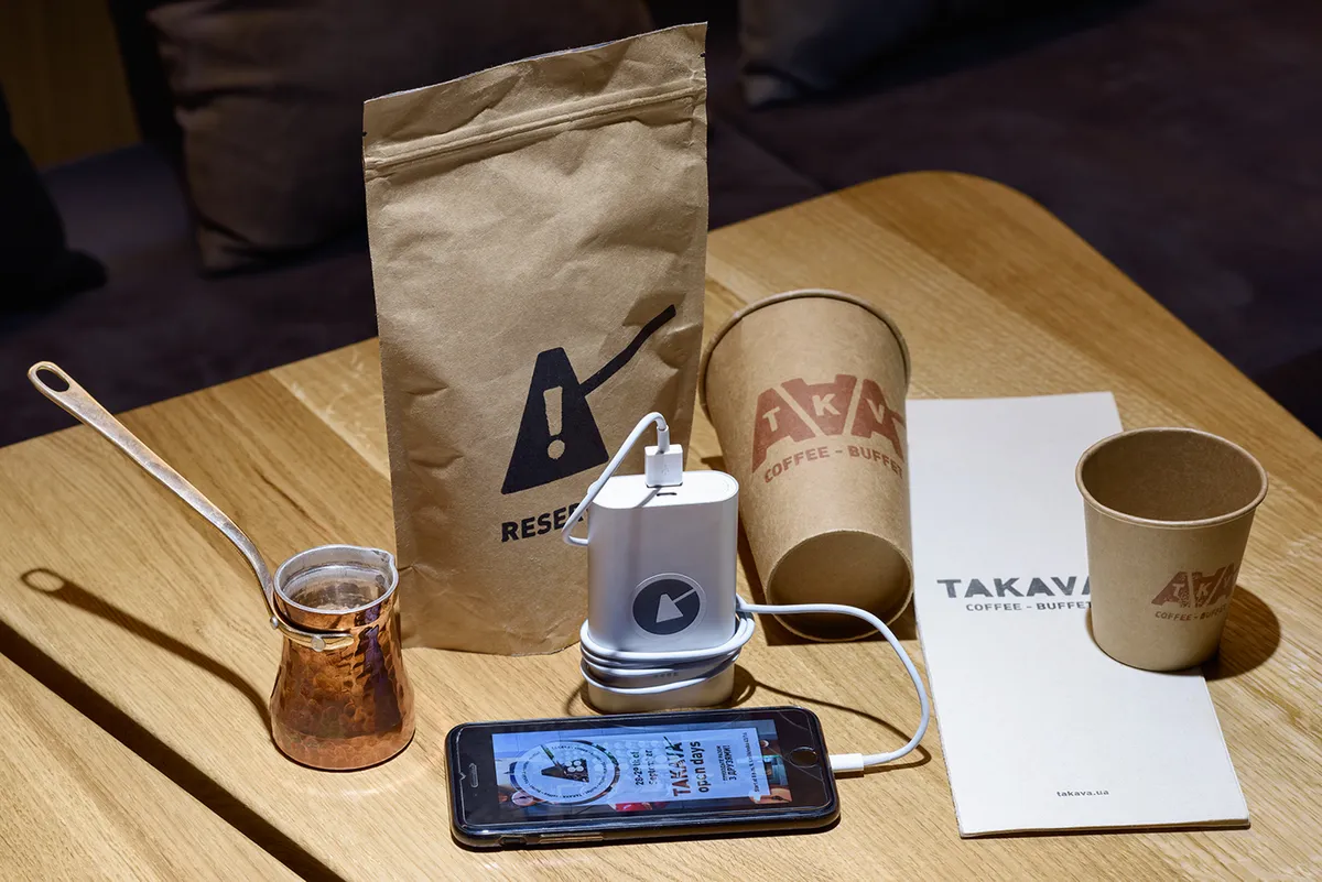
TAKAVA coffee-buffet
For the brand identity of the new coffee shop TAKAVA, the designers YUDIN Design, Aleksandr Yudin and Vladimir Yudin, used the shape of the traditional Turkish coffee pot called cezve. They proposed full and short kinds of the logo using the letter A in the shape of the cezve. Also the name of the caf? in the Ukrainian language means "the right coffee".
Three Chord Bourbon
The client came to CF Napa to design the packaging for their Bourbon that is a blend finished with their trademarked process utilizing tonal vibrations that alter the molecular structure of the bourbon. The black labels are all rock and roll with a guitar pick monogram foil stamped in gold and a framework of flourishes and type that elude to a stage.

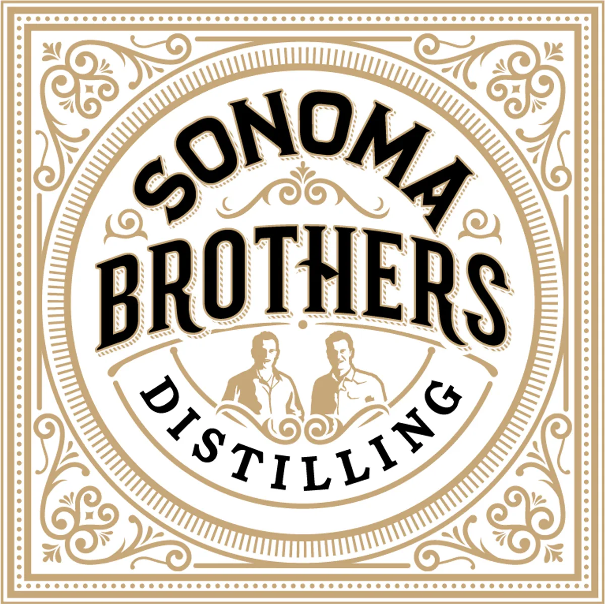
Sonoma Brothers Distilling
The design leverages a turn of the century look to give the brand a genuinely Sonoma craft feel. An illustration of the 2 brothers was incorporated to better communicate the core of the brand story & the craftsmen behind the product. Intricate detailing and gold foil elevate the quality perception and communicates the care that goes into the product itself.
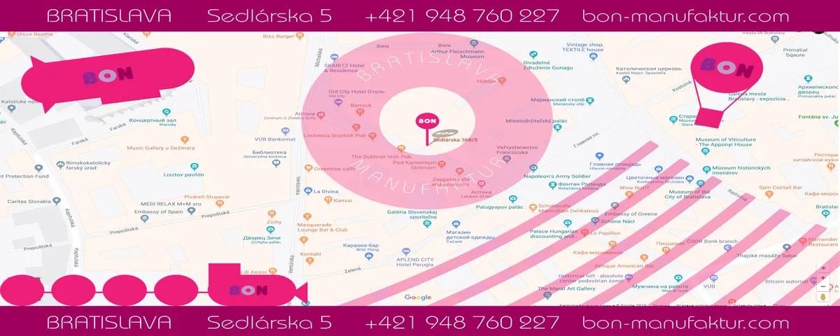
BON Bratislava Manufaktur
This logo and the other identical elements were created for the rebrand of an old confectionery. The designers Aleksandr and Vladimir Yudin decided to use the typical shades and colors that remind a lollipop. Because the factory has its own caf? shop, the designers proposed also how to interpret the logo in different items and promo materials.
Loch & Union Distilling
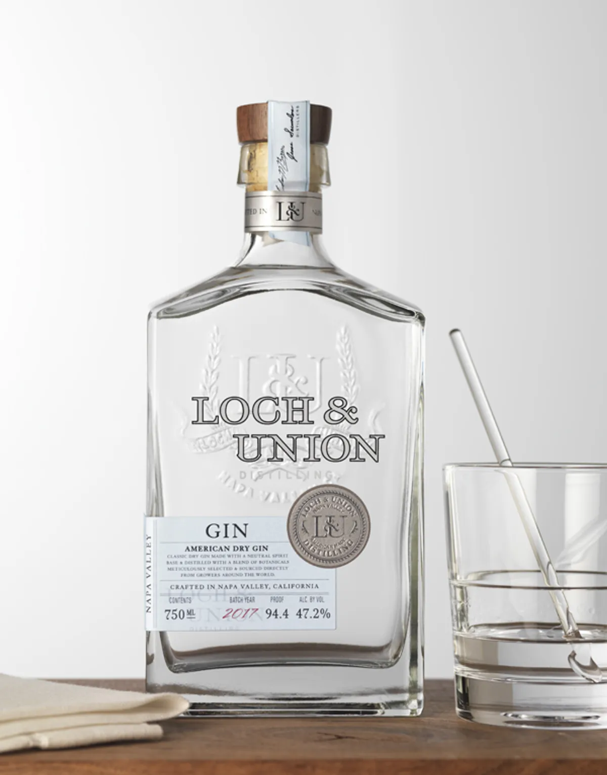
Loch & Union's namesake was inspired by locations on campus at the Heriot-Watt University in Edinburgh, Scotland where their master distiller earned his Master's Degree. Building on this we developed a collegiate inspired crest for the brand's logo. The wrap around labels denote each of the distillery's gins through color and a platinum seal of quality.
AbScent Craft Distillery
AbScent is a conceptual project based on a Birmingham, Alabama based distillery working to produce traditionally made Absinthe in the United States. The design uses Art Nouveau embellishments to represent French tradition mixed with an occult flair as a nod toward the history of the beverage.

Mezza Glacial Bubbly
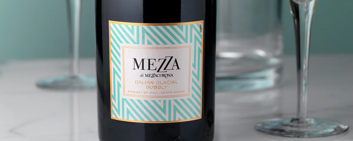
This design for this high-elevation sparkling wine from Italy was inspired by contemporary fashion design in Italy and its vibrant use of color and patterns. The zig zag pattern is a subtle nod to the Italian Alps where the vineyards for this wine benefit from the cool mountain breezes and sun exposure.
Backhouse
O'Neill Vintners & Distillers asked CF Napa to redesign the Backhouse wine brand to a boutique, artisanal selection to be sold exclusively on-premise primarily for by-the-glass programs. The packaging needed to appeal both to bartenders as well as to consumers looking for a high-quality, credible selection amongst more recognizable national brands.


Moj Sirup
Moj Sirup is a syrup package. Traditional packaging syrup after opening have the longest shelf life of up to six months. Packing Moj Sirup allows a longer duration because it consists of independent parts, each of which measured to be exactly one teaspoon. Packing Moj Sirup is practical, compact and easy to use.


It's a beautiful design, love the inspiration and the references to resilience to environmental impacts. Slightly small though and room for some solutions to make the space seem larger.