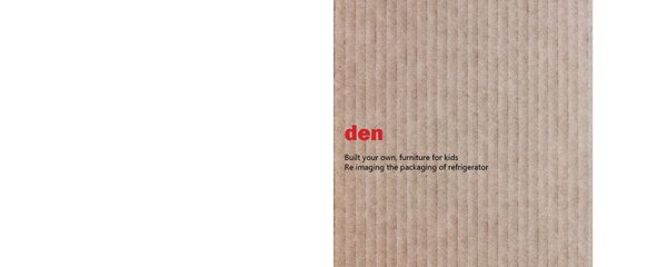
1Den, build your own furniture, re imagining the packaging of refrigeratorPackaging that is used by the products goes to waste immediately after it reaches in the hands of the consumer, only the item is essential to them not the covering. Over here the idea is to also make the cover an essential part for the customer, the only difference will be the type of the consumer. The product focuses the adults and the packaging is for kids
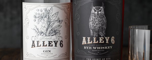
2Alley 6 Craft DistilleryAlley 6 Craft came to CF Napa to design packaging for their craft spirits. The solution was a design that captured the artisanal nature of their distillery that produces small batch productions from their Alembic Copper pot stills. The foil accents mimic the copper stills and every bottle's batch information, bottle number and bottling date is hand-written.
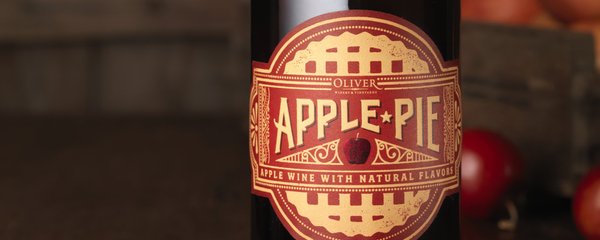
1Apple PieOliver Winery & Vineyards came to CF Napa to develop the branding and packaging for their 100% apple wine. The label die cut was inspired from pie boxes and the design expresses the feel of nostalgic Americana through hand-drawn type and a graphic of the lattice top of an apple pie. The final touch was an apple at the label's center stamped in red foil.
2BackhouseO'Neill Vintners & Distillers asked CF Napa to redesign the Backhouse wine brand to a boutique, artisanal selection to be sold exclusively on-premise primarily for by-the-glass programs. The packaging needed to appeal both to bartenders as well as to consumers looking for a high-quality, credible selection amongst more recognizable national brands.
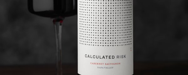
2Calculated RiskWe helped craft the brand's story that envisioned Calculated Risk as an encapsulation of the creativity born from those willing to take a risk. We represented the analytical aspects of thought processes with a series of "+" and "-" signs. Visionaries will discover the hidden plus symbol; a validation to those who see things differently.
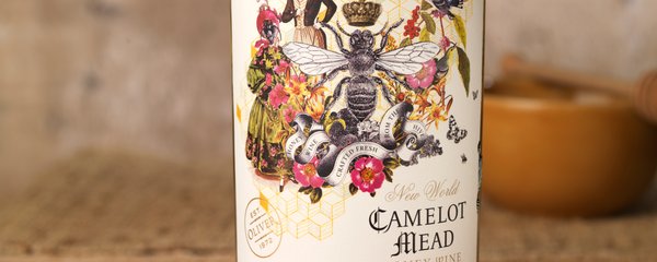
2Camelot MeadMead is the oldest alcoholic drink known to man. It is made from honey and water via fermentation with yeast. With this in mind the design is an avant-garde collage of historical illustrations flowers, bees and European aristocrats montaged with an abstract building block graphic that speaks to the key elements of this wine and the honey comb.
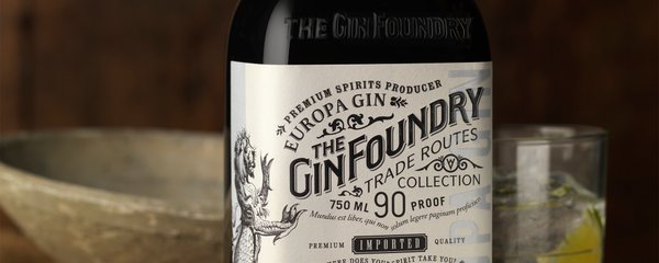
1The Gin FoundryThe custom bottle was inspired by old apothecary bottles and medicinal Gins. A Mediterranean blue was chosen for the Europa Gin and an etching of a sea monster that were so often depicted on the historic maps of the trade routes. The printing is textural with embossing and foil over stamping to put the finishing touch on the rich layered look of the package.
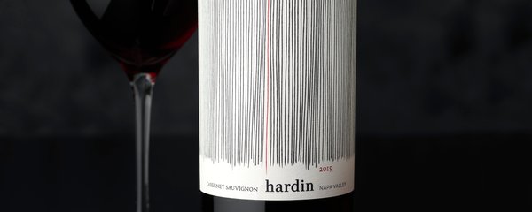
2HardinOur objective was to redesign the brand logo and packaging to compete within their category and feel more premium. Our solution was an abstract and modern design . The highly textural expression of organic lines represent the rows of the vineyard, with a single red line representing the red wine at the center.
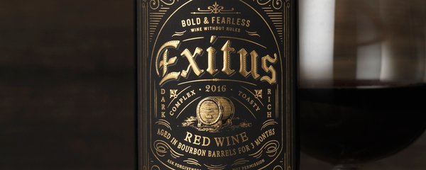
2Exitus Bourbon Barrel Aged WineBold and unconventional, Exitus is a red wine aged in Bourbon barrels. The design elicits a sense of luxury as well as a bit of a bad boy attitude through the use of a black label with gold foil embellishments inspired by tattoo culture. The final touch was a strip seal over the top of the closure of the bottle that calls out the 3-month age statement.
1Kelleher Family VineyardsKelleher Family Vineyards is situated along Highway 29 in the famous Oakville Appellation in the heart of the Napa Valley. They came to CF Napa to redesign their identity to better capture a more contemporary expression and vision. The solution is a mono weight line that forms the letter K capturing a contemporary, yet timeless expression for the brand.
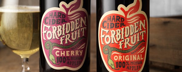
2Forbidden FruitSt. Julian Winery and Distillery asked CF Napa to design their new hard cider that is crafted utilizing Michigan apples from farm to glass. The name evoked a sense of mystery and an intrinsic naughtiness. The brand needed to feel craft and authentic. Our solution combines the classic symbol of the Garden of Eden's apple in a die cut with the serpent.
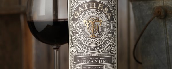
2GathesaThe client came to CF Napa wanting a package design that captured their love of their ranch and the owner's cowboy-at-heart personality. They developed their brand name by combining their sons' names: Gabriel, Theodore & Samuel. We created a monogram from their sons' initials surrounded by a Western-inspired label design.