
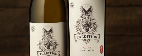
Hardin
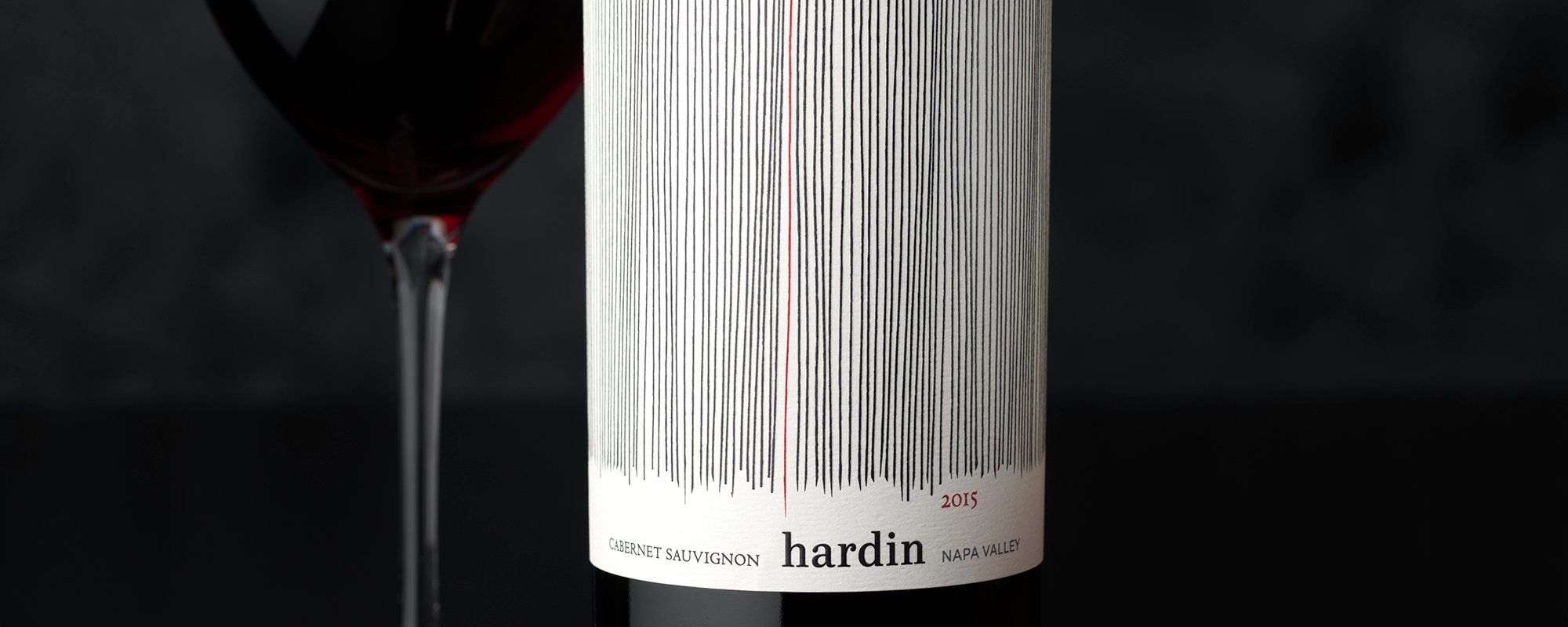
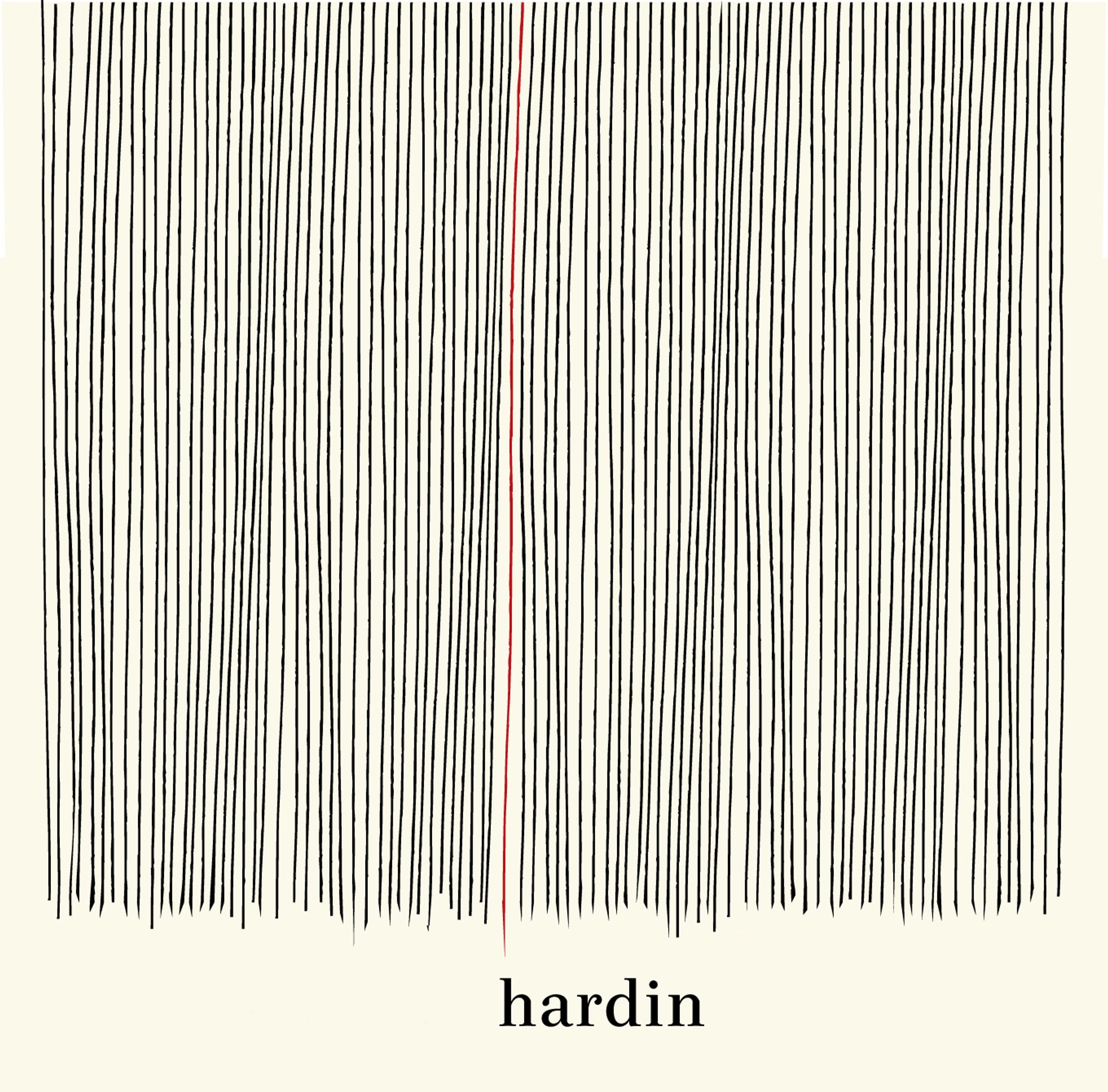
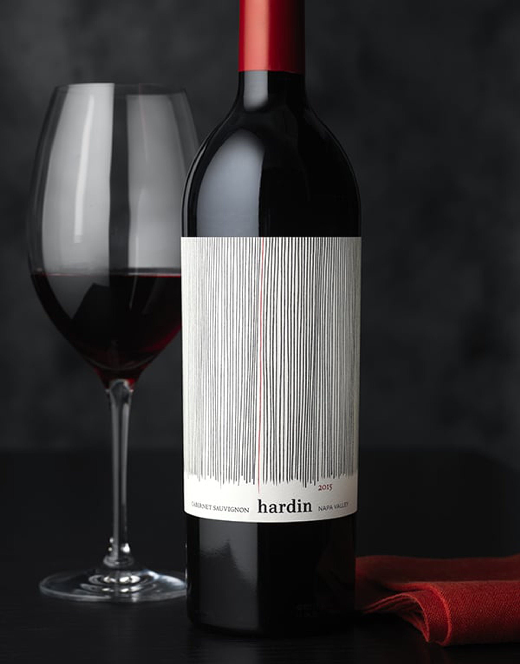
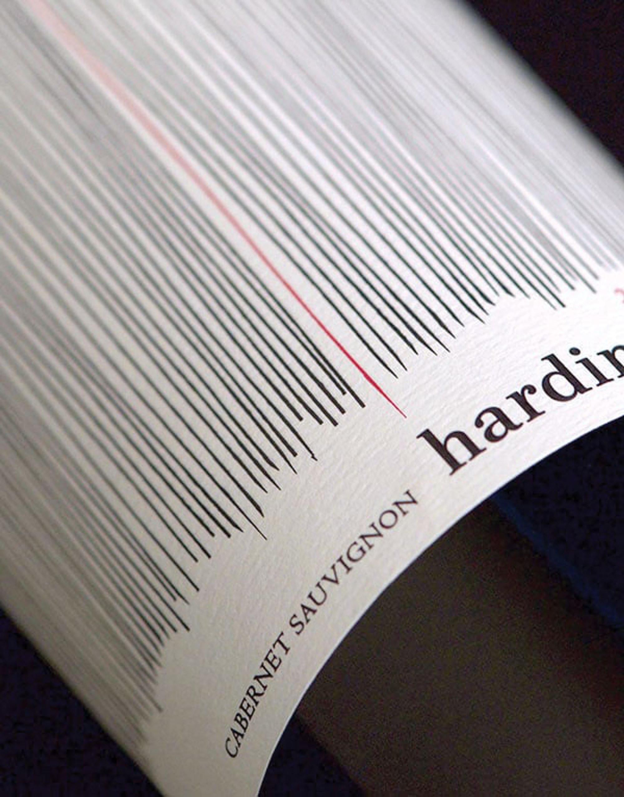
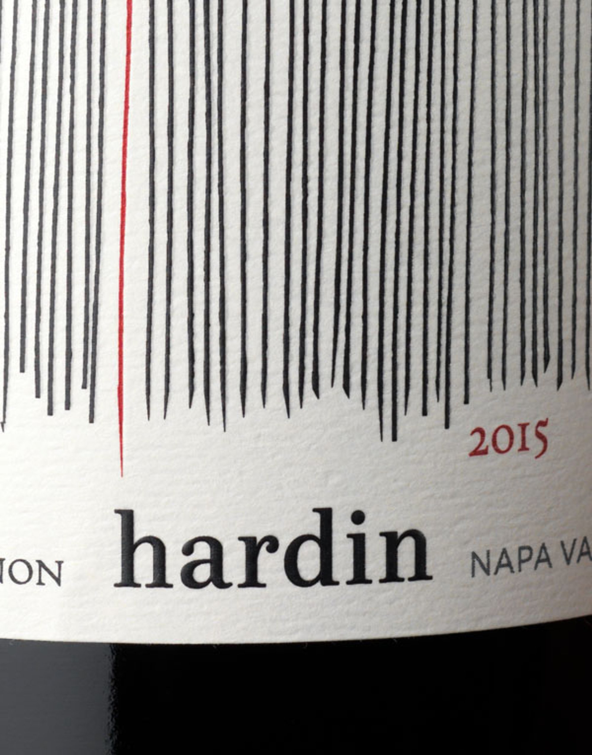
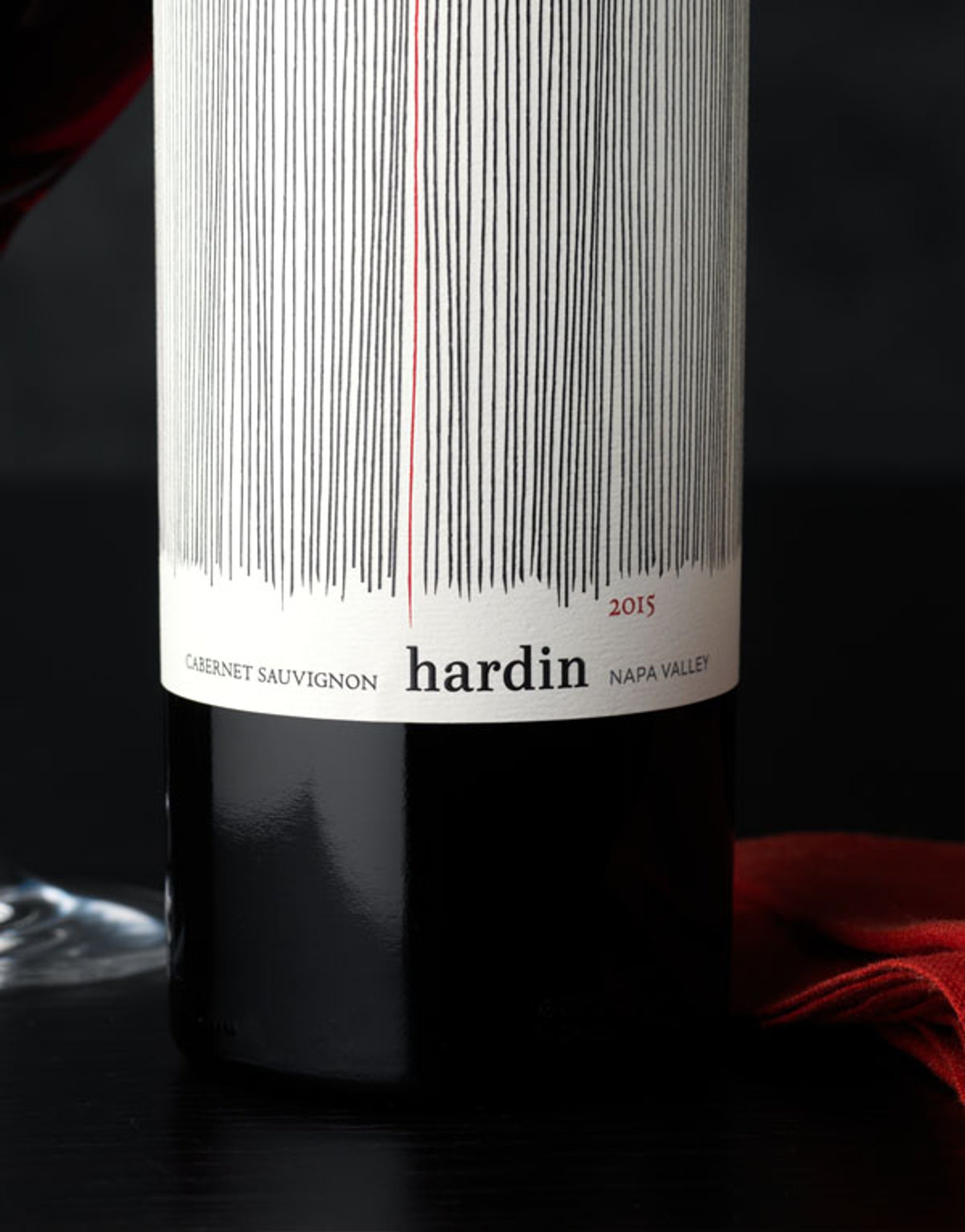
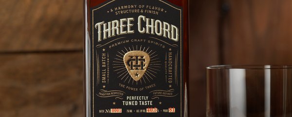
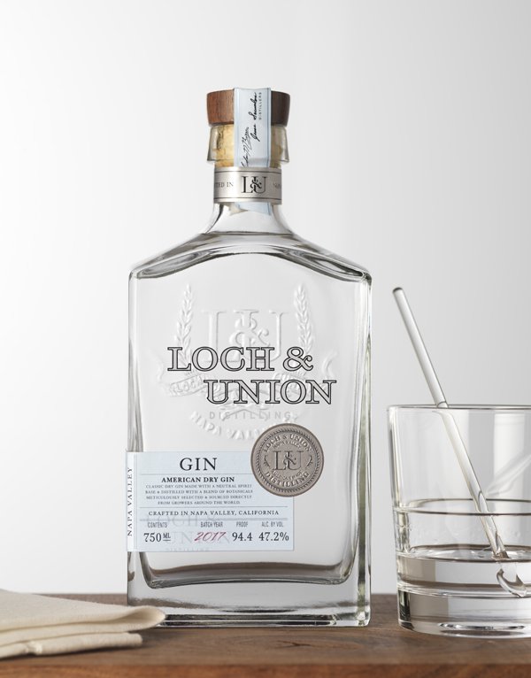
Our objective was to redesign the brand logo and packaging to compete within their category and feel more premium. Our solution was an abstract and modern design . The highly textural expression of organic lines represent the rows of the vineyard, with a single red line representing the red wine at the center.


Project Score
Be the first to rate this project
Project Team (1)
Project Owner
Associated Disciplines (3)


PUBLISHED ON 17th February 2020

Explore Graphic Design Competitions
Discover active competitions in this discipline


Hosted by UNI
The Global Benchmark for Architecture Dissertation Awards
Prize Pool:USD 1,000
Announcement of shortlisted entries: July 27, 2026
Jury evaluation starts: July 28, 2026
Worldwide
68 Entries received

Hosted by UNI
Design a brochure to showcase the effects of the technosphere
Prize Pool:USD 7,000
Regular registration ends: August 30, 2026
Submission ends: September 1, 2026
Worldwide

Hosted by UNI
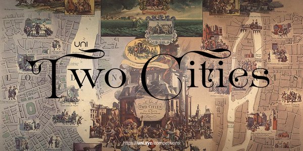
Challenge to illustrate ‘A tale of Two Cities’
Prize Pool:USD 7,000
Regular registration ends: August 30, 2026
Submission ends: September 1, 2026
Worldwide

Hosted by UNI
Deconstructivism - Illustration Design Challenge
Prize Pool:USD 7,000
Regular registration ends: September 30, 2026
Submission ends: October 1, 2026
Worldwide

Similar Projects
Discover related projects you might like


Comments (0)
Please login or sign up to add comments
No comments yet. Be the first to comment!