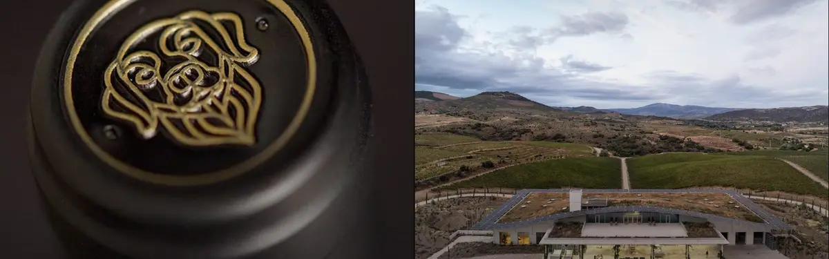
4WinnerPOURA boundless winery, Explore the seamless transition between landscape and architecture, blur the experience of inside and outside
3Erratic WineryThe design offers a winery for wine enthusiasts around the world to come together and be close to nature, while being surrounded by vineyards. A complex as simple as possible out of three houses forming a unit with clear edges. Like an erratic boulder it is placed in the south aftican landscape.
1Bigsby's Folly WineryThe client asked CF Napa to create the icon and brand packaging for their new urban winery. The inspiration for the name came from their dog Bigsby. We designed the label to harken back to the roaring 20?s, when wine production was made in small batches for speakeasies. Bigsby himself became the icon for the brand.
3TraditionThe client came to CF Napa to redesign their brand packaging to feel more authentic, premium & to capture their winemaking experience. Our solution uses a historic engraving of an eagle sitting atop an ornate framework that encompasses a cluster of grapes. The label utilizes a stock certificate-like design that leverages a vintage date seal and "T" monogram.
2GathesaThe client came to CF Napa wanting a package design that captured their love of their ranch and the owner's cowboy-at-heart personality. They developed their brand name by combining their sons' names: Gabriel, Theodore & Samuel. We created a monogram from their sons' initials surrounded by a Western-inspired label design.
2Exitus Bourbon Barrel Aged WineBold and unconventional, Exitus is a red wine aged in Bourbon barrels. The design elicits a sense of luxury as well as a bit of a bad boy attitude through the use of a black label with gold foil embellishments inspired by tattoo culture. The final touch was a strip seal over the top of the closure of the bottle that calls out the 3-month age statement.
1Apple PieOliver Winery & Vineyards came to CF Napa to develop the branding and packaging for their 100% apple wine. The label die cut was inspired from pie boxes and the design expresses the feel of nostalgic Americana through hand-drawn type and a graphic of the lattice top of an apple pie. The final touch was an apple at the label's center stamped in red foil.