


Wine
Wine-related design and architecture projects, from branding and packaging to winery buildings and spaces.


POUR
A boundless winery, Explore the seamless transition between landscape and architecture, blur the experience of inside and outside
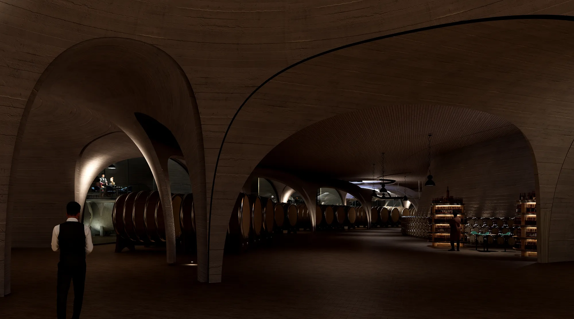


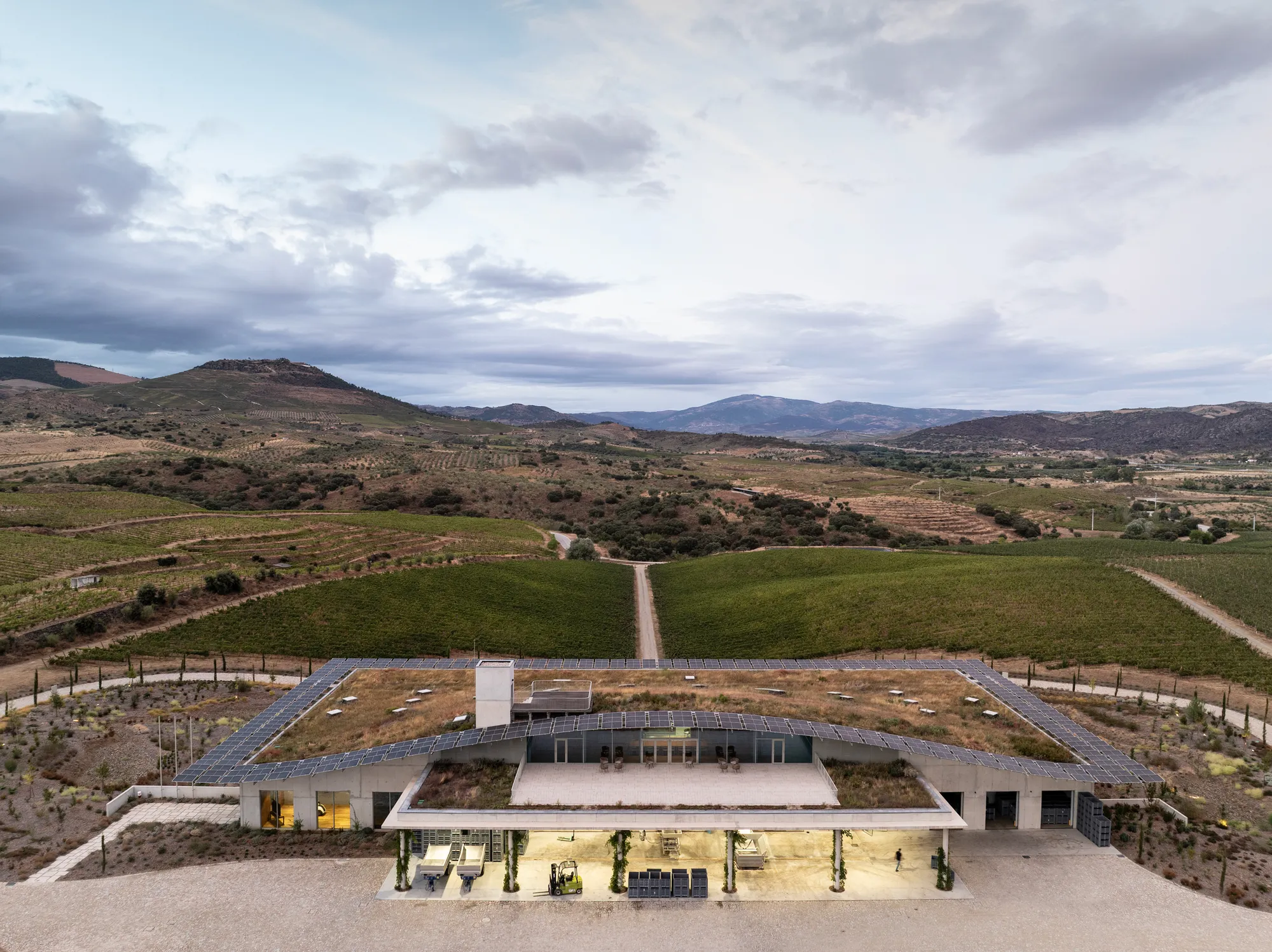
Luís Loureiro Buries a Positive-Energy Winery Beneath the Douro's Organic Vineyards
In Portugal's Vilariça Valley, a 2,700 square metre gravity-fed facility disappears under native grasses and photovoltaic panels.

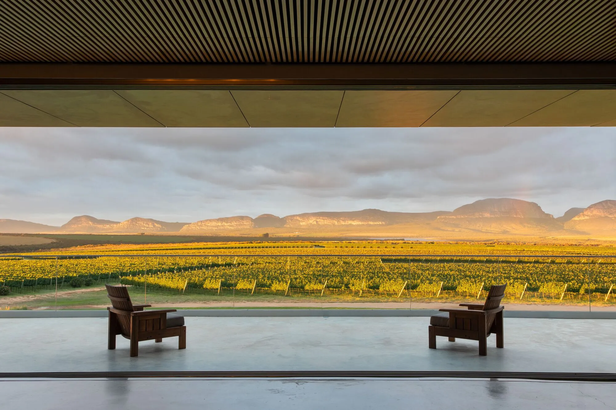
GAM Arquitetos Lets the Chapada Diamantina Landscape Speak Through UVVA Winery's Interior
A 487-square-meter interior intervention in Mucugê, Brazil, strips back ornament so vineyards and mountains become the primary material.


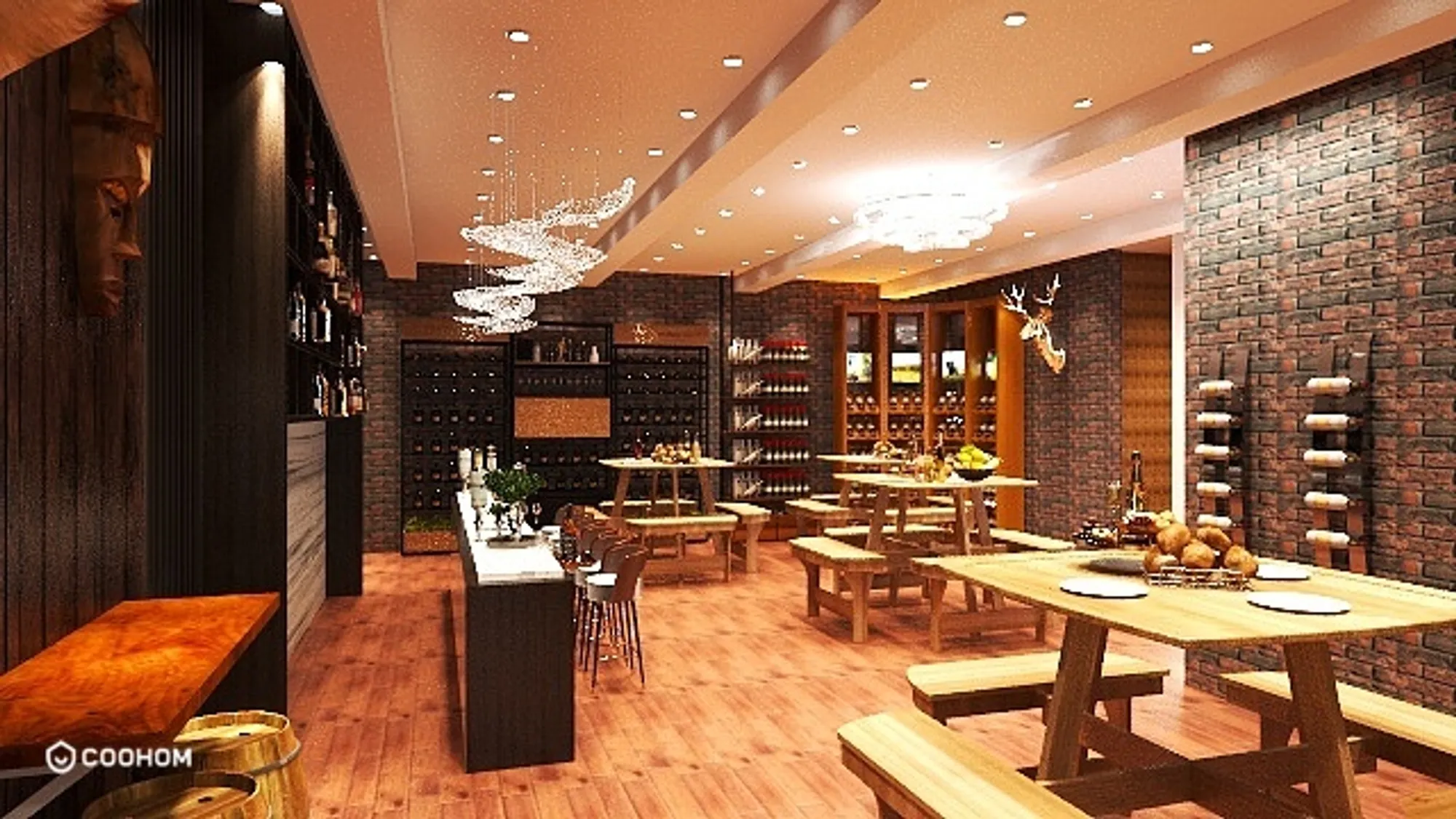
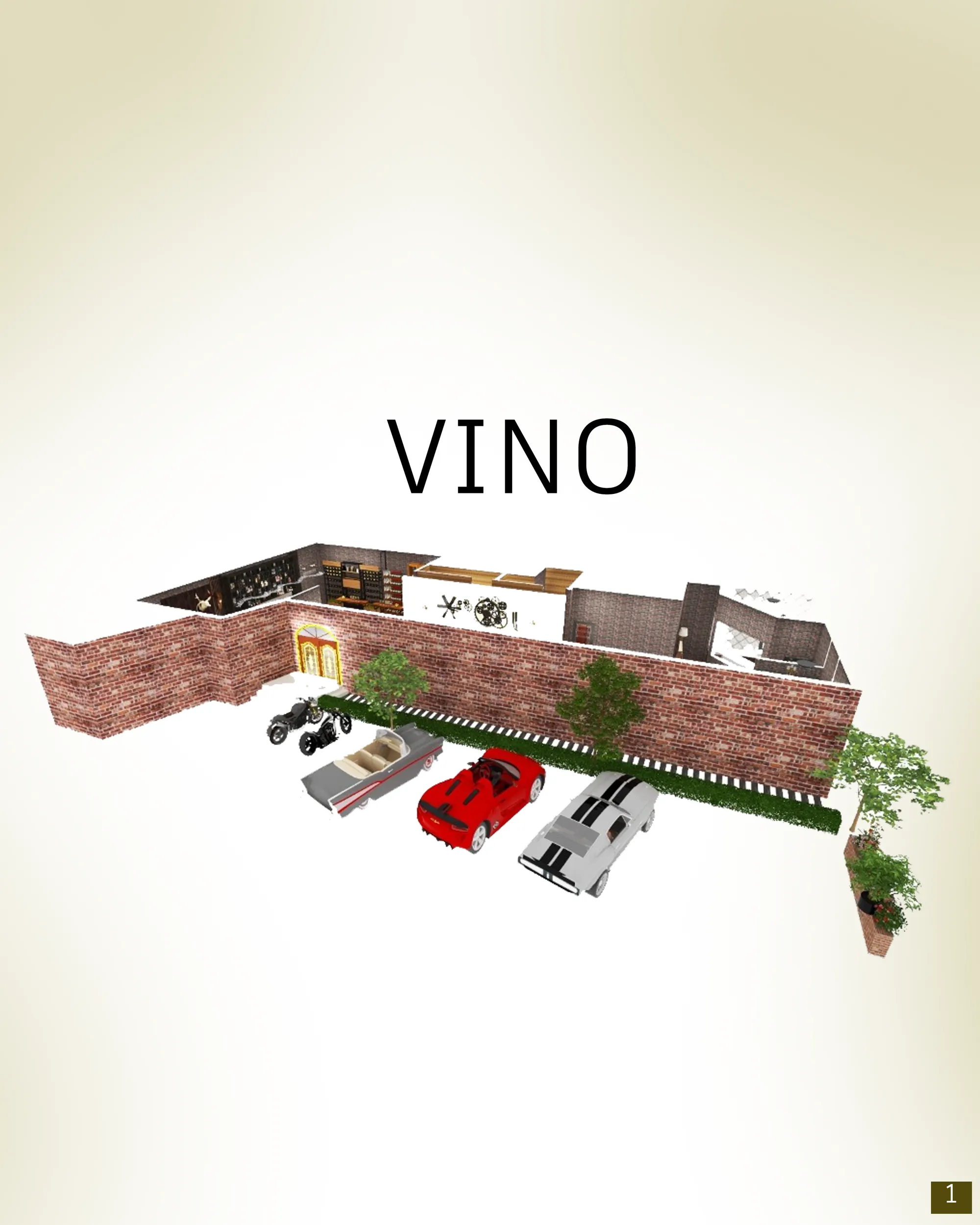
Vino-The Wine Tasting Centre
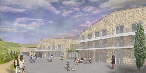
The designed structure celebrates the site and the winery nearby. The aim is to create an environment that feels refined yet relaxed through the careful use of light and local materials. According to the typology of the structures in the locality, burnt bricks are used to blend the designed structure well with the surroundings and create a welcoming space for visitors and wine enthusiasts.

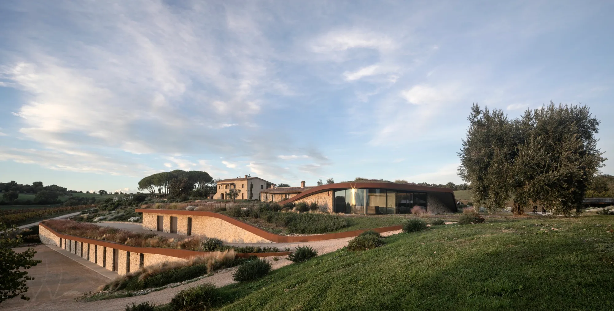
Ubik Architecture Buries a 2,000-Square-Meter Winery into a Tuscan Hillside
Il Quinto Winery in Magliano in Toscana disappears beneath green roofs, stone walls, and the logic of gravity-fed winemaking.




Tradition
The client came to CF Napa to redesign their brand packaging to feel more authentic, premium & to capture their winemaking experience. Our solution uses a historic engraving of an eagle sitting atop an ornate framework that encompasses a cluster of grapes. The label utilizes a stock certificate-like design that leverages a vintage date seal and "T" monogram.

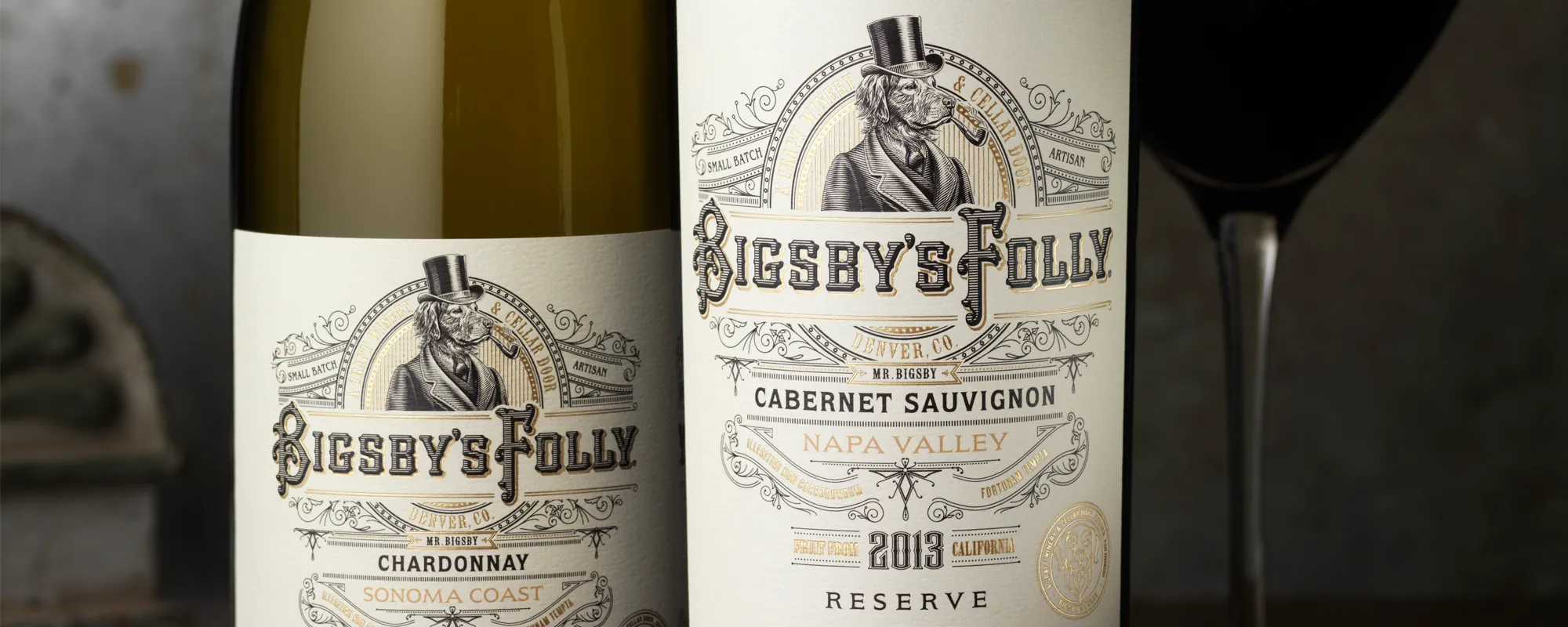
Bigsby's Folly Winery
The client asked CF Napa to create the icon and brand packaging for their new urban winery. The inspiration for the name came from their dog Bigsby. We designed the label to harken back to the roaring 20?s, when wine production was made in small batches for speakeasies. Bigsby himself became the icon for the brand.
Gathesa
The client came to CF Napa wanting a package design that captured their love of their ranch and the owner's cowboy-at-heart personality. They developed their brand name by combining their sons' names: Gabriel, Theodore & Samuel. We created a monogram from their sons' initials surrounded by a Western-inspired label design.

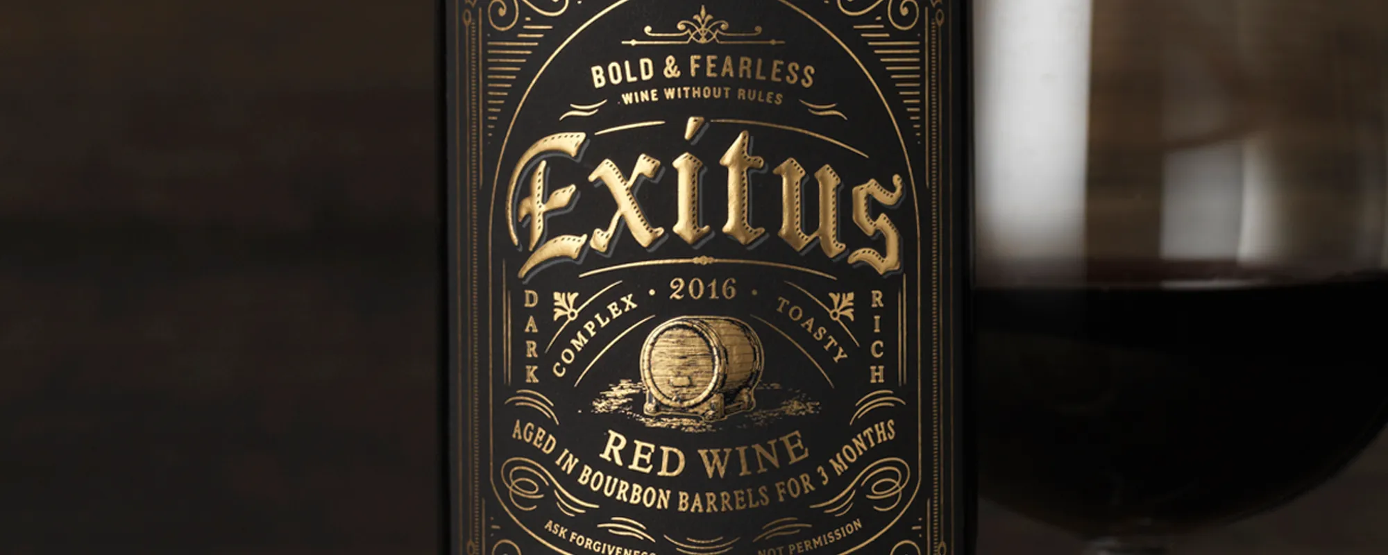
Exitus Bourbon Barrel Aged Wine
Bold and unconventional, Exitus is a red wine aged in Bourbon barrels. The design elicits a sense of luxury as well as a bit of a bad boy attitude through the use of a black label with gold foil embellishments inspired by tattoo culture. The final touch was a strip seal over the top of the closure of the bottle that calls out the 3-month age statement.
Apple Pie
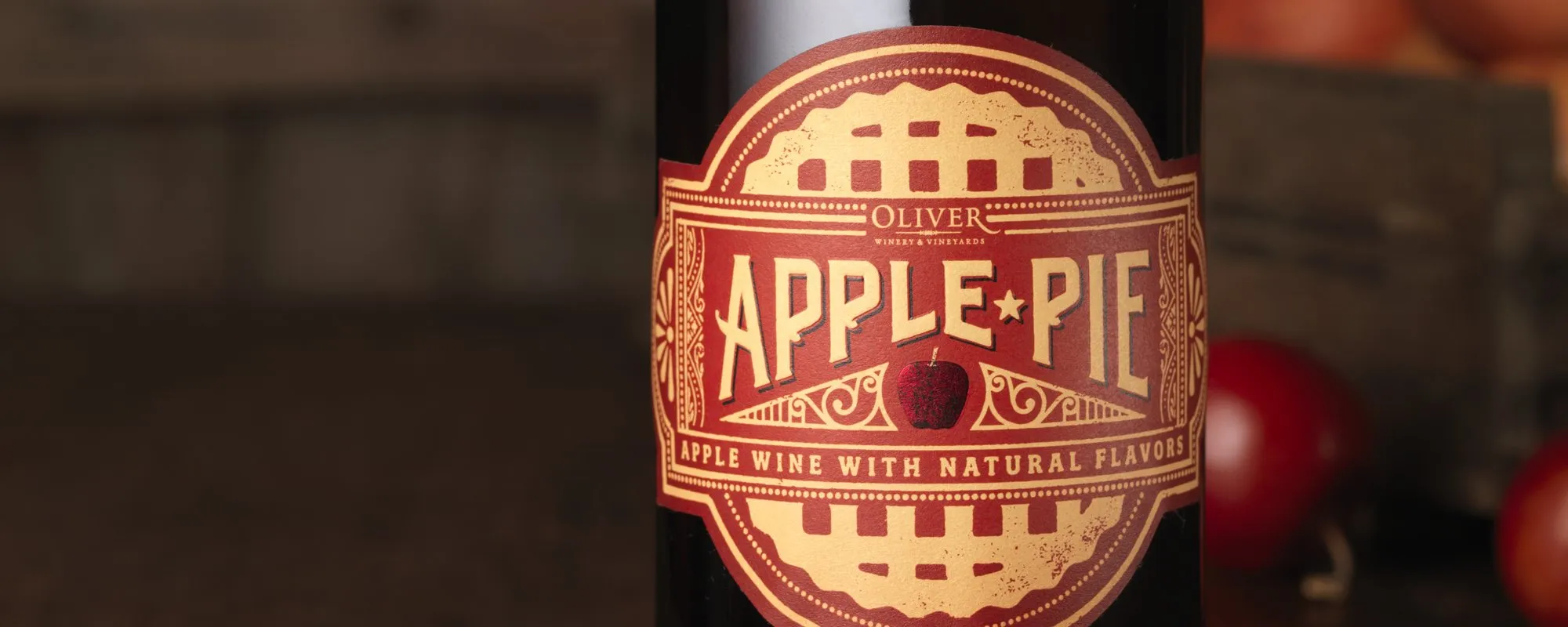
Oliver Winery & Vineyards came to CF Napa to develop the branding and packaging for their 100% apple wine. The label die cut was inspired from pie boxes and the design expresses the feel of nostalgic Americana through hand-drawn type and a graphic of the lattice top of an apple pie. The final touch was an apple at the label's center stamped in red foil.


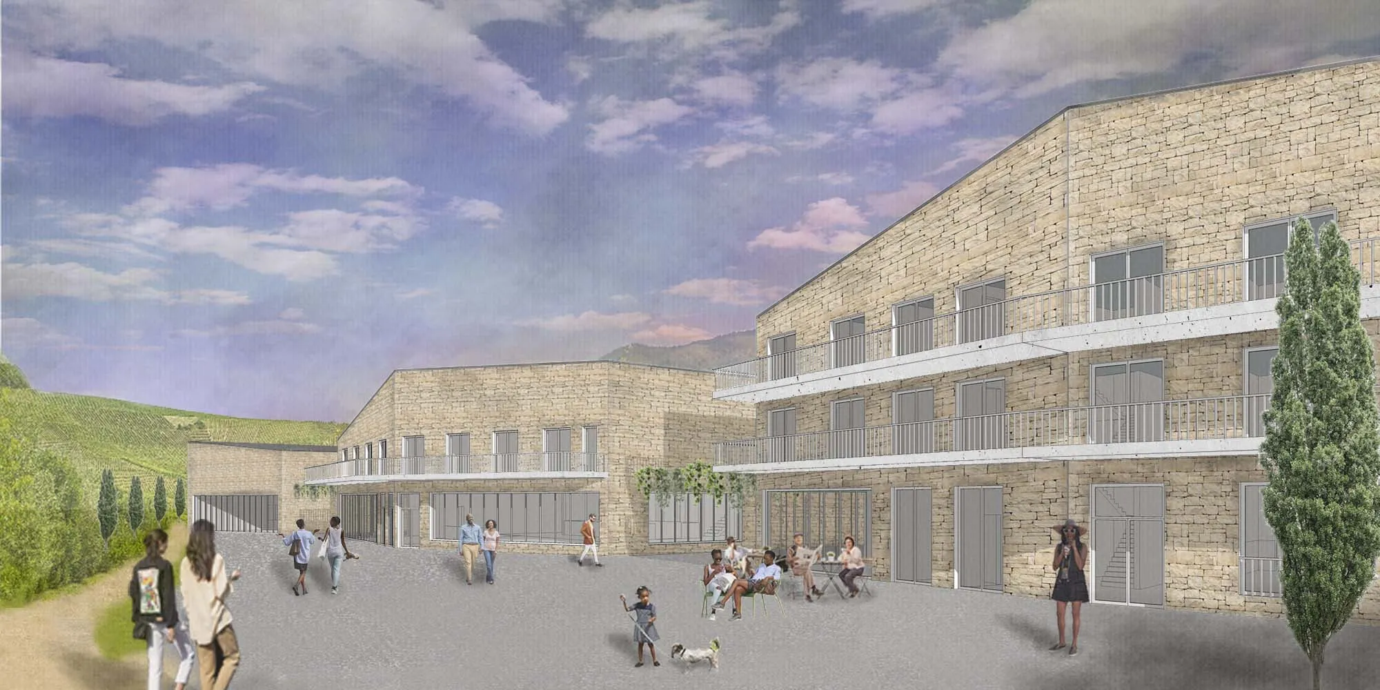
The proposal is quite realistic and focused with a rational development of resources. But, it could have gone further if the relationship with the terrain, or the use of exterior space between buildings, had been explored. Thank you for your work
Very classic approach which does not take into account the specificity of the program. The use of stone is interesting, but it is limited to dressing.