

agence ontwerp Reworks a 1958 Rotterdam Gallery-Flat Apartment Around an Eight-Metre Plywood Storage Wall
On the seventh floor of Harry Nefkens' 1958 gallery-flat in Rotterdam, a 90 m² apartment is rebuilt around bare concrete, birch plywood and a long view.

Rotterdam buyers tend to walk past post-war gallery-flats on their way to older, supposedly more charming buildings nearby. With the Bentinck Apartment, agence ontwerp makes the case that this overlooked stock deserves a second look. The 90 m² unit sits on the seventh floor of a 1958 block by Harry Nefkens, and the studio frames it as the first project in a broader effort to bring attention to mid-century heritage.
The interesting part is not a single gesture but a reversal of the usual apartment logic. Instead of minimising the distance between rooms, the designers cleared the interior completely, cut the hallways, enlarged every room, and then deliberately lengthened the routes between them. The result is a flat that feels larger than its footprint, held together by three moves: a bared concrete ceiling, a long birch plywood storage wall, and a view that stays with you as you walk through.
One Wall Absorbs the Clutter


The roughly 8 m storage wall is the hardest-working element in the apartment. Closed, it reads as a calm plywood surface with flush doors and minimal handles. Open, it holds books, kitchenware and household overflow, and one fold-down panel turns into a compact desk with orange legs and a chair tucked beneath.
We think this is the right way to handle a small home office in a family flat. The desk does not claim a room of its own; it lives inside the wall and disappears when the workday ends. Concentrating storage in one continuous piece of joinery is also what frees the rest of the plan from cupboards, niches and leftover corners.
Exposing the Original Concrete


Removing the ceiling finishes to reveal the board-marked concrete above was reportedly one of the slowest jobs on site, and it pays off. The timber grain pressed into the slab gives the living area texture and an honest link to the 1958 structure, something a fresh plaster ceiling could never offer.
The material palette stays tight around it: one floor finish, one tile, birch plywood joinery, and a mix of new furniture with wood pieces salvaged from the old kitchen and bathroom. Colour comes from loose elements such as the turquoise sofa, a red-stemmed lamp and the books on low shelves, so the architecture remains a neutral backdrop for everyday life.
Longer Routes, Larger Rooms


Doing away with corridors usually means rooms open directly onto one another. Here the designers went further and stretched the paths between spaces, so moving from kitchen to living room to bedroom becomes a short walk rather than a few steps. A cobalt blue end wall at the end of one passage gives your eye a target and makes the depth of the plan readable.
The kitchen sits within this open sequence, with white cabinets, a black stone backsplash and a steel table set against the window. It is plain, functional and placed where the daylight is, which is exactly where a kitchen belongs in a flat of this size.
The City as Part of the Interior


Seven floors up, the main asset is the outlook across Rotterdam's rooftops, and the plan is arranged so that you keep it in sight as you move through. A daybed and a telescope occupy the corner window, the long dining table faces floor-to-ceiling sheer curtains, and low steel shelving keeps the sightlines clear.
There is no landscape here in the conventional sense, so the horizon serves that role. The sheer curtains soften the glare without cutting off the view, which suits the flat Dutch light and the way the rooms are layered toward the glazing.
Quieter Private Rooms


The bedrooms are more restrained. A narrow children's room uses patterned black and white curtains and a spotted rug to give a modest space some personality, while the main bedroom relies on a petal pendant, a navy curtain and the original radiator below the window. These rooms show that the strategy is not about uniform minimalism; it simply lets each space carry a few chosen pieces.
Plans and Drawings


The existing plan shows the usual problem with units of this era: a compartmented core of small rooms, a kitchen strip and a living space left to fend for itself. The demolition drawing reveals how much was removed, effectively returning the apartment to a blank slate inside the gallery-flat's structure.


The new plan and the axonometric make the logic clear. The storage wall runs along the corridor edge, two bedrooms and a bathroom are pulled to one side, and the living area opens toward the balcony and the view. Each element has a single job, and the drawing reads as cleanly as the finished rooms.
Why This Project Matters
The Netherlands has a large stock of post-war gallery-flats, and most of them are judged on their worst interiors rather than their bones. The Bentinck Apartment shows that the problem is often the layout, not the building. Strip back the partitions, expose what the original builders left behind, and you get generous rooms, honest materials and views that pre-war walk-ups cannot offer.
For a studio describing this as the start of a body of work on mid-century heritage, the approach is a sensible one: no nostalgia, no pastiche, just a careful reading of what the structure provides and a small number of well-made interventions. If more owners in a tight market see these flats through this lens, the overlooked blocks of the 1950s and 60s could become the housing many cities need.
Bentinck Apartment by agence ontwerp, Rotterdam, The Netherlands. Area: 90 m². Completed: 2025. Photography by Riccardo de Vecchi and Rubén Dario Kleimeer.
About the Studio
Share Your Own Work on uni.xyz
If projects like this are the kind of work you want to make, uni.xyz is a place to publish your own, find collaborators, and enter design competitions.


Popular Articles
Popular articles from the community

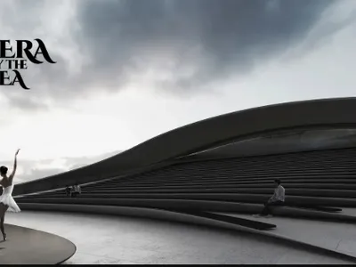
Opera by the Sea Estonia: Three Shells Dissolving Architecture into Tallinn's Coastline
A winning opera house proposal replaces monumental form with interconnected shells that blur the boundary between building, park and Baltic Sea.
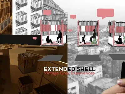
Extended Shell: Retrofitting Kolkata's Balconies as Living Urban Thresholds
A modular retrofit system recovers the social and environmental intelligence of Kolkata's historic verandas for contemporary Park Street residents.

Singing Woman: An Opera House That Performs Before the Curtain Rises
Ovidiu Cristian Pavel's conceptual opera house translates Estonia's choral identity into a sculpted waterfront landmark facing the Baltic Sea.
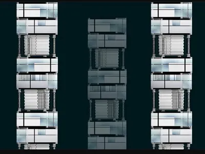
Tsunami Convergenics: Turning Catastrophic Ocean Forces into Underwater Housing Infrastructure
A speculative underwater settlement off the coast of Onagawa, Japan, treats tsunamis and typhoons as energy sources rather than threats.

Similar Reads
You might also enjoy these articles

Pixel Gardens: One Repeated Module Stacked Into a Terraced Social Housing Tower for Famagusta
Salem Bader's shortlisted housing tower builds a vertical neighbourhood from one repeated module, offsetting units to carve terraces, light and air.

Bao Huynh Watercolor Atelier: A Serene Art Retreat in Hội An
Bao Huynh Watercolor Atelier in Hội An blends multifunctional art spaces, sustainable design, local materials, and family-friendly living in a serene environment.

Atelier Macri Concept Store Interior Design by CASE-REAL
Atelier Macri store features a "ko" counter, walnut wood details, cork displays, blending retail, gallery, and seamless customer experiences.

Manuel Vargas Izquierdo Stadium and High-Performance Sports Center: Architectural Excellence in Jalpa de Méndez
The Manuel Vargas Izquierdo Stadium blends sustainable design, inclusive sports facilities, and cultural-inspired architecture, revitalizing Jalpa de Méndez’s public spaces.
Explore Architecture Competitions
Discover active competitions in this discipline


Challenge to reimagine the Iron Throne

Photograph architecture without architects

Illustrate the lost glory of Angkor Wat - Render Challenge

Design challenge to reuse E-waste
Comments (0)
Please login or sign up to add comments
No comments yet. Be the first to comment!