
Atelier Glushkó Builds an Entire Copacabana Apartment Around a Wall of Portuguese Tiles
In a 36-square-metre Rio de Janeiro flat, structural columns discovered during demolition become the project's organizing logic.


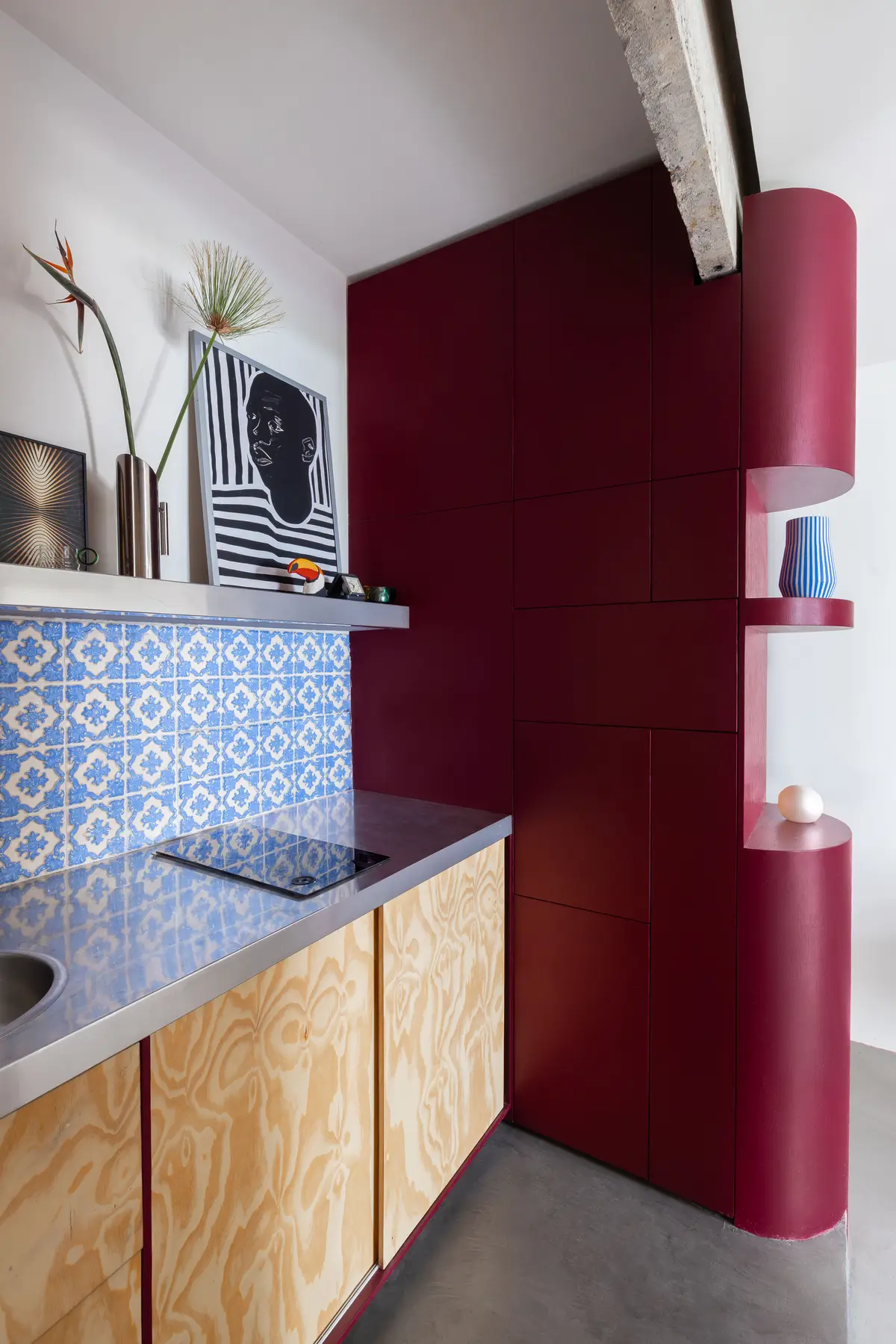
Most renovation projects start with a floor plan. Atelier Glushkó's 36-square-metre apartment in Copacabana started with a single surface: a wall of Portuguese azulejo tiles that the client refused to lose. That fixed point, a blue-patterned ceramic plane, became the seed from which the rest of the apartment grew. Every material choice, every spatial move, every color reads as a response to that tile wall, which anchors the kitchen and radiates influence into the corridor, the bedroom, and even the bathroom.
The second provocation came uninvited. When demolition stripped the flat back to its bones, two structural columns appeared where no one expected them, killing the original ambition for a clean, open loft. Rather than concealing the columns behind drywall, Atelier Glushkó made them protagonists. Wrapped in raw concrete or clad in burgundy, the columns now punctuate the apartment like vertical landmarks, giving a tiny plan the spatial rhythm of a much larger space.
Columns as Characters


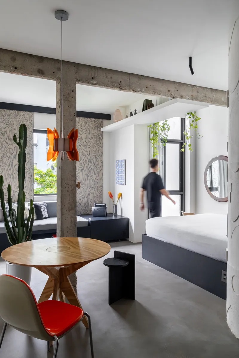
In a 36-square-metre apartment, a single structural column can feel like a boulder in a bathtub. Two of them could have been disastrous. The intelligence of this project lies in treating the columns not as obstacles but as spatial dividers that earn their keep. One raw concrete column separates the living zone from the sleeping zone without requiring a wall. Another, wrapped in a deep burgundy finish, doubles as a storage cylinder in the kitchen. The exposed concrete beams overhead complete the structural narrative, threading a continuous ceiling plane that ties the apartment together.
Polished concrete floors extend from wall to wall, reinforcing the sense of a single continuous ground plane interrupted by vertical events. The columns create implied thresholds: you know you have moved from one room to another not because of a door but because a column has shifted beside you.
The Tile Wall and Kitchen


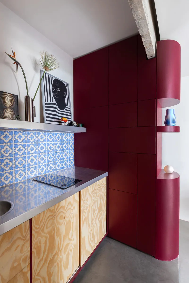
The Portuguese tile backsplash is the project's origin story, and it earns its prominence. The blue patterning has the density and repetition of traditional azulejo work, and its deep indigo hue sets the entire color palette in motion. Against it, plywood cabinets read warm and restrained. The burgundy cylindrical storage element, which wraps one of the discovered columns, introduces a third color that sits comfortably between the cool blue tiles and the warm timber grain.
The kitchenette itself is compact to the point of severity, but its surfaces are rich. Tile wraps not just the backsplash but the counter surround, pulling the pattern down toward the floor and giving the small cooking zone a material coherence that makes it feel intentional rather than squeezed.
The Burgundy Cylinder

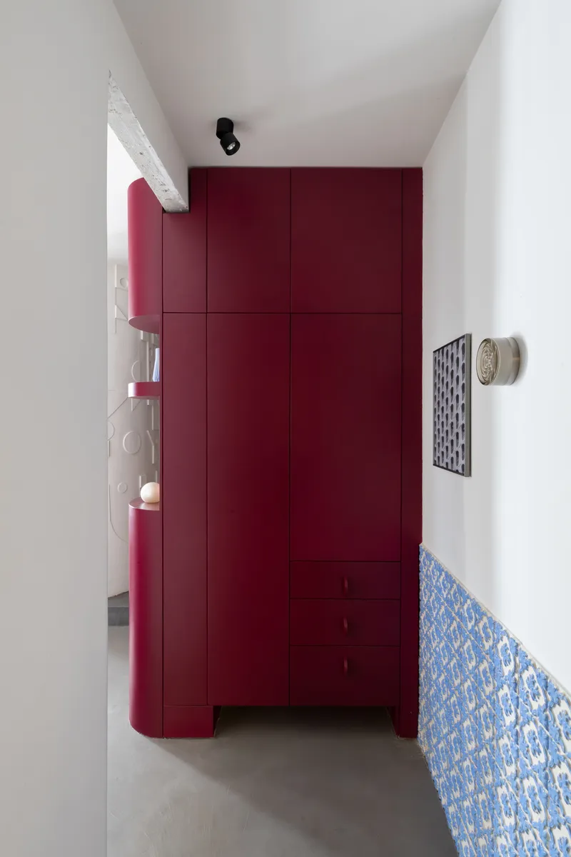
The cylindrical burgundy volume deserves its own discussion. When its curved door swings open, it reveals neatly organized shelves holding kitchen appliances and glassware. It is, functionally, a pantry built around a column. But its form turns it into something closer to a piece of furniture, a freestanding cabinet that happens to be structural. The color, a matte wine-red, recurs in the hallway as a floor-to-ceiling storage unit, creating a chromatic thread that moves through the apartment like a recurring musical motif.
Relief Walls and Textured Surfaces
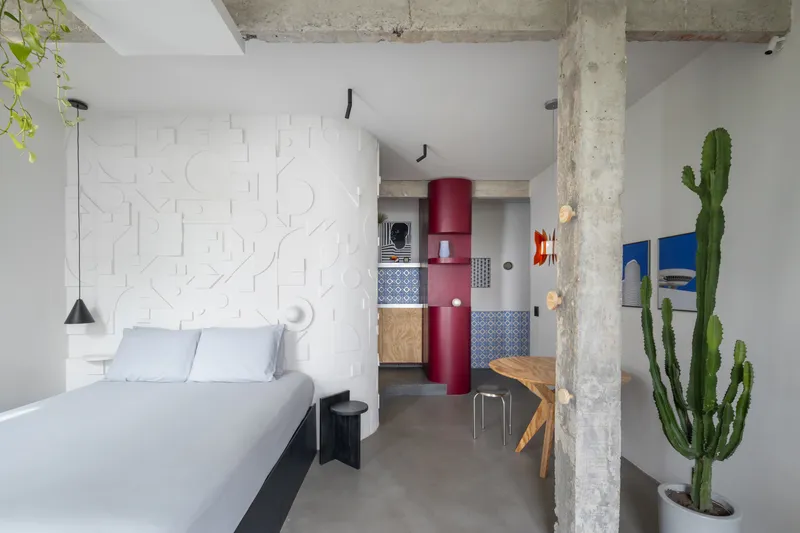

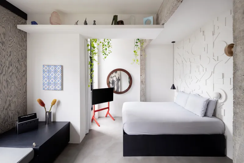
If the Portuguese tiles anchor the kitchen, the white geometric relief panels anchor the bedroom and studio zones. These textured surfaces cast soft shadows across their faces as daylight shifts, giving flat walls a sense of depth that compensates for the apartment's limited square footage. The panels function almost like an interior facade, a surface you look at rather than through, which is a clever strategy in a home where privacy from neighbors is a real concern.
In the bedroom, the relief panels run behind the headboard and up toward the ceiling, where trailing plants spill over exposed concrete beams. The contrast between the crisp geometric pattern and the organic drape of greenery keeps the room from feeling austere. A suspended shelf above the bed holds books and objects, turning the wall into something between decoration and storage.
Thresholds and Doors
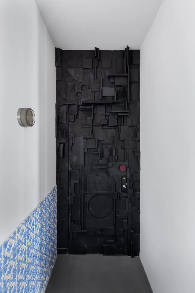

The sculptural black door that appears in the corridor is one of the apartment's most striking details. Composed of layered geometric forms, it looks more like a relief sculpture than a functional door, and it sits in deliberate tension with the blue tile baseboard running along the floor beside it. In a larger apartment, such a move might read as gratuitous. Here, where every surface is visible from almost every vantage point, the door becomes a focal object that rewards close looking.
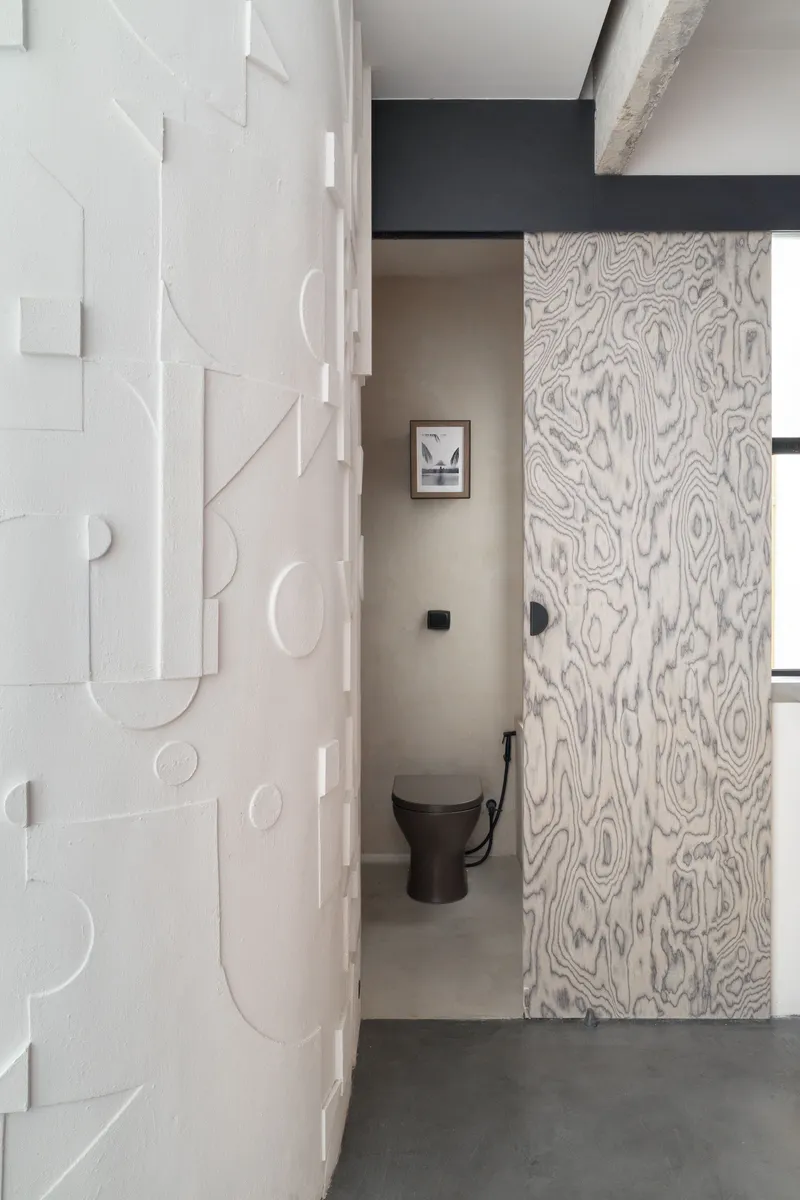
The bathroom entrance uses a different strategy: a sliding door with a wood grain finish that almost disappears against the adjacent white relief panel. Where the black corridor door announces itself, this one recedes. The contrast between the two thresholds suggests a deliberate hierarchy of transitions, from public display to private retreat.
Bathroom as Grotto

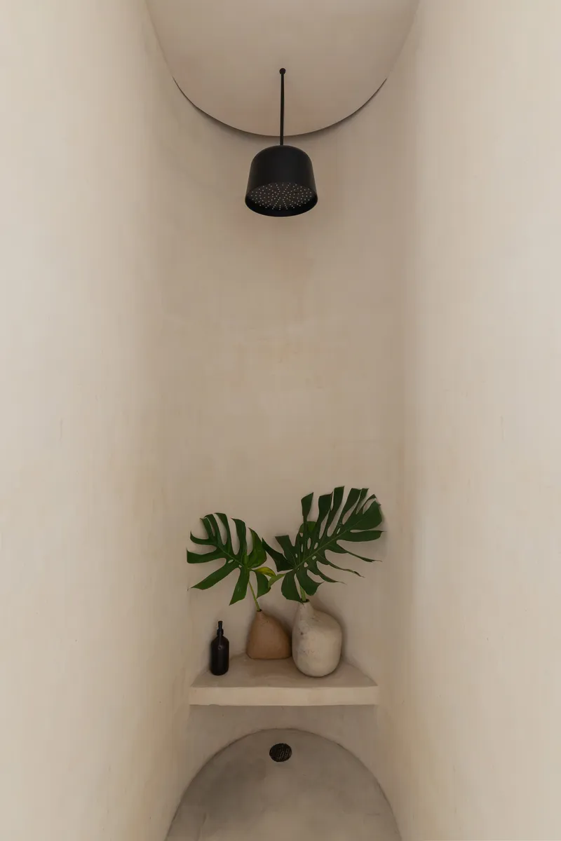
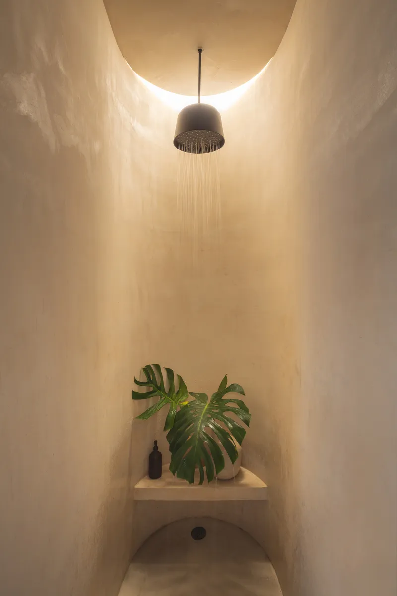
The bathroom is perhaps the most atmospheric room in the apartment. A round sage basin sits on a minimal black stand, with matte black wall-mounted fixtures reinforcing the restrained palette. But the real surprise is the shower alcove: a curved niche lit from within, with water falling from a perforated ceiling fixture. At night, the effect is genuinely theatrical, a warm glow enclosing a column of falling water. This is a 36-square-metre apartment that contains a grotto.
An adjacent curved alcove, finished in the same dark tones, holds monstera leaves and ceramic vessels beneath a black pendant light. These niches feel borrowed from a much older building typology, arched recesses carved into thick masonry. In reality they are likely lightweight constructions, but the spatial illusion works.
Living and Sitting Details
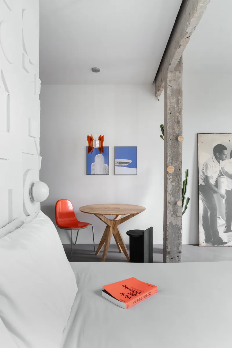


A round timber table, a single red chair, and a piece of artwork lean against a white wall beside a concrete column: the sitting nook captures the apartment's ethos in miniature. Nothing is extraneous, and every object earns its place through contrast. The red chair speaks to the burgundy storage elements elsewhere, while the raw concrete column grounds the composition. In the bedroom, trailing vines frame a black-framed window, and a round wooden mirror introduces a soft geometry that offsets the angular relief panels.
Plans and Drawings
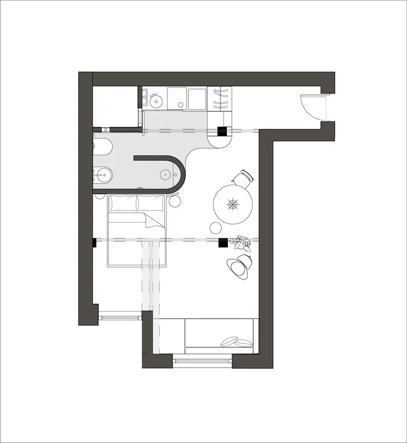
The floor plan confirms what the photographs suggest: this is a compact rectangle organized around two structural columns that sit off the expected grid. The bedroom, bathroom, kitchen, and living area flow around these fixed points without conventional corridors. The bathroom occupies a carved-out zone along one edge, while the kitchen sits opposite, defined by its tile wall. The plan reads less like a subdivided box and more like a landscape navigated around vertical obstacles.
Why This Project Matters
Small apartments are common enough in architectural media, and the temptation is always to demonstrate cleverness through folding furniture, sliding walls, and Swiss-watch spatial optimization. Atelier Glushkó takes a different path. The cleverness here is not mechanical but material: the apartment is organized around surfaces, textures, and colors that give a 36-square-metre plan the sensory richness of a much larger home. The Portuguese tile wall, the relief panels, the burgundy cylinder, and the shower grotto each claim a distinct territory, making the apartment feel like a sequence of rooms rather than a single compressed box.
The decision to embrace the unexpected structural columns is the project's most consequential move. Where many architects would have buried the columns inside partition walls, surrendering a few precious centimeters to concealment, Atelier Glushkó left them exposed and gave them roles. The result is an apartment that wears its constraints visibly and turns them into the very features you remember. It is a useful reminder that the best design often starts not with a concept but with an accident.
The Apartment That Began with a Tile, designed by Atelier Glushkó. Located in Copacabana, Rio de Janeiro, Brazil. 36 m². Completed in 2026. Photography by André Mortatti.
About the Studio
Share Your Own Work on uni.xyz
If projects like this are the kind of work you want to make, uni.xyz is a place to publish your own, find collaborators, and enter design competitions.


Popular Articles
Popular articles from the community


Juan García Correa, John González and Claudia Rueda Sink a Circular Amphitheater into a Manizales Engineering Building
On the La Nubia campus in Manizales, Colombia, the S1 Building folds labs and offices into a hillside of ramped lawns that double as a campus route.

GROUP A Strips a 1969 Rotterdam Harbor Headquarters to Its Frame and Wraps It in Timber Louvers
In Rotterdam's M4H harbor district, Ferro Offices reuses a 1969 frame, adds one timber storey and reaches BREEAM-NL Outstanding.

LT2A and OPEN Architectes Thread a Brick and Glass High School Through a Wooded Belgian Campus
In Braine-l'Alleud, a 3,000 m² wing for Collège Cardinal Mercier pairs pale brick with a glazed colonnade, deferring to a small chapel and a dense wood.

Cube Design Draws an Ecological Corridor Between Two Shenzhen Hills with the Nankai Building
Beside Shenzhen's container docks, the Nankai Building pairs stacked balconies with a climbing green screen to connect two hillsides across its height.

Similar Reads
You might also enjoy these articles


LAVA Architecten Gives Vocational Education a Sawtooth-Roofed Face on a Mechelen School Campus
In Mechelen, Belgium, a 2,053 m² STEM school on a 6×6 m grid turns workshops and classrooms into rooms that can be rearranged as teaching changes.

KEMA Studio Turns a Derelict Marvila Attic into a 60 m² Lighthouse Apartment Above Lisbon
In Lisbon's Marvila district, a rebuilt roof, four skylights and two plywood volumes turn an unlivable attic into a bright home facing the Tagus.

Pixel Gardens: One Repeated Module Stacked Into a Terraced Social Housing Tower for Famagusta
Salem Bader's shortlisted housing tower builds a vertical neighbourhood from one repeated module, offsetting units to carve terraces, light and air.

Bao Huynh Watercolor Atelier: A Serene Art Retreat in Hội An
Bao Huynh Watercolor Atelier in Hội An blends multifunctional art spaces, sustainable design, local materials, and family-friendly living in a serene environment.

Explore Clay Tile Competitions
Discover active competitions in this discipline

Challenge to reimagine the Iron Throne

Photograph architecture without architects

Illustrate the lost glory of Angkor Wat - Render Challenge

Design challenge to reuse E-waste
Comments (0)
Please login or sign up to add comments
No comments yet. Be the first to comment!