
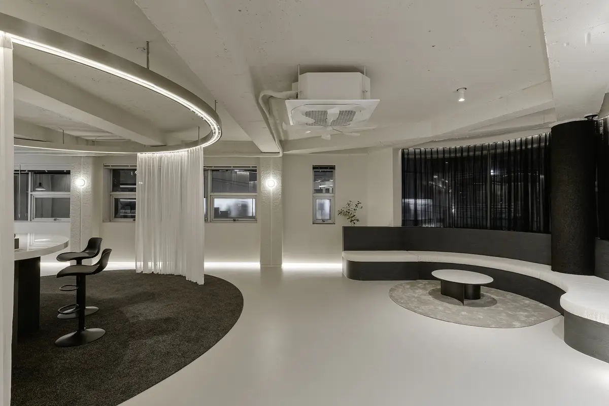
BLURKER Wraps a Seoul Curtain Showroom in Circles, Cushions, and Glass Block
In Sinsa-dong's Gangnam district, three overlapping circular zones turn fabric shopping into a tactile architectural event.


Selling curtains is not inherently glamorous. The product is soft, foldable, and usually displayed on racks in big-box stores where the lighting does no one any favors. BLURKER clearly started from the opposite assumption when they designed the Self Maker Showroom in Sinsa-dong, Gangnam-gu, Seoul. Designed by Junho Kim with construction supervision by Daesung Kim, the project treats the showroom floor not as a warehouse but as a sequence of spatial moods, each calibrated to a different stage of the customer's decision-making process.
What makes this project worth studying is its discipline. Three circular zones, each with a different diameter and purpose, overlap on a compact plan. Office, lounge, and curtain display share a single volume under an exposed concrete ceiling, yet the architecture manages to give each zone its own atmosphere through just three material moves: glass block, cushion wall, and curtain. No drywall mazes, no gimmicky signage. The space is organized by the same fabric it sells.
Circulation as Curation
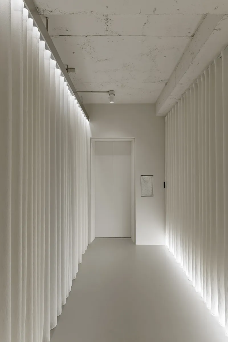
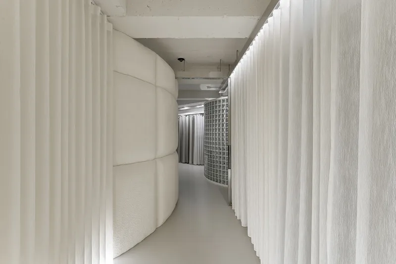
The entrance corridor is the showroom's thesis statement. Thin silk curtains hang on both sides of a narrow passage, functioning simultaneously as walls, doors to the offices and storage beyond, and a first sensory encounter with the product. You walk through the merchandise before you even reach a display. The backlit pleated panels glow against the raw concrete ceiling beams overhead, setting up an immediate tension between industrial structure and domestic softness.
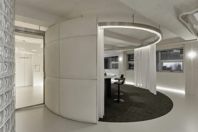
A curved cushion wall appears partway through the sequence, positioned with a deliberate gap that nudges visitors toward the curtain display zone. It is a subtle piece of crowd choreography. Rather than posting directional arrows, BLURKER lets geometry do the wayfinding, curving the padded surface so that your body follows the radius naturally. The corridor never feels like a hallway; it feels like an unfolding.
Glass Block as Soft Divider
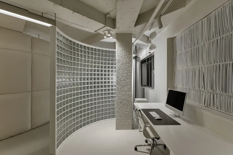
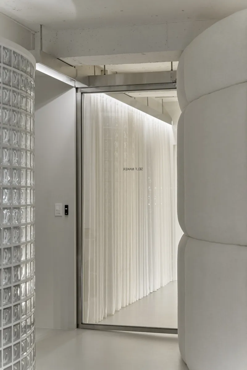
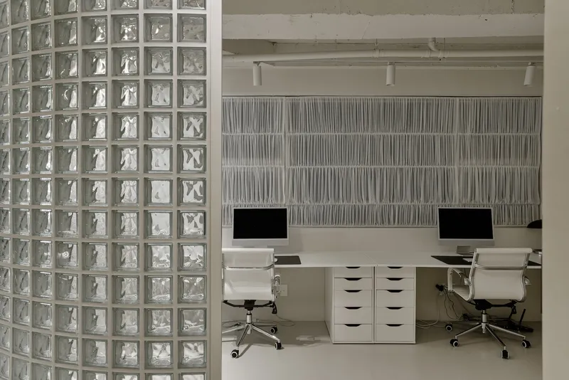
Glass block walls mark the entry and exit points of the office zone, and they earn their place. In a space already saturated with fabric, the translucency of glass block introduces a harder, cooler register without killing the intimacy. Light passes through but detail does not, which means the back-of-house functions remain visually present without being visually distracting. The curved geometry of these walls echoes the circular floor plan, keeping the material language consistent even when the material itself changes.
Behind the glass block partition, workstations sit against textured wall panels, borrowing daylight from the corridor side. It is a pragmatic choice. Staff can monitor foot traffic through the diffused glow of the blocks while remaining in a quieter zone. The framed doorways that punctuate these walls are kept simple, almost industrial, reinforcing the contrast with the soft curtain screens on the opposite side.
The Lounge as Product Theater


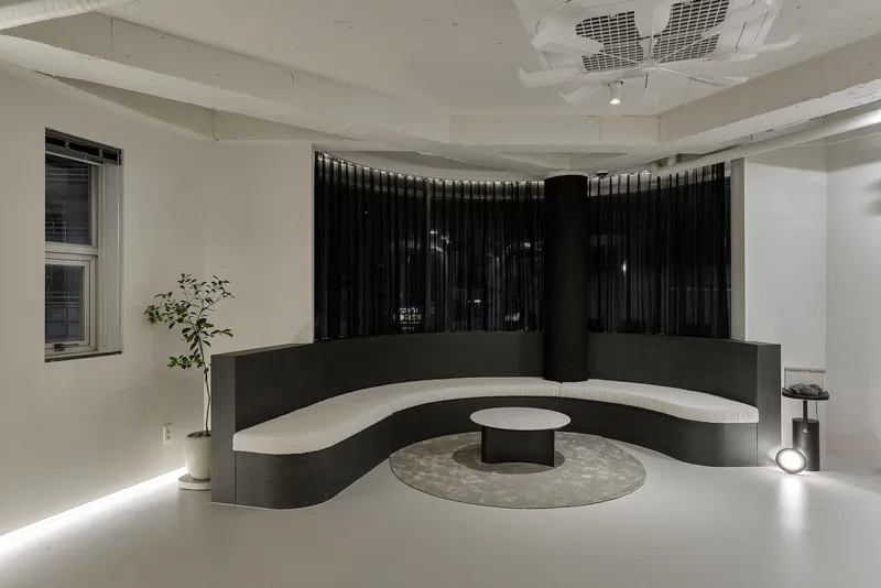
Positioned at the end of the entrance circulation line, the lounge is where the showroom slows down. A white elliptical table sits on dark carpet, surrounded by flowing curtain partitions and a continuous illuminated perimeter band that traces the ceiling edge. The geometry pushes attention inward, toward the table and toward conversation. It reads less like a retail break room and more like a stage set where product consultation becomes a proper event.
The curving service counter reinforces this reading. Potted greenery and black chairs ground the space in something almost domestic, while the circular white curtain backdrop behind the counter keeps the brand's core material perpetually in view. Customers sit within the product rather than looking at it from a distance. That collapse of display and inhabitation is the smartest decision in the project.
Curtain Rails as Architecture
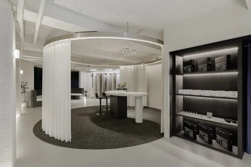
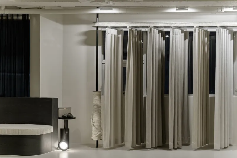

Two circular ceiling structures of different diameters serve double duty as both lighting rings and curtain rails. They are the structural conceit that holds the entire plan together. Curtains slide along these tracks to form fitting enclosures, display vignettes, or open gathering areas depending on the moment. Black frames anchor floor-to-ceiling curtain panels in neutral tones, giving the fabric enough rigidity to read as architecture rather than decoration.
The reception area shows this system at its most theatrical: a curved white curtain screen wraps behind a circular table with columns, while dark product shelving lines the opposite wall. Products overlap intentionally, encouraging customers to pull, drape, and compare fabrics side by side. The illuminated display alcoves with their purple accents add color strategically, breaking the prevailing white and black palette just enough to signal where the premium offerings live.
The Cushion Wall as Brand Identity


BLURKER positions the cushion wall as more than a spatial divider. It is an "iconic art wall" that represents the brand's relationship with fabric, translating textile texture and volume into an architectural surface. The padded panels bulge gently outward, creating a topography that catches raking light and invites touch. In a showroom where the entire point is to make customers comfortable handling soft goods, a wall that rewards physical contact is a sharp piece of branding.
Paired with the glass table and purple stools in the adjacent display area, the cushion wall reads as a gradient from hard to soft. Glass block, glass furniture, and then padded wall: the sequence mirrors the customer journey from street to consultation, each step introducing more tactility. The illuminated black shelving behind this zone provides the contrast needed to make fabric samples pop.
Plans and Drawings
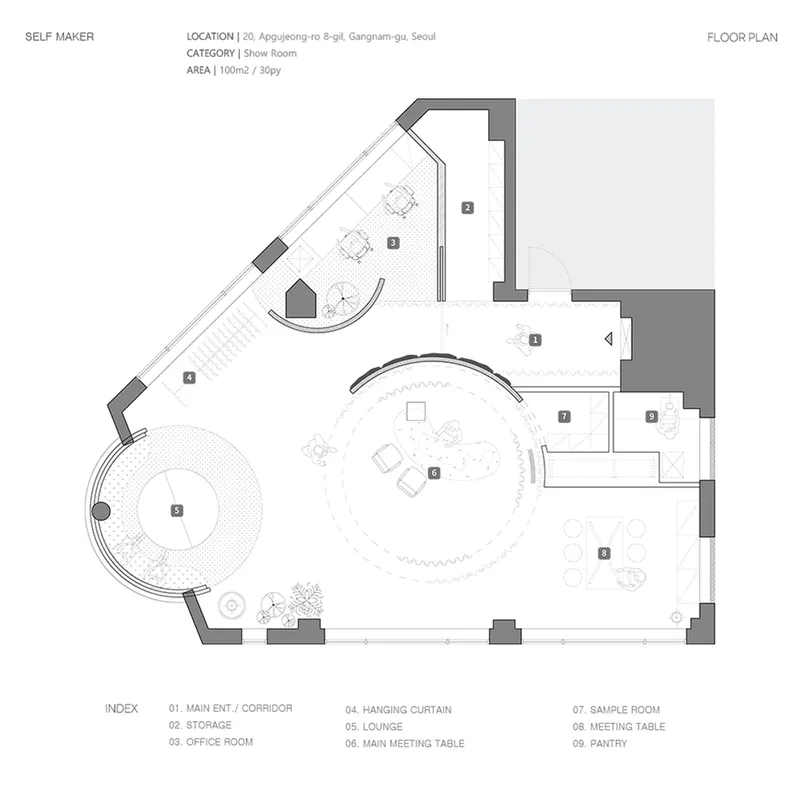
The floor plan reveals the organizational logic that the photographs only hint at. Three overlapping circles define the primary zones, with the lounge occupying the largest arc at the plan's far end. Curved walls never run parallel to one another, which means the residual spaces between them become corridors of varying width. The result is a plan that reads as organic but is actually highly controlled, with every gap calibrated to guide movement toward a specific program area.
Why This Project Matters
Retail design too often defaults to one of two modes: the stark white gallery box or the overproduced lifestyle set. The Self Maker Showroom avoids both by using the product itself as a primary building material. Curtains are not just displayed; they form walls, doors, and spatial enclosures. That decision collapses the boundary between merchandise and architecture and, in doing so, gives the customer a reason to care about the space rather than simply tolerate it.
BLURKER's design also demonstrates that material restraint does not mean spatial monotony. With only three materials doing the heavy lifting, the showroom achieves variety through geometry alone. The overlapping circles, the shifting corridor widths, and the alternation between translucent and opaque surfaces create a sequence of distinct moments within a very small footprint. For any designer working on a brand experience where the product is tactile and the budget is finite, this is a project worth pulling apart.
Self Maker Showroom, designed by BLURKER (Design: Junho Kim; Construction Supervision: Daesung Kim). Sinsa-dong, Gangnam-gu, Seoul, South Korea. Photography by rayliter.
About the Studio
Share Your Own Work on uni.xyz
If projects like this are the kind of work you want to make, uni.xyz is a place to publish your own, find collaborators, and enter design competitions.


Popular Articles
Popular articles from the community


David Ortega Stacks a Two-Story Mexico City Penthouse Around a Steel Stair and a Pergola-Shaded Roof Terrace
In Colonia Roma, a 300 m² penthouse uses oak joinery, a planted steel stair and a slatted roof pergola to make a new-build apartment feel like a house.


Opera on the Sea: Driftwood Logic Shapes a Timber Opera House on Estonia's Coast
Trevor Orgill's opera house translates the entangled drift of floating timber into a civic building where wood, water, and music converge.

graciastudio Turns a Viewless Tijuana Lot Inward Around a Courtyard of Concrete, Timber and Trees
In Tijuana, Jorge Gracia's GA2 House stacks a timber-clad private floor over exposed concrete and replaces a missing view with a planted interior patio.

Cube Design Draws an Ecological Corridor Between Two Shenzhen Hills with the Nankai Building
Beside Shenzhen's container docks, the Nankai Building pairs stacked balconies with a climbing green screen to connect two hillsides across its height.

Similar Reads
You might also enjoy these articles


Bamboo Housing Challenge 2026: Design Affordable, Sustainable Homes Using Bamboo
An international design competition by Bamboo U and IBUKU inviting architects and designers to reimagine affordable housing using bamboo — with the winning design built full-scale in Bali.
Computational Design & Education: Beegraphy Design Awards Introduces 7th Category (Featuring Jiyun's Innovative Approach)
Dive into Beegraphy’s 7th Design Awards category, where computational design meets education to create immersive, interactive learning tools, inspired by Jiyun’s work.

From Parametric Lighting to Urban Furniture: Join the 2nd Workshop in Beegraphy’s Computational Design Series
Dive into Cutting-Edge Design Techniques and Practical Applications with Industry Experts

Last Call: Unleash Your Architectural Genius in SHAK's Kindergarten Design Competition
Urgent call for architects to join SHAK's kindergarten design competition before the looming deadline

Explore Showrooms Competitions
Discover active competitions in this discipline

Challenge to reimagine the Iron Throne

Photograph architecture without architects

Illustrate the lost glory of Angkor Wat - Render Challenge

Design challenge to reuse E-waste
Comments (0)
Please login or sign up to add comments
No comments yet. Be the first to comment!