

FCC Arquitectura Carves an Office and Showroom into a Working Shoe Factory in Felgueiras
In Felgueiras, Portugal, a 427 m² remodel pairs raw concrete and steel with timber slats and linear light to give a footwear brand its public face.

Felgueiras is shoe country. The town in northern Portugal runs on footwear production, and most of its factories are built for output, not for being looked at. Nobrand, a 427 m² remodel by FCC Arquitectura, sits inside one of these working buildings and turns the brand's office and showroom area into the part of the factory that faces clients, buyers and visitors. Construction ran from September 2012 to July 2013, with João Pinto Construções as builder, and the studio is based in the same town.
What makes the project worth your attention is how little it pretends. FCC does not disguise the industrial shell; it keeps the sawtooth roof, the steel trusses and the concrete character, then uses timber and light only where comfort or display requires them. The result is a calibrated split between cool and warm surfaces. The brand's name, printed literally into the plaster, shows that the architects understood the job was as much about identity as about square metres.
Working Inside a Working Factory


This is a renovation in the strictest sense: the factory kept operating around the brief. That condition shapes everything. The new rooms read as an insertion into an existing volume, a set of partitions and finishes threaded beneath a roof that was already there, rather than a building that claims the site as its own.
We think this restraint is the right call. Shoe production is the reason this building exists, and a showroom that erased that fact would feel dishonest to the buyers walking through it. Keeping the factory legible lets the product carry the weight of its origin.
Concrete and Steel Set a Cool Baseline


Exposed concrete and iron form the default palette. FCC treats them as the neutral ground of the project: grey, rough and deliberately unsoftened. Walls carry a plastered, concrete-like texture, and steel shows up in structure, rails and frames without much ornament.
The temperature of this baseline matters. Because most surfaces stay cool, any moment of warmth reads as an intentional event. The material strategy works like a lighting cue, telling you where to slow down and where to simply pass through.
Stair, Glass and a Suspended Duct


The vertical connection is where the palette meets most directly. A steel and glass balustrade sits above wood-tread stairs, and the upper level looks down across glass guarding toward shelving and a dark duct hung through the space. Timber slat walls appear in the distance, hinting at the showroom before you reach it.
Leaving the ductwork exposed is a small but telling decision. Rather than burying services in a dropped ceiling, the designers let them hang as a graphic element, consistent with the post-industrial language and cheaper to maintain in a building that will keep changing.
Lettering Pressed into the Walls


The project's best idea is also its simplest. The words NO BRAND are embossed into textured plaster, running vertically beside a dark door and then climbing from the wall onto the dark ceiling. A strip of light at floor level grazes the relief, so the letters appear through shadow rather than through paint or signage.
This is branding done with architecture instead of graphics applied after the fact. The lettering costs almost nothing in material and is impossible to remove without rebuilding the wall, which gives the identity a permanence that a vinyl logo never could. It also has a dry wit: a brand called Nobrand announcing itself in raised capitals.
A Showroom Built from Timber and Daylight


The showroom is where FCC spends its warmth. Striped timber walls hold recessed shoe shelves, round pendant lamps hang overhead, and a tall glazed wall brings daylight deep into the room. After the grey of the circulation spaces, the shift in tone is immediate.
The detail drawings show that the display walls are more engineered than they look: slatted panels with integrated LED lines, acrylic faces and steel T-profiles. Light is built into the joinery itself, so each shoe sits in its own lit niche. For a product that sells on craft and finish, that level of precision in the display is the correct place to invest.
Kitchen and Washroom as Quiet Service Rooms


The service spaces stay within the same material discipline. A compact kitchenette pairs a steel sink with grey cabinets and an under-cabinet light strip against plaster walls. The washroom uses dark plaster, a glass-topped vanity with a steel basin, and pendant lights doubled in a full-height mirror.
These rooms could easily have been an afterthought. Instead they carry the same logic as the showroom at a smaller scale: cool surfaces, a single warm or reflective gesture, and light used to define the surface rather than flood it. Even the pink soap dispensers feel like a deliberate flick of colour.
Corridors Lit Along the Trusses


The circulation spine is a narrow corridor with rough plastered walls and grey doors, lit by a long linear strip running along the exposed steel roof trusses. The light line follows the direction of travel and makes the old structure readable at the same time.
This is light treated as a material, as the brief puts it, and the corridor is the clearest proof. Without the strip, the space would be a dim factory passage. With it, the corridor becomes a measured, almost graphic route between rooms.
Plans and Drawings


The floor plan organises offices, meeting rooms and a long table terrace around a central core, with one timber-edged room highlighted as the warm centre of the layout. Sections A and B make the factory's sawtooth roofs explicit, showing how the new partitions and long shelving wall slip beneath the existing profile. A kitchen section reveals a long inclined black stair rising above the cabinet run, and the display details document the slat, LED and acrylic assembly that gives the showroom its glow.
Why This Project Matters
Countless factories across northern Portugal and beyond need a public face without the budget or the appetite for a new building. Nobrand offers a workable model: keep the shell, expose what is already good about it, and focus investment on the few surfaces a visitor actually touches and remembers. The concrete and steel do the background work; timber, light and relief lettering do the selling.
It is also a reminder that identity can be built rather than applied. The embossed lettering, the lit display joinery and the light lines along the trusses are architectural moves that double as brand communication. For a small studio working in its home town, that integration of interior architecture and brand is the lasting lesson, and one more design-led manufacturers should take seriously.
Nobrand by FCC Arquitectura, Felgueiras, Portugal. Area: 427 m². Completed: 2013. Photography: José Campos.
About the Studio
Share Your Own Work on uni.xyz
If projects like this are the kind of work you want to make, uni.xyz is a place to publish your own, find collaborators, and enter design competitions.


Popular Articles
Popular articles from the community


GROUP A Strips a 1969 Rotterdam Harbor Headquarters to Its Frame and Wraps It in Timber Louvers
In Rotterdam's M4H harbor district, Ferro Offices reuses a 1969 frame, adds one timber storey and reaches BREEAM-NL Outstanding.

longwave studio Reorganizes a 112 m² Tainan Apartment Around the Daily Routines of a Family and Two Cats
In Tainan, Taiwan, birch plywood, rust-red furniture and a freestanding plaster wall link arrival, storage, work and family life in one apartment.

David Macias Steps a Doorless Stone and Plaster House Down a Tropical Colombian Hillside
In the humid hills of Colombia, Threshold House replaces the front door with an open void and terraces its 850 m² down the slope instead of fighting it.

Cube Design Draws an Ecological Corridor Between Two Shenzhen Hills with the Nankai Building
Beside Shenzhen's container docks, the Nankai Building pairs stacked balconies with a climbing green screen to connect two hillsides across its height.

Similar Reads
You might also enjoy these articles


LAVA Architecten Gives Vocational Education a Sawtooth-Roofed Face on a Mechelen School Campus
In Mechelen, Belgium, a 2,053 m² STEM school on a 6×6 m grid turns workshops and classrooms into rooms that can be rearranged as teaching changes.

KEMA Studio Turns a Derelict Marvila Attic into a 60 m² Lighthouse Apartment Above Lisbon
In Lisbon's Marvila district, a rebuilt roof, four skylights and two plywood volumes turn an unlivable attic into a bright home facing the Tagus.

Pixel Gardens: One Repeated Module Stacked Into a Terraced Social Housing Tower for Famagusta
Salem Bader's shortlisted housing tower builds a vertical neighbourhood from one repeated module, offsetting units to carve terraces, light and air.
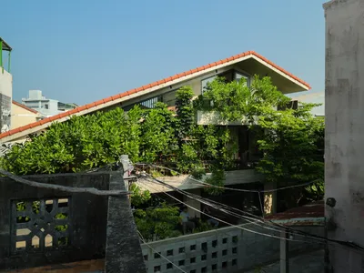
Bao Huynh Watercolor Atelier: A Serene Art Retreat in Hội An
Bao Huynh Watercolor Atelier in Hội An blends multifunctional art spaces, sustainable design, local materials, and family-friendly living in a serene environment.

Explore Architecture Competitions
Discover active competitions in this discipline


Challenge to reimagine the Iron Throne

Photograph architecture without architects

Illustrate the lost glory of Angkor Wat - Render Challenge

Design challenge to reuse E-waste
Comments (0)
Please login or sign up to add comments
No comments yet. Be the first to comment!