

Gurgel D’Alfonso Turns the Awkward Angles of a 1990s Moema Apartment into Its Best Features
A 360 m² renovation in Moema, São Paulo, keeps the sharp corners and level changes of a 1990s flat and fills them with timber, travertine and plants.

Most renovations of 1990s São Paulo apartments follow the same script: demolish the partitions, flatten the floor, square the corners, and hope the result reads as contemporary. Gurgel D’Alfonso Arquitetura took the harder route with Apartment Matisse, a 360 m² flat in the leafy Moema neighborhood. The original unit had sharp angles, level differences and heavy compartmentalization. The architects kept much of that geometry and reworked it, treating the quirks as raw material rather than problems to erase.
That is the interesting part. The project, which covers both architecture and interiors, is less a reinvention than a negotiation with an existing plan. A sunken seating area survives with a softened curved edge. Angled walls stay angled. Window bays become planted rooms. The palette of walnut, oak, travertine and pink stone does a lot of work, but the real argument is spatial: a home can feel open and connected without pretending its awkward bones never existed.
Keeping the Level Change


The sunken living area is the clearest sign of the approach. Instead of filling in the drop, the architects gave it a curved floor edge that sweeps from the planted window bay down into the seating zone. A step that once read as an obstacle now reads as a threshold, marking the shift from circulation to rest without a single wall.
A round white column stands at the edge of the drop and works as a pivot. Paired with the cylindrical travertine plinth beside the curved mustard sofa, it shows a consistent instinct: answer hard angles with soft, round objects so you never feel boxed in by the plan's geometry.
Gardens Inside the Plan


The planted bays are what most people will remember. Broad banana and taro leaves fill the deep window recesses and a small atrium with a log bench, and travertine-framed openings turn them into framed views from the living spaces. Light reaches the room through foliage first, which tempers the São Paulo sun and gives the interior a green, shifting glow over the day.
Out on the covered terrace, landscaping by Estúdio Musgo continues the idea: a frangipani tree beneath a slatted timber ceiling, a terrazzo-topped table and green chairs. The stated goal is to bring nature into daily life. Here that means the planting is built into the plan, not added afterwards as decoration.
A Living Room Built from Timber and Stone


The main living room relies on a small set of materials used with discipline. A timber-clad media wall anchors one side, slatted blinds filter the windows, and a round stone coffee table sits at the center of grey armchairs. Flooring comes from Monofloor, and its seamless surface lets the timber and stone carry the visual weight.
What stands out is how the rooms flow into each other. From the living area you see through to the dining table and its black conical pendants, with plants framing the background. The partitions that once chopped this floor into cells are gone, but the level changes and angled walls still give each zone its own character.
Dining Around a Column


The dining area sits beside another round plaster column, with a stone bench tucked into the planted window bay behind. A long table with ochre leather chairs runs under a black conical pendant, and taro leaves press against the glass. It reads as a room in its own right, even though nothing encloses it.
The ochre upholstery is one of several warm accents, along with mustard, orange and pink, scattered through the apartment. You can see where the Matisse name comes from: saturated color set against neutral timber and stone, used sparingly enough that it never turns into a theme.
A Walnut Galley with a Pink Stone Anchor


The kitchen keeps the galley format, which is honest about the constraints of the original plan. Walnut cabinetry lines both sides, steel fridges sit flush, and a pink marble island ends the run with leather stools and smoked glass pendants. A round backlit mirror on the back wall echoes the circular columns elsewhere.
At the sink, a coiled steel faucet sits beneath a window, and a round mirror is set into a glass partition. These are small details, but they show the same attention found across the apartment: functional rooms get the same material care as the spaces you show to guests.
Rooms for Retreat


Not everything is opened up. A small sitting room with an orange daybed, a mustard pouf and oak shelving sits behind a glazed folding door, so it can join the main space or close off as needed. A media room wrapped in oak panelling, anchored by a large yellow abstract painting, offers a quieter, more enclosed alternative to the living room.
This is where keeping some of the original compartmentalization pays off. A fully open plan would have lost these pockets. Instead the family gets a range of rooms, from shared and bright to private and enclosed, which suits a household that does not always want to be in the same space.
Ledges, Objects and Everyday Rituals


Travertine ledges run along walls and windows and hold art books, clay vessels, a lantern lamp and a brass bowl. A cube paper lamp sits on a steel plinth, and slatted blinds cast stripes across the ceramics. The furniture comes from Dpot, Aalvo Gallery, Jader Almeida and +55 Design, with lighting by Lumini. The architects also co-designed the Vela wall sconce in steel and resin with Pedro Ávila.
A whippet curled up on an orange bench is the best evidence that these surfaces are meant to be used. The ledges are deep enough to sit on and robust enough to collect a life's worth of objects, which fits the project's stated interest in living that responds to the passage of time.
Private Quarters


The bedrooms shift to walnut. A low upholstered bed sits under a walnut canopy, with sheer curtains softening daylight from the balcony. Walnut lines the window recess and nightstand, and bouclé armchairs and charcoal artwork keep the mood calm. The canopy is a clever move, creating a room within a room and giving the bed its own sense of enclosure.
The bathroom brings stone and steel together in a floating sink shelf with bronze fixtures, and tube lights double in a full-height mirror. It is more industrial than the rest of the apartment, yet it still uses the same restrained set of materials.
Plans and Drawings

The plan explains everything the photographs hint at. Bedrooms cluster on the left, living and dining spread across the right, and angled walls cut through the layout instead of being squared off. Set next to the curved floor edge of the sunken lounge, the drawing shows how deliberately the architects worked with the existing geometry rather than against it.
Why This Project Matters
São Paulo has a huge stock of 1990s apartments with plans that feel dated: odd angles, steps in the floor and too many rooms. The usual answer is total demolition, which is wasteful and often produces anonymous results. Apartment Matisse offers another model. By keeping the level changes and angles and redesigning around them, Gurgel D’Alfonso Arquitetura creates a home with a character no blank-slate renovation could match.
The lesson for designers is that constraints can carry identity. Planted bays, a curved step and walnut-lined retreats only exist because the architects took the original plan seriously. We would like to see more renovations begin with the question of what is worth keeping, not only what can be removed.
Apartment Matisse by Gurgel D’Alfonso Arquitetura. Location: Moema, São Paulo, Brazil. Area: 360 m². Year: 2024. Photography: Arthur Duarte.
About the Studio
Share Your Own Work on uni.xyz
If projects like this are the kind of work you want to make, uni.xyz is a place to publish your own, find collaborators, and enter design competitions.


Popular Articles
Popular articles from the community


U.GA Architects Wraps an Oval Rooftop Pool in Curved Board-Formed Concrete on Busan's Jeollidan-gil
In Busan's Jeonpo-dong, a 454 m² mixed-use block stacks a neighborhood facility, guest rooms and an oval rooftop pool inside spiraling concrete walls.

longwave studio Reorganizes a 112 m² Tainan Apartment Around the Daily Routines of a Family and Two Cats
In Tainan, Taiwan, birch plywood, rust-red furniture and a freestanding plaster wall link arrival, storage, work and family life in one apartment.

GROUP A Strips a 1969 Rotterdam Harbor Headquarters to Its Frame and Wraps It in Timber Louvers
In Rotterdam's M4H harbor district, Ferro Offices reuses a 1969 frame, adds one timber storey and reaches BREEAM-NL Outstanding.

andblack design studio Wraps a Three-Generation Ahmedabad Home Around a Planted, Skylit Central Courtyard
In Ahmedabad, a 9,910 sq ft house uses exposed concrete, brick jali and a skylit green court to give three generations both distance and closeness.

Similar Reads
You might also enjoy these articles


LAVA Architecten Gives Vocational Education a Sawtooth-Roofed Face on a Mechelen School Campus
In Mechelen, Belgium, a 2,053 m² STEM school on a 6×6 m grid turns workshops and classrooms into rooms that can be rearranged as teaching changes.

KEMA Studio Turns a Derelict Marvila Attic into a 60 m² Lighthouse Apartment Above Lisbon
In Lisbon's Marvila district, a rebuilt roof, four skylights and two plywood volumes turn an unlivable attic into a bright home facing the Tagus.

Pixel Gardens: One Repeated Module Stacked Into a Terraced Social Housing Tower for Famagusta
Salem Bader's shortlisted housing tower builds a vertical neighbourhood from one repeated module, offsetting units to carve terraces, light and air.
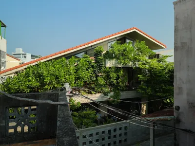
Bao Huynh Watercolor Atelier: A Serene Art Retreat in Hội An
Bao Huynh Watercolor Atelier in Hội An blends multifunctional art spaces, sustainable design, local materials, and family-friendly living in a serene environment.

Explore Architecture Competitions
Discover active competitions in this discipline


Challenge to reimagine the Iron Throne

Photograph architecture without architects

Illustrate the lost glory of Angkor Wat - Render Challenge
Comments (0)
Please login or sign up to add comments
No comments yet. Be the first to comment!