

IN arq+design Fits a 100 m² Pizza Bar into a Neglected Historic Building in Downtown Curitiba
In downtown Curitiba, red corrugated panels, plywood counters and whitewashed brick turn a narrow historic shell into a pizza bar built for lingering.

Downtown Curitiba has plenty of older buildings that sit half-used, too awkward for big retail and too small for anything ambitious. With Cença Pizza Bar, IN arq+design, led by Izadora Czerpicki and Noelle Piasetzki, takes one of these underused historic structures and fits a full restaurant and bar into roughly 100 m². The brief was simple: make a place where people stay, wander around and talk, rather than eat and leave.
The project interests us because of its restraint. The studio does not hide the old building behind a themed interior. It works with a small set of materials: painted brick, corrugated metal in a deep red, raw plywood and rough concrete. Each one has a specific job. This is a budget-conscious, high-clarity interior, and it shows how much atmosphere a small team can get from a few honest moves inside a narrow plan.
Entering by the Stair


The way in sets the tone. Rough concrete steps run alongside a wavy maroon corrugated wall, and the whitewashed brick above catches diagonal bands of sunlight. Nothing here is polished. The entry treats the change in level as a moment worth slowing down for, and it introduces the material palette before you reach a table.
Corrugated metal is usually a cladding of last resort. Here it is chosen on purpose, and its ribs pick up light in a way flat paint cannot. On a short stair, that texture works almost like a handrail for the eye.
One Long Room, Read End to End


The plan is a single long, narrow hall. Daylight comes in at the far entrance and an orange wall closes the other end. Instead of breaking the room into booths, the designers keep it open. Loose folding tables fill the middle, and a continuous timber ledge with tall stools runs along the wall. You can see the whole space from almost any seat, which suits a bar that wants its guests to watch one another and mix.
The folding furniture is a smart and slightly cheeky choice. It costs little, it can be rearranged for events, and its white frames read as lightweight against the heavy brick. The orange end wall gives the eye somewhere to land, so the narrow room feels like it is heading somewhere rather than simply getting squeezed.
Red Corrugation as a Wayfinding Device


The red corrugated service counter sits between two painted brick pillars. These pillars appear to be part of the original structure, and the counter becomes the room's anchor. When you look between them, the composition stacks up neatly: brick frame, red counter, plywood bar beyond. The colour tells you where to order before any sign does.
Up close, the junctions are worth a look. Painted brick with open hollow cores meets the maroon ribbing, with no trim or reveal to tidy the joint. We read this as a deliberate refusal to over-detail. The old masonry keeps its scars, and the new insertions sit against it as clearly separate additions.
Plywood for the Working Surfaces


Plywood does the practical work: the bar counter, the wall shelves and the ledges. Its warm grain balances the cool white brick and the saturated red. Where the counter is lit from below, under orange wall lettering and next to stacked pizza boxes, the material turns warm and close. That small move is enough to make the bar end feel like the social core.
The perforated brick wall next to the plywood shelf is a nice found condition. It filters side light and adds depth that new construction would struggle to fake. The studio simply leaves it alone and lets the light do the work.
Plans and Drawings


The floor plan confirms how much is packed into the footprint. It holds a dining hall, a pizza kitchen, a bar, a cashier, two restrooms and the entrance stair, all in a tight rectangle. The isometric shows the strategy clearly: freestanding columns stay exposed in the open room, and service functions go into a compact enclosed volume. Keeping the back-of-house contained is what lets the dining space stay open.
Why This Project Matters
Small hospitality interiors are often where historic city centres either come back to life or get emptied out by generic fit-outs. Cença Pizza Bar shows a third way. Keep the existing masonry visible, add a few strongly coloured and inexpensive elements, and let a clear plan carry the experience. The result feels specific to its building without being precious about it.
For designers working on tight budgets and narrow footprints, the takeaway is to edit hard. Give each material one role, put service into a single volume, and spend your boldness on one gesture, here the red corrugated counter. Underused buildings in downtown districts across Brazil and beyond could take a lot from this approach.
Cença Pizza Bar by IN arq+design (lead architects Izadora Czerpicki and Noelle Piasetzki), Curitiba, Brazil. Area: 100 m². Completed: 2024. Photography by Guilherme Rocha.
About the Studio
design
Share Your Own Work on uni.xyz
If projects like this are the kind of work you want to make, uni.xyz is a place to publish your own, find collaborators, and enter design competitions.


Popular Articles
Popular articles from the community


Manzana Morphosis: Stretching Barcelona's Grid into a Living Landscape for 2050
A radical reworking of the Eixample manzana turns density into a tool for generous public space, vertical ecology, and environmental performance.

Temporary Home for Dogs: A Reversed Zoo Rethinks Animal Shelter Architecture
In Bucharest, a sinuous corridor and freed landscape flip the logic of containment, designing a shelter that works to make itself unnecessary.

The Amber Palace Opera: A Geological Fiction Surfaces on Tallinn's Baltic Waterfront
Pierre Brillard reimagines a Baltic legend as a public landscape, opera house, and waterfront promenade rooted in Tallinn's coastal identity.
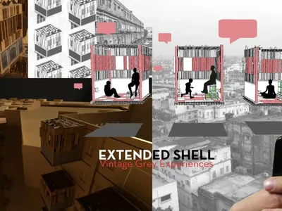
Extended Shell: Retrofitting Kolkata's Balconies as Living Urban Thresholds
A modular retrofit system recovers the social and environmental intelligence of Kolkata's historic verandas for contemporary Park Street residents.

Similar Reads
You might also enjoy these articles

Pixel Gardens: One Repeated Module Stacked Into a Terraced Social Housing Tower for Famagusta
Salem Bader's shortlisted housing tower builds a vertical neighbourhood from one repeated module, offsetting units to carve terraces, light and air.

Bao Huynh Watercolor Atelier: A Serene Art Retreat in Hội An
Bao Huynh Watercolor Atelier in Hội An blends multifunctional art spaces, sustainable design, local materials, and family-friendly living in a serene environment.

Atelier Macri Concept Store Interior Design by CASE-REAL
Atelier Macri store features a "ko" counter, walnut wood details, cork displays, blending retail, gallery, and seamless customer experiences.

Manuel Vargas Izquierdo Stadium and High-Performance Sports Center: Architectural Excellence in Jalpa de Méndez
The Manuel Vargas Izquierdo Stadium blends sustainable design, inclusive sports facilities, and cultural-inspired architecture, revitalizing Jalpa de Méndez’s public spaces.

Explore Interior Design Competitions
Discover active competitions in this discipline


Challenge to design luxury tourism on rails

VR headsets Storefront design competition

Designing a staircase for a client
Comments (0)
Please login or sign up to add comments
No comments yet. Be the first to comment!