
Álvaro Siza Vieira Gives Porto's Bus-Metro Stops the Dignity of Real Architecture
A family of white concrete shelters along Porto's transit corridors treats infrastructure as civic design, not afterthought.


Transit shelters rarely get the attention of a Pritzker laureate, and when they do, the results tend to be sculptural one-offs that photograph well but serve commuters poorly. Álvaro Siza Vieira's shelters for Porto's bus-metro line are the opposite: understated, systematic, and grounded in the specific grain of the neighborhoods they serve. They are not icons. They are civic furniture elevated to architecture.
What makes the project genuinely interesting is its refusal to repeat itself mechanically. Each shelter responds to its immediate context, the width of the street, the proximity of mature trees, the scale of the adjacent residential fabric, while maintaining a clear formal language of white concrete volumes, precise rectangular openings, and cantilevered canopies. The shelters are recognizable as a family without being identical. That is an extraordinarily difficult thing to pull off at infrastructure scale, and Siza does it with the economy of means that has defined his career.
White Volumes Against a Terracotta City


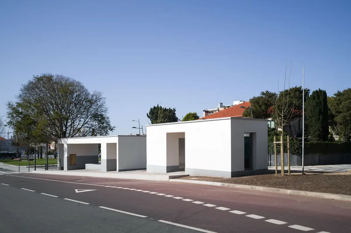
Porto's residential fabric is dominated by warm tones: orange-tiled roofs, stone and plaster walls in ochre and cream, the grey-blue of granite paving. Siza's shelters sit inside this palette as deliberate counterpoints. The white concrete reads as clean and institutional without being cold, partly because the material picks up the color of whatever light falls on it. On an overcast Porto morning, these volumes look almost silver. Under direct sun, they become warm enough to sit comfortably beside the surrounding buildings.
The large square openings in the street-facing facades are the key formal gesture. They frame views of the city behind the shelter, turning each structure into a kind of window. A commuter standing inside looks through these openings at the neighborhood; a passerby on the opposite sidewalk sees the shelter as a screen that crops and presents the streetscape. It is a simple move, but it keeps the shelters from becoming walls.
Reading the Street from Above
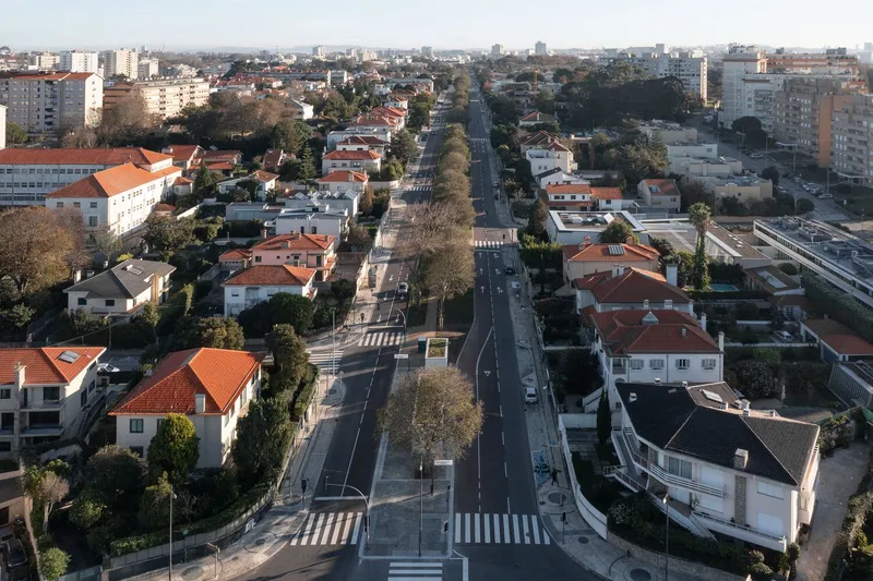


The aerial views reveal what ground-level photographs cannot: these shelters are scaled to the street, not to the building. They sit low, stretching linearly along the roadway in a way that mirrors the movement of the buses and trams they serve. From above, the flat roof canopies read as thin white bars laid between rows of tree canopy, a rhythm that reinforces the corridor rather than interrupting it.
The drone perspective also makes clear how tightly embedded these structures are in residential neighborhoods. There is no buffer zone, no transit plaza carved out of the urban fabric. The shelters slot into the existing sidewalk and road geometry, occupying gaps between trees and lot lines with surgical precision. Siza's long history of working in Porto pays dividends here: he knows exactly how much room these streets can spare.
Canopy, Bench, Wall: The Interior Kit
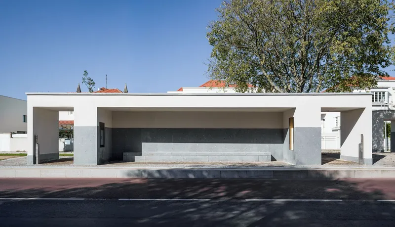


Inside, the shelters reduce transit waiting to its essentials. A concrete bench runs along a dark wall panel. The canopy overhead provides shade and rain cover. Columns are kept to the minimum needed for structural support, leaving the sides open for ventilation and sightlines. There is no signage clutter, no advertising panel jostling for space. The restraint is almost monastic, and it works because the proportions are right: ceiling height, bench depth, and column spacing all feel calibrated to the human body rather than to a transit agency's branding guidelines.
The play of tree shadows on the white surfaces is clearly not accidental. The shelters are sited to receive dappled light through existing canopy, which softens what could otherwise be a stark experience. Architecture that accounts for the trees already there, rather than clearing them or ignoring them, signals a maturity of design thinking that most infrastructure projects lack entirely.
Pavilion as Typology


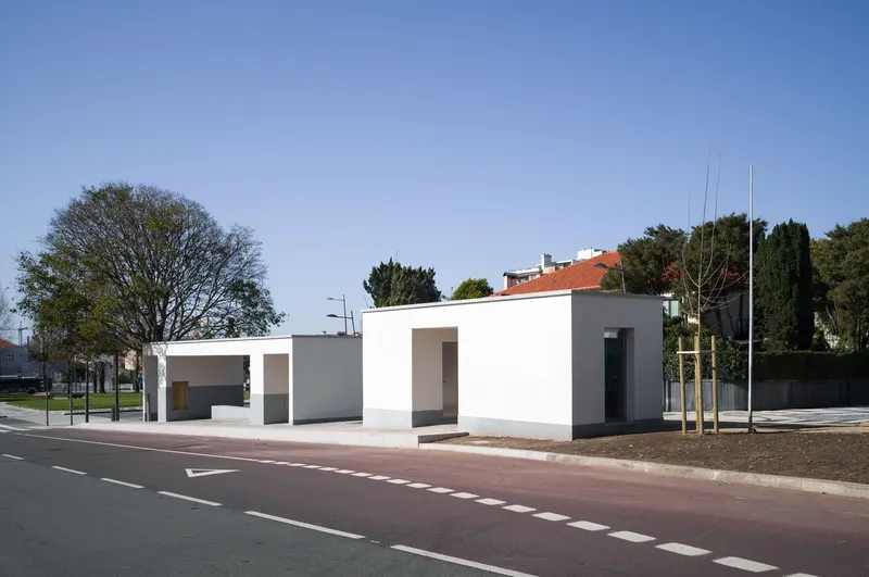
Siza treats each shelter as a small pavilion, an elevated volume that sits lightly on the ground rather than anchoring itself to it. Some units are raised on a plinth; others cantilever slightly over the paving. The effect is consistent: these are objects placed in the landscape, not excavated from it. The pavilion typology gives each shelter a sense of autonomy, as if it could exist on its own in a park or plaza and still make sense as a piece of architecture.
That autonomy is important for a transit system, where each stop has a different surrounding condition. The pavilion form absorbs variation without losing coherence. A shelter beside a park looks like a garden folly. A shelter on a commercial street looks like a kiosk. The bones are the same, but the reading shifts with context. It is the kind of flexibility that comes from getting the proportions right at the outset, then trusting them.
Infrastructure Meets Intersection

The aerial image of a dark linear structure spanning a street intersection is perhaps the most revealing photograph in the series. It shows the shelter not as an isolated object but as a piece of urban infrastructure, bridging the gap between sidewalk and roadway, marking the point where pedestrian and vehicular paths cross. The crosswalk markings, traffic islands, and paving patterns all read as part of the same design language. Whether Siza's office designed all of these elements or simply accounted for them, the result is a transit stop that feels integrated into the ground plane rather than dropped on top of it.
Plans and Drawings


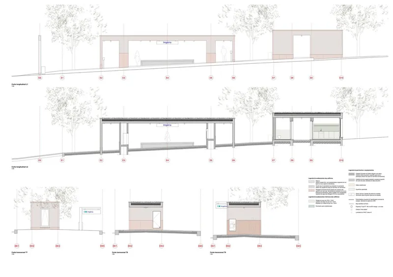
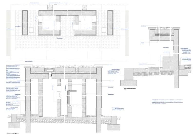
The drawing sets confirm what the photographs suggest: each shelter is a site-specific response. Elevations shift from stop to stop, adjusting overhang depths, opening sizes, and column positions to suit the local condition. The sections show how low the structures are kept, rarely exceeding the height of a single-story residential ground floor. Tree canopy is drawn with the same care as the building profile, indicating that landscape and architecture were designed as a single system.
Material notations on the plan drawings point to a deliberately limited palette: poured concrete, stone paving, dark cladding panels, and planting. There is no curtain wall, no composite cladding, no complicated waterproofing assembly. The details are simple enough to be maintained by municipal crews, which is a practical consideration that too many architects ignore when designing public infrastructure. These shelters are meant to last decades with minimal intervention, and the drawings suggest they will.
Why This Project Matters
Public transit infrastructure is the most democratic architecture a city builds. Everyone uses it, everyone sees it, and its quality signals how seriously a city takes its own public realm. Siza's Porto shelters argue, convincingly, that a bus stop deserves the same spatial intelligence as a museum or a house. They are not overdesigned, and they are certainly not expensive looking. They are simply precise, well-proportioned, and attentive to their surroundings in a way that most transit furniture is not.
The project also offers a quiet rebuke to the trend of parametric or branded transit design, where each new system gets a bespoke swooping canopy that becomes obsolete within a decade. Siza's approach is durational. These shelters will look as appropriate in thirty years as they do now, because their logic comes from the street, the trees, and the scale of the city rather than from a rendering style. That is not nostalgia. It is competence.
Bus-Metro Line Shelters in Porto, designed by Álvaro Siza Vieira. Located in Porto, Portugal. Photography by Pedro Cardigo.
About the Studio
Share Your Own Work on uni.xyz
If projects like this are the kind of work you want to make, uni.xyz is a place to publish your own, find collaborators, and enter design competitions.


Popular Articles
Popular articles from the community

Extended Shell: Retrofitting Kolkata's Balconies as Living Urban Thresholds
A modular retrofit system recovers the social and environmental intelligence of Kolkata's historic verandas for contemporary Park Street residents.
Faces of the Soviet Avant-Garde: Turning Moscow's Street Names into an Open-Air Museum
A network of sculptural installations across a Moscow residential district transforms forgotten architect names into spatial encounters with cultural memor

Singing Woman: An Opera House That Performs Before the Curtain Rises
Ovidiu Cristian Pavel's conceptual opera house translates Estonia's choral identity into a sculpted waterfront landmark facing the Baltic Sea.

Manzana Morphosis: Stretching Barcelona's Grid into a Living Landscape for 2050
A radical reworking of the Eixample manzana turns density into a tool for generous public space, vertical ecology, and environmental performance.

Similar Reads
You might also enjoy these articles


Hodi-Mandai Geram
Project Function: Preservation and revitalization of the Intangible heritage and socio-spatial identity of the Hodi by Housing, Cultural Memory Center, Sacred Grove, landscape, local tourism economy

Olio Towers: A Mid-Rise for Performers That Fuses Housing, Rehearsal, and Stage
Located blocks from Houston's Theater District, this modular tower stacks living units around a central performance atrium.
Oasis: Modular Green Housing Carved into Dhaka's Urban Fabric
A shortlisted Plugin Housing entry reclaims unauthorized settlements in Dhaka with stepped concrete volumes, green roofs, and ventilation-driven design.

Black Hole: A Floating Megastructure for the Post-Physical Era
Emiliano Mazzarotto envisions a spherical, self-scaling arena where e-sports, digital hotels, and holographic stadiums replace traditional public space.

Explore Porto Local Tiles Competitions
Discover active competitions in this discipline

Challenge to reimagine the Iron Throne

Photograph architecture without architects

Illustrate the lost glory of Angkor Wat - Render Challenge

Design challenge to reuse E-waste
Comments (0)
Please login or sign up to add comments
No comments yet. Be the first to comment!