

LoHA Transforms an Arata Isozaki House into a Café and Lifestyle Shop in Rural Japan
A 1985 concrete residence in Katsuyama, Fukui Prefecture becomes a scarf shop where products float like clouds between structure and ground.


Renovating the work of a Pritzker laureate is a loaded proposition. The building at the center of nimbus Café and Lifestyle Shop in Katsuyama, Japan, is a private house completed by Arata Isozaki in 1985, a compact concrete volume with vaulted ceilings, clerestory skylights, and the kind of sculptural rigor that tends to intimidate later interventions. LoHA, led by Hiroshi Yamada and Toshitaka Shimizu, along with Fukui University of Technology, took the commission not as an exercise in preservation but as an act of re-inhabitation: stripping the domestic program from the 155 square meter shell and inserting a scarf shop and café that treats Isozaki's monumental frame as a kind of permanent sky.
The conceptual logic is disarmingly poetic. The existing concrete frame is cast as "heaven," immovable and formal. The daily life of shoppers and café visitors below is "earth." Products, scarves, and miscellaneous goods are meant to occupy the middle register, suspended on wires and wall rings like clouds drifting between the two. It sounds like a metaphor that could collapse under its own weight, but the execution is restrained enough to carry it: the interventions are limited to new finishes, reconfigurable furniture on a 1050mm grid, and a careful repainting of the original counter. Isozaki's architecture stays intact. What changes is how you move through it and what you encounter.
Isozaki's Concrete Shell, Still Commanding
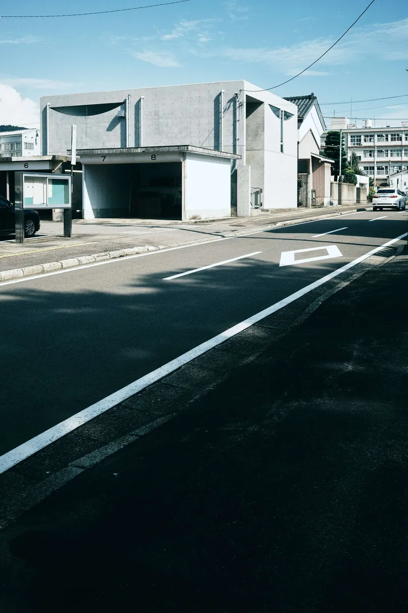


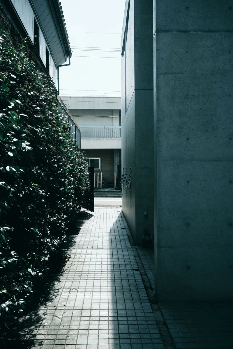
From the street, the building reads as unmistakably Isozaki: sculpted concrete panels with curved openings, a volumetric presence that sits slightly apart from its residential neighbors in Katsuyama. The corner facade, with its punched curves and monolithic finish, is the work of an architect operating in a postmodern register that prized geometry and mass. At night, the upper volume glows through its curved skylights, a lantern effect that signals the building's new public life without altering its silhouette.
LoHA's decision to leave the exterior essentially untouched is the smartest move in the project. The numbered garage doors and the raw concrete street face remain, grounding the conversion in the reality of the existing neighborhood rather than advertising its new retail function. The architecture announces itself through form, not signage.
Light From Above

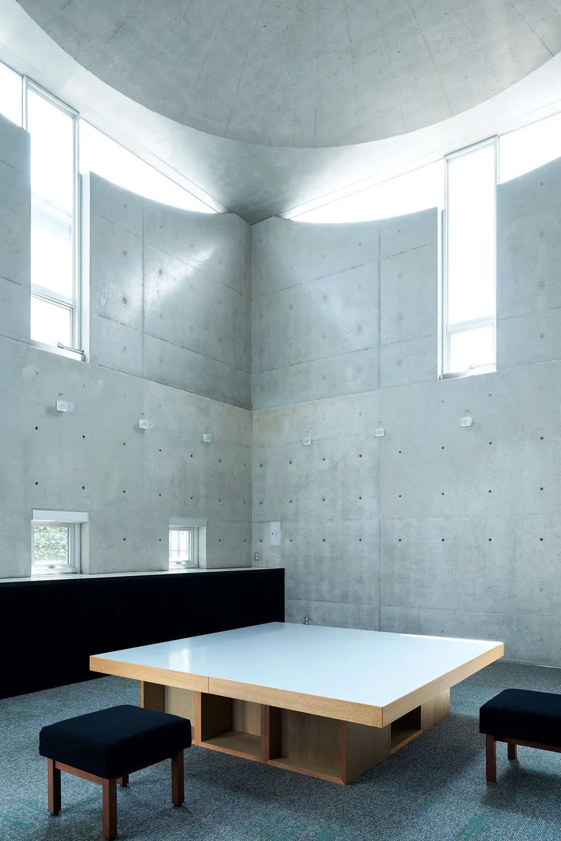
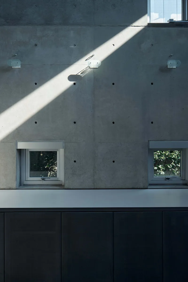
The interior experience is defined almost entirely by the quality of light. Isozaki's original design channels daylight through clerestory windows and vertical skylights, creating a double-height space that feels far larger than 155 square meters. Board-formed concrete walls catch diagonal shafts of afternoon sun, turning the structure into a sundial. The vaulted ceiling over the main hall pushes light down and across surfaces in a way that makes the space feel ecclesiastical without being heavy.
LoHA's contribution here is one of subtraction: by removing domestic partitions and opening the floor, they allow the original light strategy to perform at full capacity. The white platform flooring amplifies reflected light, bouncing it upward against the rough concrete and softening what could otherwise be a punishingly austere interior.
Between Heaven and Earth: The Display Strategy
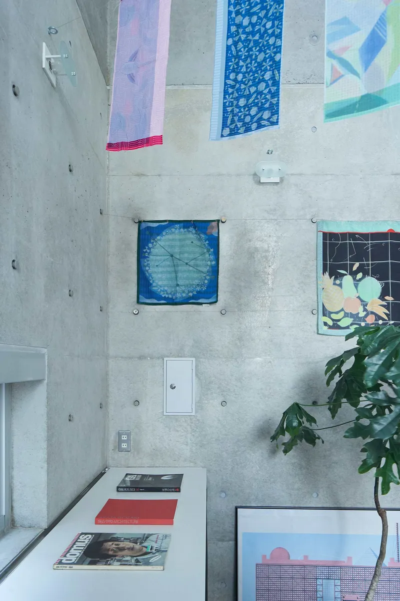


The cloud metaphor materializes in the display system. Patterned fabric panels, presumably the shop's scarves, are pinned directly to the concrete walls. Round rings mounted at varying heights allow products to hang on wires, occupying the vertical space between the floor plane and the vaulted ceiling. Scattered wooden cube furniture can be rearranged at will, their dimensions derived from the 1050mm structural grid that governs the concrete frame.
What makes the display strategy work is its deliberate lightness against the mass of the architecture. The textiles soften the board-formed surfaces without covering them. There is no built-in shelving, no glass vitrines, nothing that would compete with the primary structure. The products genuinely appear to float, tacked and suspended rather than enshrined. It is a curatorial approach borrowed from gallery practice, applied to retail with real discipline.
Café as Domestic Echo

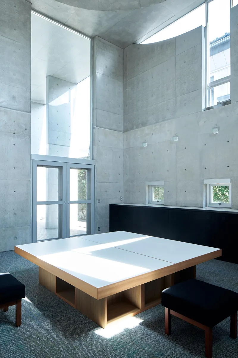

The café zone occupies the lower portions of the vaulted hall, where low tables and cushioned stools sit on carpeted floor, a deliberate recall of domestic living. This is not a standard café fitout with counter seating and espresso machines on display. It reads closer to a living room, which makes sense: the building was a house. LoHA has not erased that memory so much as abstracted it, replacing private furniture with public pieces that maintain the same posture of informality.
The timber island in the kitchen area, paired with black cabinetry under the exposed concrete ceiling, strikes a practical tone. The existing fixture counter has been retained and simply repainted, a gesture of economy that also preserves the spatial choreography Isozaki originally intended. You cook and serve in the same footprint a family once did.
Material Continuity and the 1050mm Grid


The 1050mm grid is the project's hidden logic. Isozaki used it to set the spacing of the concrete formwork; LoHA adopted it for all new fixture dimensions, ensuring that every added element reads as a continuation of the original structural rhythm rather than an imposition. The exposed paneling, the table surfaces, and the modular cubes all reference this module, creating a dimensional consistency that you feel more than see.
The material palette stays deliberately narrow. Concrete remains exposed throughout. The floor has been reupholstered rather than replaced, a technique that preserves the substrate while updating its surface. New finishes are tuned to ensure that the existing frame and the products coexist without one overwhelming the other. Even the artworks hung on the board-formed walls seem chosen for their scale and tone rather than their content, functioning as another layer in the display ecology.
Plans and Drawings


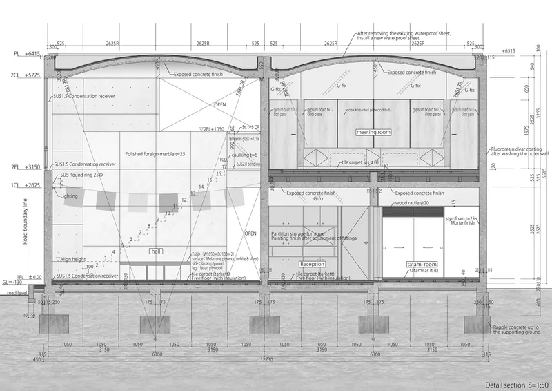
The conceptual section diagrams reveal the heaven-earth-cloud thesis in its clearest form: three sequential drawings show the relationship between the domed volume above and the horizontal plane below, with an intermediate zone of activity between them. The floor plans make legible what the photographs suggest: a ground level organized around a central hall and terrace, with an upper level containing an atrium and meeting room. The section drawing, annotated with material callouts, confirms the double-height hall as the spatial core, flanked by smaller service rooms.
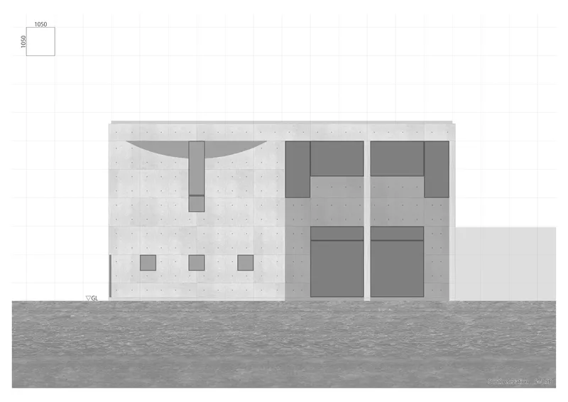

The elevation drawings document the concrete facade with its curved canopy, rectangular window punches, and gridded pavement, capturing a building that belongs unmistakably to a specific moment in Japanese postmodernism. They also show the adjacent gridded screen element, a secondary facade treatment that mediates between the sculptural main volume and the surrounding streetscape.
Why This Project Matters
Adaptive reuse of landmark buildings tends to fall into two camps: the reverential museum approach, which preserves everything and adds nothing, or the aggressive gut renovation that keeps only the shell. nimbus Café occupies a more interesting middle ground. LoHA and Fukui University of Technology have left Isozaki's concrete frame fully legible while inserting a program that activates the space in ways a private house never could. The café and shop bring daily foot traffic into a building that might otherwise have remained invisible to the public, turning architecture appreciation from a specialist activity into something that happens while you browse scarves and drink coffee.
The project also demonstrates that small-scale interventions in small cities can carry outsized architectural significance. Katsuyama is not Tokyo or Osaka. It is a city where a 155 square meter building by a Pritzker laureate sits next to ordinary houses and parked cars. By converting this house into a public amenity without erasing its authorship, LoHA has created a model for how second-generation architects can steward the legacy of the first without either genuflecting or demolishing. The clouds floating between heaven and earth are lightweight, but the argument they make is substantial.
nimbus Café and Lifestyle Shop, designed by LoHA (Hiroshi Yamada, Toshitaka Shimizu) and Fukui University of Technology. Katsuyama, Japan. 155 m², completed 2022. Photography by Kyohei Noda.
About the Studio
Share Your Own Work on uni.xyz
If projects like this are the kind of work you want to make, uni.xyz is a place to publish your own, find collaborators, and enter design competitions.


Popular Articles
Popular articles from the community


Manzana Morphosis: Stretching Barcelona's Grid into a Living Landscape for 2050
A radical reworking of the Eixample manzana turns density into a tool for generous public space, vertical ecology, and environmental performance.
Extended Shell: Retrofitting Kolkata's Balconies as Living Urban Thresholds
A modular retrofit system recovers the social and environmental intelligence of Kolkata's historic verandas for contemporary Park Street residents.
Tsunami Convergenics: Turning Catastrophic Ocean Forces into Underwater Housing Infrastructure
A speculative underwater settlement off the coast of Onagawa, Japan, treats tsunamis and typhoons as energy sources rather than threats.

The Amber Palace Opera: A Geological Fiction Surfaces on Tallinn's Baltic Waterfront
Pierre Brillard reimagines a Baltic legend as a public landscape, opera house, and waterfront promenade rooted in Tallinn's coastal identity.

Similar Reads
You might also enjoy these articles

Pixel Gardens: One Repeated Module Stacked Into a Terraced Social Housing Tower for Famagusta
Salem Bader's shortlisted housing tower builds a vertical neighbourhood from one repeated module, offsetting units to carve terraces, light and air.

Bao Huynh Watercolor Atelier: A Serene Art Retreat in Hội An
Bao Huynh Watercolor Atelier in Hội An blends multifunctional art spaces, sustainable design, local materials, and family-friendly living in a serene environment.

Atelier Macri Concept Store Interior Design by CASE-REAL
Atelier Macri store features a "ko" counter, walnut wood details, cork displays, blending retail, gallery, and seamless customer experiences.

Manuel Vargas Izquierdo Stadium and High-Performance Sports Center: Architectural Excellence in Jalpa de Méndez
The Manuel Vargas Izquierdo Stadium blends sustainable design, inclusive sports facilities, and cultural-inspired architecture, revitalizing Jalpa de Méndez’s public spaces.


Comments (0)
Please login or sign up to add comments
No comments yet. Be the first to comment!