

FUMIASO Splits a 93-Square-Meter Osaka House into 13 Interlocking Pieces
A nine-square grid carves an irregular residential plot in Osaka into thirteen distinct zones connected by diagonal sight lines.


In the residential pockets of Osaka that sit pinched between railway corridors and arterial roads, a quiet arms race is underway. Older two-story houses are being knocked down and replaced by three-story boxes that trade every centimeter of front yard for a ground-floor garage. The result is a streetscape slowly losing its porosity, its light, its greenery. FUMIASO ARCHITECT & ASSOCIATES saw this condition not as a constraint but as an opening: what if you stayed at two stories, skipped the garage entirely, and redirected all that freed-up volume toward spatial quality?
The answer is the 13 Pieces House, completed in 2024, a 93-square-meter residence that takes an irregular pentagonal plot and subjects it to a rigorous nine-square grid. Where grid lines intersect, walls dissolve into openings; where they don't, enclosure stays firm. The math produces thirteen distinct spatial zones, some fully interior, some open to the sky, all stitched together by diagonal views that make a compact home feel far larger than its footprint. It is a project about geometry as atmosphere, about the distance you can create between two points in a very small building.
A Facade That Refuses to Line Up


White corrugated metal wraps the house in a continuous skin that reads as deliberately plain until you notice the windows. They are scattered across the facade with no discernible rhythm, varying in size and height like punctuation in a run-on sentence. The effect is disarming. Rather than telegraphing the floor levels inside, the openings collapse the visual difference between this two-story volume and its taller three-story neighbors. You cannot immediately tell how tall the building is, and that ambiguity is the point.
Young olive trees sit in a gravel bed at the base, replacing the garage apron that dominates every adjacent lot. It is a modest gesture, but in a neighborhood rapidly losing its planted setbacks, the choice to keep ground-level greenery visible from the street is quietly radical.
Timber-Framed Thresholds


The entry elevation shifts register. Where the street-facing walls are clad in metal, the approach to the front door reveals timber-framed glass openings that immediately announce the warmth of the interior. A yellow mailbox on the sidewalk marks the transition from public to private with an almost childlike directness, and a single window on the corrugated wall frames the courtyard tree inside like a vitrine.
These framed glimpses are critical to the design strategy. Before you step inside, the house is already showing you its central move: layered openings that connect interior to interior and interior to exterior, establishing distances you experience visually before you walk them physically.
The Courtyard as Interior Landscape


One of the nine grid squares is left open to the sky. A single tree grows from a concrete floor surrounded by white walls and exposed timber ceiling beams that frame the sky above. Angled skylights channel light down onto the planting, and because every surrounding room can see into this void, the courtyard becomes the spatial anchor of the entire house. It is less a garden and more an interior room that happens to have no roof.
The overhead view reveals just how tightly the courtyard is embedded in the plan. It is not pushed to a perimeter; it occupies the center of the grid, meaning natural light penetrates deep into zones that would otherwise be dark. In a 93-square-meter house, giving up floor area for an open court is a significant trade. The payoff is that every adjacent room borrows its depth.
Diagonal Connections and Hanging Walls


The grid's real power shows up in the diagonal views. Standing in the living area, you can see through a timber-slatted screen into the courtyard, past the tree, and into a room beyond. Each zone is simultaneously a self-contained space and a frame for the next one. The architects achieved this by placing hanging walls at grid intersections, walls that drop from the ceiling but stop short of the floor, or rise from the floor but stop short of the ceiling. The height of each wall varies, producing a hierarchy: some thresholds you walk through freely, others you duck under, others you only look through.
The result is a spatial resonance that the project's name captures well. Thirteen pieces, none of them identical, all of them aware of each other.
Living Under Exposed Timber Joists


The ceiling plane does enormous work in this house. Exposed timber joists run continuously across zones, ignoring the walls below. Where the rooms are subdivided by white columns and partial partitions, the timber overhead keeps reading as a single surface, unifying what is actually a highly fragmented plan. The joists also absorb the domestic clutter that a small house cannot hide: pendant lights hang from them, and the warm tone of the wood softens the otherwise stark white palette.
In the double-height dining space, the joists climb further away, and a brass pendant drops on a long cord to pull the focus back down to table level. The scale shift between compressed kitchen and generous dining volume is one of the house's most effective moments, a reminder that spatial quality is not about average ceiling height but about the contrast between high and low.
Kitchen, Dining, and the Semi-Open Plan


The kitchen sits within one of the grid squares, anchored by a stainless steel island and lit by glass transom windows framed in timber. A sliding wood-framed window connects the kitchen counter to the dining table on the other side of a partial wall. You can pass a plate through it, or close it for visual separation. The detail is small but telling: in a house governed by a conceptual grid, the sliding window is the domestic equivalent of the hanging wall, a threshold you can calibrate moment by moment.
Green glass bowls on the counter, a hanging plant at the pass-through, a timber table with mismatched chairs: the house is clearly occupied and lived in, and the architecture accommodates that without demanding austerity.
Layered Rooms and Soft Boundaries


Moving deeper into the plan, the experience becomes more intimate. White portal-like openings frame successive rooms, each slightly offset from the last, so that sight lines bend rather than run straight. The pale timber flooring changes to polished concrete at certain thresholds, signaling a shift in program without any door to close. A sliding door sits in one threshold, left open in the photographs, suggesting that it exists more as an option than a habit.
The softness of these boundaries is what separates the 13 Pieces House from a typical open-plan layout. An open plan removes walls; this house multiplies them but makes each one partial, translucent, or movable. The distinction matters. Openness here is not the absence of enclosure but the careful negotiation of it.
Dusk and the Illuminated Interior


At twilight the house inverts. The scattered windows that obscured the building's scale during the day now glow unevenly across the corrugated facade, each one a different brightness depending on the room behind it. Uplighting on the courtyard trees throws leaf shadows onto the white walls, and the glazed openings at ground level pull the interior garden into view from the sidewalk. The building becomes a lantern, one that reveals the irregularity of its internal life rather than smoothing it into a uniform glow.
Photographed from the corner, the house reads as a compact white volume quietly holding its own beneath the tangle of overhead power lines. It is not trying to be monumental. Its ambition is more precise: to prove that 93 square meters, subdivided with discipline and imagination, can feel like enough.
Why This Project Matters
The 13 Pieces House is a serious argument against the default logic of small-lot residential development in Japanese cities. Where the market pushes toward maximum volume, minimum setback, and ground-floor parking, FUMIASO demonstrates that restraint in height and footprint can produce a richer domestic environment. The nine-square grid is not decorative geometry; it is a decision-making framework that resolves planning, structure, light, and privacy simultaneously. That kind of rigor is rare in houses this size.
More broadly, the project shows that modularity in residential architecture does not have to mean repetition or prefabrication. Here, the module is a spatial idea: equal squares, selectively opened. The thirteen resulting pieces are all different in character, all connected by sight lines, all anchored by a single tree in a roofless room. It is a house that treats complexity as a form of generosity, giving its residents more spatial variety in 93 square meters than many houses manage in three times the area.
13 Pieces House by FUMIASO ARCHITECT & ASSOCIATES, Osaka, Japan. 93 m², completed 2024. Photography by yousuke ohotake.
About the Studio
Share Your Own Work on uni.xyz
If projects like this are the kind of work you want to make, uni.xyz is a place to publish your own, find collaborators, and enter design competitions.


Popular Articles
Popular articles from the community


Singing Woman: An Opera House That Performs Before the Curtain Rises
Ovidiu Cristian Pavel's conceptual opera house translates Estonia's choral identity into a sculpted waterfront landmark facing the Baltic Sea.


David Ortega Stacks a Two-Story Mexico City Penthouse Around a Steel Stair and a Pergola-Shaded Roof Terrace
In Colonia Roma, a 300 m² penthouse uses oak joinery, a planted steel stair and a slatted roof pergola to make a new-build apartment feel like a house.

FCC Arquitectura Expands a Portuguese Granite House with a Board-Marked Concrete Wing
In Portugal, JV House pairs a cleaned-up whitewashed and granite dwelling with a timber-shuttered concrete extension, courtyards and a garden pool.

Aquadapt: An Underwater Habitat That Rewrites Its Rooms by the Hour
Curved modules ring the seabed while one shell shifts from breakfast room to cinema, farm and football pitch as residents' needs change.

Similar Reads
You might also enjoy these articles


Hodi-Mandai Geram
Project Function: Preservation and revitalization of the Intangible heritage and socio-spatial identity of the Hodi by Housing, Cultural Memory Center, Sacred Grove, landscape, local tourism economy

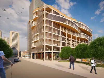
Olio Towers: A Mid-Rise for Performers That Fuses Housing, Rehearsal, and Stage
Located blocks from Houston's Theater District, this modular tower stacks living units around a central performance atrium.
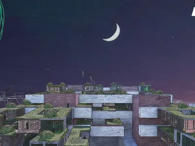
Oasis: Modular Green Housing Carved into Dhaka's Urban Fabric
A shortlisted Plugin Housing entry reclaims unauthorized settlements in Dhaka with stepped concrete volumes, green roofs, and ventilation-driven design.

Black Hole: A Floating Megastructure for the Post-Physical Era
Emiliano Mazzarotto envisions a spherical, self-scaling arena where e-sports, digital hotels, and holographic stadiums replace traditional public space.

Explore Modular Housing Competitions
Discover active competitions in this discipline

Challenge to reimagine the Iron Throne

Photograph architecture without architects

Illustrate the lost glory of Angkor Wat - Render Challenge

Design challenge to reuse E-waste
Comments (0)
Please login or sign up to add comments
No comments yet. Be the first to comment!