

Studio Carré Rebuilds a 70 m² Marais Apartment Around a Red Kitchen Corridor and a 360-Degree Sightline
In the Enfants Rouges quarter of Paris, a 70 m² third-floor flat trades walls for sightlines, terracotta, steel and one fearless coat of red.

Seventy square meters on the third floor of an old Marais building is not much room to make an argument. Studio Carré, the Paris interiors practice led by Paul Levaillant, makes one anyway. The Enfants Rouges Apartment sits a short walk from the covered market that gives the quarter its name. It takes an awkward, irregular plan and treats the irregularity as the brief. The program is ordinary: a living and dining room, a kitchen, two bedrooms and a bathroom. What happens between those rooms is not ordinary.
The interesting move is about vision, not square footage. The living and dining room spans the full width of the flat. The larger bedroom is placed behind it as a backdrop, and the smaller bedroom sits behind the kitchen in the same way. The plan is organized so the eye can rotate 360 degrees and keep finding layered depth. The whole job took four months and a budget of around €160,000. We think it is a useful lesson in how much a renovation can do by editing sightlines rather than moving the whole building around.
A Bench That Refuses to Touch the Floor


The living room's anchor is a long cantilevered bench in heavily figured, burl-like veneer. It hovers below a brushed steel cabinet and a dark recessed niche. Keeping it off the floor matters in a small room. You read the floor plane as continuous, and the swirling grain becomes something close to a painting hung at knee height.
The bench changes role as it travels. At one end it is a sideboard for prints, glasses and camellia branches. Further along, a cushion turns it into a window seat for reading. A black three-legged stool and a stack of books are enough to signal the shift. One continuous piece of joinery does the work of three pieces of furniture, and that economy is exactly what a 70 m² plan needs.
Black Backs, Brushed Steel and Soft Upholstery


The open shelving is white, but each bay has a black back panel. It is a small detailing decision with a big effect. Ceramics, framed prints and berry branches read as silhouettes rather than clutter. The black also connects visually to the darker study glimpsed through the corner doorway, so the shelving starts the sequence into the next room.
Against all this hard material, the seating is deliberately soft: bouclé ottomans, a modular lounge chair on chrome feet, a leather-strap steel magazine rack. Knoll International is the listed manufacturer on the project, and the furniture leans toward modernist classics. That choice keeps the palette tight. Steel, chrome and nubby wool are a familiar trio, but here they are arranged so each surface catches the tall-window daylight differently.
Terracotta Hexagons Mark the Dining Room


The dining zone is not walled off. It is defined by a rug of hexagonal terracotta tiles inset into a pale poured floor. The tiles nod to the traditional Parisian floor without asking the entire flat to be retiled. The junction between the two floors is cut cleanly, and in low sun the step in material becomes one of the project's best moments.
A round timber table, teak chairs and a slim linear pendant keep the zone light. A full-height mirror beside the window doubles the table and the daylight. Mirrors recur throughout the apartment, and the narrow entrance and the black bathroom use them heavily to manufacture depth. They also conceal masonry and technical elements, which is a smart way to make a constraint pay for itself.
The Red Kitchen Corridor


The plan forces the kitchen into a narrow corridor. Rather than brightening it into anonymity, Studio Carré paints every surface a saturated red: walls, upper cabinets, shelving and the door at the far end. Stainless steel base units and worktops cut through the color like a single horizontal line. The result is the most memorable room in the apartment, and it is also the smallest.
It is hard not to read the red as a wink at the neighborhood, named for the orphans once dressed in red here. Whatever the intent, the color works spatially. Seen through doorways from the living room and dining table, the corridor glows like a lit lantern at the end of the view. It gives the 360-degree sightline something to land on.
Bedrooms Built as Backdrops


Because the bedrooms act as backdrops to the public rooms, they have to hold up as views as well as places to sleep. The main bed sits in a symmetrical alcove. A dark oak headboard runs into built-in nightstands, with white cabinets overhead that absorb storage without crowding the bed. A small mushroom lamp, red on one side and white on the other, keeps the composition from feeling too stiff.
The red door reappears at the bedroom threshold, so the kitchen's color follows you through the plan instead of staying in one room. A full-height wardrobe with a tall mirror sits beside the windows, and a jute rug softens the pale floor. These are restrained rooms. They are designed to be calm enough to read from across the flat.
Study, Washroom and the Small Details


The study is the darkest room: floor-to-ceiling matte black cabinets and a built-in timber desk set under a tall casement window. A brass pull against the black finish and the walnut edge of the desktop are the kind of junctions that justify the custom joinery budget. The window becomes the room's only light source, which concentrates attention on the work surface.
The washroom continues the logic in miniature, with a black basin, oak shelving and a single small window. In the living room, a slim vertical wall light on a white column and an oak radiator cover show that the minor elements were designed too. Leibal filed the project under minimalism, and that is partly right. We would call it edited rather than minimal, because there is plenty here; it is just carefully placed.
Plans and Drawings

The plan explains everything the photographs suggest. The wide living and dining room sits at the center, a bedroom closes each end, and the kitchen squeezes into a thin corridor along one edge. The drawing makes clear that the 360-degree view is not a marketing phrase. Doorways are aligned so that from the dining table you can look into the red kitchen, through to a bedroom, and back across the bench and shelving.
Why This Project Matters
Most small-apartment renovations try to create space by erasing character: white walls, hidden storage, nothing left to look at. Studio Carré goes the other way. The Enfants Rouges Apartment keeps the historic shell and the odd geometry, then layers terracotta, steel, figured veneer and one bold coat of red on top. The flat feels bigger because there is always another room, color or reflection in view, not because there is less in it.
It also shows what a modest, fast renovation can achieve. Four months and about €160,000 bought a home where the joinery, the floor and the paint each solve a planning problem instead of only decorating it. For designers working inside old European housing stock, the takeaway is practical: map your sightlines first, then let material and color reward the eye where it lands.
Enfants Rouges Apartment by Studio Carré (Paul Levaillant), Paris, France. Area: 70 m². Completed: 2026. Photography: Clément Gérard - Oracle Paris.
About the Studio
Studio Carré
Official website of Studio Carré, one of the studios behind this project.
carre-studio.frShare Your Own Work on uni.xyz
If projects like this are the kind of work you want to make, uni.xyz is a place to publish your own, find collaborators, and enter design competitions.


Popular Articles
Popular articles from the community


Opera on the Sea: Driftwood Logic Shapes a Timber Opera House on Estonia's Coast
Trevor Orgill's opera house translates the entangled drift of floating timber into a civic building where wood, water, and music converge.

Temporary Home for Dogs: A Reversed Zoo Rethinks Animal Shelter Architecture
In Bucharest, a sinuous corridor and freed landscape flip the logic of containment, designing a shelter that works to make itself unnecessary.
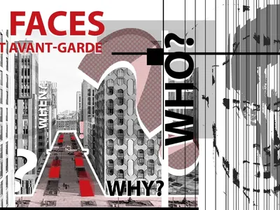
Faces of the Soviet Avant-Garde: Turning Moscow's Street Names into an Open-Air Museum
A network of sculptural installations across a Moscow residential district transforms forgotten architect names into spatial encounters with cultural memor

Manzana Morphosis: Stretching Barcelona's Grid into a Living Landscape for 2050
A radical reworking of the Eixample manzana turns density into a tool for generous public space, vertical ecology, and environmental performance.

Similar Reads
You might also enjoy these articles

Pixel Gardens: One Repeated Module Stacked Into a Terraced Social Housing Tower for Famagusta
Salem Bader's shortlisted housing tower builds a vertical neighbourhood from one repeated module, offsetting units to carve terraces, light and air.

Bao Huynh Watercolor Atelier: A Serene Art Retreat in Hội An
Bao Huynh Watercolor Atelier in Hội An blends multifunctional art spaces, sustainable design, local materials, and family-friendly living in a serene environment.

Atelier Macri Concept Store Interior Design by CASE-REAL
Atelier Macri store features a "ko" counter, walnut wood details, cork displays, blending retail, gallery, and seamless customer experiences.

Manuel Vargas Izquierdo Stadium and High-Performance Sports Center: Architectural Excellence in Jalpa de Méndez
The Manuel Vargas Izquierdo Stadium blends sustainable design, inclusive sports facilities, and cultural-inspired architecture, revitalizing Jalpa de Méndez’s public spaces.

Explore Housing Competitions
Discover active competitions in this discipline


Challenge to reimagine the Iron Throne

Photograph architecture without architects

Illustrate the lost glory of Angkor Wat - Render Challenge

Design challenge to reuse E-waste
Comments (0)
Please login or sign up to add comments
No comments yet. Be the first to comment!