

Studio Fragment Turns a Seoul Brick Box into a Magazine You Can Walk Through
29CM's first physical showroom in Seongsu treats retail space as editorial content, with frosted glass layers and flexible timber systems across 339 square


When an online retailer decides to open a physical store, the obvious trap is mimicry: build a warehouse with better lighting, arrange products on shelves, call it experiential. studio fragment, led by Seo Donghan, took a different route for 29CM's first offline showroom in Seoul's Seongsu district. Rather than designing a store, they designed a container for stories. The 339-square-meter space across two floors operates less like a shop and more like a three-dimensional magazine, where each spread can be swapped out for the next season's content.
The core idea is deceptively simple: make the invisible visible. 29CM built its reputation as a curated online platform, and the architecture needed to give that curation a physical body without locking it into a single aesthetic. Studio fragment accomplished this through a system of modular timber display units, frosted glass partitions that shift color and transparency depending on the light, and a suspended mezzanine that hovers over the ground floor like an unfinished thought. Nothing here is permanent except the bones of the building, and that is precisely the point.
Brick Skin, Graphic Identity
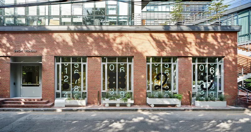
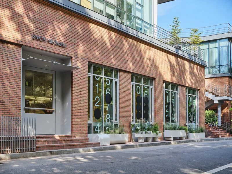

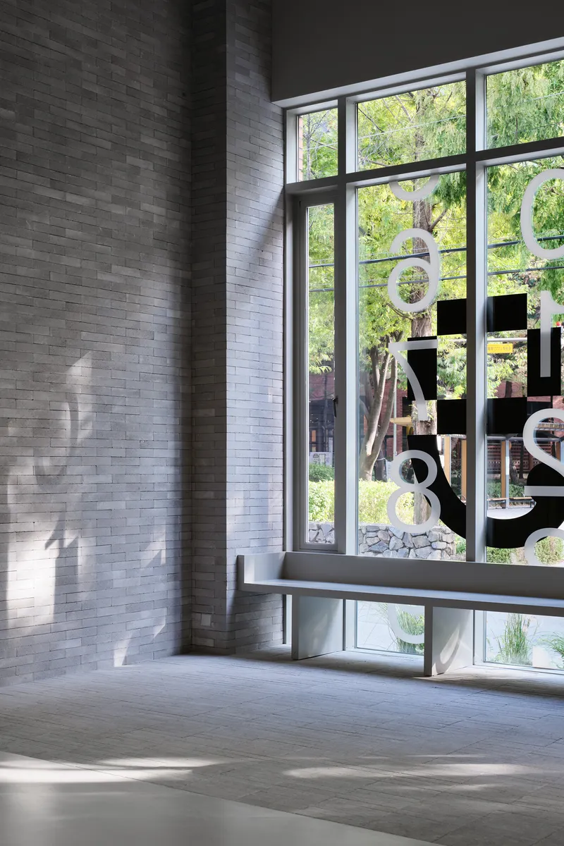
The red brick facade does something unusual: it acts both as a quiet neighbor and a billboard. By day, dappled tree shadows play across oversized white numerals painted onto the glazed storefronts, dissolving the boundary between signage and architecture. At dusk, the interior glow turns those same windows into illuminated panels, broadcasting the brand's graphic identity to the street without a single backlit sign. The brick itself is unremarkable by Seongsu standards, which is the point. The building belongs to the neighborhood. The content inside does not.
Recessed entries and low planters soften the transition from sidewalk to interior, resisting the hard threshold that many retail interiors impose. You are already inside the brand experience before you cross the door.
The Suspended Platform
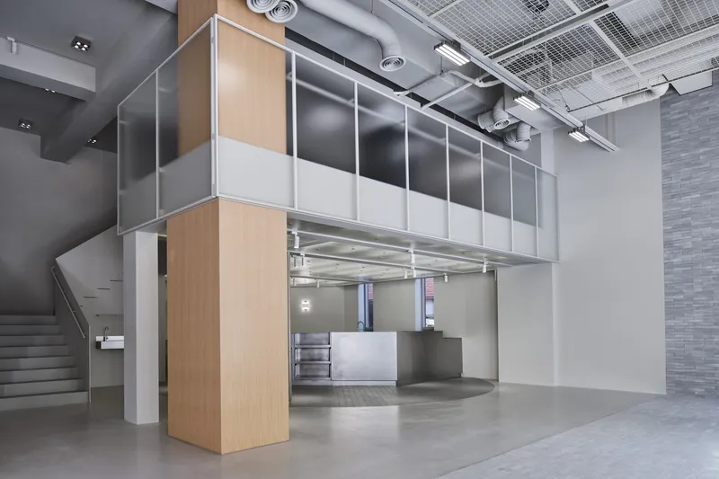

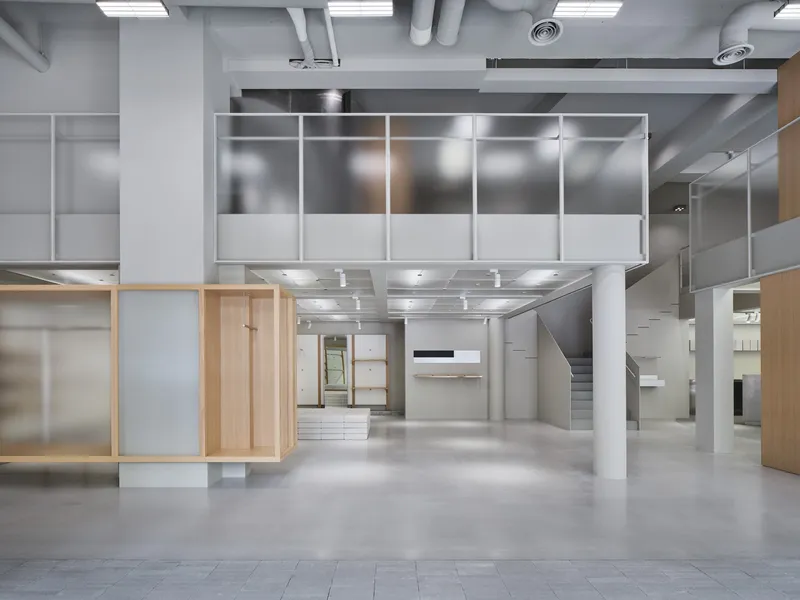
The most striking spatial move is the mezzanine. It hangs from the ceiling structure on steel and translucent panels, hovering above the polished concrete ground floor like a stage set waiting for performers. From below, it compresses the retail space and focuses attention on the product displays arranged beneath it. From above, it opens into a glass-encased second level used for seasonal concepts and events. The staircase connecting the two is deliberately simple, a folded white plane that avoids the sculptural ego trip so common in retail design.
This split-level arrangement lets the store run two distinct programs simultaneously. The ground floor can host a curated product exhibition while the mezzanine operates as an event space, a gallery, or a workshop. The translucent partitions between them allow visual connection without acoustic or programmatic bleed.
Timber Systems and Flexible Display

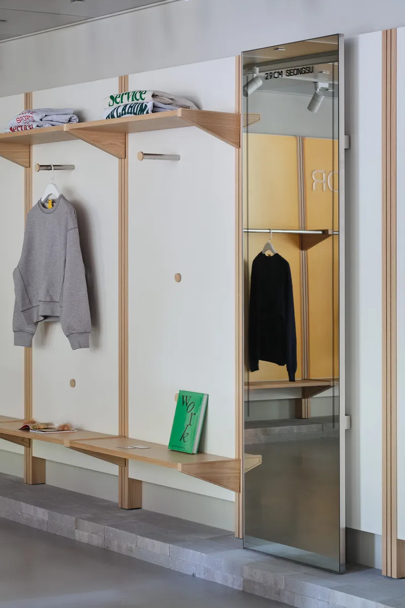
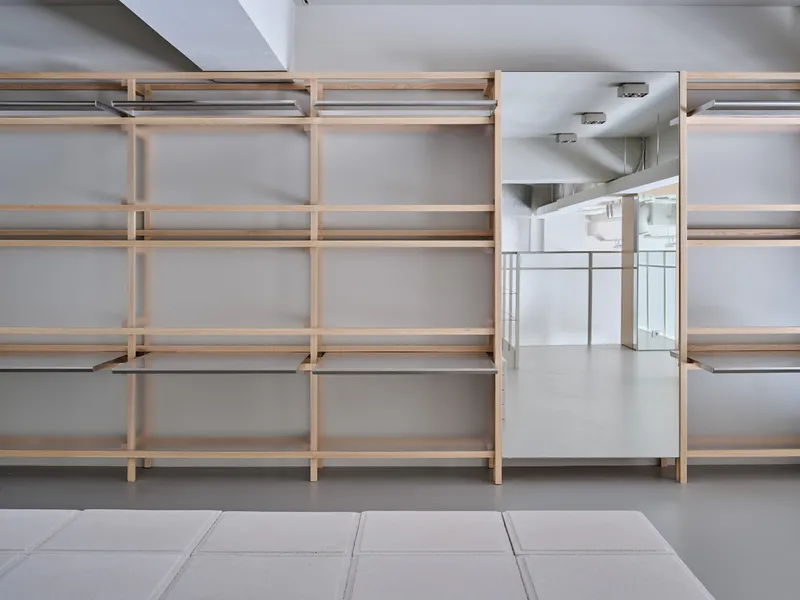
Studio fragment designed the display infrastructure as a toolkit rather than a fixed arrangement. Wall-mounted timber cabinets with frosted glass doors can conceal or reveal merchandise. Hooks, shelves, and niches within a single unit accommodate garments, ceramics, or printed materials without modification. The frosted glass panels are a recurring motif: they layer opacity, creating depth and color shifts that make each display feel considered rather than stocked.
The modular logic extends to freestanding shelving units that combine light wood frames with white panels and open compartments. These pieces occupy the floor loosely, like furniture in a living room, leaving generous circulation paths and sightlines through the space. Nothing feels crammed. The restraint in material palette, timber, glass, white panel, allows the products to carry the color.
Details That Earn Their Keep
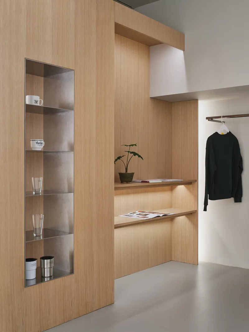
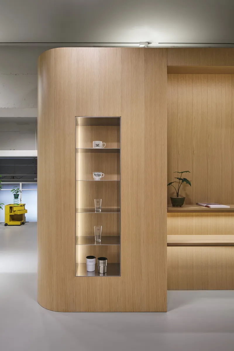

The millwork throughout the store rewards close looking. Curved timber volumes create recessed vertical niches for glassware and ceramics, turning a display shelf into something closer to a vitrine. The grain of the wood and the radius of the curves feel calibrated, not arbitrary. Overhead, square ceiling fixtures with four recessed lamps in brushed metal housings provide focused light without the visual noise of a typical track system.
These are not heroic details. They are quiet decisions that accumulate into an atmosphere of care. The wall-mounted sink with chrome faucet beneath linear slot vents, the integrated shelving at the retail counter, the potted plant placed in a recessed niche: each moment suggests that someone thought about how this object would be encountered, not just where it would go.
Ground Floor as Editorial Spread
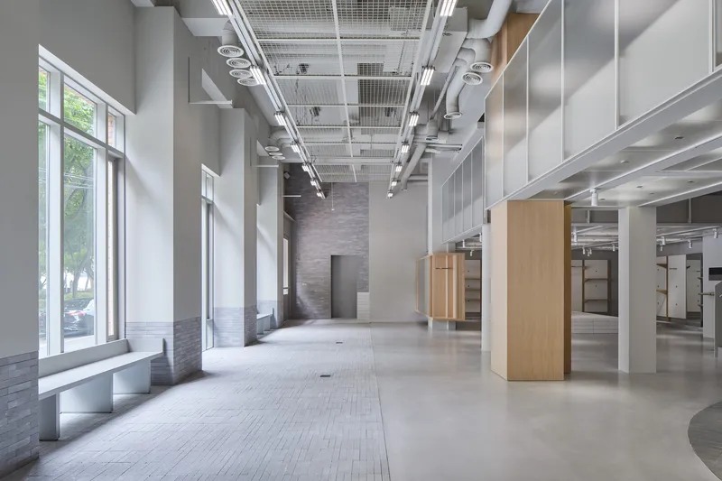
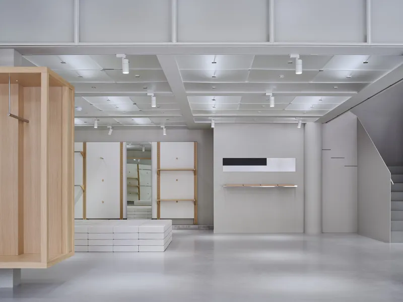
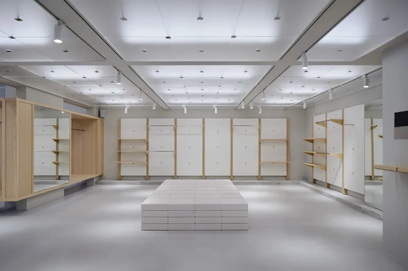
Walk through the ground floor and you understand the magazine analogy. The entry section functions as a rotating art show, the opening editorial. Move deeper and you encounter curated product groupings arranged on timber platforms and within coffered display niches, the feature stories. The coffee counter in the opposite corner serves as the back page, a social destination that gives visitors a reason to stay after they have seen everything.
Floor-to-ceiling windows along the street front flood the space with daylight, and exposed ceiling grids with ductwork and track lighting give the interior an honest, unfinished quality. Timber columns punctuate the open plan without enclosing it. The overall effect is generous and unhurried, a retail space that trusts its visitors to browse at their own pace.
The Coffee Counter and Upper Level
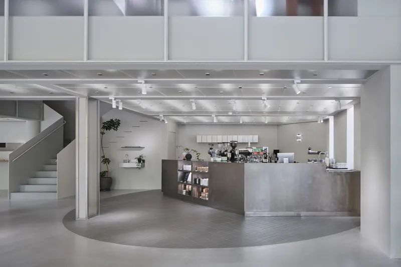
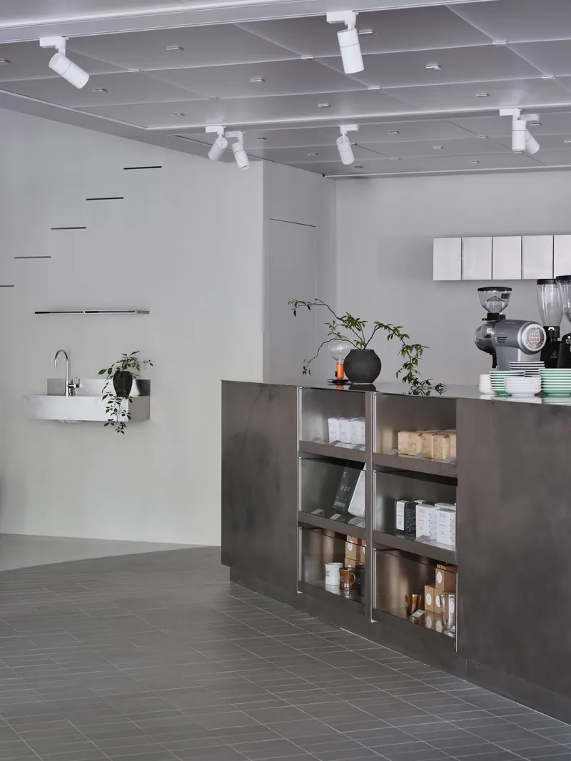
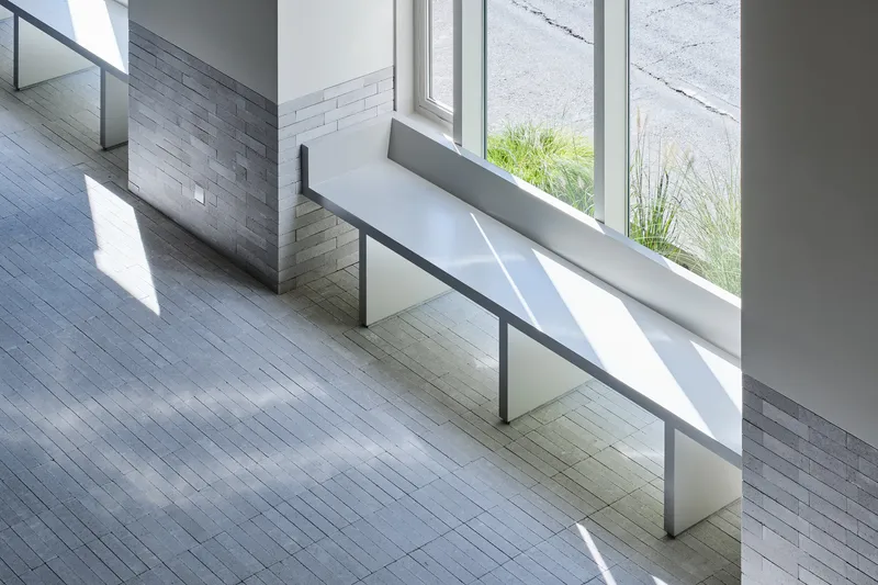
The cafe counter sits at the intersection of retail and hospitality, a dark metal volume that contrasts sharply with the light timber display systems. Open shelving displays coffee equipment and plants, turning the functional back-of-house into another layer of visual content. Exposed ductwork above reinforces the industrial character without tipping into self-conscious roughness.
Upstairs, a white metal bench beneath a glass balustrade catches bright afternoon sunlight, offering a moment of pause. The upper level, accessed by simple staircases, is deliberately open and underspecified. It waits for its next program, the next seasonal concept, the next collaboration. The architecture provides structure without prescribing use.
Layered Transparency

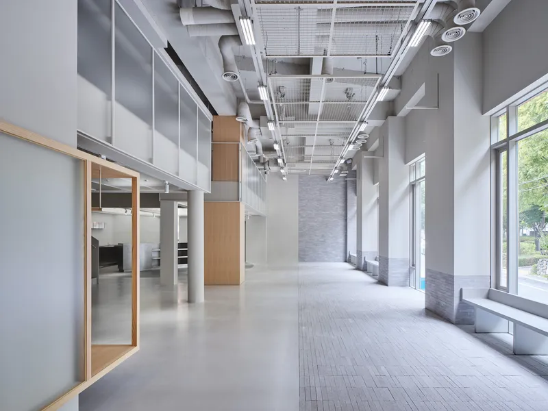
Seen from above, the double-height interior reveals its organizational logic: translucent partitions and metal railings define zones without walls. Light filters through frosted glass and skylight openings, shifting throughout the day and blurring the hard edges of the structure. The frosted layers embody 29CM's founding idea of making the unknown known, a material metaphor for discovery. You see something through the glass, not quite clearly, and you move closer.
Circulation corridors with timber-framed display boxes and streetside windows create a rhythm of compression and release. Grey brick walls beside full-height windows with graphic signage frame views to a sunlit courtyard, pulling exterior context into the interior experience. The store never feels sealed off from Seoul.
Plans and Drawings
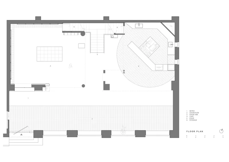


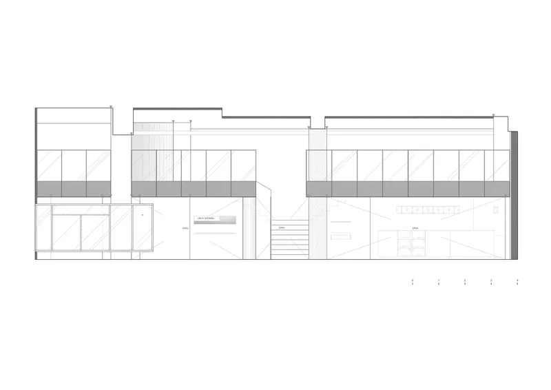
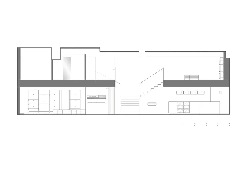
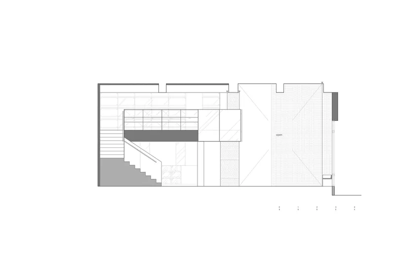
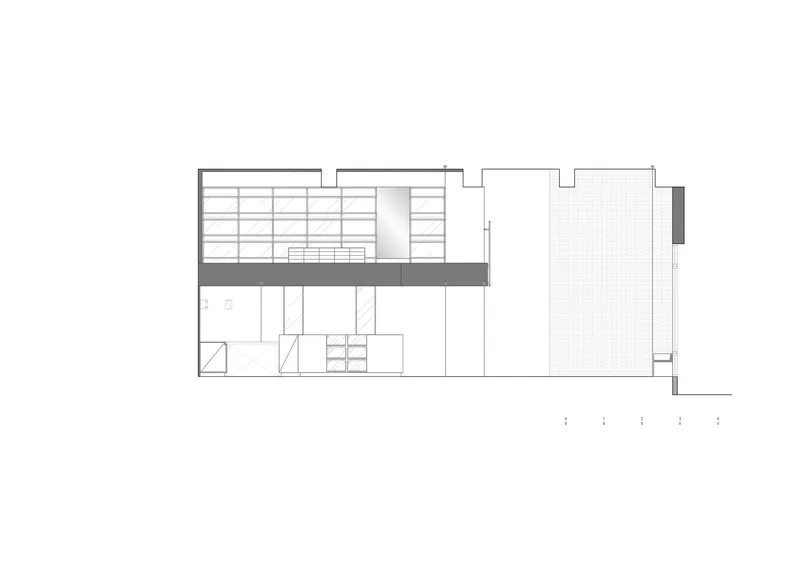
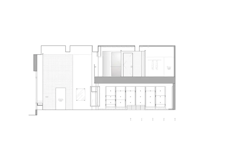
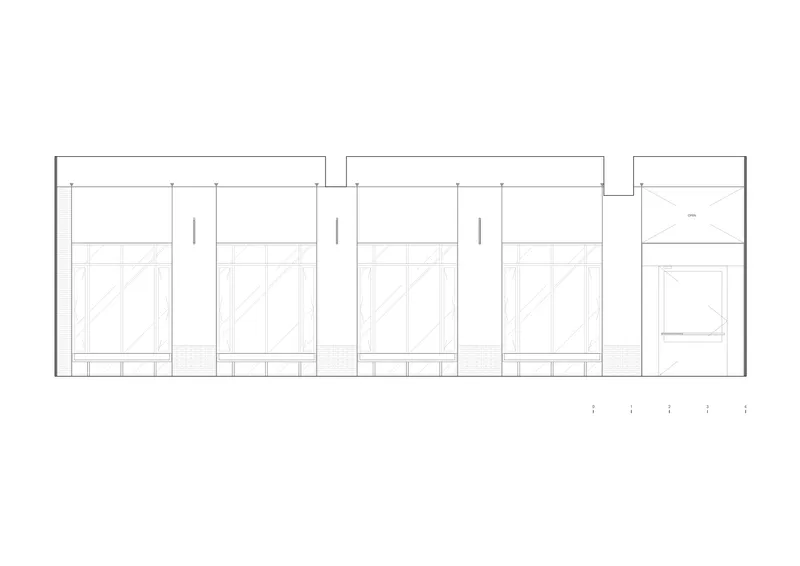
The floor plans confirm what the photographs suggest: the ground level is organized around a circular counter and a gridded outdoor terrace, while the upper level accommodates a bathroom alcove, an open workspace, and a terrace overlook. The sections are more revealing. They show how the split-level strategy creates a surprisingly varied sequence of spatial heights within a compact footprint, and how the central staircase acts as a hinge between the public retail ground floor and the more programmatically flexible mezzanine.
The elevation drawings depict four identical storefront bays with transom windows above, a deliberately repetitive rhythm that lets the changing interior content provide variety. The narrow vertical circulation core visible in the sections separates distinct spatial zones while maintaining visual continuity through the courtyard adjacency.
Why This Project Matters
Retail architecture tends toward two extremes: the neutral white box that defers entirely to the merchandise, or the overwrought destination that overwhelms it. Studio fragment found a third path. The 29CM Seongsu Store is specific enough to feel designed, and open enough to accept whatever its operators throw at it next season. The modular timber systems, the frosted glass layers, the suspended mezzanine: these are not formal gestures. They are instruments. The architecture treats retail as a medium, not a backdrop.
For a brand that began as an editorial platform for products, this is the right physical translation. The store does not shout. It curates. It invites browsing in the way a well-designed magazine does, with pacing, hierarchy, and enough white space to let each piece breathe. In a neighborhood like Seongsu, where every other storefront is competing for Instagram attention, that kind of restraint is itself a statement.
29CM Seongsu Store, designed by studio fragment, lead architect Seo Donghan. Located at 78 Achasan-ro, Seongdong-gu, Seoul, South Korea. 339 square meters. Completed in 2022. Photography by Kim Donggyu.
About the Studio
studio fragment
Official website of studio fragment, one of the studios behind this project.
frgmnt.krShare Your Own Work on uni.xyz
If projects like this are the kind of work you want to make, uni.xyz is a place to publish your own, find collaborators, and enter design competitions.


Popular Articles
Popular articles from the community


Cloaked Colonization: A Mobile Underwater Habitat That Moves Like a Fish
Micah Abaya's shortlisted EHC Pacific entry reimagines ocean settlement as a dispersed network of self-sustaining architectural organisms.
Faces of the Soviet Avant-Garde: Turning Moscow's Street Names into an Open-Air Museum
A network of sculptural installations across a Moscow residential district transforms forgotten architect names into spatial encounters with cultural memor

Manzana Morphosis: Stretching Barcelona's Grid into a Living Landscape for 2050
A radical reworking of the Eixample manzana turns density into a tool for generous public space, vertical ecology, and environmental performance.

Temporary Home for Dogs: A Reversed Zoo Rethinks Animal Shelter Architecture
In Bucharest, a sinuous corridor and freed landscape flip the logic of containment, designing a shelter that works to make itself unnecessary.

Similar Reads
You might also enjoy these articles

Bao Huynh Watercolor Atelier: A Serene Art Retreat in Hội An
Bao Huynh Watercolor Atelier in Hội An blends multifunctional art spaces, sustainable design, local materials, and family-friendly living in a serene environment.

Atelier Macri Concept Store Interior Design by CASE-REAL
Atelier Macri store features a "ko" counter, walnut wood details, cork displays, blending retail, gallery, and seamless customer experiences.

Manuel Vargas Izquierdo Stadium and High-Performance Sports Center: Architectural Excellence in Jalpa de Méndez
The Manuel Vargas Izquierdo Stadium blends sustainable design, inclusive sports facilities, and cultural-inspired architecture, revitalizing Jalpa de Méndez’s public spaces.
KAKR Buluh Awar Hall: Revitalizing Community and Ecology Through Bamboo Architecture
Community built bamboo hall revitalizes Buluh Awar village, empowering youth, restoring ecology, celebrating vernacular craftsmanship through sustainable architecture and culture.

Explore Shopping Mall Competitions
Discover active competitions in this discipline

Challenge to design a portable theatre

Challenge to design a portable music platform

Challenge to design an open learning module for the elderly
Comments (0)
Please login or sign up to add comments
No comments yet. Be the first to comment!