
Three Studios Revive a Paris Printing House as a Red-Framed Workplace in the Sentier
A former printing house in Paris's historic textile district becomes 1,000 square meters of layered, imperfect, and characterful office space.


The Sentier district in Paris has always been a place of making: textiles, presses, workshops, the hum of small urban industries stacked floor upon floor. So when three practices, Agathe Marimbert Architecte, Exbrayat Enrico architectes, and Romain Granoux architecte, took on the conversion of a former printing house on the corner of rue des Forges and rue de Damiette, the question was never whether to erase the building's productive past. It was how to amplify it.
What makes this project genuinely compelling is its refusal to smooth things over. The building is actually two structures merged over time, creating a five-story ensemble where floor levels don't align, volumes shift unpredictably, and circulation fragments rather than flows. Rather than rationalizing these mismatches into a clean open-plan office, the architects treated every discrepancy as spatial opportunity. The result is 1,000 square meters of contemporary workplace that feels nothing like a coworking template, and everything like a building that has lived several lives and is beginning another.
Red Steel as Memory


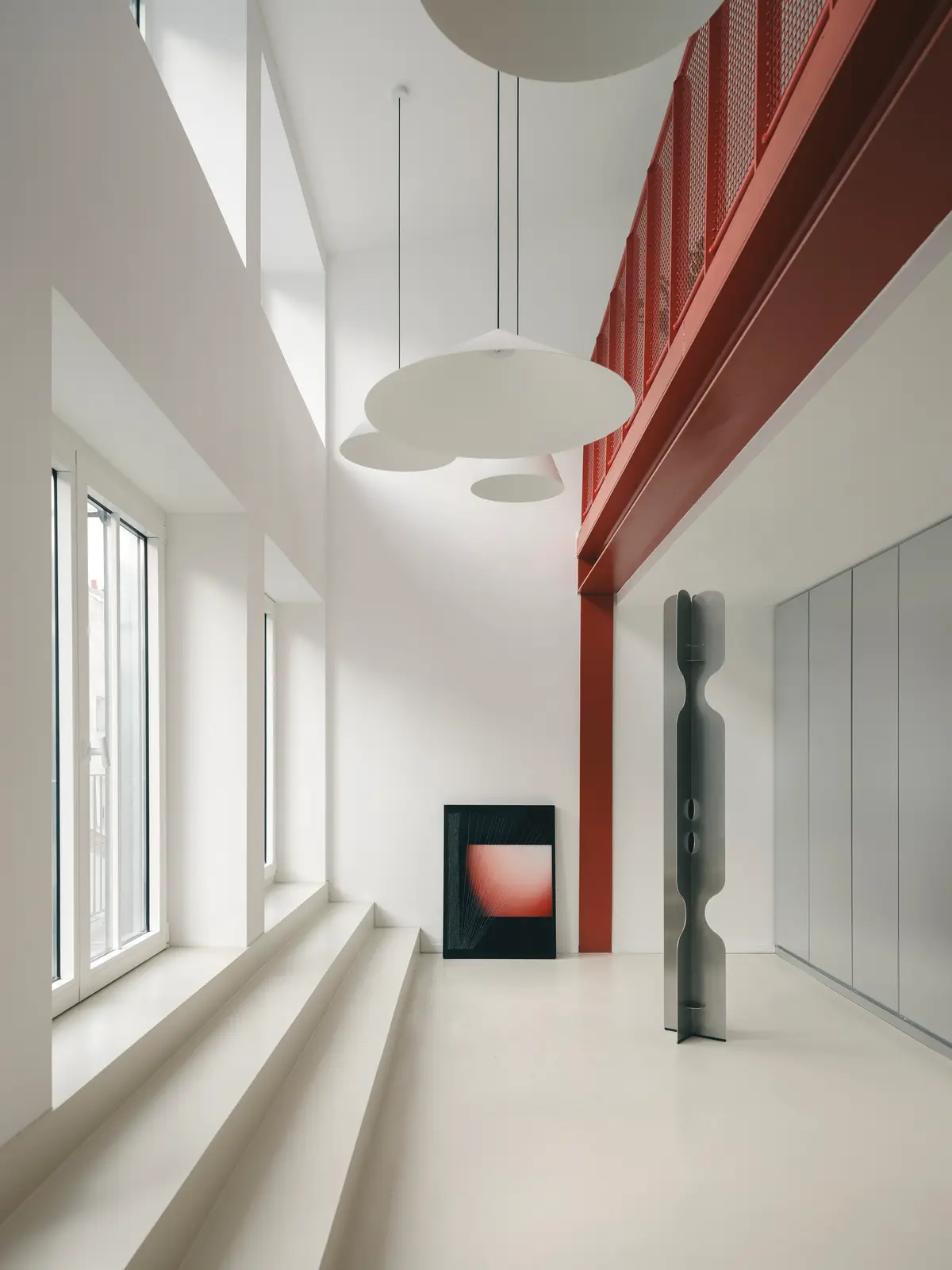
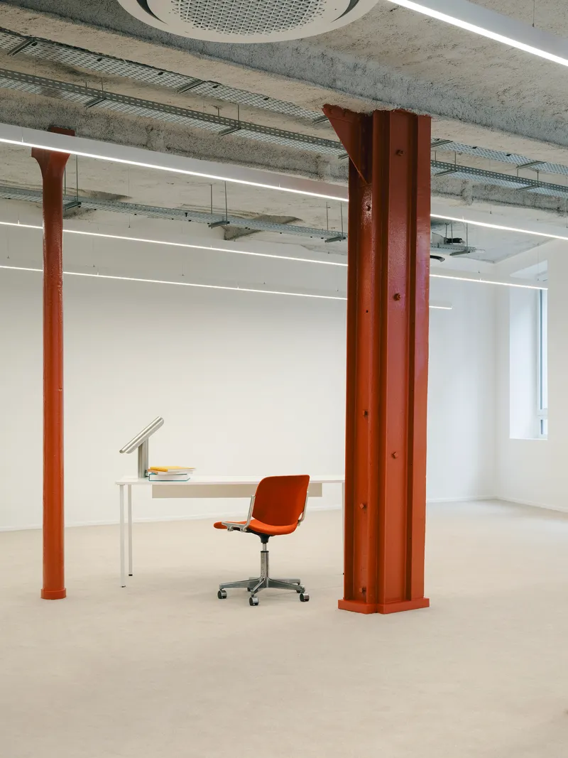
The most immediate gesture is the decision to paint the existing metal structure a saturated red. These are not decorative columns; they are the riveted beams and cast iron bones of a building that once supported presses and machinery. By highlighting them in color rather than concealing them behind drywall, the architects turn structural legibility into a kind of narrative device. You read the building's history in its skeleton.
The red registers differently depending on context. Against the retained limestone walls, it feels almost archaeological, an industrial artifact framed by older masonry. Against white plaster and perforated metal ceilings, it becomes graphic and precise. The consistency of the color across floors gives the heterogeneous building something it never had: a unifying visual thread that respects what already existed.
Two Buildings, One Logic


The two merged structures reveal themselves floor by floor. On some levels, orange-flared steel columns with decorative capitals support exposed concrete ceilings, a different structural vocabulary from the red riveted frames elsewhere. The architects did not try to reconcile these differences into a single aesthetic. Instead, each floor reads as its own environment, with its own proportions, ceiling heights, and spatial character.
The connections between the two buildings are where the architecture does its most interesting work. Level changes become thresholds. Shifts in ceiling height create natural zones without partitions. A desk beside an orange column under an exposed slab feels fundamentally different from a workspace framed by stone walls and red steel, even though both belong to the same address. Spatial diversity here is not a luxury; it is the organizing principle.
The Concrete Core

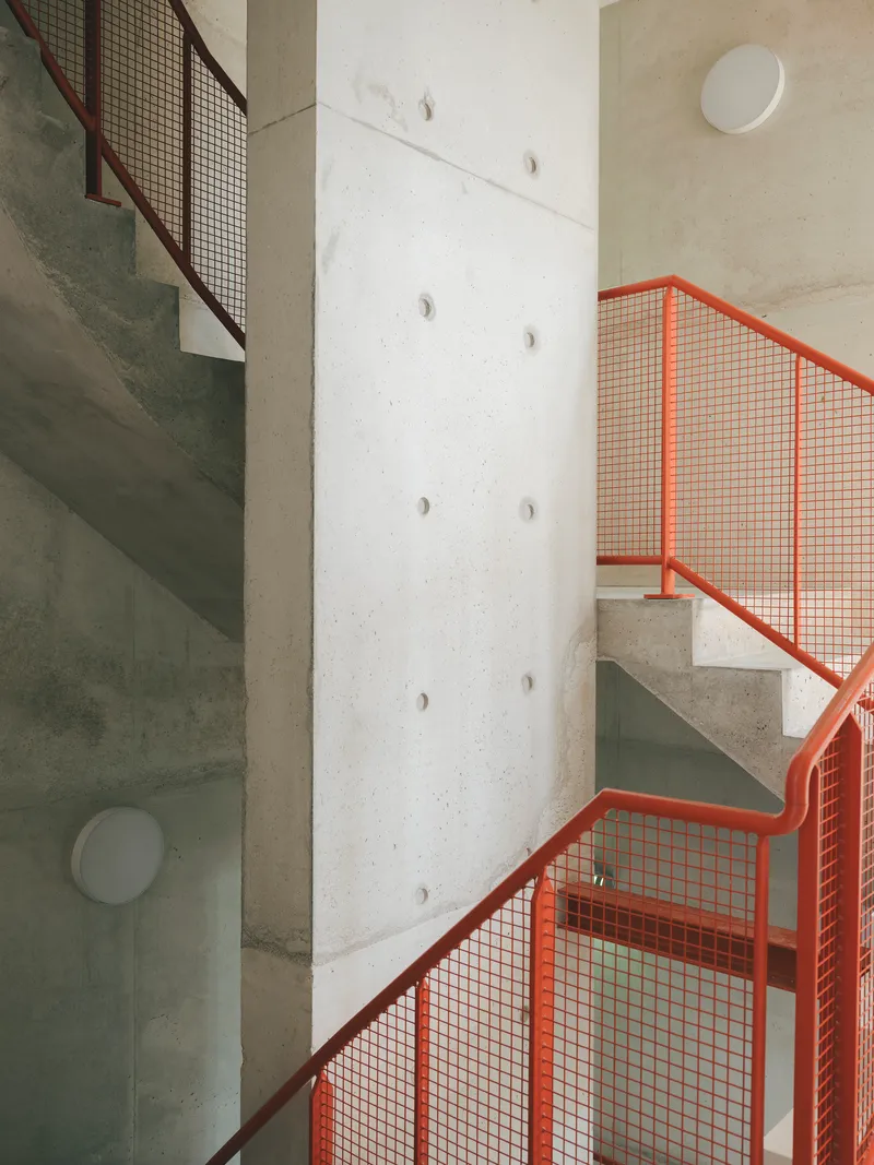

The most significant new insertion is a concrete core at the rear of the building, housing the staircase and vertical circulation. It stabilizes the existing structure while giving the project its most sculptural moments. The stairwell ascends between curved concrete walls, with red-orange mesh railings wrapping around cylindrical columns pierced by circular apertures. Light enters from above and filters down through the mesh, creating a vertical sequence that feels generous for a utilitarian element.
The materiality of this core, raw concrete against metal mesh, stands in deliberate contrast to the delicacy of the heritage structure it supports. It announces itself as new without apology. The curved geometry softens what could have been a blunt shaft of circulation and turns the daily act of moving between floors into something worth noticing.
Arrivals and Thresholds
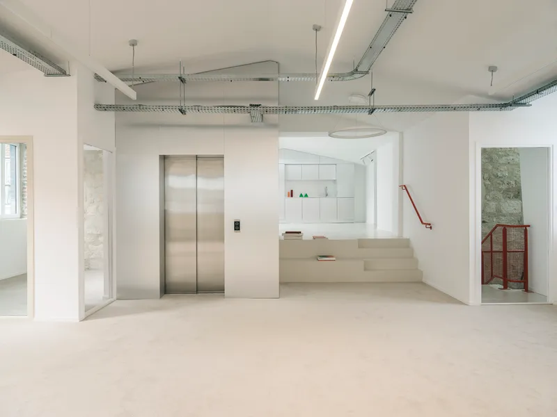
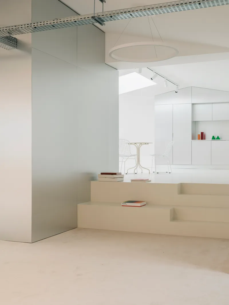

The ground-level reception sets the tone: stainless steel elevator doors sit beside an integrated stair platform, with exposed ductwork overhead signaling the building's honest approach to services. Nothing is hidden for the sake of polish. Elsewhere, light wood stair treads rise beside grey walls under a circular pendant, offering a quieter moment of material refinement that balances the rawness of the main circulation core.
Transitional spaces throughout the building are handled with care. Doorways frame views of the concrete stair beyond. Circular ceiling lights punctuate white corridors. These are small moves, but they add up to a workplace where moving through the building is not dead time between meetings but a sequence of considered moments.
Texture and Atmosphere
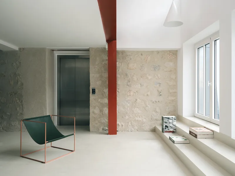
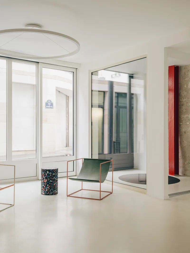

The architects clearly understand that a good workplace is not just about desk counts and lux levels. A room with textured limestone walls, a red steel column, and a single metal sling chair beside a window becomes a place to think. A lounge with brass-framed seating and a terrazzo planter beneath a circular ceiling fixture offers a different register entirely, one of quietness and material warmth.
Terrazzo cylinders reappear on the open floor plates as sculptural anchors, lending weight and identity to spaces that could otherwise feel under-furnished. These elements, along with wheeled storage units and flexible furniture, suggest a workplace that is designed to evolve. The architecture provides the character; the occupants provide the program.
The Double-Height Interior

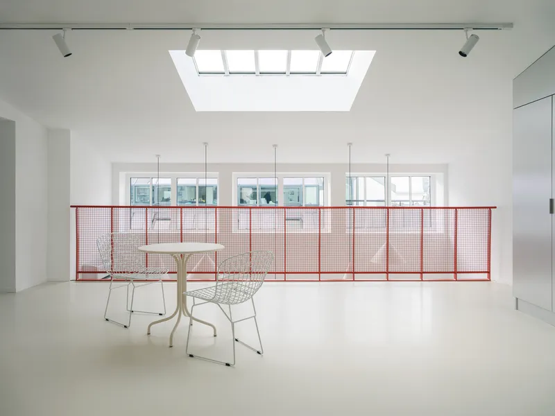

The building's most dramatic space is a double-height volume where a red perforated metal mezzanine hovers above, pendant lights drop at varying heights, and tall windows flood the room with natural light. It is the kind of space that would have once housed the largest presses, and you can feel the scale of the original industrial use even now. The mezzanine, accessed from above, provides both a functional upper level and a visual datum that defines the volume below.
On the upper levels, red mesh railings edge a void beside a central skylight, pulling daylight deep into the plan. These are not dramatic architectural set pieces so much as intelligent responses to the existing section. The building already had generous volumes and variable heights; the architects simply made sure those qualities survived the conversion and became assets rather than problems to solve.
Street Presence
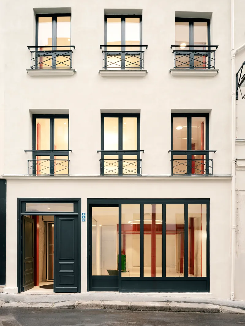

From the street, the building is purposefully understated. The white stucco facade with rows of metal balconies reads as a typical Parisian faubourg elevation, not a corporate headquarters. At dusk, ground-floor glazing reveals the illuminated interior, offering a glimpse of the red structure within, but the building does not shout for attention on the streetscape. It belongs to its block.
The black-framed windows and metal railings have been treated with precision but without the heaviness of a full heritage restoration. The facade is clean and contemporary without pretending the building is new. It is an appropriate restraint for a district where the architecture has always been secondary to what happened inside the buildings.
Plans and Drawings
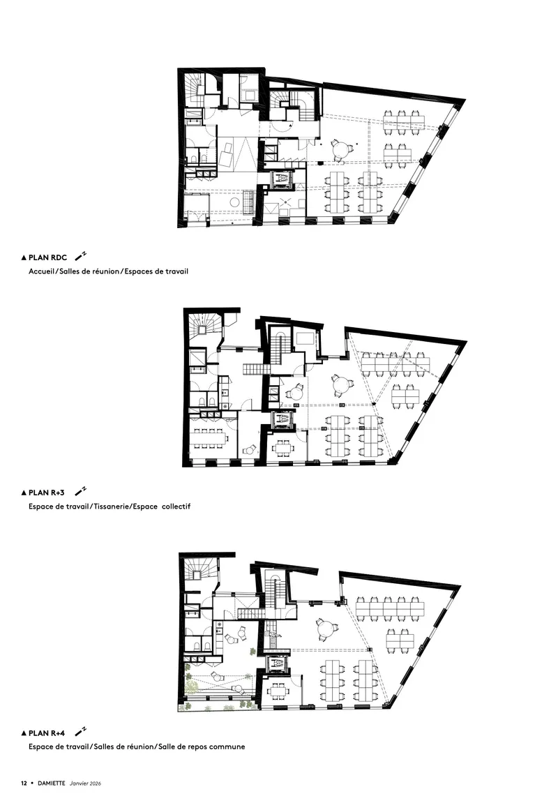
The stacked floor plans reveal the angular, irregular footprint that results from the merging of two buildings on a corner site. Workstations cluster in the larger floor plates while meeting rooms tuck into narrower zones. The angled exterior walls generate non-orthogonal geometries that the architects use to create pockets of spatial variety rather than fighting against them. The plans confirm what the photographs suggest: this is not a building that surrendered to a generic office layout.
Why This Project Matters
Workplace conversions are everywhere, and the vast majority follow a predictable script: strip it back, expose the brick, add a polished concrete floor, and call it creative office space. What Agathe Marimbert, Benjamin Exbrayat, Maxime Enrico, and Romain Granoux have done here is significantly more thoughtful. They treated the building's inconsistencies, its mismatched floor levels, its two distinct structural systems, its variable ceiling heights, as the design itself. The architecture emerges from the existing condition rather than being imposed on it.
The Sentier project also matters as a collaborative model. Three small practices working together on a complex Parisian renovation, each bringing a different sensibility, produced something that feels more considered and less ego-driven than many solo-authored conversions. The red steel, the concrete core, the material restraint on the facade: these are decisions that serve the building, not a brand. In a district defined by centuries of collective making, that feels exactly right.
Sentier, Contemporary Workplace by Agathe Marimbert Architecte, Exbrayat Enrico architectes, and Romain Granoux architecte. Paris, France. 1,000 m². Completed 2026. Photography by Jean Baptiste Thiriet.
About the Studio
Share Your Own Work on uni.xyz
If projects like this are the kind of work you want to make, uni.xyz is a place to publish your own, find collaborators, and enter design competitions.


Popular Articles
Popular articles from the community


Singing Woman: An Opera House That Performs Before the Curtain Rises
Ovidiu Cristian Pavel's conceptual opera house translates Estonia's choral identity into a sculpted waterfront landmark facing the Baltic Sea.

Manzana Morphosis: Stretching Barcelona's Grid into a Living Landscape for 2050
A radical reworking of the Eixample manzana turns density into a tool for generous public space, vertical ecology, and environmental performance.


Cube Design Draws an Ecological Corridor Between Two Shenzhen Hills with the Nankai Building
Beside Shenzhen's container docks, the Nankai Building pairs stacked balconies with a climbing green screen to connect two hillsides across its height.

David Ortega Stacks a Two-Story Mexico City Penthouse Around a Steel Stair and a Pergola-Shaded Roof Terrace
In Colonia Roma, a 300 m² penthouse uses oak joinery, a planted steel stair and a slatted roof pergola to make a new-build apartment feel like a house.

Similar Reads
You might also enjoy these articles

LAVA Architecten Gives Vocational Education a Sawtooth-Roofed Face on a Mechelen School Campus
In Mechelen, Belgium, a 2,053 m² STEM school on a 6×6 m grid turns workshops and classrooms into rooms that can be rearranged as teaching changes.

KEMA Studio Turns a Derelict Marvila Attic into a 60 m² Lighthouse Apartment Above Lisbon
In Lisbon's Marvila district, a rebuilt roof, four skylights and two plywood volumes turn an unlivable attic into a bright home facing the Tagus.

Pixel Gardens: One Repeated Module Stacked Into a Terraced Social Housing Tower for Famagusta
Salem Bader's shortlisted housing tower builds a vertical neighbourhood from one repeated module, offsetting units to carve terraces, light and air.

Bao Huynh Watercolor Atelier: A Serene Art Retreat in Hội An
Bao Huynh Watercolor Atelier in Hội An blends multifunctional art spaces, sustainable design, local materials, and family-friendly living in a serene environment.

Comments (0)
Please login or sign up to add comments
No comments yet. Be the first to comment!