

WIDOARQUITECTOS Carves a Monumental Studio from a Five-Meter-Wide Lot in Cuernavaca
A 150-square-meter office building on a narrow 5-by-15-meter plot uses vaulted ceilings, courtyards, and raw materials to project quiet strength.


Five meters wide and fifteen meters deep is not the kind of site that invites ambition. It is the kind of site that invites compromise: lower ceilings, thinner walls, borrowed light. WIDOARQUITECTOS, the Cuernavaca-based practice led by a design team including Iris Ovando, Dafne Muñoz, and Carla Jacobo, refused that logic for their own office. Instead, they treated the constraint as the entire premise, building a 150-square-meter, three-story studio that generates a sense of scale and gravity precisely because the lot demands it.
Completed in 2026, the project sits in Cuernavaca, Morelos, a city whose mild climate and volcanic landscape have long attracted architects interested in the relationship between indoor and outdoor living. What makes this building worth examining is not novelty but conviction. The vocabulary is familiar: concrete, wood, brick, plaster, planting. The intelligence lies in how those elements are orchestrated within an almost absurdly tight footprint to create double-height volumes, borrowed light, cross-ventilation, and a genuine interior courtyard. It is, in a very direct way, a statement about what a small practice needs from its workspace and what it believes architecture can still do with limited means.
Two Faces on a Narrow Street
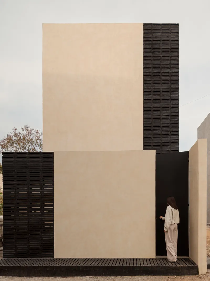
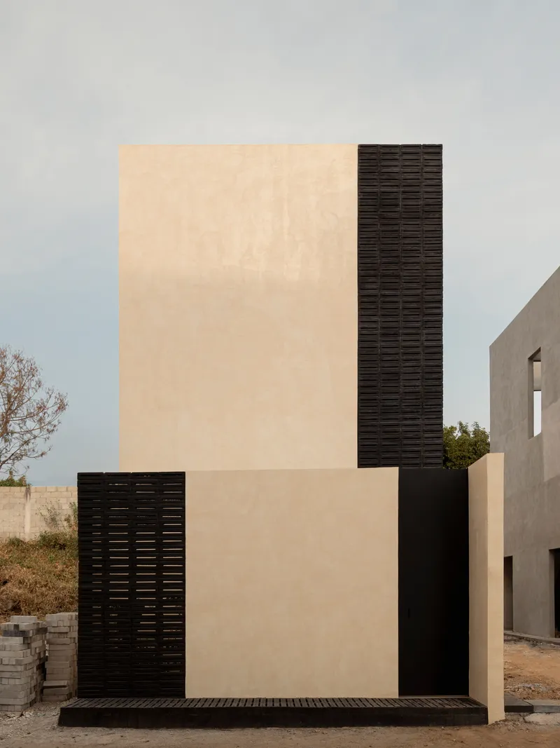
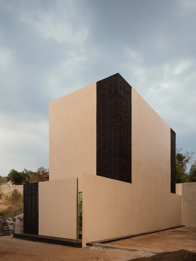
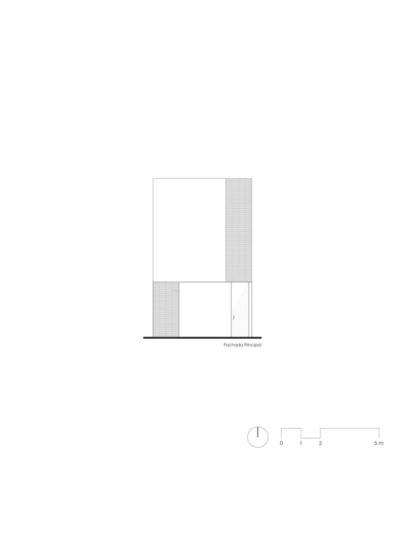
The street elevation reads as a composed, almost graphic exercise in surface and void. Cream-toned plaster planes sit against vertical bands of dark textured brick, creating a rhythm that is too precise to be decorative and too deliberate to be incidental. The brick, likely locally sourced and laid with visible texture, does the heavy lifting in terms of material presence. It anchors the facade in something physical while the smooth plaster recedes and breathes.
What prevents this from becoming a flat composition is the depth of the entry opening, which carves into the facade and reveals the building's thickness. Horizontal louvers on the upper level add a second layer of information, suggesting habitation and screening without revealing the interior. The result is a facade that communicates sobriety and weight, two qualities that feel increasingly rare in small commercial buildings designed to attract attention through other means.
A Courtyard That Earns Its Place
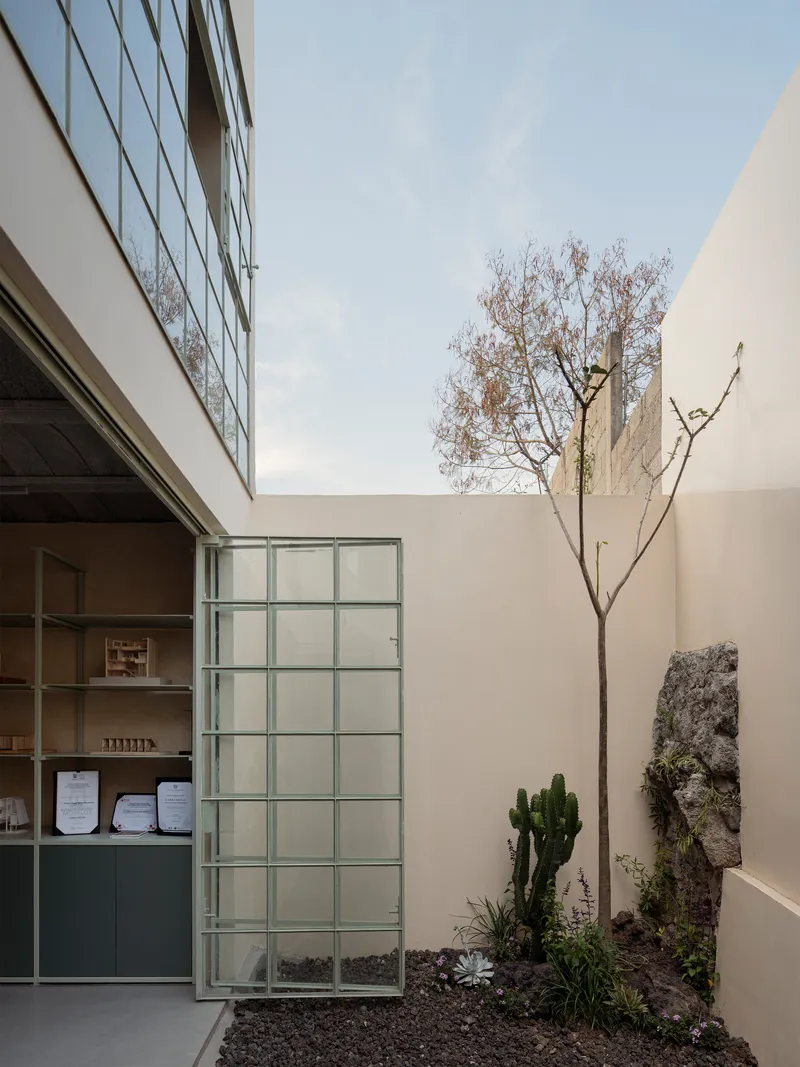
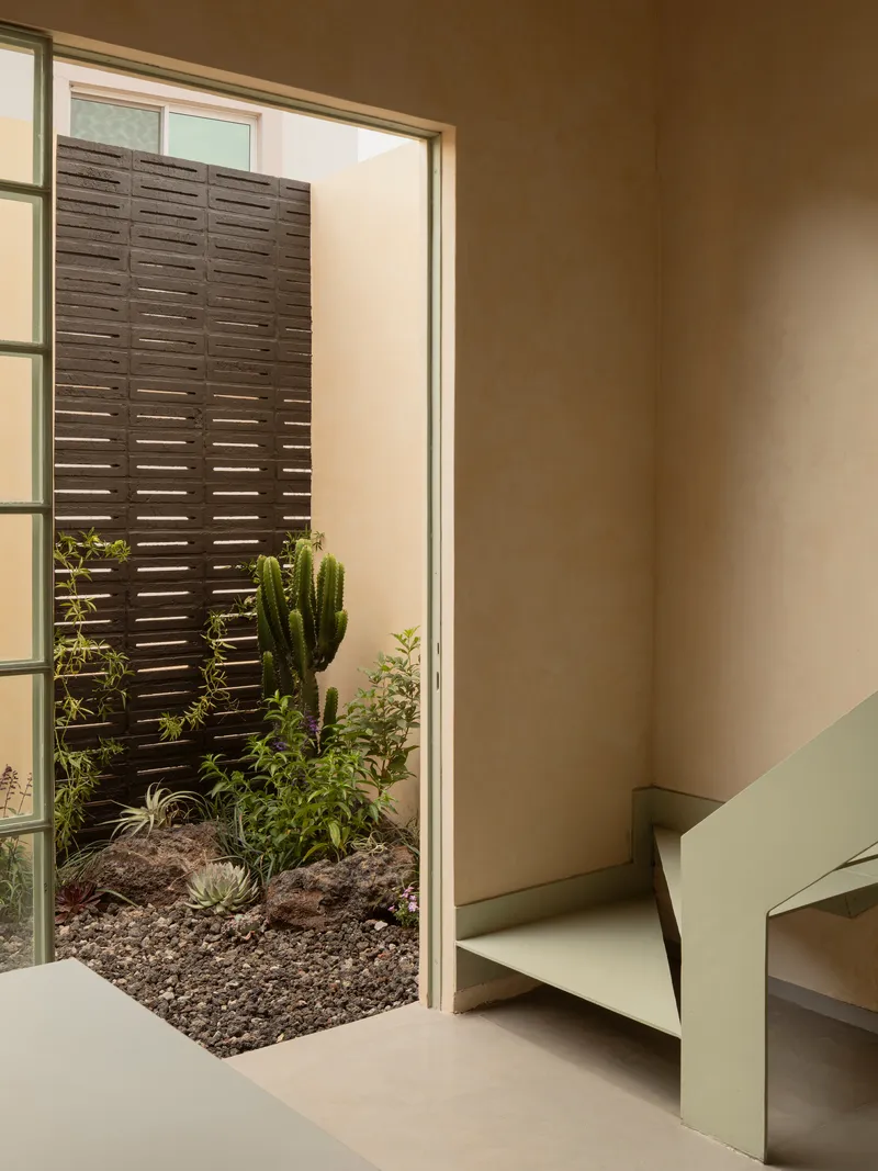
Dedicating any square meters to an open courtyard on a 75-square-meter footprint is a bold decision. WIDOARQUITECTOS did it anyway, and the building is entirely dependent on it. The courtyard, planted with cacti, succulents, and volcanic rock beneath a bare tree, serves as the building's lung: it draws light down through the section, ventilates the interior spaces, and creates a visual anchor that makes the narrow plan feel oriented rather than squeezed.
The landscaping, handled by Verde Manifiesto, makes a smart choice by staying dry and textural. There is no lawn, no irrigation-heavy planting. The gravel and volcanic stone connect the courtyard to the broader geology of Morelos, and the cacti will only thicken with time. It is a courtyard designed to age well, which is more than can be said for most.
Vertical Workspace, Stacked Logic
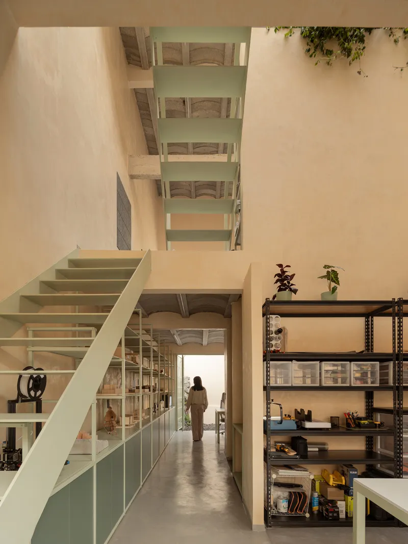
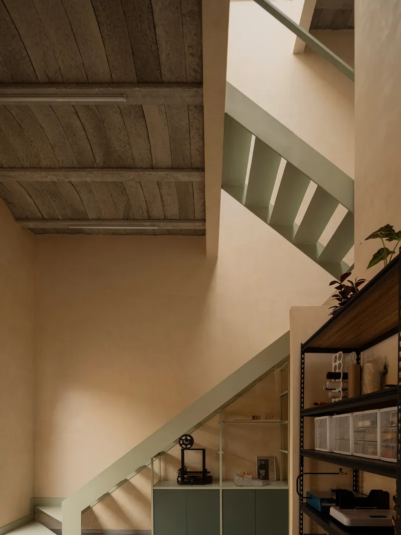
The building organizes itself vertically out of necessity. The ground floor holds the public functions: meeting room, kitchen, bathroom, and entry garden. The first floor is the main project workspace. The second floor houses the principal office and a terrace. Circulation happens along a pale green staircase that runs continuously through the section, pulling light from a skylight above and channeling it downward like a vertical well.
That staircase color, a muted celadon green, is one of the building's few chromatic gestures. It is applied to the handrail, the ladder in the double-height space, and select joinery details. Against the polished concrete floors and exposed timber ceilings, the green reads as both practical and gently eccentric, a signature without being a brand.
Double Height as Working Atmosphere
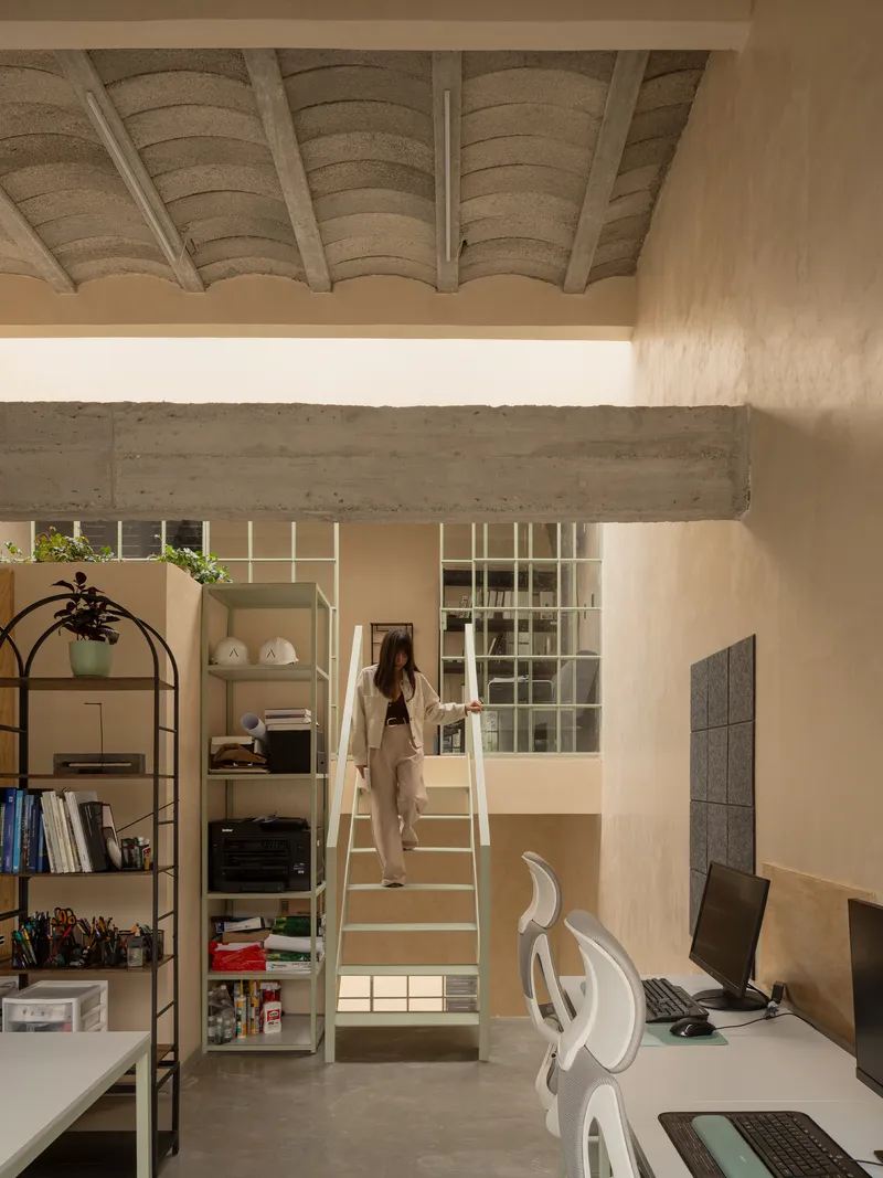
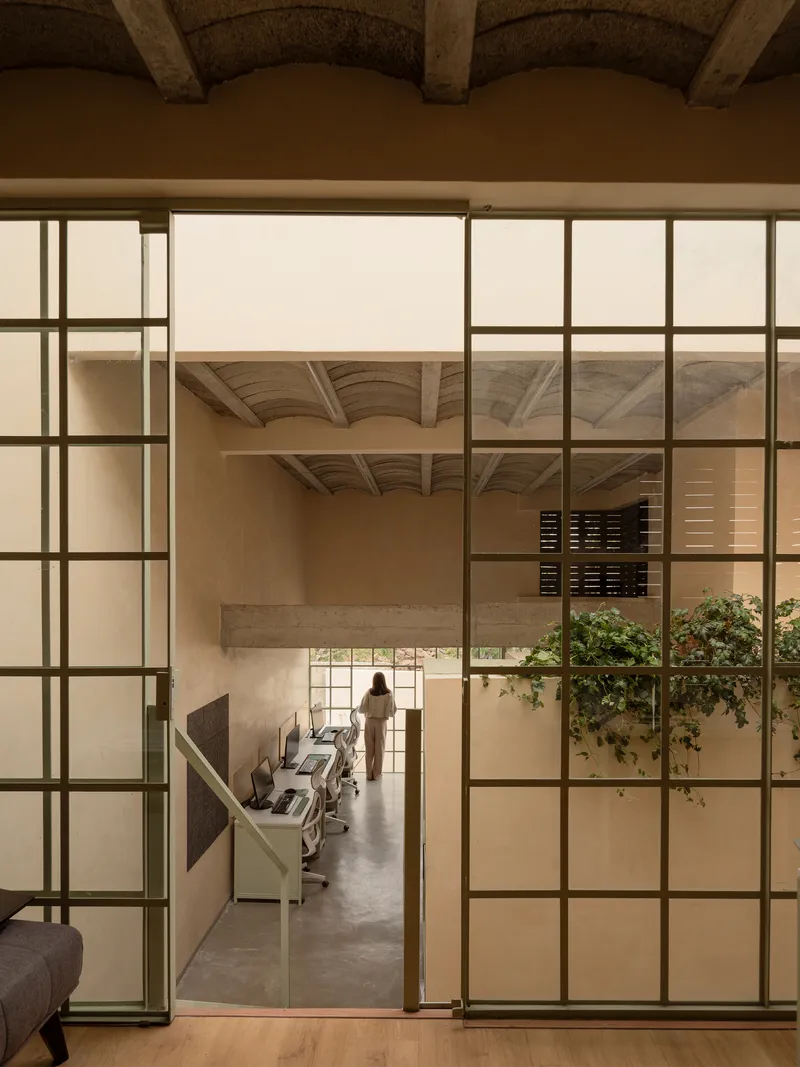
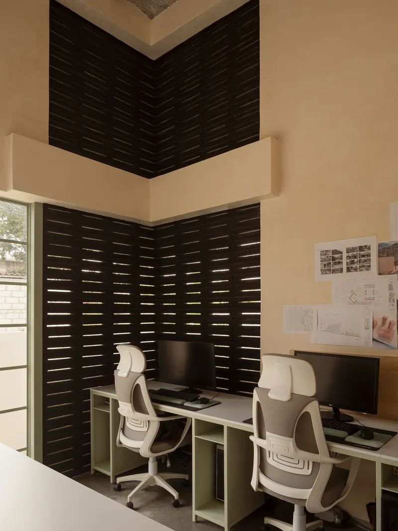
The main workspace occupies a double-height volume spanned by an exposed concrete beam and crowned by a vaulted ceiling. This is where the claim to monumentality becomes legible. The vault, modest in span but generous in proportion, transforms what could have been a cramped mezzanine condition into an open, breathing room. Natural light enters from both the courtyard side and the street-facing louvers, creating a layered illumination that shifts throughout the day.
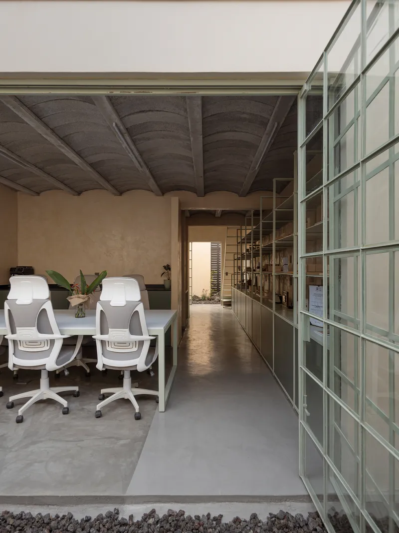
Steel-framed glazed partitions separate zones without breaking the spatial continuity, and translucent gridded glass walls allow light to pass between program areas while maintaining acoustic separation. Pinned drawings on the walls and a rolling ladder confirm this as a working studio rather than a showroom. The architecture does not perform for visitors; it performs for the people producing work inside it, which is exactly the right priority for an architect's own office.
Light Control Through Louvers and Glass
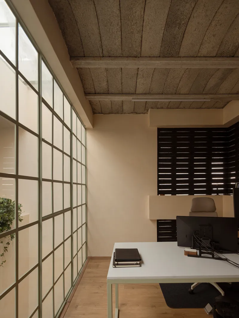
In a climate as mild and sunny as Cuernavaca's, light management matters more than light maximization. The building deploys horizontal louvered screens on the upper facades to filter direct sun while still admitting diffused light and air. Translucent glass walls on the interior act as secondary filters, distributing light into corridors and service areas that would otherwise go dark.
The timber-beamed ceilings add warmth and texture to spaces that could easily feel institutional under bare concrete. Combined with the polished concrete floors, the palette holds together tightly: wood above, stone below, filtered light in between. It is a controlled environment built from simple, repeatable moves rather than elaborate mechanical systems.
Plans and Drawings
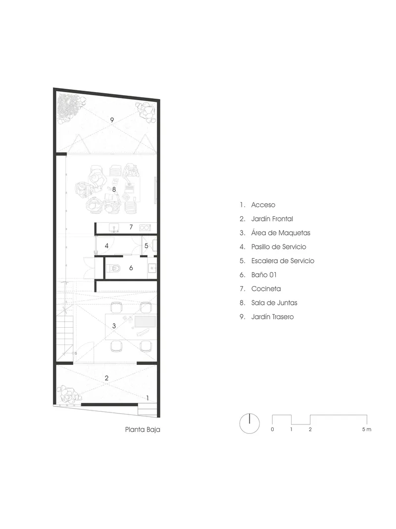
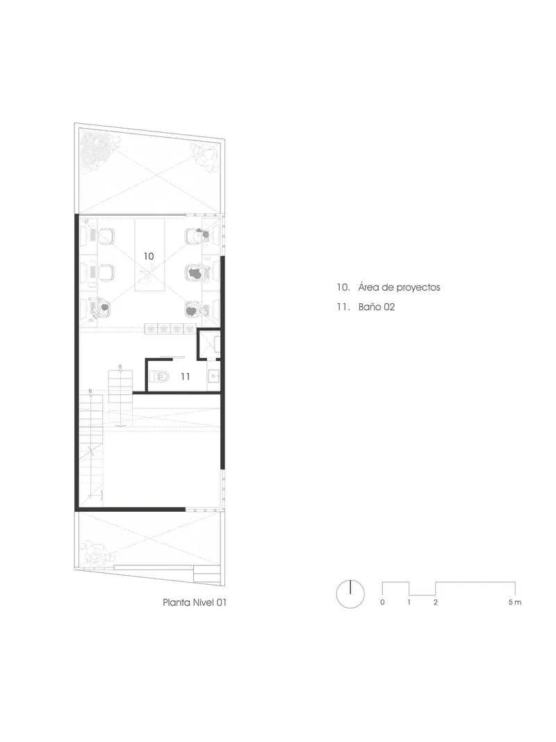
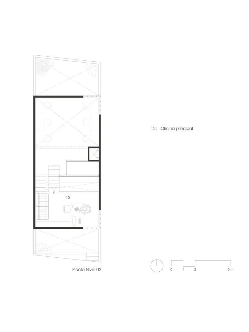
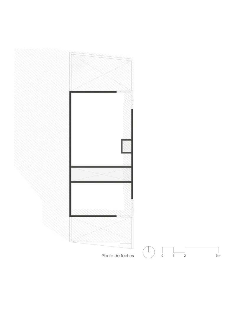
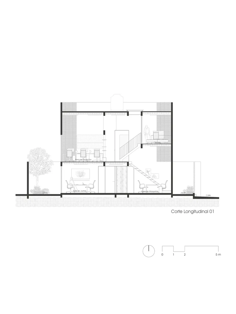
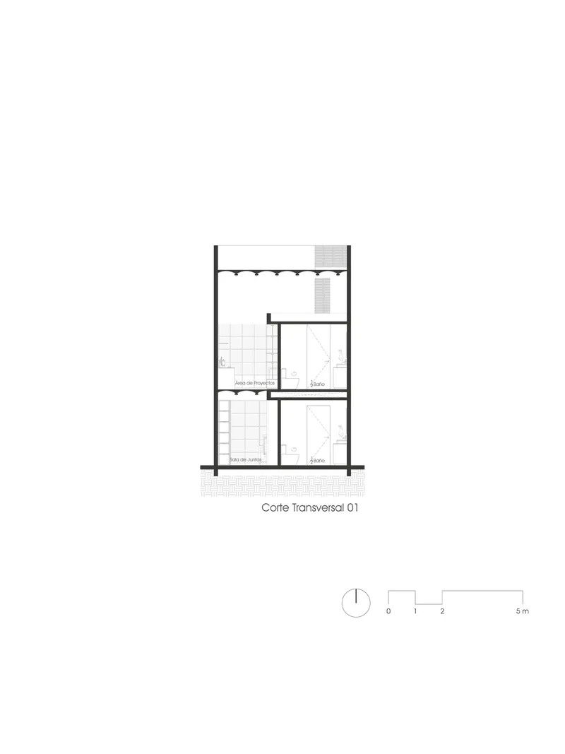
The floor plans confirm how tightly the program is packed into the narrow lot. The ground floor plan reveals the entry sequence: a front garden gives way to the meeting room, with kitchen and bathroom tucked along the party wall. The first floor is given almost entirely to the open project workspace, while the second floor opens onto a terrace that compensates for the building's dense interior condition. The longitudinal section is the most revealing drawing, showing how the double-height void, the courtyard, and the stairwell work together to create vertical spatial connections that the plan alone cannot communicate.
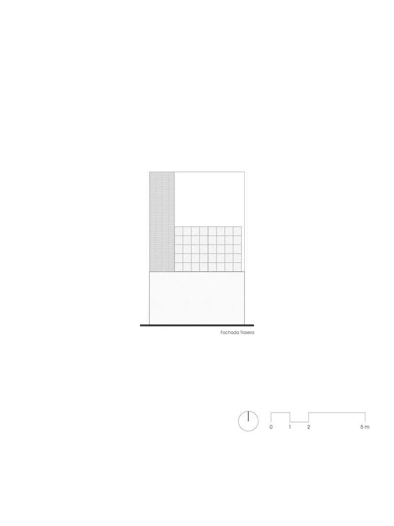
The elevation drawings illustrate the careful asymmetry of the facade composition: textured brick panels are placed off-center, the entry is recessed, and the upper balcony receives a grid-patterned screen. These are not arbitrary formal decisions. Each element corresponds to an interior condition, whether screening a workspace, marking a threshold, or ventilating a corridor.
Why This Project Matters
There is a long tradition of architects designing their own studios as manifestos, and WIDOARQUITECTOS has added a compelling entry to that list. The building does not argue for technology, parametric geometry, or spectacle. It argues for proportion, material honesty, and the spatial potential hiding inside constrained sites. On a lot most developers would dismiss or fill to its edges with a generic box, this team carved out a courtyard, vaulted a ceiling, and built a workspace that prioritizes daylight and air movement over every available square meter of leasable floor.
For practices working in Latin American cities where narrow, deep lots are the norm rather than the exception, this project offers a useful precedent. It demonstrates that density and dignity are not in conflict, and that the most effective way to prove what your practice believes is to build it for yourself first. The 150-square-meter footprint is small. The conviction behind it is not.
WIDOARQUITECTOS Office by WIDOARQUITECTOS (Design Team: Iris Ovando, Dafne Muñoz, Carla Jacobo). Located in Cuernavaca, Mexico. 150 m². Completed 2026. Photography by César Belio.
About the Studio
Share Your Own Work on uni.xyz
If projects like this are the kind of work you want to make, uni.xyz is a place to publish your own, find collaborators, and enter design competitions.


Popular Articles
Popular articles from the community


Opera on the Sea: Driftwood Logic Shapes a Timber Opera House on Estonia's Coast
Trevor Orgill's opera house translates the entangled drift of floating timber into a civic building where wood, water, and music converge.
Faces of the Soviet Avant-Garde: Turning Moscow's Street Names into an Open-Air Museum
A network of sculptural installations across a Moscow residential district transforms forgotten architect names into spatial encounters with cultural memor

Manzana Morphosis: Stretching Barcelona's Grid into a Living Landscape for 2050
A radical reworking of the Eixample manzana turns density into a tool for generous public space, vertical ecology, and environmental performance.
Extended Shell: Retrofitting Kolkata's Balconies as Living Urban Thresholds
A modular retrofit system recovers the social and environmental intelligence of Kolkata's historic verandas for contemporary Park Street residents.

Similar Reads
You might also enjoy these articles

Bao Huynh Watercolor Atelier: A Serene Art Retreat in Hội An
Bao Huynh Watercolor Atelier in Hội An blends multifunctional art spaces, sustainable design, local materials, and family-friendly living in a serene environment.

Atelier Macri Concept Store Interior Design by CASE-REAL
Atelier Macri store features a "ko" counter, walnut wood details, cork displays, blending retail, gallery, and seamless customer experiences.

Manuel Vargas Izquierdo Stadium and High-Performance Sports Center: Architectural Excellence in Jalpa de Méndez
The Manuel Vargas Izquierdo Stadium blends sustainable design, inclusive sports facilities, and cultural-inspired architecture, revitalizing Jalpa de Méndez’s public spaces.
KAKR Buluh Awar Hall: Revitalizing Community and Ecology Through Bamboo Architecture
Community built bamboo hall revitalizes Buluh Awar village, empowering youth, restoring ecology, celebrating vernacular craftsmanship through sustainable architecture and culture.

Comments (0)
Please login or sign up to add comments
No comments yet. Be the first to comment!