

WilkinsonEyre Bridges Toronto's Rail Corridor with a Diagrid Twin-Tower Campus
CIBC Square stitches Toronto's financial district to its waterfront with 330,000 square meters of office space and an elevated public park.


Toronto's financial district has long turned its back on the waterfront. Train tracks, an elevated expressway, and the congested throat of Union Station have formed a hard barrier between Bay Street's towers and the lake. CIBC Square, designed by WilkinsonEyre, attacks that problem directly: two 250-meter towers straddle the rail corridor, linked at the fourth floor by a one-acre elevated park that physically bridges the infrastructure below. Where a parking lot and an aging bus terminal once stood, there is now a 330,000-square-meter urban campus that integrates transit, public space, and commercial floorplates into a single interconnected organism.
What makes this project worth studying is not its height or its program but its facade logic and its infrastructural ambition. The towers wear a three-dimensional diamond diagrid that catches light differently at every angle, a deliberate counterpoint to the flat, dark curtain walls of Mies van der Rohe's Toronto-Dominion Centre next door. The floor plates are reportedly almost identical to Mies's plans, but the envelope rewrites the visual language of the district. Below the lobbies, a new bus terminal for Metrolinx slots into the podium, turning the base of the project into a transit hub rather than a decorative plinth.
A Diagrid That Earns Its Complexity
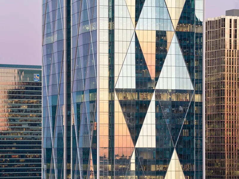
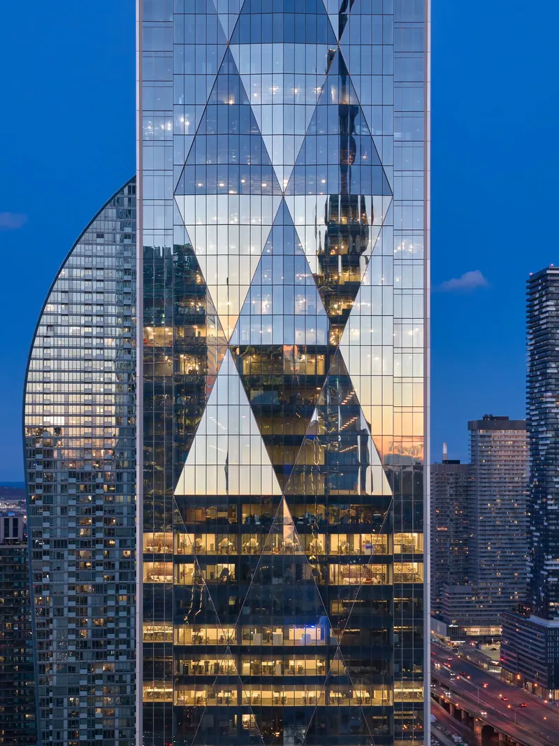
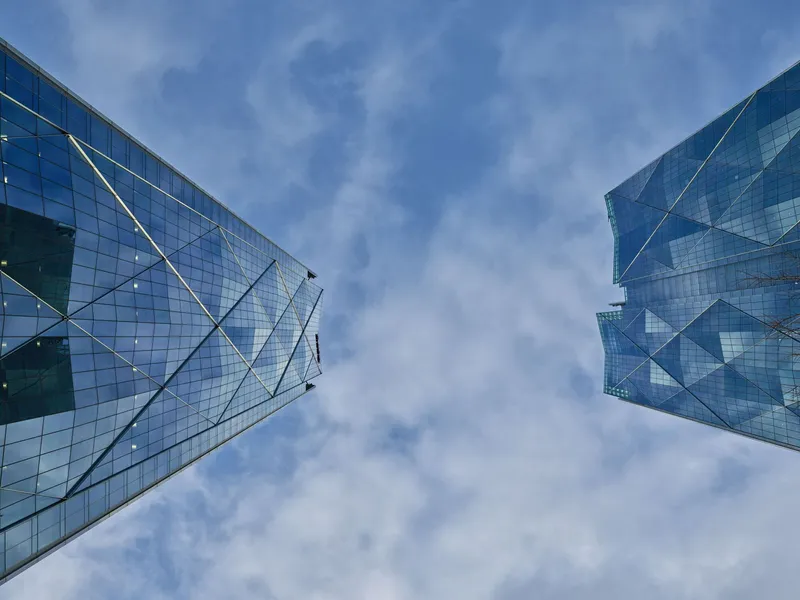
The facade's diamond pattern repeats every ten storeys, producing a rhythm that registers clearly from the street but dissolves into texture at a distance. Chamfered corners and glazing that continues past the top floor give the curtain wall a weightless quality, as though the structural bracing is holding up air rather than cladding. The triangulated panels catch reflections of adjacent buildings and the sky in constantly shifting facets, lending the towers a kinetic quality that flat glass walls simply cannot achieve.
The diagrid is not purely decorative. The hybrid structure pairs a concrete core housing all vertical movement with a steel skeleton that radiates outward, and 12 massive steel nodes at level three, some weighing up to 40 metric tons, transfer loads from 48 floors above down through V-shaped castings into the podium. The visual expression of the diagonal bracing on the exterior is, in part, a legible trace of that structural logic.
Twin Towers, One Skyline Move
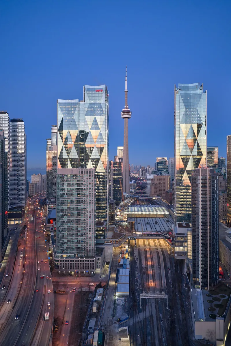
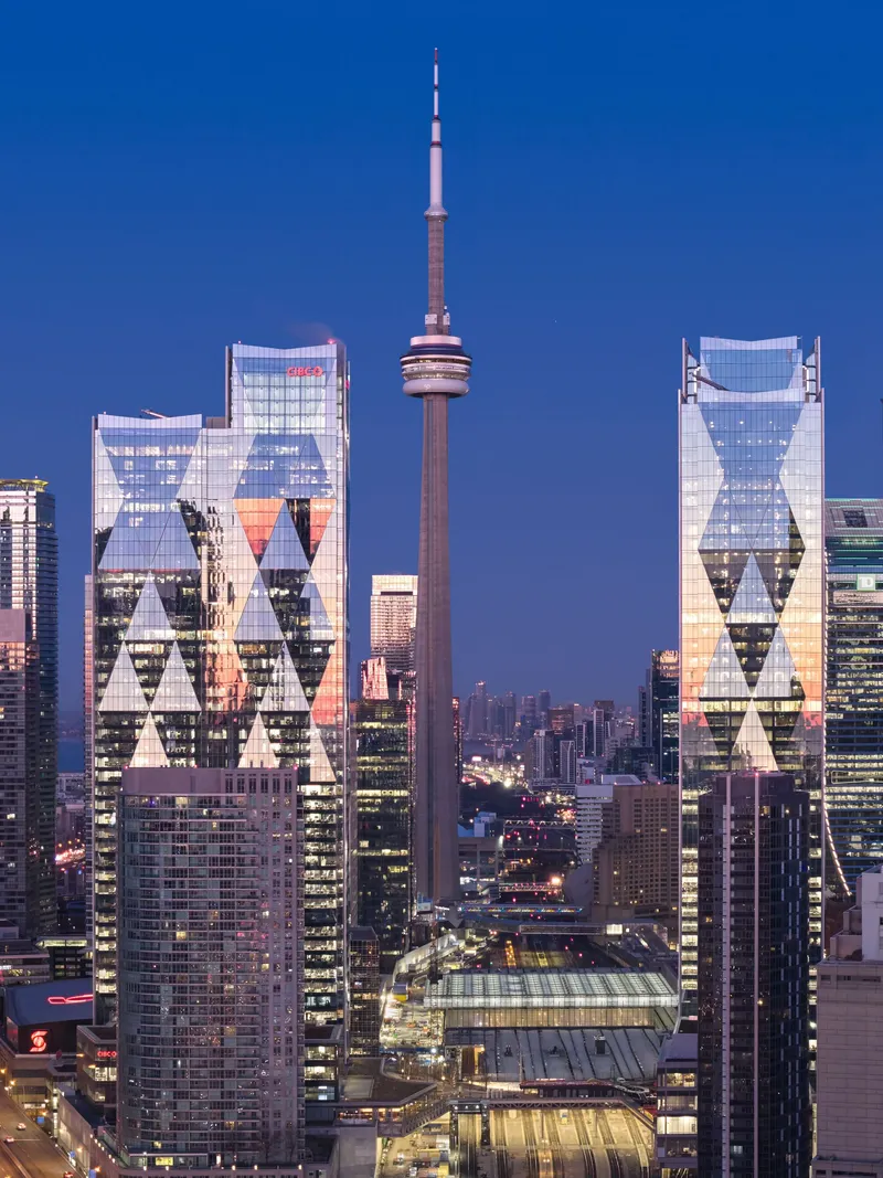

Seen from a distance, the paired towers read as a deliberate composition rather than two separate buildings. Each volume is articulated as two slipped, slender rectangles placed against each other, split by a vertical notch that breaks down their mass. The stepped profile and the expression of a crown at the top of each building give them a finished silhouette, avoiding the flat-topped monotony that plagues many commercial towers. At twilight, when the interior lights glow through the diagrid, the towers become lanterns flanking the rail corridor.
The siting is precise. The towers frame views through to the CN Tower and the lake while keeping a respectful distance from Union Station's heritage architecture. They do not dominate the older building so much as grow out of the same infrastructural seam, treating the rail corridor as a shared spine rather than a leftover gap.
Ground Plane and Heritage Dialogue
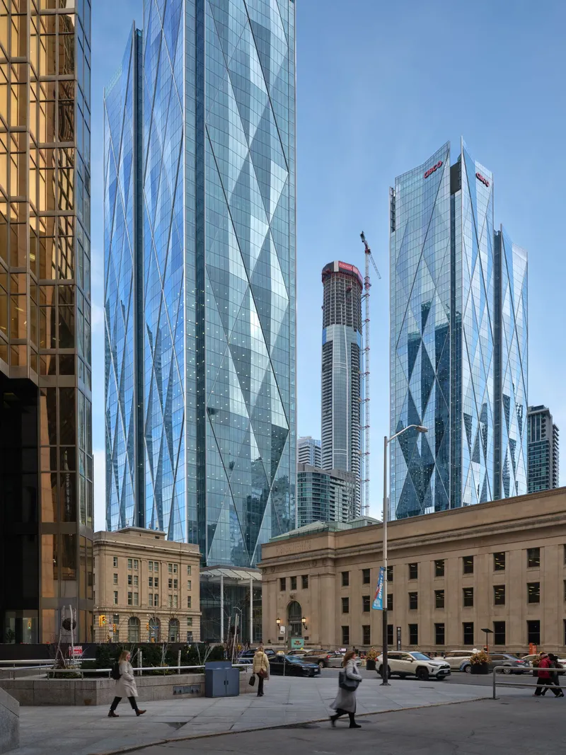

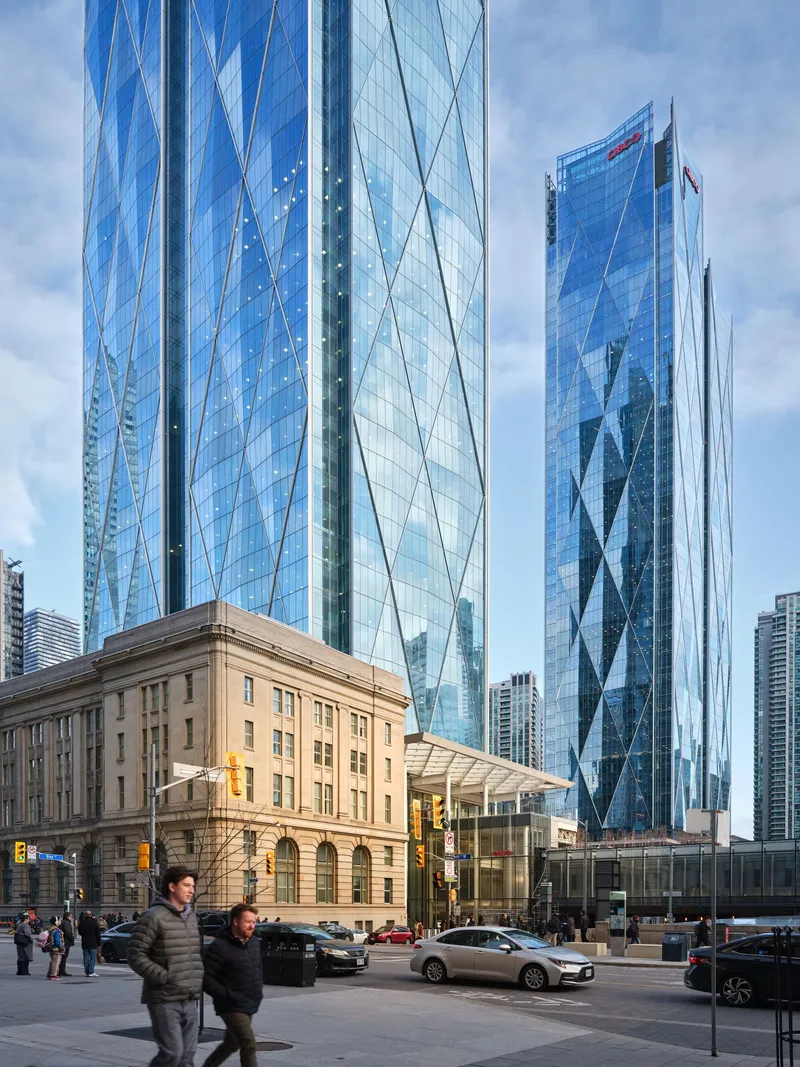
At street level, the project negotiates a dense heritage context. Sandstone and limestone facades from Union Station and adjacent buildings sit directly against the glass and steel of the new towers. The transition is handled through a series of glass canopies and diagonal lattice structures that mediate between the scale of the pedestrian and the scale of the tower above. These canopies are generous enough to shelter public life without feeling like corporate barricades.
Three new public plazas activate the ground plane, connected by an urban laneway that threads between the towers. The intention is clear: to make the base of a commercial campus feel like a piece of city rather than a private forecourt. Whether that ambition survives corporate security protocols over the coming decades is another question, but the architecture at least provides the right bones.
The Glass Pavilion and Elevated Park


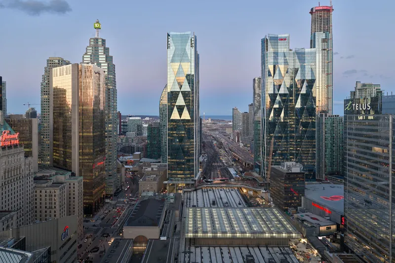
The glass pavilion entrance, with its diagonal lattice canopy, signals the presence of something beyond a standard office lobby: a pedestrian bridge and sky park that span the rail corridor at the fourth floor. Designed by landscape architects Public Work, the one-acre park incorporates slopes, hills, shade groves, and balconies, creating varied topography on what is essentially a structural deck over active train tracks. In winter, an ice rink replaces green space, keeping the park operational year-round rather than letting it become a seasonal amenity.
The elevated park is the project's most public-facing gesture. Sky lobbies in both towers open directly onto it, blurring the line between corporate amenity and civic space. The success of this idea depends entirely on access: if pedestrians can reach the park without passing through turnstiles, it will become genuine connective tissue. If not, it risks being a landscaped rooftop for office tenants and little more.
Lobby Materiality


The 25-meter-tall lobbies are restrained in their palette: vein-cut travertine slabs on the rear walls, bronze metalwork on lift doors and reception desks, and suspended black ceiling elements that compress the scale at the turnstile zone before the volume opens up above. The travertine is backlit at its edges, turning stone into a luminous surface rather than a heavy cladding material. It is a quiet interior that lets the scale of the space do the talking.
The lobby design acknowledges that these are workplaces, not museums. The security infrastructure is visible but not aggressive, and the material choices prioritize durability over spectacle. Bronze and travertine will age gracefully in a way that painted drywall and LED panels will not.
Dusk and the Urban Edge
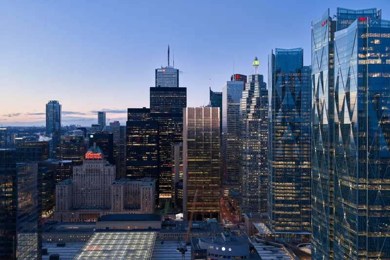
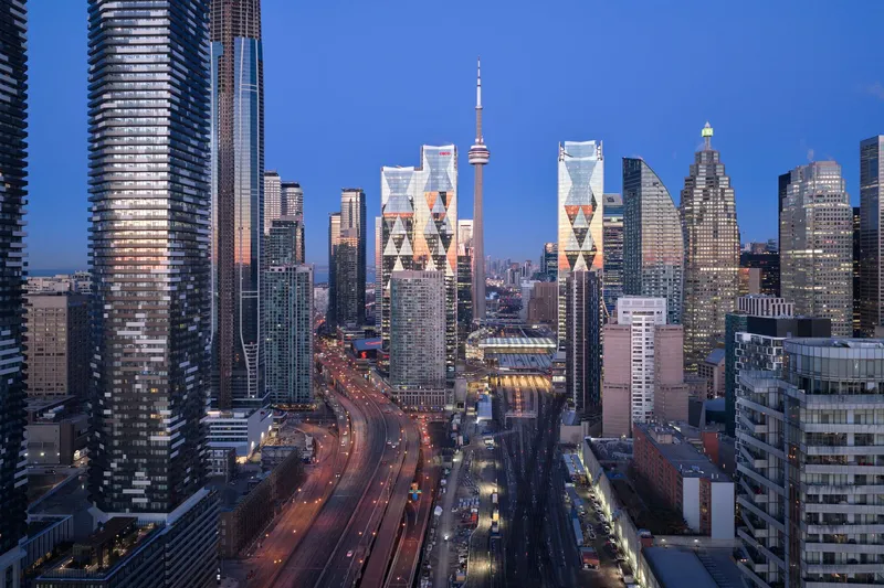
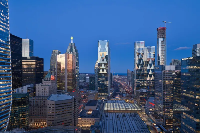
The project's relationship to the broader skyline is most legible at dusk, when the rail corridor glows beneath the towers and the Gardiner Expressway's car lights streak through the foreground. CIBC Square does not try to stand apart from its context. It accepts the noise of highways, rail infrastructure, and competing towers as the reality of its site and works within that density rather than retreating from it.
The illuminated glass roofs of the transit station at the base reinforce the project's hybrid identity: part office campus, part infrastructure, part public realm. Very few commercial developments manage to integrate all three without one category overwhelming the others. WilkinsonEyre has, at minimum, kept all three legible in the architecture.
Plans and Drawings
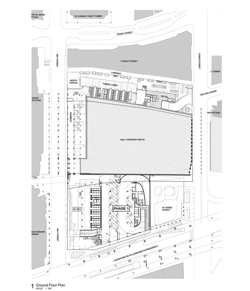
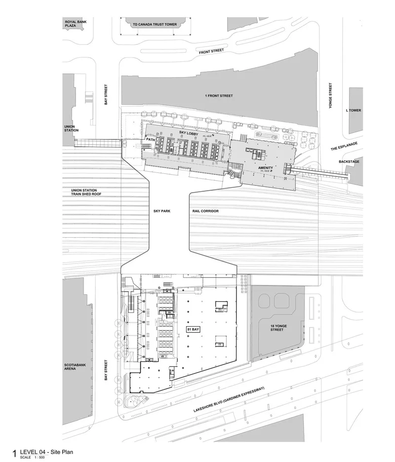
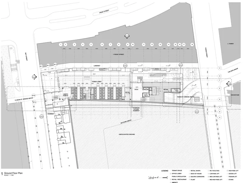
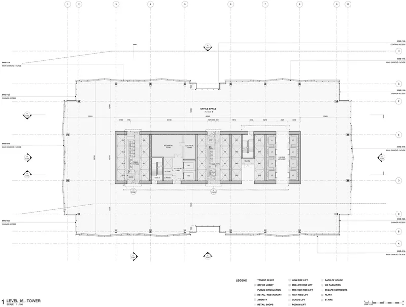
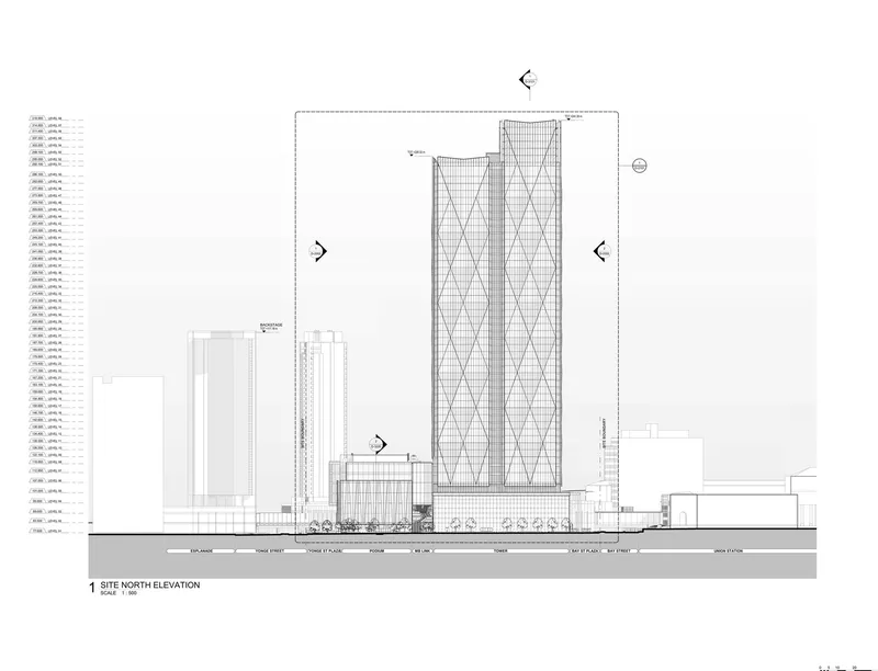
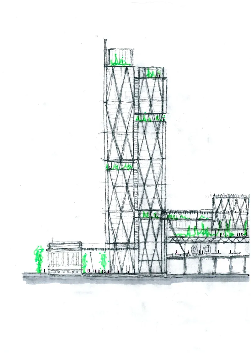
The ground floor plans reveal the extent of the infrastructural negotiation: the rail corridor cuts directly through the site, and the lobbies and concourses wrap around it rather than ignoring it. At level four, the sky park reads as a continuous green slab spanning the tracks, with retail frontage along the street edge. The level 16 floor plan shows efficient, core-centered office plates with open tenant areas radiating outward to the diagrid perimeter, maximizing daylight and views.
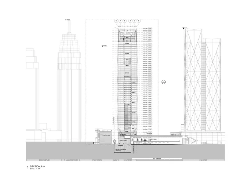
The section drawings are the most revealing. The diagonal exoskeleton is legible as a continuous structural system from podium to crown, and the green-highlighted occupied floors in the analytical section make clear how much of the tower's volume is given over to active program versus structure and services. The north elevation shows the diagrid's ten-storey repeat at full scale, a pattern that never feels monotonous because the depth of the diamond panels introduces shadow lines that shift through the day.
Why This Project Matters
CIBC Square matters because it treats infrastructure as architecture rather than as a problem to be buried. The bus terminal, the rail corridor, the pedestrian bridge, and the elevated park are not afterthoughts bolted onto a commercial tower; they are the organizing logic of the entire project. In a city that has spent decades letting highways and rail tracks sever its downtown from its waterfront, this campus represents a genuine attempt to heal that wound with built form.
The diagrid facade, meanwhile, offers a credible update to Toronto's modernist tower tradition. By keeping Mies's floor plates but wrapping them in a three-dimensional, light-catching envelope, WilkinsonEyre finds a way to honor the city's architectural DNA without repeating it. The result is a pair of towers that feel specific to Toronto rather than importable to any skyline, grounded in the particular challenges and opportunities of their site. That specificity, more than any LEED Platinum certification or WELL rating, is what will determine whether the project endures.
CIBC Square by WilkinsonEyre. Toronto, Canada. 330,000 m². Completed 2026. Landscape architects: Public Work.
About the Studio
Share Your Own Work on uni.xyz
If projects like this are the kind of work you want to make, uni.xyz is a place to publish your own, find collaborators, and enter design competitions.


Popular Articles
Popular articles from the community

Faces of the Soviet Avant-Garde: Turning Moscow's Street Names into an Open-Air Museum
A network of sculptural installations across a Moscow residential district transforms forgotten architect names into spatial encounters with cultural memor

Cloaked Colonization: A Mobile Underwater Habitat That Moves Like a Fish
Micah Abaya's shortlisted EHC Pacific entry reimagines ocean settlement as a dispersed network of self-sustaining architectural organisms.

Opera on the Sea: Driftwood Logic Shapes a Timber Opera House on Estonia's Coast
Trevor Orgill's opera house translates the entangled drift of floating timber into a civic building where wood, water, and music converge.

Temporary Home for Dogs: A Reversed Zoo Rethinks Animal Shelter Architecture
In Bucharest, a sinuous corridor and freed landscape flip the logic of containment, designing a shelter that works to make itself unnecessary.

Similar Reads
You might also enjoy these articles

Bao Huynh Watercolor Atelier: A Serene Art Retreat in Hội An
Bao Huynh Watercolor Atelier in Hội An blends multifunctional art spaces, sustainable design, local materials, and family-friendly living in a serene environment.

Atelier Macri Concept Store Interior Design by CASE-REAL
Atelier Macri store features a "ko" counter, walnut wood details, cork displays, blending retail, gallery, and seamless customer experiences.

Manuel Vargas Izquierdo Stadium and High-Performance Sports Center: Architectural Excellence in Jalpa de Méndez
The Manuel Vargas Izquierdo Stadium blends sustainable design, inclusive sports facilities, and cultural-inspired architecture, revitalizing Jalpa de Méndez’s public spaces.

KAKR Buluh Awar Hall: Revitalizing Community and Ecology Through Bamboo Architecture
Community built bamboo hall revitalizes Buluh Awar village, empowering youth, restoring ecology, celebrating vernacular craftsmanship through sustainable architecture and culture.

Explore City Square Competitions
Discover active competitions in this discipline

Challenge to design a portable theatre

Challenge to design a portable music platform

Challenge to design an open learning module for the elderly
Comments (0)
Please login or sign up to add comments
No comments yet. Be the first to comment!