

World Super Market by KiKi ARCHi: A Harmonious Retail Experience in Suzhou
World Super Market by KiKi ARCHi in Suzhou offers a vibrant, color-driven retail experience, blending luxury brands, textures, and immersive design.


The World Super Market by KiKi ARCHi redefines modern retail design, blending global luxury brand aesthetics with everyday warmth. Situated on the basement level of MATRO Department Store in Suzhou, the supermarket integrates multi-national brand resources from Matro Luxury Centre into a seamless, experiential environment.
Designed by Yoshihiko Seki, the concept draws inspiration from the color spectrum, using flowing color transitions and textures to craft a visually cohesive yet dynamic retail journey. This approach ensures that every visitor experiences not just a marketplace but a carefully curated narrative of materials, color, and spatial rhythm.

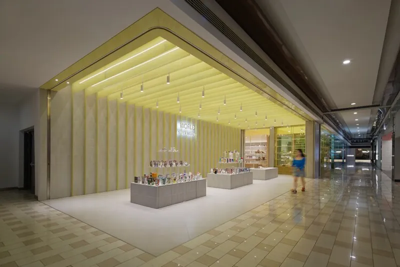
Architectural and Interior Design
Entrance and Spatial Flow
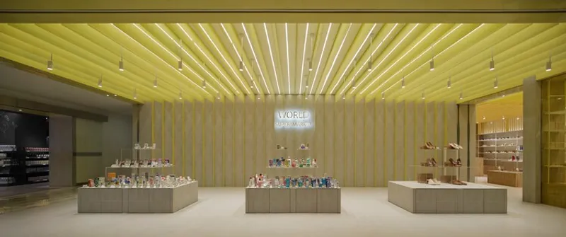
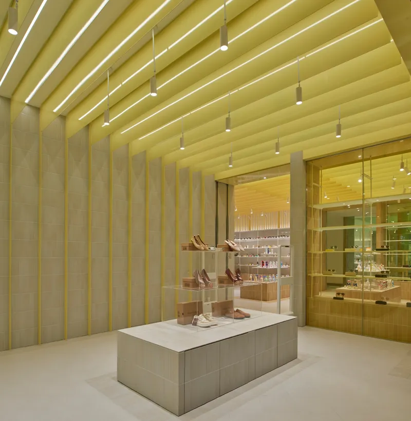
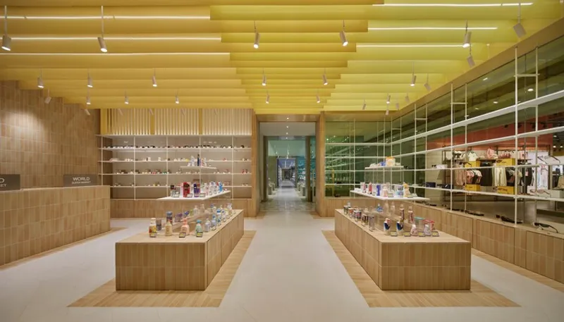
The entrance connects visually and emotionally to the original mall market, which features warm yellow tones. The designers extended this familiar visual memory into the main display area, ensuring a harmonious transition from surrounding spaces.
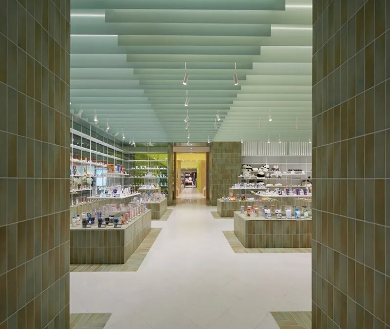
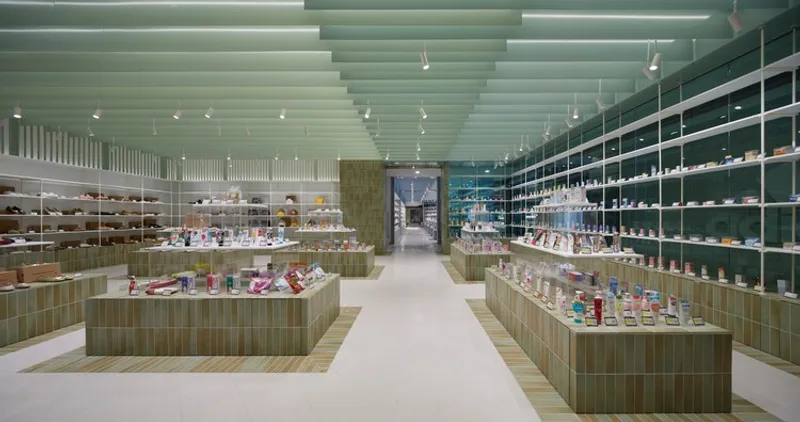
- Color Spectrum: Starting with yellow at the entrance, colors gradually shift through green to blue, creating a continuous visual axis. Each section maintains its distinct identity while contributing to a unified store experience.
- Spatial Rhythm: Existing 2-meter gaps between retail units were transformed into a rhythmic sequence, using partitions to introduce diversity and depth.
Materiality and Texture
The material palette emphasizes chic simplicity, including:
- Ceiling aluminum panels
- Small-format tiles
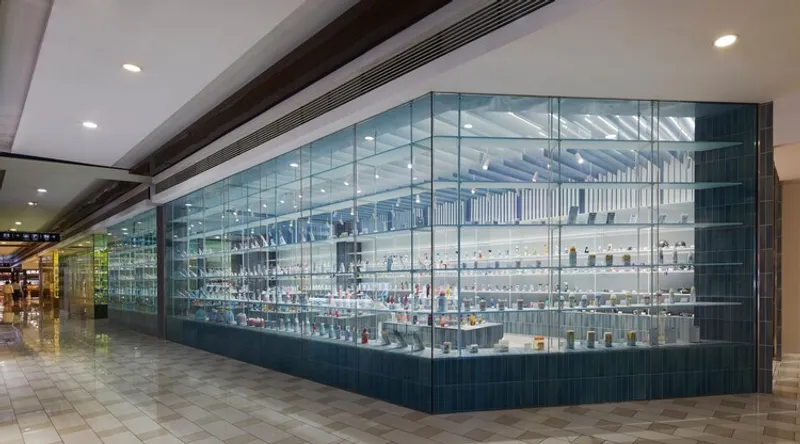
- Curtain-wall glass
Through careful proportioning and layering, these everyday materials create a subtle textural richness. A unified system logic governs the ceiling, walls, floor, and display fixtures, with colors and textures calibrated to flow naturally across each zone.
- Watercolor-Like Color Transitions: Color saturation is moderately restrained, producing gradual, seamless transitions across surfaces and materials.
- Layered Spatial Details: Ceiling panels overlap with slight saturation differences, aligned with original brick floor and aisle openings to create rhythmic visual symmetry.
- Wall and Display Integration: Small tiles echo each zone’s dominant color, while upper shelving returns to neutral white, balancing visual intensity.
Sensory and Experiential Design
World Super Market is not only about shopping, it is a multi-sensory experience:
- Visual Cohesion: A coherent color and material language guides visitors intuitively through the store.
- Rhythmic Navigation: Sequential layering of aisles and displays creates a sense of movement and discovery.
- Attention to Detail: From transitions between colors to the interplay of materials, every element reflects careful craftsmanship and deliberate design logic.
The overall effect is restrained yet abundant, offering clarity, fluidity, and subtle power in the retail experience.


World Super Market by KiKi ARCHi demonstrates how thoughtful interior design can elevate retail architecture, merging luxury branding, material innovation, and spatial harmony. Visitors are not just shopping: they are immersed in a meticulously woven, sensory-rich environment, where color, texture, and form converge in perfect balance.
All the photographs are works of Ruijing Photo


Popular Articles
Popular articles from the community

Tsunami Convergenics: Turning Catastrophic Ocean Forces into Underwater Housing Infrastructure
A speculative underwater settlement off the coast of Onagawa, Japan, treats tsunamis and typhoons as energy sources rather than threats.

Cloaked Colonization: A Mobile Underwater Habitat That Moves Like a Fish
Micah Abaya's shortlisted EHC Pacific entry reimagines ocean settlement as a dispersed network of self-sustaining architectural organisms.
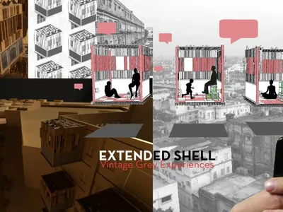
Extended Shell: Retrofitting Kolkata's Balconies as Living Urban Thresholds
A modular retrofit system recovers the social and environmental intelligence of Kolkata's historic verandas for contemporary Park Street residents.
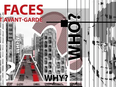
Faces of the Soviet Avant-Garde: Turning Moscow's Street Names into an Open-Air Museum
A network of sculptural installations across a Moscow residential district transforms forgotten architect names into spatial encounters with cultural memor

Similar Reads
You might also enjoy these articles


Hodi-Mandai Geram
Project Function: Preservation and revitalization of the Intangible heritage and socio-spatial identity of the Hodi by Housing, Cultural Memory Center, Sacred Grove, landscape, local tourism economy

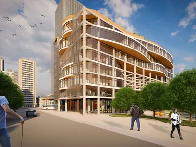
Olio Towers: A Mid-Rise for Performers That Fuses Housing, Rehearsal, and Stage
Located blocks from Houston's Theater District, this modular tower stacks living units around a central performance atrium.

Oasis: Modular Green Housing Carved into Dhaka's Urban Fabric
A shortlisted Plugin Housing entry reclaims unauthorized settlements in Dhaka with stepped concrete volumes, green roofs, and ventilation-driven design.

Black Hole: A Floating Megastructure for the Post-Physical Era
Emiliano Mazzarotto envisions a spherical, self-scaling arena where e-sports, digital hotels, and holographic stadiums replace traditional public space.

Explore Shopping Mall Competitions
Discover active competitions in this discipline

Challenge to reimagine the Iron Throne

Photograph architecture without architects

Illustrate the lost glory of Angkor Wat - Render Challenge

Design challenge to reuse E-waste
Comments (0)
Please login or sign up to add comments
No comments yet. Be the first to comment!