
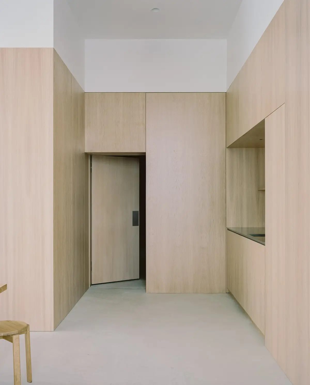
Actual Office Turns South London Shell Spaces into a Warm, Steel-Accented Shared Living Scheme
At Cherry Orchard, a restrained palette of pale timber, white brick, and polished steel gives communal living a sense of quiet permanence.


Shared living in London has, for the most part, been defined by two poles: the overdesigned co-living brand with its millennial pink and rattan pendants, or the underdesigned HMO with its fire doors and laminate counters. Cherry Orchard, a 600 square meter fit-out by Actual Office, occupies neither camp. Completed in 2025 in South London, the project transforms a series of interconnected shell volumes into a residential environment where the design language is simple, consistent, and surprisingly material. The effect is closer to a small institution than a lifestyle product, and that is a compliment.
What makes the project worth studying is the discipline of its palette. Pale timber, white-painted brick, polished stainless steel, and sheer curtain fabric. That is essentially the entire material vocabulary. The architects use these four elements to differentiate rooms, create moments of intimacy, and provide spatial orientation across what could easily read as a monotonous series of white boxes. Instead, each space carries its own character through proportion, light quality, and a few carefully placed details. It is the kind of restraint that only works when the details are genuinely resolved.
Arrival and Threshold
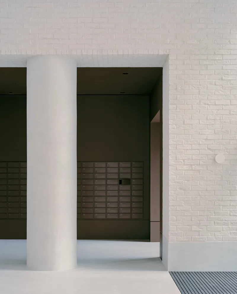
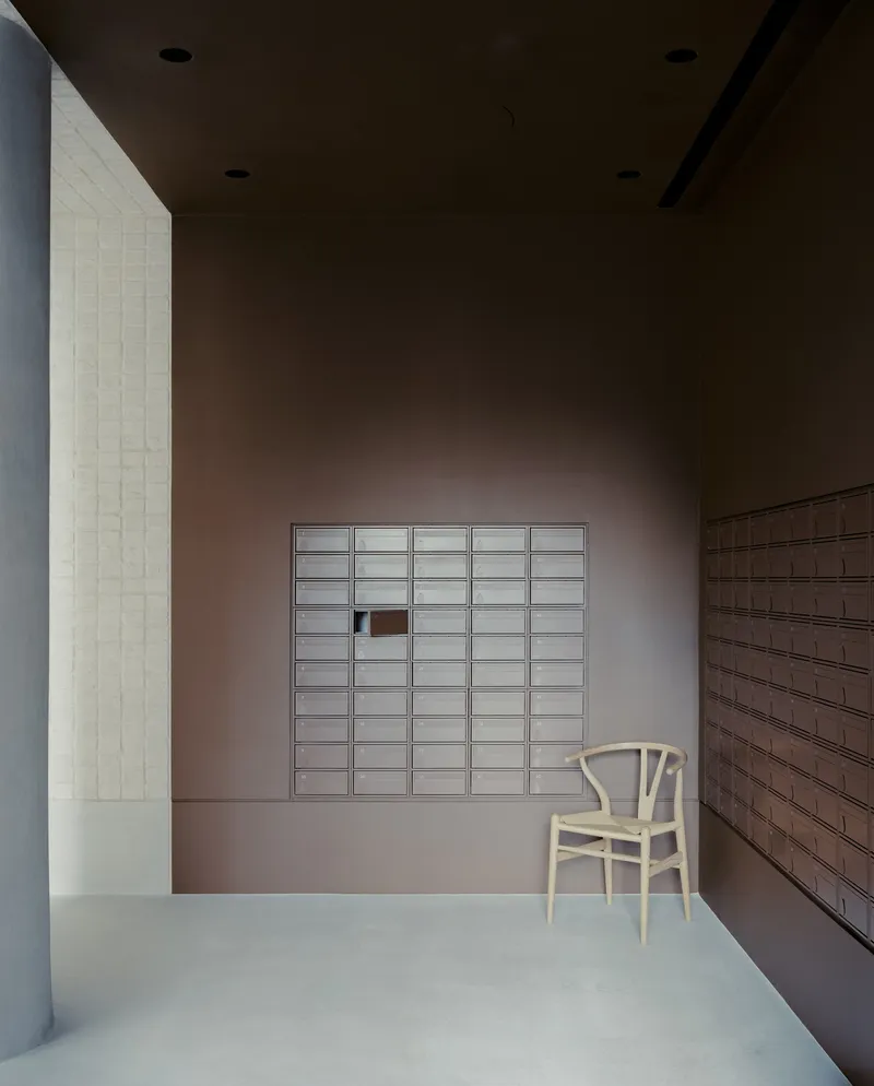

The entrance sequence sets the tone immediately. A white circular column frames the approach into a dark vestibule, compressing the view before you arrive at a wall of frosted glass letterboxes set into terracotta-toned plaster. It is a small gesture, but it does real work: the letterboxes signal that this is a place where multiple people live, while the plaster color distinguishes the threshold from the cooler whites beyond. The courtyard elevation, with its deep-set openings punched into a white brick base beneath rendered upper walls, suggests a building that is both open and protective.
Actual Office clearly understands that shared living depends on the quality of transitions. The move from public approach to semi-private courtyard to private room matters as much as the rooms themselves. Getting the grain of that sequence right is what separates a project like this from the co-living conveyor belt.
The Courtyard as Social Center
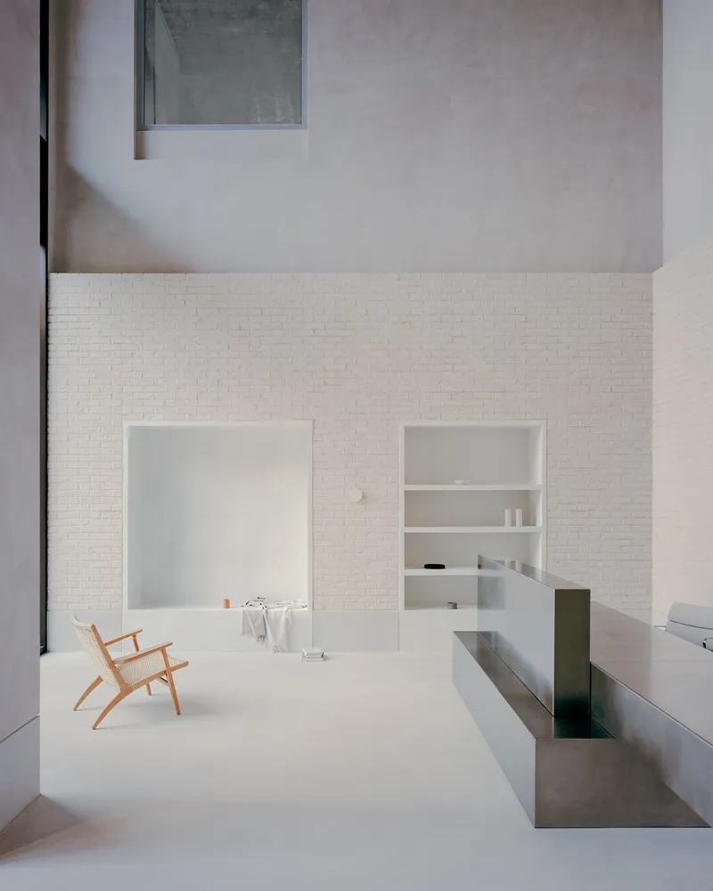
The double-height courtyard is the project's spatial anchor. White brick walls rise to an open sky, and the floor is kept pale and minimal. A single timber chair sits in it during the photo shoot, which tells you something about the architects' confidence in the space: it does not need furnishing to hold your attention. Internal glazing between the courtyard and adjacent kitchens allows borrowed light and visual connection, so that communal cooking and outdoor calm feel continuous.
In a dense urban context like South London, carving out a courtyard of this quality is not trivial. It provides daylight, ventilation, and a shared exterior room that belongs to no single unit. The decision to keep its material language consistent with the interiors, rather than treating it as a garden, reinforces its role as an extension of the living space rather than a leftover.
Timber and Light in the Common Rooms
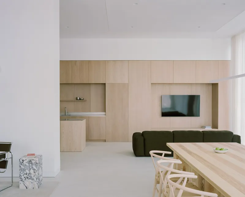
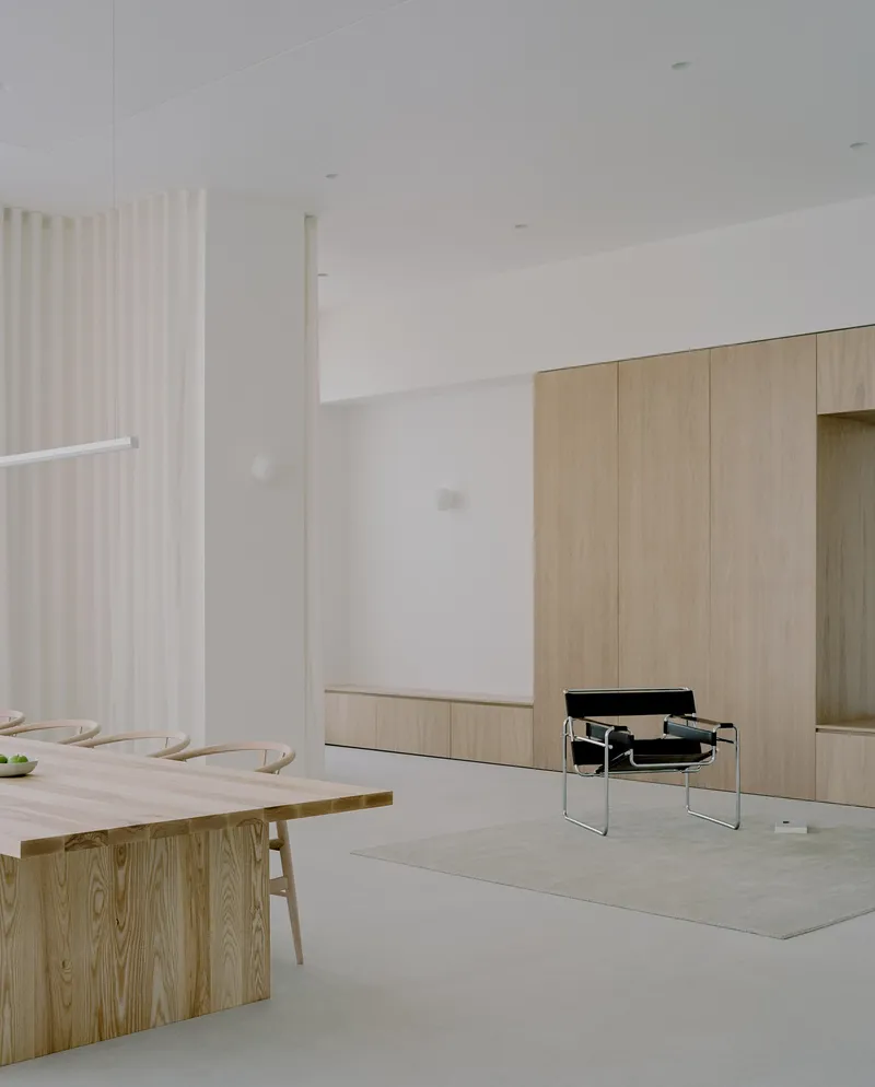
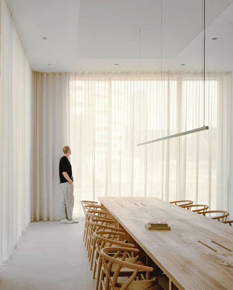
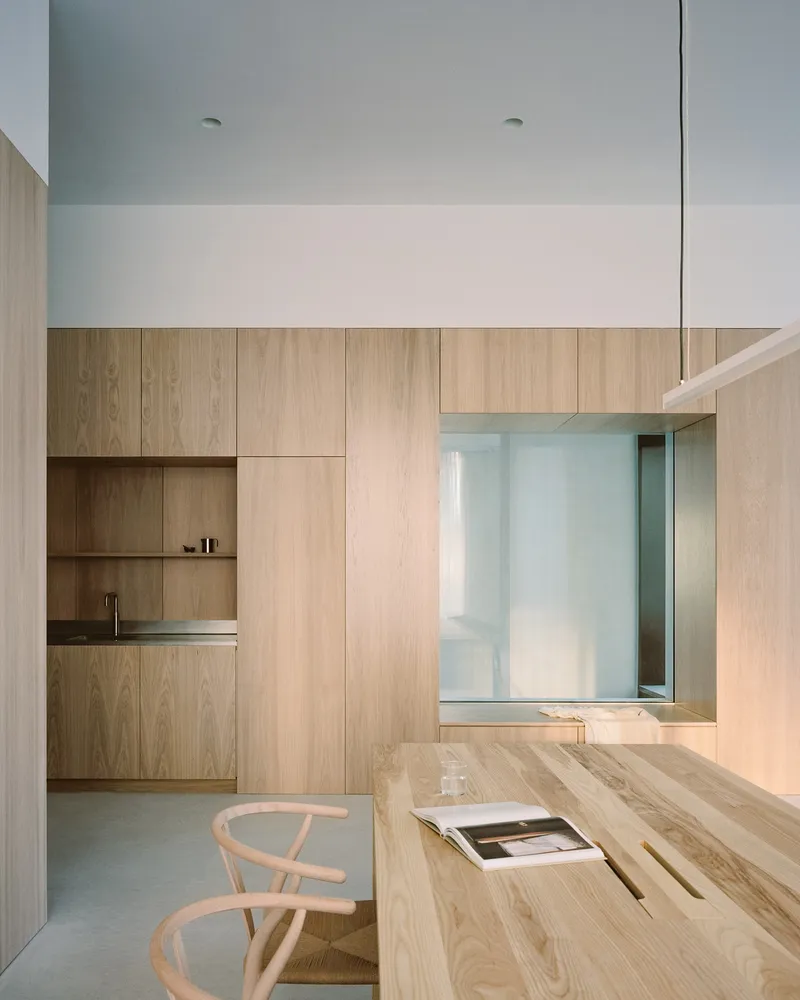
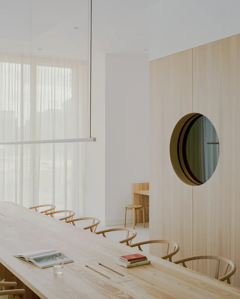
The living and dining areas demonstrate how far a limited palette can stretch when proportions are right. Pale timber cabinetry wraps the kitchen zone, an olive-green sofa provides the only real color accent, and sheer curtains diffuse daylight into a soft, even wash. The dining spaces follow the same logic: long timber tables under linear pendant lights, with the curtains doing most of the atmospheric work.
What is notable here is the scale of the communal furniture. The long dining table seats eight or more, and it is positioned to be the dominant element in the room. This is not a shared house where people retreat to their bedrooms with a takeaway. The design makes a clear argument that the table is where life happens. The circular mirror on the pale veneer wall and the curved-back dining chairs add softness without competing for attention.
Alcoves and Window Seats
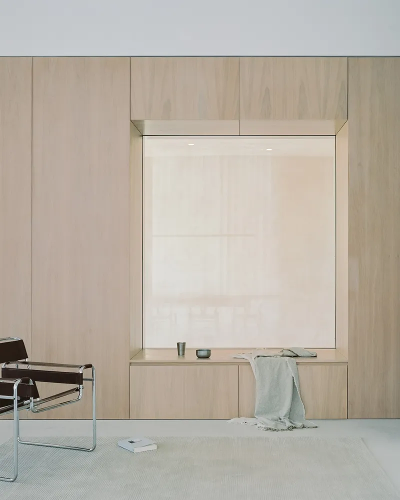
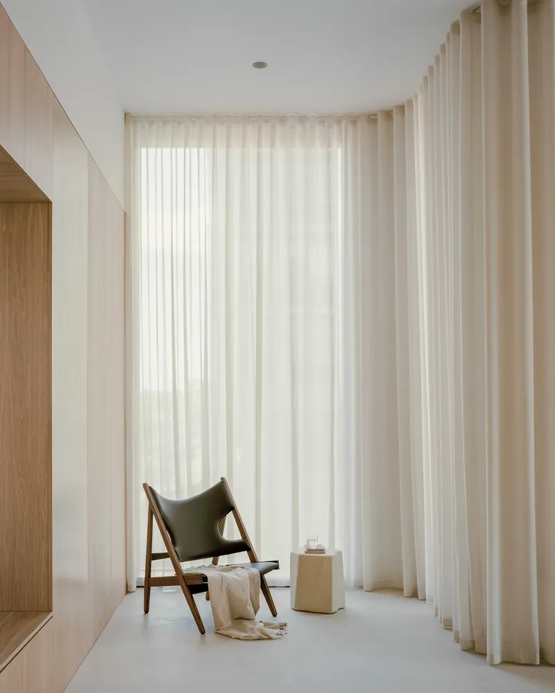
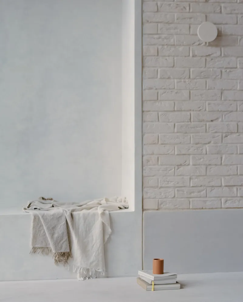
Some of the best moments in the project are the smallest. A timber-framed window alcove with a built-in bench and a sheer roller shade becomes a reading nook that feels genuinely inviting. A curved alcove with floor-to-ceiling curtains and a walnut lounge chair carves out a private pocket within a shared room. A white brick ledge holding folded linens and stacked books suggests that domestic life here is meant to be unhurried.
These intimate insertions matter because they give residents a sense of ownership over specific corners without requiring walls or doors. In shared housing, the ability to claim a spot, even temporarily, is essential to psychological comfort. Actual Office provides those spots through geometry rather than furniture, which means they hold up over time.
Corridors as Rooms
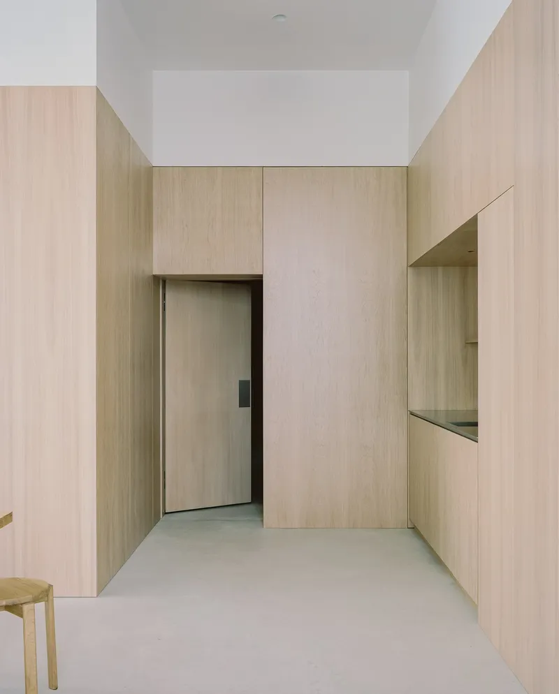
The timber-paneled corridor is one of the project's quiet triumphs. A recessed door and a built-in display niche transform what would typically be dead circulation space into something worth pausing in. The clerestory above washes the corridor ceiling with natural light, eliminating the institutional fluorescent strip that haunts most shared housing. These corridors do not feel like corridors. They feel like thresholds between one quality of space and another.
Stainless Steel as Counterpoint
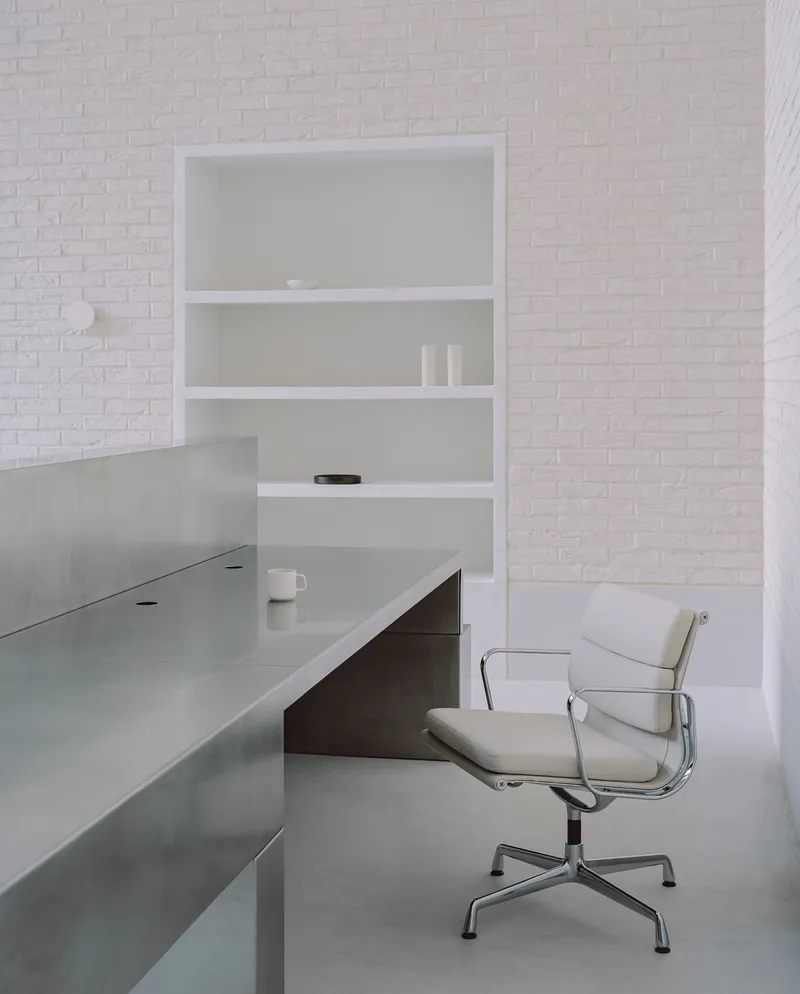
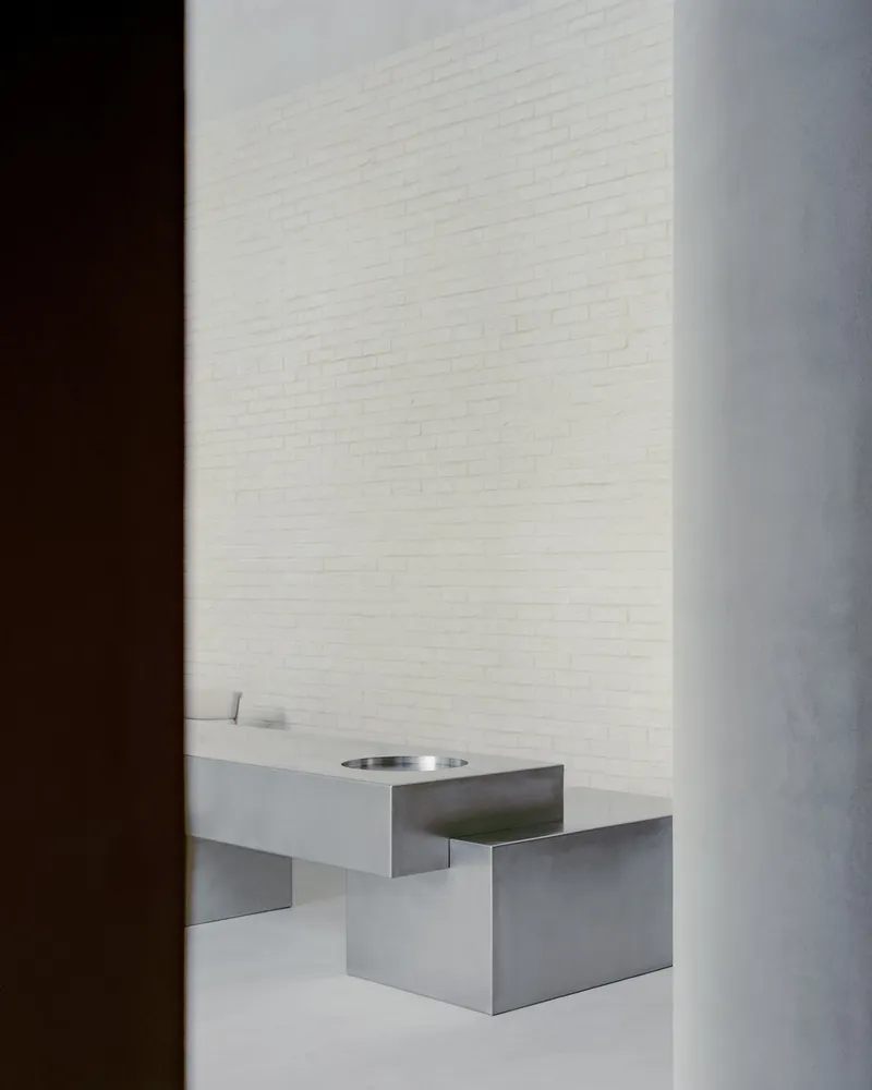
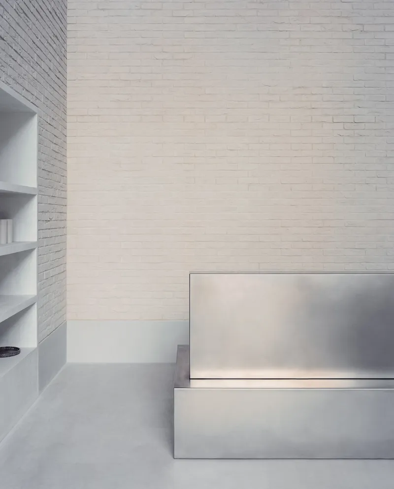
Against all the warmth of timber and brick, the stainless steel elements act as a sharp, deliberate contrast. A polished steel desk with recessed shelving turns a workspace into something almost laboratory-precise. Floating countertops with circular basins sit cantilevered off white brick walls, their joints and edges resolved with a level of care that rewards close looking. Steel stair treads with integrated lighting glow against the painted brick behind them.
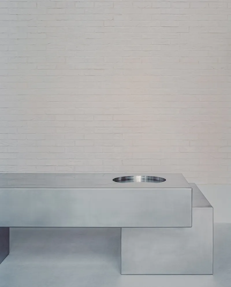
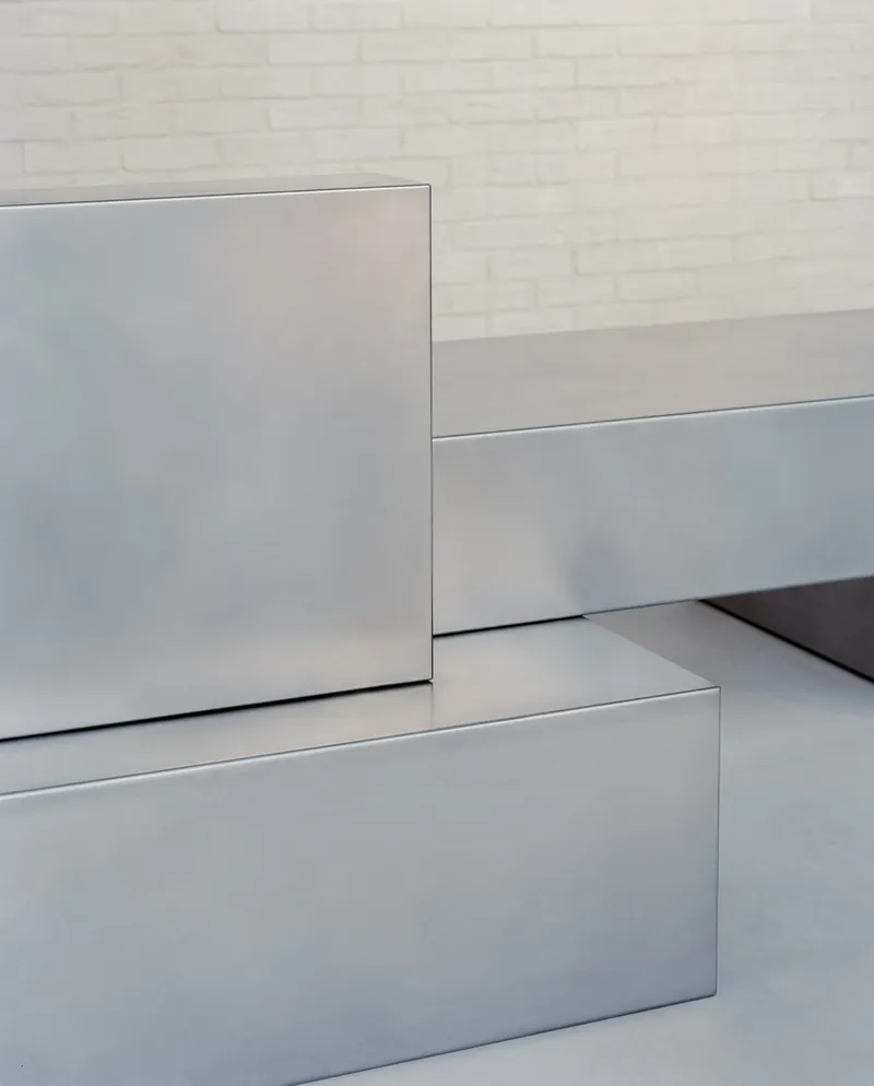
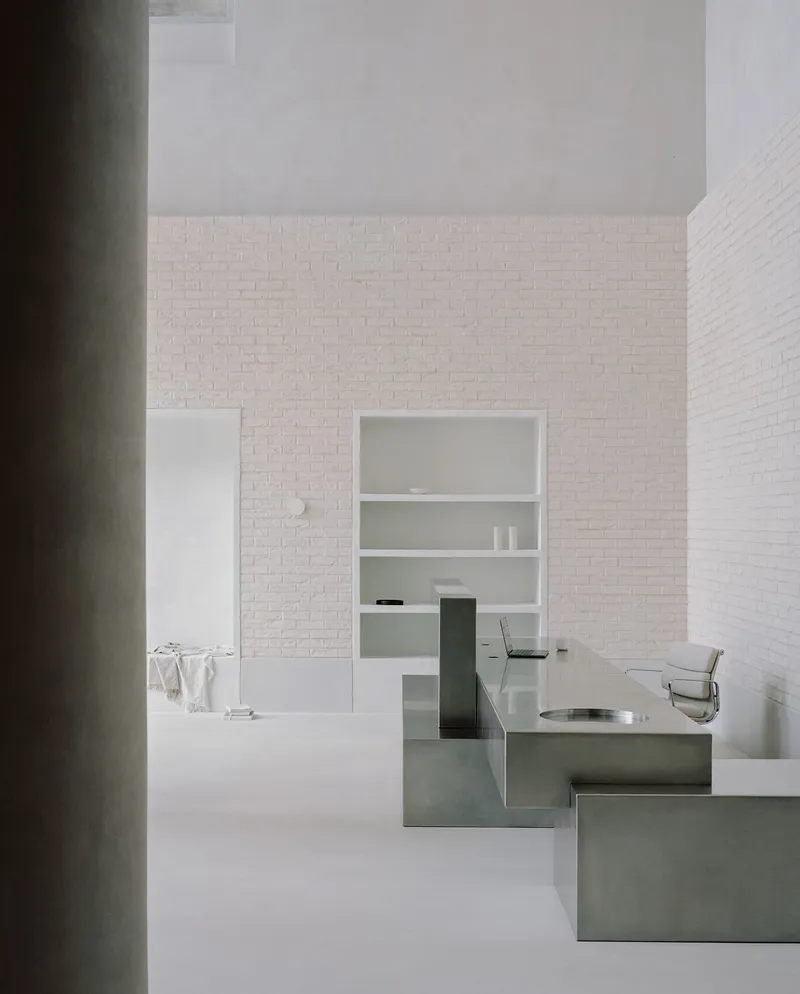
The steel is not decorative. It marks the functional elements: sinks, desks, stairs. By confining a harder, cooler material to the points of most intensive use, the architects create a legible hierarchy. You understand, almost unconsciously, which surfaces are for sitting and which are for working. The circular basin detail, repeated in both the bathroom and utility areas, becomes a small recurring motif that ties the steel moments together across the project.
Curtains and the Quality of Daylight
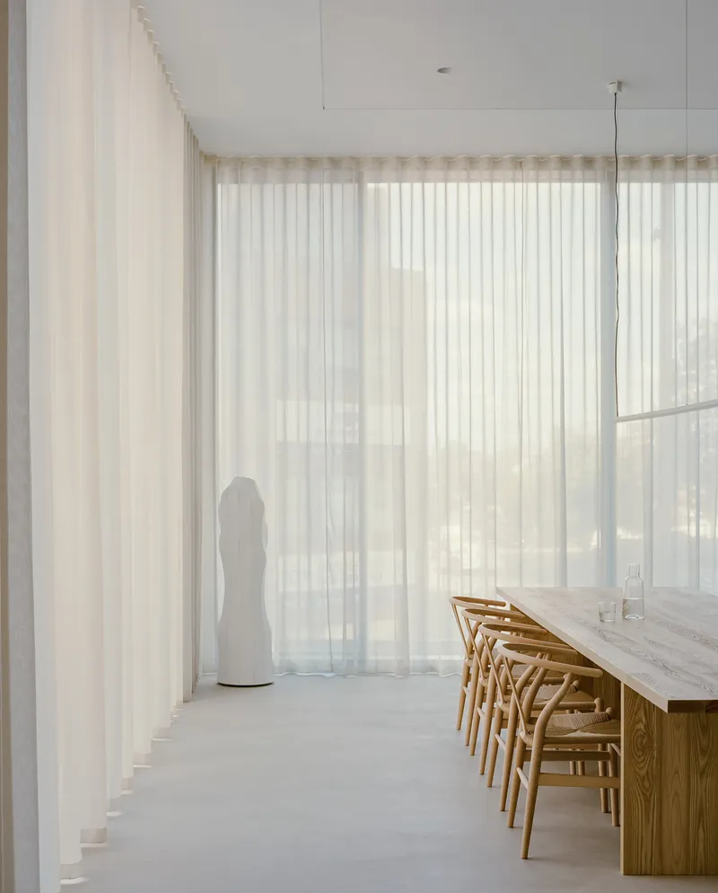
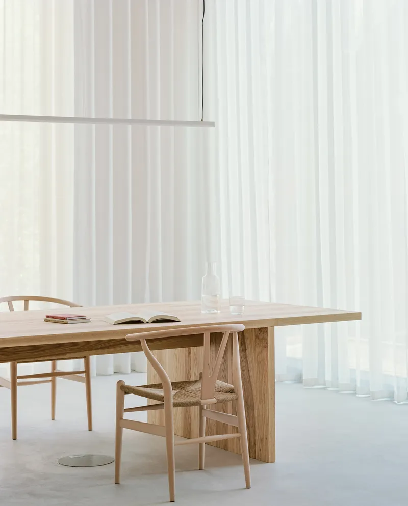
Sheer curtains are doing an enormous amount of work in this project. Nearly every communal room is wrapped in floor-to-ceiling white fabric that filters daylight into a luminous, directionless glow. The effect is calm without being dim, and it provides a layer of visual privacy from the outside without resorting to blinds or frosted glass. In the dining space, a white sculptural form sits beside the curtain wall, catching the filtered light and almost dissolving into it.
There is a risk with this approach: everything can start to feel the same. But the architects counterbalance the uniformity by varying ceiling heights, introducing alcoves, and anchoring each room with a strong piece of furniture or a material shift. The curtains become a constant backdrop against which other elements perform.
Plans and Drawings
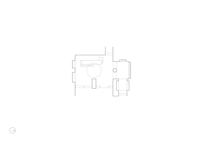
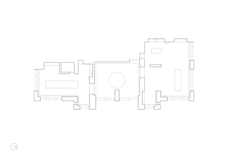
The floor plans reveal the organizational logic. Two connected rooms pivot around a circular element, likely corresponding to the courtyard or a central stair, while a second plan shows three rooms linked around the same nucleus. The circular geometry, which appears subtle in the photographs, is actually the project's primary organizational device. It creates non-orthogonal adjacencies between rooms, which explains why moving through the scheme feels less like a corridor-and-door arrangement and more like a sequence of rooms opening onto one another.
Why This Project Matters
Cherry Orchard matters because it demonstrates that shared living does not have to be either aspirational lifestyle branding or utilitarian box-ticking. Actual Office has produced something genuinely architectural: a fit-out where the spatial ideas are legible, the material choices are purposeful, and the details reward attention. The fact that it was done within what appears to be a modest budget, using a deliberately limited palette, makes the achievement more impressive, not less.
London needs more of this. The city's housing crisis has pushed shared living from niche to necessity, but the design quality has rarely kept pace. Projects like Cherry Orchard suggest that the typology can be taken seriously as architecture, not just as real estate product. When the corridors are worth lingering in, the courtyard holds its own as a room, and a stainless steel sink is detailed with the care of a piece of furniture, something meaningful is happening. The question now is whether this level of attention can be sustained as the model scales.
Cherry Orchard Shared Living Spaces by Actual Office. London, United Kingdom. 600 m². Completed 2025. Photography by Building Narratives.
About the Studio
Share Your Own Work on uni.xyz
If projects like this are the kind of work you want to make, uni.xyz is a place to publish your own, find collaborators, and enter design competitions.


Popular Articles
Popular articles from the community

Opera by the Sea Estonia: Three Shells Dissolving Architecture into Tallinn's Coastline
A winning opera house proposal replaces monumental form with interconnected shells that blur the boundary between building, park and Baltic Sea.
Tsunami Convergenics: Turning Catastrophic Ocean Forces into Underwater Housing Infrastructure
A speculative underwater settlement off the coast of Onagawa, Japan, treats tsunamis and typhoons as energy sources rather than threats.
Faces of the Soviet Avant-Garde: Turning Moscow's Street Names into an Open-Air Museum
A network of sculptural installations across a Moscow residential district transforms forgotten architect names into spatial encounters with cultural memor

Cloaked Colonization: A Mobile Underwater Habitat That Moves Like a Fish
Micah Abaya's shortlisted EHC Pacific entry reimagines ocean settlement as a dispersed network of self-sustaining architectural organisms.

Similar Reads
You might also enjoy these articles

Pixel Gardens: One Repeated Module Stacked Into a Terraced Social Housing Tower for Famagusta
Salem Bader's shortlisted housing tower builds a vertical neighbourhood from one repeated module, offsetting units to carve terraces, light and air.

Bao Huynh Watercolor Atelier: A Serene Art Retreat in Hội An
Bao Huynh Watercolor Atelier in Hội An blends multifunctional art spaces, sustainable design, local materials, and family-friendly living in a serene environment.

Atelier Macri Concept Store Interior Design by CASE-REAL
Atelier Macri store features a "ko" counter, walnut wood details, cork displays, blending retail, gallery, and seamless customer experiences.

Manuel Vargas Izquierdo Stadium and High-Performance Sports Center: Architectural Excellence in Jalpa de Méndez
The Manuel Vargas Izquierdo Stadium blends sustainable design, inclusive sports facilities, and cultural-inspired architecture, revitalizing Jalpa de Méndez’s public spaces.

Comments (0)
Please login or sign up to add comments
No comments yet. Be the first to comment!