

Cécile Elicagaray Rewires a 1970s Workers' Terrace at the Edge of a Basque Forest
In Anglet, France, a narrow row house opens itself to the Pignada forest and the distant Pyrenees through timber, tile, and careful restraint.


The 1970s workers' neighbourhoods of Anglet sit at the threshold between city and forest. Modest terraced houses line a shared central square, their scale domestic, their ambitions communal. When Cécile Elicagaray Architecte took on the renovation of one of these 120 square metre row houses, the task was not to reinvent the typology but to crack it open: to let the Pignada pine forest and the distant Pyrenean range into a home that had spent decades turning its back on both.
What makes the project compelling is its economy of means. There is no extension, no dramatic volumetric surgery. Instead, Elicagaray works with what the narrow footprint already offers: depth, section, and the play of light through a plan that runs from street to courtyard. Dark ceramic tile wraps the exterior in a new skin. Inside, timber framing, polished concrete floors, and white walls create a luminous interior that reads as both contemporary and deeply rooted in the Basque material tradition. The house earns its nickname from the mountain view it frames, but the real achievement is how it reframes the everyday rituals of a terraced dwelling.
A New Skin for an Old Terrace
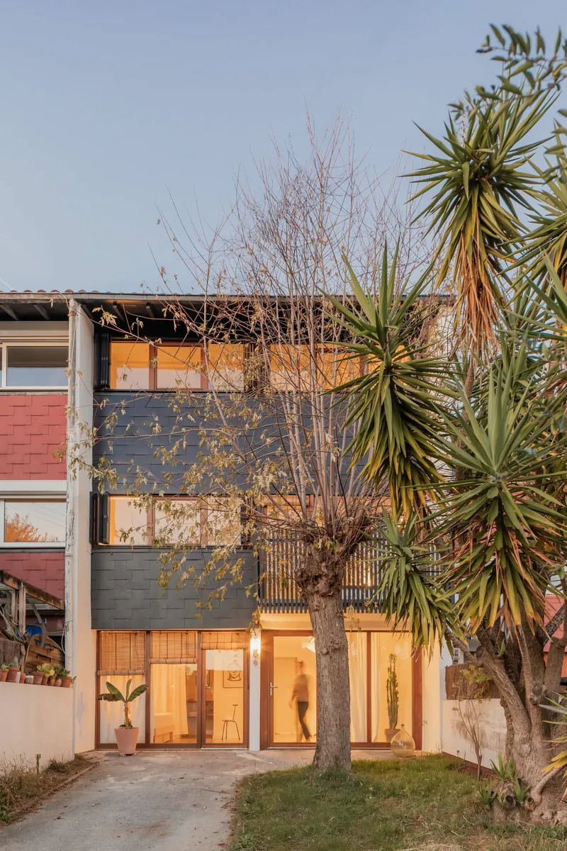

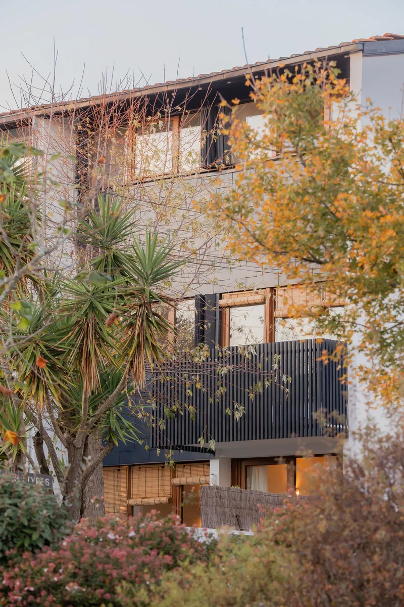
The original street facade has been reclad in dark slate-blue ceramic tile, a material that registers differently across the day: matte and recessive in overcast light, sharp and graphic when the sun catches its edges. Timber-framed windows sit flush within this surface, sometimes screened by rolled bamboo blinds that soften the boundary between inside and out. The corrugated metal balcony screen on the upper level introduces a coarser texture, industrial in origin but refined here by context. Autumn foliage and the neighbourhood's characteristic palm fronds mediate between the architecture and the street.
The choice of tile over render or paint is significant. It gives the renovation a material presence that the neighbouring houses lack, marking the intervention without shouting. It also ages well in the humid Basque climate, a pragmatic decision dressed up as an aesthetic one.
Ground Floor: Courtyard and Threshold

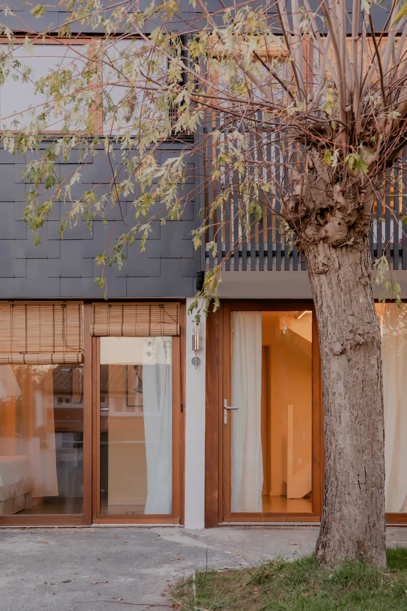
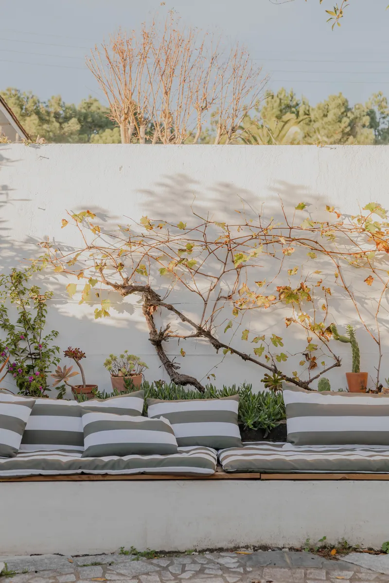
The rear elevation tells a different story from the front. Here, dark tile gives way to sliding timber doors that open the ground floor directly onto a paved courtyard. The transition from interior to exterior is almost frictionless: the polished concrete floor runs right up to the threshold, and the courtyard's white walls bounce light deep into the plan. At dusk, the interplay of wisteria branches, potted plants, and wall-cast shadows transforms this modest outdoor room into something genuinely atmospheric.
The ground floor entry, with its timber doors and slatted screen, operates as a layered filter. You pass through botanical softness (bare wisteria, bamboo) before reaching the hard surfaces of the interior. It is a sequence that slows you down, a quality this kind of tight urban terrace rarely affords.
Light as Material

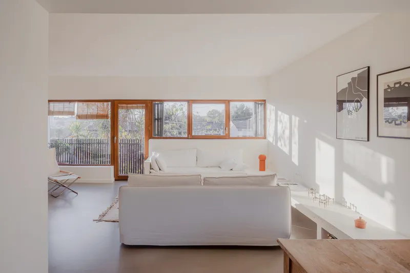
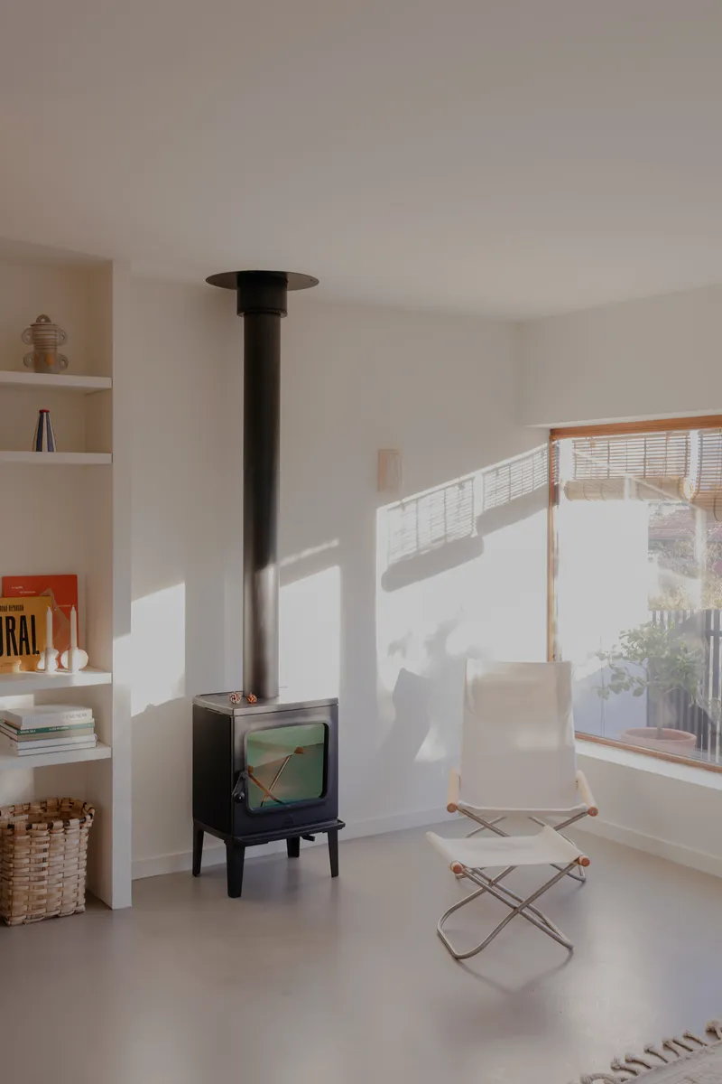
The white-walled living spaces on the ground and first floors are engineered around sunlight. Timber-framed ribbon windows run along the party wall side, capturing afternoon light and projecting sharp rectangular shadows across floors and walls. These shadows become the interior's primary decoration, shifting through the day, marking time in a house that otherwise keeps ornament to a minimum.
A black freestanding wood stove anchors the main living room. Positioned beside a canvas lounge chair, it creates a scene of deliberate warmth, both literal and visual. The stove's cylindrical silhouette is the room's one dark accent, a counterpoint to the pervading whiteness. Elicagaray understands that in a narrow terrace, light is the most powerful spatial tool available, and she deploys it with precision.
Timber Structure as Spatial Divider


Rather than relying on solid partitions to organize the plan, the renovation introduces timber lattice screens and gridded partition walls that subdivide space without interrupting it. The lattice beside the wood stove filters views between the staircase and the living area. At the courtyard-facing window, a timber grid partition works with the rolled bamboo shade to create graduated layers of enclosure: open, screened, shaded, closed.
These timber elements do more than manage sightlines. They establish a material continuity that ties the project together: door frames, window mullions, partitions, and cabinetry all speak the same warm, blond language. Against the polished concrete floors and white plaster walls, the wood reads as both structural and tender.
Living with Concrete, Sisal, and Restraint

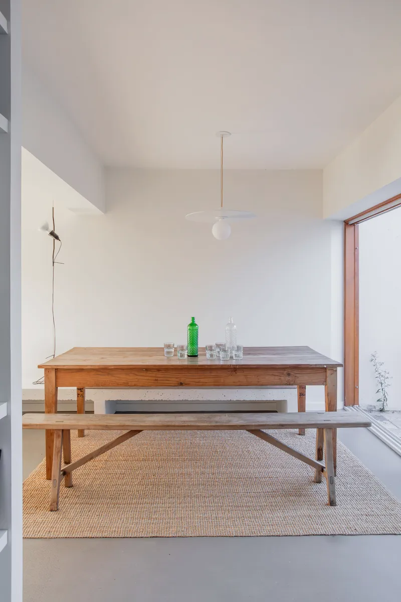

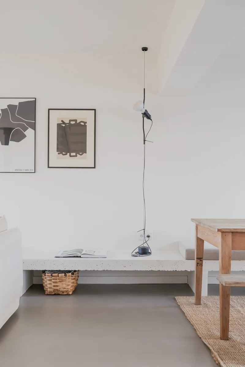
The furnishing strategy is as disciplined as the architecture. Built-in concrete benches with upholstered cushions line the walls, doubling as storage and seating. A timber dining table and benches sit on a sisal rug beneath a single brass pendant. The palette is muted: grey concrete, natural fibre, linen, striped cotton. There is nothing extraneous here, no gestures made for the camera.
What distinguishes these interiors from generic minimalism is their tactile range. The rough weave of the jute rug, the cool mass of the concrete shelf, the turned edge of a timber coffee table: each surface rewards touch as much as sight. In a 120 square metre terrace, this sensory density keeps rooms from feeling austere.
Kitchen, Bedrooms, and the Small Room Done Well
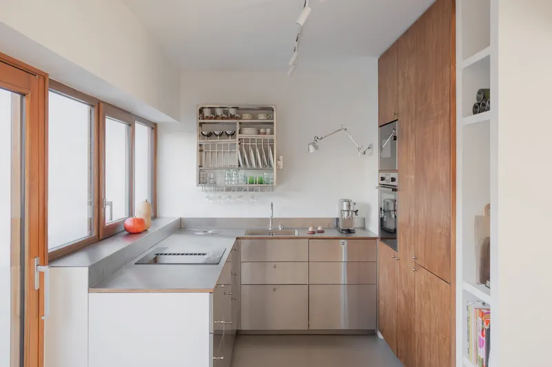



The compact kitchen pairs stainless steel countertops with timber cabinetry, a combination that is practical, honest, and quietly handsome. Open shelving with compartments for cookware and glassware replaces upper cabinets, keeping the wall plane visually light. The row of timber windows along the countertop pulls the courtyard garden into the cook's sightline.
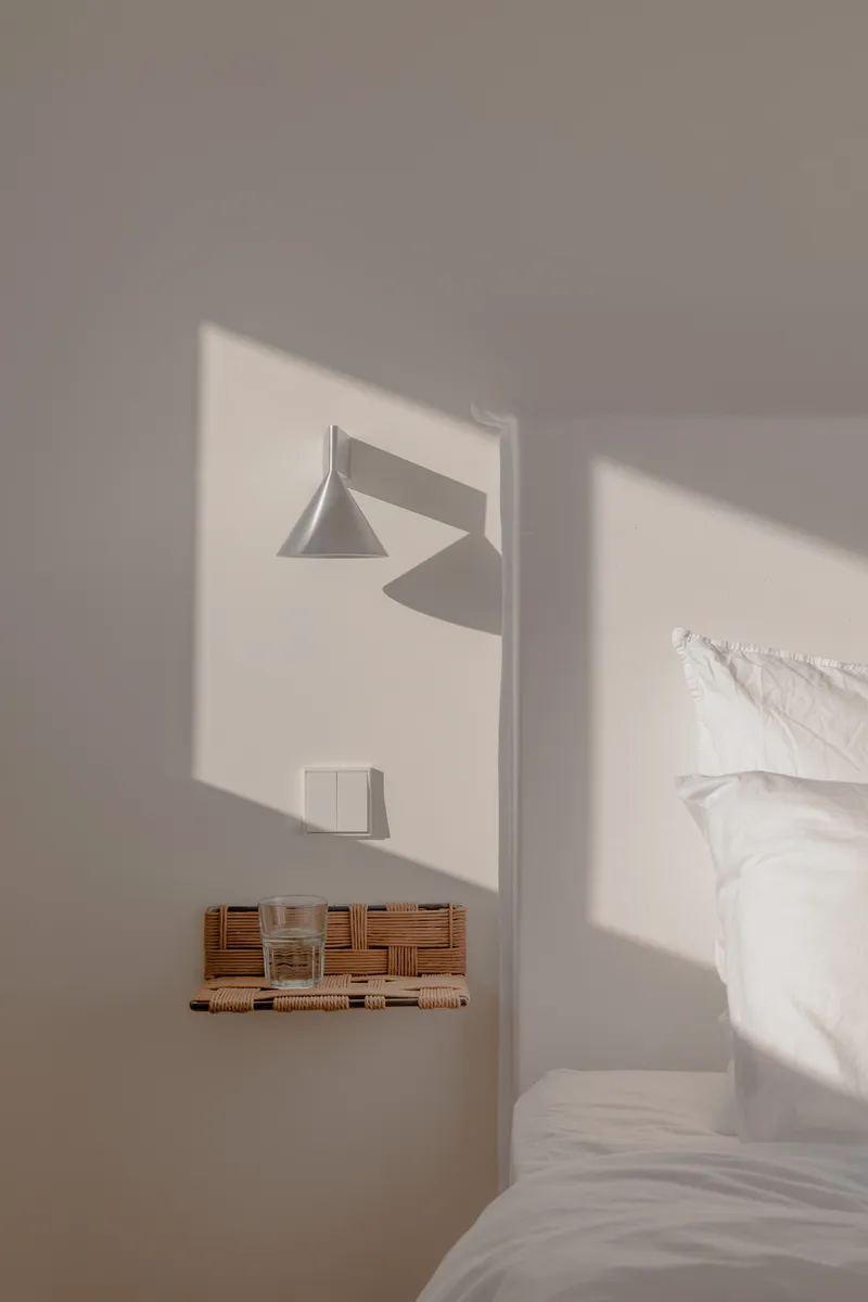
Upstairs, bedrooms are treated with the same economy. White plank ceilings lower the perceived height, creating intimacy. Wall-mounted disc sconces cast geometric shadows that animate otherwise plain surfaces. The bathrooms, clad in white mosaic tile with timber-trimmed windows, are small but carefully composed: a built-in tub sits beneath a window, a floating timber vanity tucks into a tiled alcove. These are not luxury bathrooms. They are rooms where every element has been considered, which is a rarer thing.
Details That Accumulate
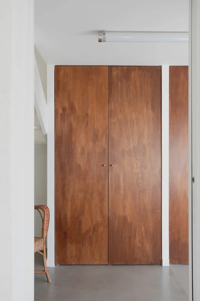
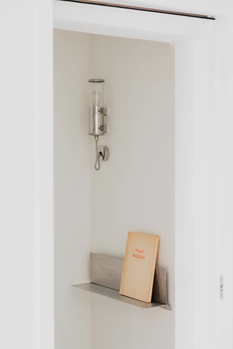

The project's quality is best measured in its details. Timber double doors with white frames and sidelight panels turn a simple opening into an event. A built-in wall niche with a glass sconce and a stack of books transforms dead wall space into something personal. These are not signature moves; they are the quiet accumulations of a designer who understands that a renovated terrace house lives or dies in its specifics.
Plans and Drawings

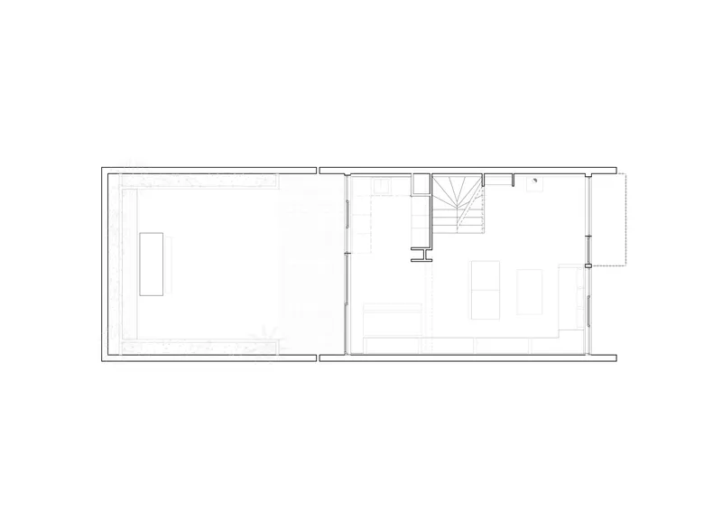


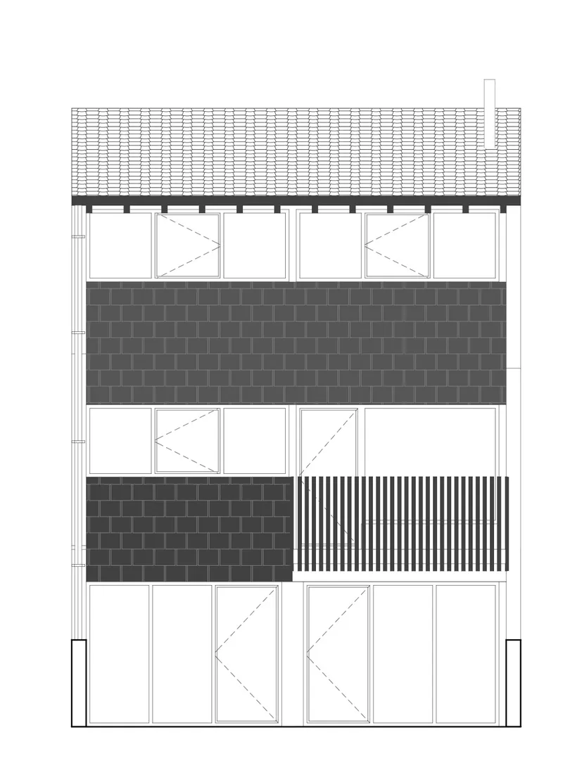
The floor plans confirm what the photographs suggest: a long, narrow volume organized around a central stair, with service rooms clustered at one end and living spaces stretching toward the courtyard. The upper level splits into two bedroom volumes flanking a hallway, a straightforward arrangement that maximizes usable area within the terrace's constraints. The elevations reveal how the new tile cladding and horizontal masonry bands work together to give the facade a layered depth, with vertical slatted panels at ground level providing ventilation and visual rhythm. It is a compact project, but the drawings show just how much spatial intelligence has been packed into 120 square metres.
Why This Project Matters
Workers' housing from the 1960s and 1970s represents an enormous portion of the European building stock, and most of it is in need of renovation. The temptation is either to gut these houses into open-plan shells or to leave them untouched. Cécile Elicagaray charts a third path: retaining the terrace typology's social logic, its relationship to the shared square, its modest footprint, while radically improving its material quality and its relationship to light, landscape, and the surrounding forest.
The project also demonstrates that renovation does not need to be spectacular to be significant. There are no cantilevered additions, no roof gardens, no double-height voids. Instead, there is a house that has been made warmer, brighter, and more legible through timber, tile, and a series of measured spatial decisions. In an era that increasingly asks architects to do more with less, this workers' terrace in Anglet is a quiet argument that less, done precisely, is enough.
Workers' House Renovation by Cécile Elicagaray Architecte, Anglet, France. 120 m², completed 2025. Photography by Emmy Martens.
About the Studio
Share Your Own Work on uni.xyz
If projects like this are the kind of work you want to make, uni.xyz is a place to publish your own, find collaborators, and enter design competitions.


Popular Articles
Popular articles from the community

Extended Shell: Retrofitting Kolkata's Balconies as Living Urban Thresholds
A modular retrofit system recovers the social and environmental intelligence of Kolkata's historic verandas for contemporary Park Street residents.

Singing Woman: Contemporary Architecture Inspired by Estonia’s Voice and the Sea
Singing Woman turns Estonia’s song culture into flowing opera house architecture, blending public life, landscape, sea, and national memory.

Cloaked Colonization: A Mobile Underwater Habitat That Moves Like a Fish
Micah Abaya's shortlisted EHC Pacific entry reimagines ocean settlement as a dispersed network of self-sustaining architectural organisms.

Temporary Home for Dogs: A Reversed Zoo Rethinks Animal Shelter Architecture
In Bucharest, a sinuous corridor and freed landscape flip the logic of containment, designing a shelter that works to make itself unnecessary.

Similar Reads
You might also enjoy these articles

Bao Huynh Watercolor Atelier: A Serene Art Retreat in Hội An
Bao Huynh Watercolor Atelier in Hội An blends multifunctional art spaces, sustainable design, local materials, and family-friendly living in a serene environment.

Atelier Macri Concept Store Interior Design by CASE-REAL
Atelier Macri store features a "ko" counter, walnut wood details, cork displays, blending retail, gallery, and seamless customer experiences.

Manuel Vargas Izquierdo Stadium and High-Performance Sports Center: Architectural Excellence in Jalpa de Méndez
The Manuel Vargas Izquierdo Stadium blends sustainable design, inclusive sports facilities, and cultural-inspired architecture, revitalizing Jalpa de Méndez’s public spaces.

KAKR Buluh Awar Hall: Revitalizing Community and Ecology Through Bamboo Architecture
Community built bamboo hall revitalizes Buluh Awar village, empowering youth, restoring ecology, celebrating vernacular craftsmanship through sustainable architecture and culture.

Explore Renovation Competitions
Discover active competitions in this discipline

Challenge to design mud housing for contemporary communities

Challenge to design luxury tourism on rails

VR headsets Storefront design competition

Designing a staircase for a client
Comments (0)
Please login or sign up to add comments
No comments yet. Be the first to comment!