

FCC Arquitectura Bends a Garden-Roofed House into a 16-Meter Slope in Northern Portugal
In northern Portugal, AP House embeds 521 square meters of concrete and glass in a steep hillside, hiding its bulk under a garden roof facing west.

Some sites ask for a house; others ask you to apologise for building one at all. The plot behind AP House, completed in 2014 by FCC Arquitectura in northern Portugal, falls 16 meters from one edge to the other. That drop is roughly five storeys. The brief the architects set themselves was blunt: keep the land's natural character, push the building into the ground, disguise its volume and cut its visual impact. The result is 521 square meters of construction on a 452 square meter footprint, most of it tucked under a planted roof and turned west toward the valley.
What interests us is not the disappearing act itself, which plenty of hillside houses attempt, but how unevenly it succeeds. Seen from the street, AP House is a low concrete box and a boundary wall. Seen from below, it is a long, bent ribbon of glass that glows like a lantern at dusk. The design lives in the tension between those two faces, and it handles that tension with more discipline than most embedded houses manage.
Reading the Hill Before the House


From a distance the house barely registers: a horizontal concrete line on a hillside, with a lone walker giving it scale. From the road, a low wall and bare winter trees do most of the talking. That is the strategy working as intended. The building concedes the skyline to the landscape and the red-roofed village across the valley.
The roof is where the strategy gets honest. Curved green-roof wings sweep toward the view, but other stretches are gravel ballast carrying solar panels and heat pumps. We think that is the right call, even if it dents the purity of the garden-roof story. A roof this visible from the street has to work for its living, and the architects let it do so without dressing up the equipment.
A Curve That Follows the Contours


The plan bends like a boomerang, and the bend is the project's most consequential decision. A straight bar on a slope this steep would have demanded either deep excavation along its full length or a long exposed underside. The curve lets the house trace the contours, so the retaining walls stay modest and the glazed elevation faces west along most of its run.
The material palette is tight: board-formed concrete, floor-to-ceiling glass and a granite plinth. The board marks keep the concrete from reading as a smooth industrial product, and the long horizontal grain of the formwork reinforces the low, stretched profile. Everything about this elevation says ground, not object.
Granite, Olive Trees and the Retained Ground


The landscape work carries as much weight as the architecture. Rough granite retaining walls, cobbled paving and stone steps terrace the slope in a way that feels continuous with the agricultural walls found across rural northern Portugal. Old olive trees were clearly worked around rather than cleared, and one gnarled trunk leans across the stairs as if it had been there first. It almost certainly was.
Where the stone meets newer surfaces, as in the junction of granite curb and composite decking, the detailing is plain and unfussy. The carport and service passages use the same rough-cut granite blocks under thin concrete slabs, which keeps the utilitarian parts of the house from looking like afterthoughts.
Arriving Through Concrete Thresholds


The upper side of the house is a different animal. A rectangular board-marked volume sits above a granite forecourt, closed and almost severe, with a black vertical-slat panel as its main gesture. A thin concrete canopy arches over the entrance path. This is the face that neighbours see, and it gives away almost nothing about the curved, glassy world below.
The entry sequence is the best spatial moment in the project. You pass through narrow gaps between concrete walls, between slatted screens and board-formed surfaces, and each gap frames a sliver of distant hills. A pivoting door opens onto a curved white corridor. Compression first, then release: it is an old trick, but here the topography makes it feel earned rather than staged.
Dusk and the Lantern Effect


After dark the logic of concealment flips. The glazed western face becomes a continuous strip of light above the granite base, and the cantilevered corner of the upper volume glows like a display case. During the day the house hides; at night it advertises.
We do not count this as a contradiction so much as a reminder that "reducing visual impact" depends on when you look. A building can be quiet in its massing and still be loud in its lighting. Anyone designing on a visible slope should weigh that, especially in non-urban settings where night skies are part of what is being protected.
The Corridor as Spine


Inside, the curved plan turns into a long, bending corridor with flush white doors, a dark timber floor and a light slot running along the ceiling. Because the corridor curves, you never see its full length at once. It keeps revealing itself, which makes a circulation route that could have felt institutional feel closer to a walk.
The corridor ends in a full-height glazed opening onto the hillside, so the spine resolves in landscape rather than in a blank wall. The flush doors and built-in cabinetry keep the surfaces calm. One frosted glass panel, with a blurred figure behind it, hints at how much privacy the bedrooms gain from sitting on the uphill side of this route.
Living Rooms Facing West


The western orientation is the one passive move we can confirm, and the living spaces commit to it fully. Floor-to-ceiling sliding glass opens onto timber decks covered by the concrete roof, so the overhang shades the glass while the view stays unbroken. Slim white columns stand in for structure and are easy to miss.
The interior finishes are restrained to the point of anonymity: white kitchen, floating vanity, built-in fireplace, a freestanding wood stove. A curved white partition stands free on the timber floor and echoes the plan without fuss. The white-on-dark-timber scheme is safe, and we would have liked a little more of the exterior's concrete and granite brought inside. Still, the rooms clearly exist to frame the outdoors, and they do that job without competing with it.
Stairs and the Upper Volume


The vertical connection between the embedded wing and the upper volume gets its own small set piece. White cantilevered treads project from a wall above a solid timber block stair, lit by a soft translucent window. In black and white, the tapered treads and the shadows they cast read almost as sculpture.
Upstairs, under a sloped white ceiling, a freestanding bathtub sits on a timber platform beside the stair opening. It is the most private room in the house, and it occupies the part of the building that is most exposed to the street. The architects handle that paradox by keeping the upper volume nearly windowless toward the public side.
Plans and Drawings


The drawings make the strategy plain. The floor plan bends to keep living spaces and bedrooms in one continuous arc facing the terrace. The roof plan sets that bent outline against tight contour lines and a driveway loop, and the site plan shows the upper volume as a lighter outline floating over the curved footprint. Seen together, they show that the curve is a direct response to the terrain, not a stylistic flourish.
Why This Project Matters
AP House is a useful case study because it does not pretend the house disappears. It hides where hiding matters, at the street and in its massing against the hill, and it opens up where opening up pays off, toward the west and the valley. The curved plan is the hinge that makes both possible, reducing excavation while giving almost every main room the same view.
For anyone designing on steep, rural land, the lesson is to treat the retaining walls, the trees and the roof as primary architecture. Here the granite terraces and preserved olives do as much to settle the building into its site as the concrete does. A decade on, the project still argues that the most convincing way to build on a difficult slope is to let the slope set the terms.
AP House by FCC Arquitectura, northern Portugal. Construction area: 521 m². Completed: 2014. Photography: José Campos.
About the Studio
Share Your Own Work on uni.xyz
If projects like this are the kind of work you want to make, uni.xyz is a place to publish your own, find collaborators, and enter design competitions.


Popular Articles
Popular articles from the community


Singing Woman: An Opera House That Performs Before the Curtain Rises
Ovidiu Cristian Pavel's conceptual opera house translates Estonia's choral identity into a sculpted waterfront landmark facing the Baltic Sea.

Opera on the Sea: Driftwood Logic Shapes a Timber Opera House on Estonia's Coast
Trevor Orgill's opera house translates the entangled drift of floating timber into a civic building where wood, water, and music converge.
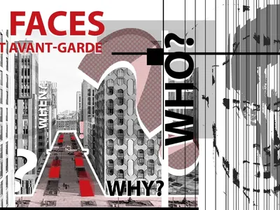
Faces of the Soviet Avant-Garde: Turning Moscow's Street Names into an Open-Air Museum
A network of sculptural installations across a Moscow residential district transforms forgotten architect names into spatial encounters with cultural memor
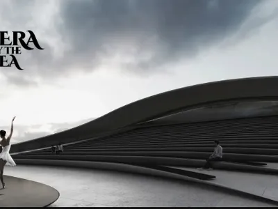
Opera by the Sea Estonia: Three Shells Dissolving Architecture into Tallinn's Coastline
A winning opera house proposal replaces monumental form with interconnected shells that blur the boundary between building, park and Baltic Sea.

Similar Reads
You might also enjoy these articles

Pixel Gardens: One Repeated Module Stacked Into a Terraced Social Housing Tower for Famagusta
Salem Bader's shortlisted housing tower builds a vertical neighbourhood from one repeated module, offsetting units to carve terraces, light and air.

Bao Huynh Watercolor Atelier: A Serene Art Retreat in Hội An
Bao Huynh Watercolor Atelier in Hội An blends multifunctional art spaces, sustainable design, local materials, and family-friendly living in a serene environment.

Atelier Macri Concept Store Interior Design by CASE-REAL
Atelier Macri store features a "ko" counter, walnut wood details, cork displays, blending retail, gallery, and seamless customer experiences.

Manuel Vargas Izquierdo Stadium and High-Performance Sports Center: Architectural Excellence in Jalpa de Méndez
The Manuel Vargas Izquierdo Stadium blends sustainable design, inclusive sports facilities, and cultural-inspired architecture, revitalizing Jalpa de Méndez’s public spaces.


Comments (0)
Please login or sign up to add comments
No comments yet. Be the first to comment!