

Sornells 21: A Shared Studio That Earns Its Rawness
Paloma Bau Studio and T.O.T Studio carve a collaborative workspace from a Ruzafa storefront, layering tile, copper, and honest infrastructure.


Ruzafa has spent the last decade becoming Valencia's most self-consciously creative neighborhood. Cafés, galleries, and design studios jostle for ground-floor frontage along its tight grid of streets, and the risk is always the same: that the interiors start to look like mood boards rather than workplaces. Sornells 21, the shared studio of architect Paloma Bau and Ausiàs Pérez of T.O.T Studio, pushes back against that tendency. At 170 square meters, it is not large, but it is serious about what a working environment should feel like when two practices with distinct identities share a single address.
What makes the project worth studying is the way it treats materials not as finishes but as structural arguments. White grid tile is the connective tissue of the space, running from storefront to courtyard to shower enclosure. Against that neutral matrix, a handful of emphatic moves, copper-clad joinery volumes, exposed spiral ductwork, fluted concrete plinths, do all the heavy lifting. Nothing is concealed for the sake of polish. The ceiling stays raw, the ducts stay visible, and the result is a studio that looks like it was designed by people who actually build things.
Entering from the Street

The storefront is disarmingly simple: a tiled surround, a retractable awning, and a fully glazed opening that puts the interior on display for anyone walking past. There is no lobby, no reception desk. You look through glass straight into a working space with potted plants and a blue steel staircase. The message is legible immediately: this is a transparent practice, literally and otherwise.
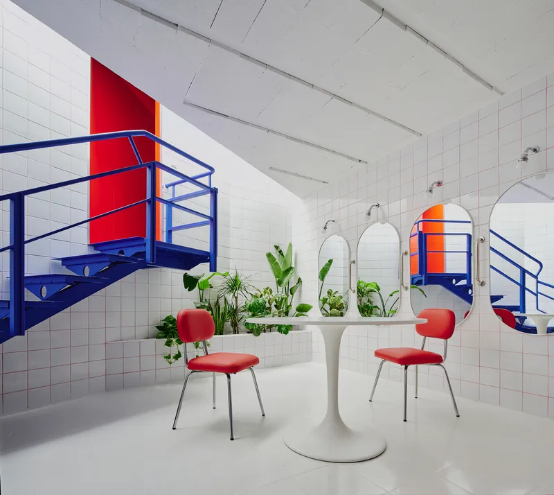
Inside the threshold, the full palette announces itself. White tile walls climb to meet an exposed concrete ceiling. A pair of blue steel staircases frame the composition, with red accent panels and round mirrors providing punctuation. The color choices are deliberate and restrained: blue, red, and copper appear only where they serve to orient you within the plan.
Copper Volumes as Anchors
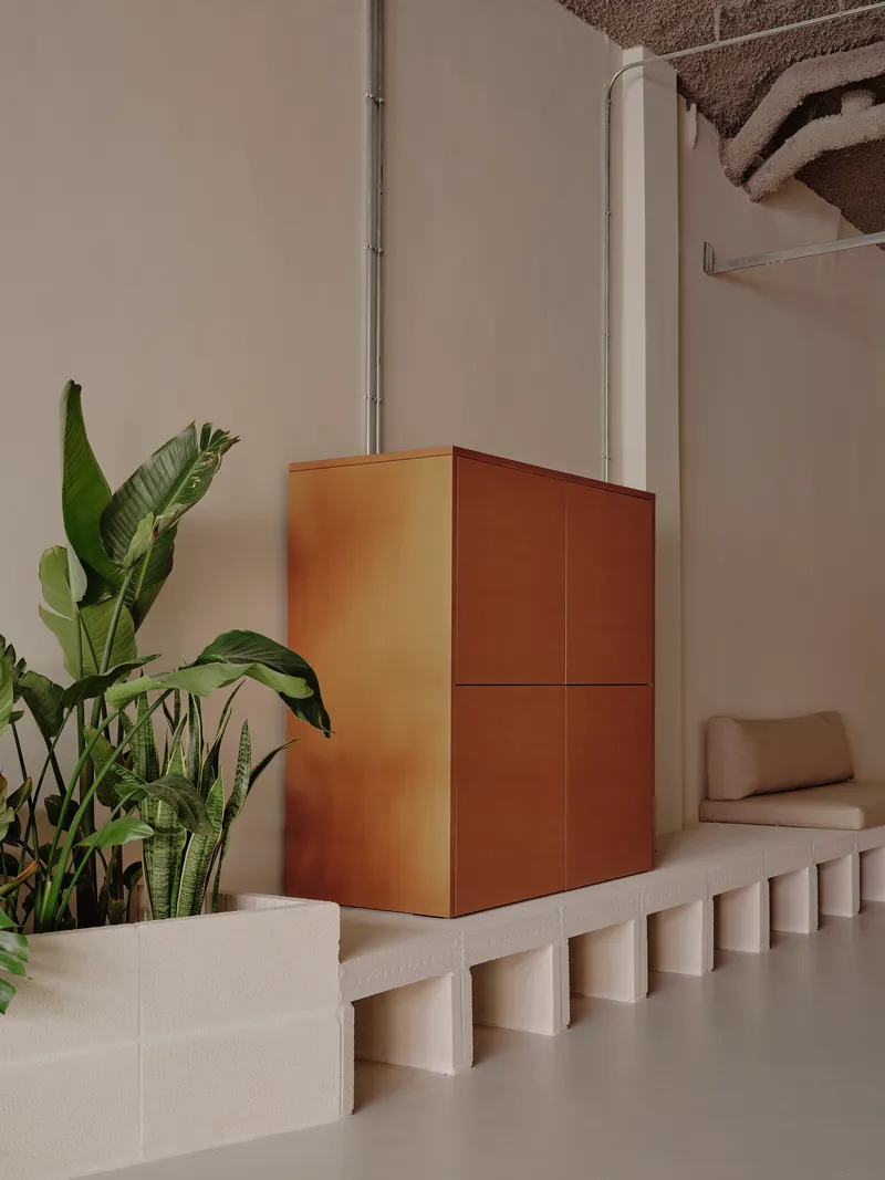
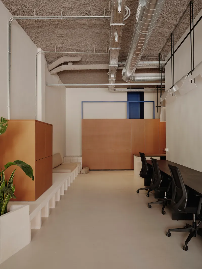
The most distinctive formal move in the project is the use of copper-clad cubic volumes that read almost as freestanding furniture within the open plan. One sits on a fluted concrete plinth beside tropical plants and a white column, functioning as a room within a room. These objects are unapologetically heavy in a space that otherwise trends toward lightness, and they earn their presence by housing storage, services, or enclosures that would otherwise fragment the floor plate.
The copper will patinate over time, and that is clearly part of the plan. In a studio built for two practices, the aging of materials becomes a shared clock, a slow record of occupation. It is a smarter move than paint.
The Communal Table and Working Core
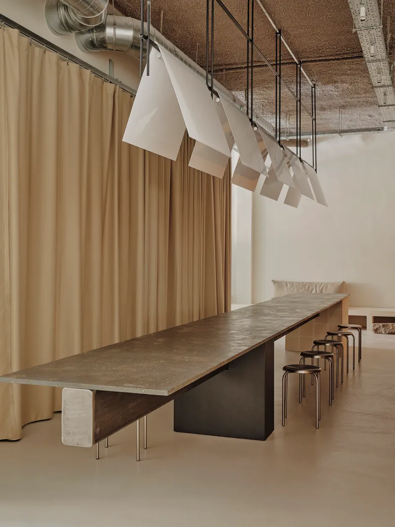


A long communal table running beneath a row of suspended white fabric pendants is the social center of the studio. Steel stools line both sides, and the ceiling above is finished in what appears to be cork, lending acoustic warmth to a surface that would otherwise bounce sound off the exposed concrete elsewhere. This is the informal workspace, the pin-up table, the lunch spot.
A smaller conference setting, with a timber pedestal table beneath a sphere pendant, handles more focused meetings. Above both zones, spiral ductwork runs openly against the textured ceiling, suspended on black cords alongside pendant lights. The services are treated as architectural elements rather than things to be hidden behind drywall, and the result is a ceiling plane with genuine visual depth.
Courtyard and Greenery


The courtyard wall is perhaps the most photogenic surface in the project: white grid tile with an integrated planter shelf, trailing vines overhead, and modular tile seating blocks at the base. It functions as a break space, a meeting point, and a light well. In a 170 square meter plan, dedicating area to an outdoor room is a luxury, but it pays dividends in terms of air, light, and the mental reset a studio needs across a long workday.
Planting is not incidental here. Tropical foliage fills integrated planters beside the blue staircase, appearing in oval mirrors that double the greenery. The architects clearly understood that in a Valencian climate, bringing plants inside is not decoration. It is climate strategy.
Material Details and Craft
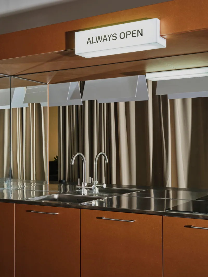
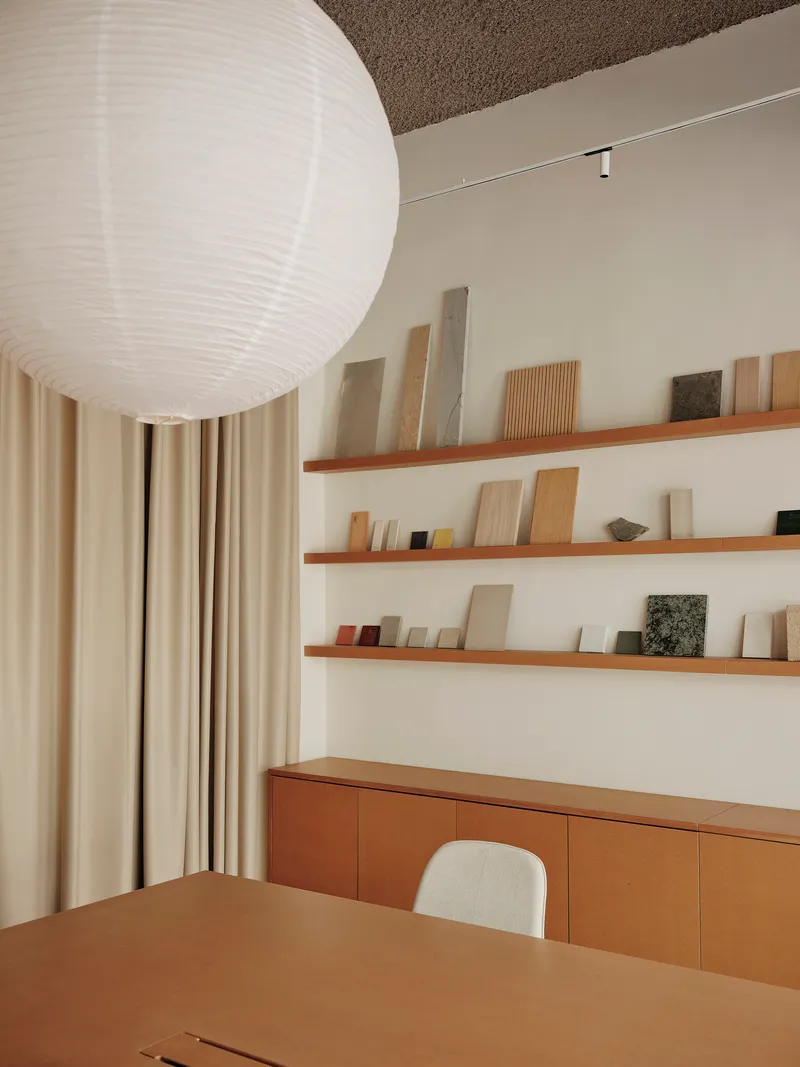
Zoom in, and the project rewards attention. The kitchen counter pairs a stainless steel sink with a backsplash of vertical metal tubes beneath timber shelving, a composition that feels borrowed from a workshop rather than a residential catalogue. Elsewhere, timber shelving holds material samples above a low cabinet and table beneath a spherical paper lantern. These are spaces designed for people who think through material choice daily.
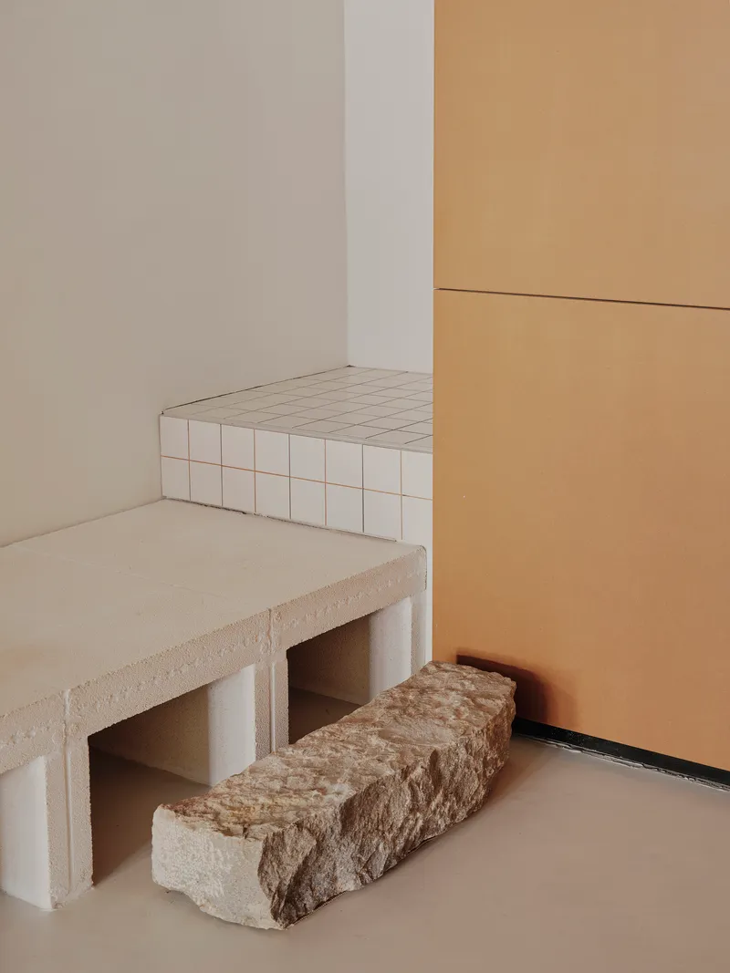
A corner bench detail combines white tile, raw stone blocks, and pale flooring beside timber panels. It is the kind of junction that only works when the designer has thought carefully about how different materials age, how they meet at edges, and how thick or thin each element should be. Nothing here is clipped on. Everything has mass.
Functional Rooms Within the Grid

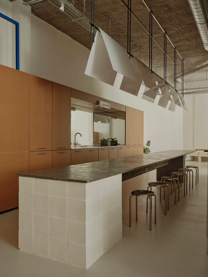

Discrete rooms within the studio hold specific programs. A white tiled meeting room features four oval mirrors bearing graphic patterns, a white pedestal table, and red upholstered chairs, striking a playful note within the otherwise restrained palette. A kitchen island with a white concrete block base anchors the utility zone, while a tiled shower enclosure with a built-in bench and exposed ceiling joinery provides the kind of amenity that signals a studio designed for long hours and bike commutes.
The shower detail is worth noting because it demonstrates the project's consistency. The same white grid tile used on the storefront, the courtyard, and the meeting room wraps the wet room. One material, applied with discipline across every condition, is what gives the 170 square meters a sense of coherence that a space twice this size might struggle to achieve.
Why This Project Matters
Shared studios are common enough in architecture, but they rarely become projects in their own right. Too often they are afterthoughts, rented spaces furnished on a budget with whatever is available. Sornells 21 treats the act of co-occupying a workspace as a design problem worth solving properly: two practices, one material language, a handful of strong moves, and the discipline to leave the ceiling raw rather than prettify it.
For a 170 square meter fitout in a neighborhood that rewards visibility, Paloma Bau Studio and T.O.T Studio have produced something that works equally well as a storefront, a workplace, and a portfolio piece. The lesson is straightforward: if you are going to share a studio, design it as if it were your most important commission. Because in many ways, it is.
Sornells 21 Studio by Paloma Bau Studio and T.O.T Studio. Located in Ruzafa, València, Spain. 170 m². Completed 2025. Photography by David Zarzoso.
About the Studio
Share Your Own Work on uni.xyz
If projects like this are the kind of work you want to make, uni.xyz is a place to publish your own, find collaborators, and enter design competitions.


Popular Articles
Popular articles from the community

The Amber Palace Opera: A Geological Fiction Surfaces on Tallinn's Baltic Waterfront
Pierre Brillard reimagines a Baltic legend as a public landscape, opera house, and waterfront promenade rooted in Tallinn's coastal identity.
Singing Woman: An Opera House That Performs Before the Curtain Rises
Ovidiu Cristian Pavel's conceptual opera house translates Estonia's choral identity into a sculpted waterfront landmark facing the Baltic Sea.


David Ortega Stacks a Two-Story Mexico City Penthouse Around a Steel Stair and a Pergola-Shaded Roof Terrace
In Colonia Roma, a 300 m² penthouse uses oak joinery, a planted steel stair and a slatted roof pergola to make a new-build apartment feel like a house.

FCC Arquitectura Expands a Portuguese Granite House with a Board-Marked Concrete Wing
In Portugal, JV House pairs a cleaned-up whitewashed and granite dwelling with a timber-shuttered concrete extension, courtyards and a garden pool.

Similar Reads
You might also enjoy these articles

LAVA Architecten Gives Vocational Education a Sawtooth-Roofed Face on a Mechelen School Campus
In Mechelen, Belgium, a 2,053 m² STEM school on a 6×6 m grid turns workshops and classrooms into rooms that can be rearranged as teaching changes.

KEMA Studio Turns a Derelict Marvila Attic into a 60 m² Lighthouse Apartment Above Lisbon
In Lisbon's Marvila district, a rebuilt roof, four skylights and two plywood volumes turn an unlivable attic into a bright home facing the Tagus.

Pixel Gardens: One Repeated Module Stacked Into a Terraced Social Housing Tower for Famagusta
Salem Bader's shortlisted housing tower builds a vertical neighbourhood from one repeated module, offsetting units to carve terraces, light and air.
Bao Huynh Watercolor Atelier: A Serene Art Retreat in Hội An
Bao Huynh Watercolor Atelier in Hội An blends multifunctional art spaces, sustainable design, local materials, and family-friendly living in a serene environment.

Explore Studios Competitions
Discover active competitions in this discipline

Challenge to reimagine the Iron Throne

Photograph architecture without architects

Illustrate the lost glory of Angkor Wat - Render Challenge

Design challenge to reuse E-waste
Comments (0)
Please login or sign up to add comments
No comments yet. Be the first to comment!