

studioMDA Resurrects a Cast-Iron Tribeca Warehouse as Marian Goodman's New Gallery
An 1875 industrial building on Broadway gets a careful renovation that foregrounds original brick, iron, and archways for contemporary art.


A five-story cast-iron warehouse at 385 Broadway, built in 1875 as the Grosvenor Building, sat vacant for years before studioMDA transformed it into the new home of Marian Goodman Gallery. The original structure, once a pair of mirror-image buildings unified by a bracketed cornice, had served as an industrial warehouse for over a century and later housed performing arts organizations. Lead architects Markus Dochantschi, Beatriz de Uña Bóveda, and Keren Bao approached the renovation not as a blank canvas exercise but as an act of deep listening, letting the building's bones dictate what the gallery could become.
What makes this project genuinely compelling is how little it imposes. At 35,000 square feet, the gallery is large by Manhattan standards, yet the design team's most consequential move was subtraction: relocating the main stair and elevators to the rear of the building so the street-facing spaces could open up as continuous, high-ceilinged galleries. The result is a place where 19th-century brickwork and timber joists coexist with polished concrete floors and state-of-the-art climate systems, and where art takes precedence over architecture without architecture disappearing.
Cast Iron Restored


The Grosvenor Building's cast-iron facade had been obscured for decades, its ornamental detail lost under layers of grime and indifference. studioMDA's restoration brings it back into sharp focus: the bracketed cornice, the rhythmic bays, and the slender iron columns are now legible again from across Broadway. At street level, an entirely new facade with oversized entrance doors and windows replaces what had been a sealed-off ground floor, establishing transparency between the sidewalk and the exhibitions inside.
The tall arched windows on the upper floors do serious work beyond aesthetics. Exhibition spaces are concentrated on the east side of the building to capture morning light, and those generous glazed openings mean that curators can calibrate the balance between natural illumination and the gallery's upgraded lighting systems. From the street, passersby catch glimpses of art through the glass, a deliberate strategy to make the institution feel porous rather than fortified.
Brick and Timber as Exhibition Partners

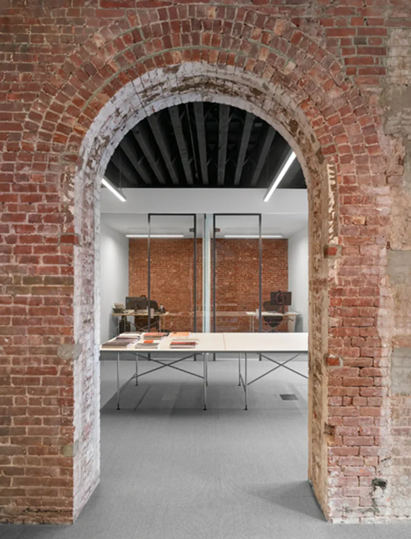

The interior archways are the project's signature spatial device. Rather than flattening the warehouse into a white-box sequence, studioMDA preserved the original brick arches and used them to frame transitions between rooms. Walking through the gallery becomes an act of serial revelation: you pass through an exposed brick opening and arrive at a display table with suspended brick panels, or step beneath a painted arch into a room where freestanding steel frames hold artwork against dark timber joists.
The decision to leave the ceiling structure exposed throughout is critical. Black-painted timber joists run overhead in most rooms, giving each space a strong horizontal datum that grounds even the most minimal installations. Exposed brick walls appear selectively, sometimes as full surfaces, sometimes as fragments visible through archways, calibrating the degree of historical texture room by room. The building never lets you forget what it was, but it never competes with what is on display.
Flexible White Rooms
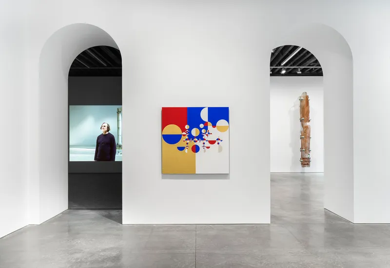


Not every gallery needs raw brick. Several rooms are finished with clean white walls that can be subdivided as exhibitions demand, offering curators the neutral backdrop that large-scale contemporary work often requires. Paired arched openings punched through these white partitions give the rooms a rhythmic cadence, linking them visually while still allowing each to function as a self-contained gallery.
The consistency of the polished concrete floor across these spaces is worth noting. It reads as a continuous ground plane that ties the more industrial rooms to the cleaner ones, keeping the entire building on the same register even as wall treatments shift. It is a small choice that does a lot of spatial work.
Circulation and the Logic of the Section
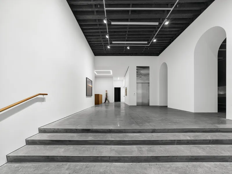

Pushing the stairs and elevators to the back of the building is the kind of pragmatic decision that rarely gets celebrated but shapes everything. The wide concrete staircase, fitted with a simple timber handrail, connects the two main exhibition floors and terminates in views through arched doorways. It is generous enough to feel public without being monumental, and its placement means that every street-facing bay can be given over to art.
The program stacks vertically in a logical sequence: exhibition spaces occupy the primary floors, viewing rooms appear on the first through third levels, and support functions like the library, archive, art storage, and administrative offices fill the remaining floors. The building's five stories accommodate a surprisingly varied program without any single use feeling squeezed.
Atmosphere and Darkened Rooms


The gallery is not locked into a single mood. One room is finished with charcoal-colored walls and a cylindrical partition element, creating an enclosed, contemplative atmosphere suited to video, photography, or installations that benefit from reduced ambient light. The exposed black ceiling joists overhead compress the space vertically, intensifying the experience.
Elsewhere, a quieter moment: a white-walled room where a timber bookshelf is visible through an opening, suggesting the library or a reading area adjacent to the galleries. These secondary spaces, tucked between the main exhibition rooms, give visitors a chance to decompress and shift their attention. The building accommodates slowness as well as spectacle.
Plans and Drawings

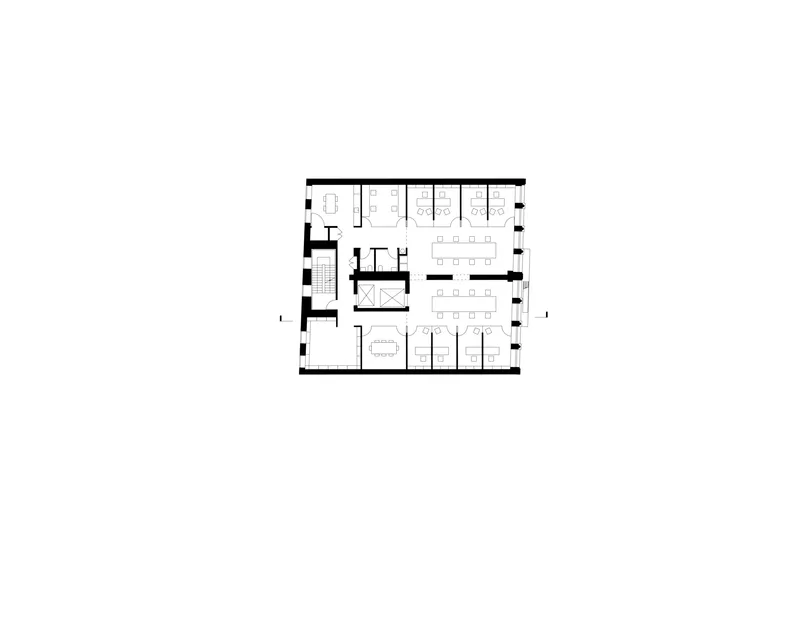


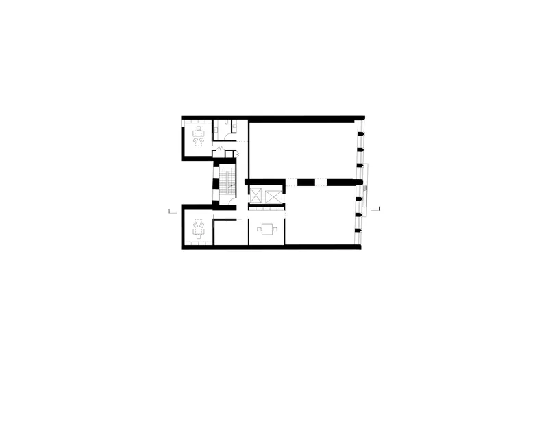


The floor plans reveal the organizational logic behind the experience. The central stair appears consistently at the rear, freeing the front half of each floor for open, column-free exhibition or workspace. Some levels show enclosed meeting rooms and open workstation zones for the gallery's administrative team, while others feature terraces flanking the main volume, introducing outdoor space into a building type that rarely offers it. The section drawing is especially telling: it shows the full stack of arched openings marching across multiple levels, with basement storage below, confirming that the arch motif is not decorative but structural, woven into the building from foundation to cornice.
Why This Project Matters
New York's gallery scene has long oscillated between pristine white cubes in Chelsea and scrappy artist-run spaces in Brooklyn, with little room for a third approach. Marian Goodman's move to Tribeca, and the choice to renovate rather than build new, stakes out different territory. The gallery inherits the material weight and civic presence of a 19th-century commercial building while gaining the environmental controls and spatial flexibility that contemporary art demands. It is neither nostalgic nor futuristic, and that balance is harder to achieve than either extreme.
studioMDA's contribution is defined by restraint. The architects did not clad the building in a new skin or hollow it out for a dramatic atrium. They reorganized its circulation, restored its facade, and let its existing archways, joists, and brickwork do the atmospheric heavy lifting. The result is a gallery where architecture serves as a stable frame for changing exhibitions rather than competing with them, a building that will age well precisely because it already has.
Marian Goodman Gallery New York by studioMDA (lead architects: Markus Dochantschi, Beatriz de Uña Bóveda, Keren Bao). Located at 385 Broadway, New York, United States. 35,000 square feet. Completed 2024. Photography by Roland Halbe and Alex Yudzon.
About the Studio
Share Your Own Work on uni.xyz
If projects like this are the kind of work you want to make, uni.xyz is a place to publish your own, find collaborators, and enter design competitions.


Popular Articles
Popular articles from the community

Opera by the Sea Estonia: Three Shells Dissolving Architecture into Tallinn's Coastline
A winning opera house proposal replaces monumental form with interconnected shells that blur the boundary between building, park and Baltic Sea.

Temporary Home for Dogs: A Reversed Zoo Rethinks Animal Shelter Architecture
In Bucharest, a sinuous corridor and freed landscape flip the logic of containment, designing a shelter that works to make itself unnecessary.
Faces of the Soviet Avant-Garde: Turning Moscow's Street Names into an Open-Air Museum
A network of sculptural installations across a Moscow residential district transforms forgotten architect names into spatial encounters with cultural memor

Manzana Morphosis: Stretching Barcelona's Grid into a Living Landscape for 2050
A radical reworking of the Eixample manzana turns density into a tool for generous public space, vertical ecology, and environmental performance.

Similar Reads
You might also enjoy these articles

Pixel Gardens: One Repeated Module Stacked Into a Terraced Social Housing Tower for Famagusta
Salem Bader's shortlisted housing tower builds a vertical neighbourhood from one repeated module, offsetting units to carve terraces, light and air.

Bao Huynh Watercolor Atelier: A Serene Art Retreat in Hội An
Bao Huynh Watercolor Atelier in Hội An blends multifunctional art spaces, sustainable design, local materials, and family-friendly living in a serene environment.

Atelier Macri Concept Store Interior Design by CASE-REAL
Atelier Macri store features a "ko" counter, walnut wood details, cork displays, blending retail, gallery, and seamless customer experiences.

Manuel Vargas Izquierdo Stadium and High-Performance Sports Center: Architectural Excellence in Jalpa de Méndez
The Manuel Vargas Izquierdo Stadium blends sustainable design, inclusive sports facilities, and cultural-inspired architecture, revitalizing Jalpa de Méndez’s public spaces.

Explore Art Gallery Competitions
Discover active competitions in this discipline

Challenge to reimagine the Iron Throne

Photograph architecture without architects

Illustrate the lost glory of Angkor Wat - Render Challenge

Bring back Drive In's
Comments (0)
Please login or sign up to add comments
No comments yet. Be the first to comment!