
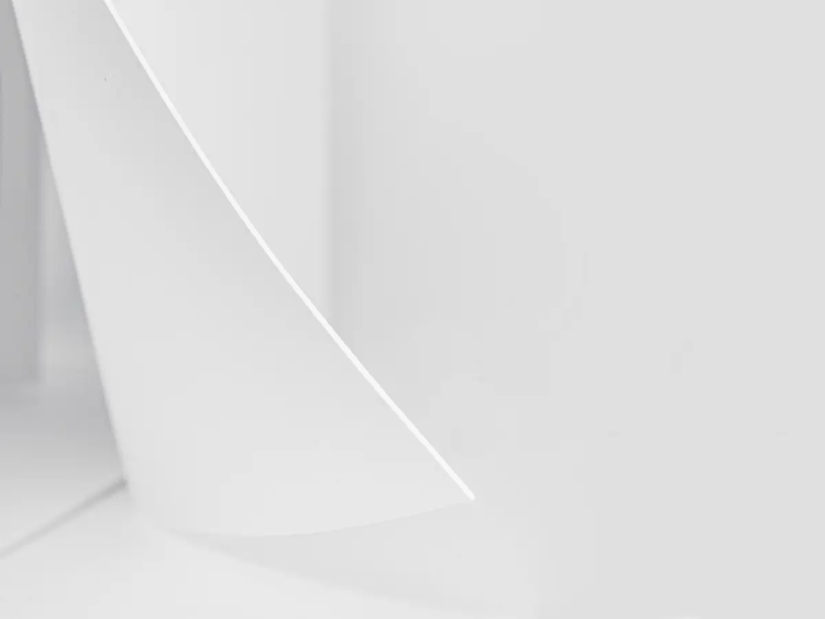
TABULA RASA
MICROLIBRARY

Nowadays we lack time and space for gaining knowledge and information, which are both crucial in a modern world. By resigning from the traditional cube, we focused on designing in the project to create the most narrow, tall and functional building possible. It serves as a public library for four people. Given the shortfall of free space in many city centers, this library could be built in the smallest zones that are unoccupied and available for everyone. The main theme of our project is tabula rasa. It appears in our design as a symbol of the sheets of book paper. Designing the entrance to our library was very important, because by resigning from traditional doors, we wanted to design something that will refer directly to paper cards, which is why we decided to make a detail that looks like a folded piece of paper coming out of the wall and suggesting sliding in inwards . The library is a place not only to gain knowledge, but also to relax, contemplate and daydream. Therefore we have designed comfortable seats on the stairs and a space on the mezzanine which was connected by a platform inside the building just below the top, which we climbed using a ladder placed there. It is dedicated for those seeking solitude. The vertices of the building are made of transparent glass so that the readers would have the access to daylight anywhere they are. The openwork pattern located in the middle of the building, from the bottom to the top, is both aesthetic and functional. Thanks to this procedure, a person moving in space with stairs, it is able to grab shelves if necessary, because instead of traditional shelves, there are openings for books in the wall that can be accessed from two sides, both from each level of the building, standing on a given level and going up the stairs. In in this way, the stairs were used not only to overcome height differences, but also to allowing access to the higher levels of the bookshelf by the person staying inside. The openwork with the regiments also has a delicate detail in the form of a red color on the edges of the protruding elements. We also wanted the reader visiting such a place to have time for an appropriate interior reception. Therefore, the regiments are open from the side of the exit from the stairs to the next ceiling, allowing a person to pick up books from the regiments while climbing the storey, while while descending, walking around the openwork in the opposite direction, we see white sheets overlapping each other, creating a beautiful aesthetic detail. The essential element of the decor is the color white. White - like a sheet of paper - does not distract nor interrupt the reader. The whole concept of the project was to find a simple architectural solution with an imposed functionality. The solution is meant to be both interesting and not gaudy, to be universal in different areas of the city. The aesthetic search applied mainly to the building material. The fusion of a big space made of glass, with a brass openwork pattern, provides a great amount of daylight and clearness. This serves as an incentive, an invitation to come in. Moreover, depriving the building of all building materials and focusing on a uniform finish of the building was to help the reader to eliminate all distracting elements, so that the reader could focus on the content with peace of mind. The above-mentioned clearness is also an all-purpose element that creates the possibility to locate the building next to an already existing one, without forming any kind of competition. Another universal aspect of our project is its simple form that produces the opportunity for repetitiveness by adding building modules on a bigger area. This way we could create building objects depending on the available space. Initially the main color is white and this choice seems obvious. However, the building materials used in the project do not determine the color scheme for future implementations. Depending on the location, the building could be created in the color scheme that is dominant in the area, thus fitting in and becoming an integral part of the neighborhood. By using the art glass which is known for its wide utility we can predict some perspectives for the project development. There are more and more technological solutions enabling the implementation of large-format glass objects. The art glass looks good in this kind of project, it corresponds well with modern architecture and it visually animats the space. It possesses great artistic advantages. Used inside, it emphasizes its function and helps to set the mood. Used outside, the art glass accentuates the form of the building. All the features of the art glass provide possibility of the project’s evolution.


Popular Articles
Popular articles from the community


LT2A and OPEN Architectes Thread a Brick and Glass High School Through a Wooded Belgian Campus
In Braine-l'Alleud, a 3,000 m² wing for Collège Cardinal Mercier pairs pale brick with a glazed colonnade, deferring to a small chapel and a dense wood.

ETEH Reworks the Shared Spaces of São Domingos School in Brazil Around Timber, Color and Hanging Plants
At São Domingos School in Brazil, 436 m² of hall, refectory and library are recast with timber joinery, a yellow and blue code and trailing greenery.

graciastudio Turns a Viewless Tijuana Lot Inward Around a Courtyard of Concrete, Timber and Trees
In Tijuana, Jorge Gracia's GA2 House stacks a timber-clad private floor over exposed concrete and replaces a missing view with a planted interior patio.

Cube Design Draws an Ecological Corridor Between Two Shenzhen Hills with the Nankai Building
Beside Shenzhen's container docks, the Nankai Building pairs stacked balconies with a climbing green screen to connect two hillsides across its height.

Similar Reads
You might also enjoy these articles


Vereda Arquitetos Renovates a 40-Square-Meter Apartment Inside Niemeyer's Copan Building
A compact unit in São Paulo's most iconic residential tower gets a material overhaul that pairs exposed concrete with bold blue Formica.

Shakur's House: Exposed Brick as an Interior Organiser in a 168 m² Mashhad Residence
Brick moves indoors in this Mashhad residence, where masonry walls, glass partitions and teal planes sequence a compact home without closing it off.
Day and Night Park: A Time-Based Urban Newsstand in Beijing
A temporary urban newsstand in Beijing blending travel, light, and reading through poetic colors, compact form, and community-focused design.

Modernist Patio Renovation in El Masnou, Barcelona by Oliver Segura Arquitectura + Cebrià Arquitectura
Modernist patio renovation blending tradition and innovation with a movable pool, leveled floors, and Catalan materials in El Masnou.


Comments (0)
Please login or sign up to add comments
No comments yet. Be the first to comment!