

Tsou Arquitectos Wraps a Braga Corner Pharmacy in a White Cylinder Cut Through by an Oval Light Well
In Braga, a compact curved pharmacy follows the bend of the road, cuts an oval light well through its floors and carries its signage in relief.

Pharmacies are among the most ordinary buildings in a European neighbourhood. Most are a glazed shopfront, a lit green cross and a wall of boxes. In Espadanido, a residential district of Braga, Tsou Arquitectos, led by Tiago Tsou, has built the São João Pharmacy as a freestanding white cylinder on a corner plot. The site sits at a junction between a busy avenue and a quieter residential street, and the building's curved face follows the profile of the road as it bends.
The rounded form is the obvious move, but it is not the most interesting one. What matters is how the curve settles two scales: it is visible enough to hold the corner on the avenue and contained enough to sit among the pitched red roofs of the houses behind it. Inside, the same geometry organises a vertical program around an oval opening that carries daylight from the roof down to the sales floor. The result is a small civic object that never feels like a retail box.
A Volume That Turns the Corner


Seen across the road, the building reads as a single drum with very few incidents: a recessed upper window, a rounded fin at the roofline and the cross sign. That restraint is deliberate. A corner plot invites a landmark, and many architects would answer with height or cantilevers. Tsou answers with continuity instead. The wall never presents a front or a back, so the building addresses the avenue and the residential street with equal weight.
The aerial dusk view makes the scale argument clear. The cylinder is about the same size as the houses around it, and it stands out because of its shape and its whiteness, not its bulk. When the green neon cross switches on, the pharmacy does what pharmacies have always done at night: it becomes a beacon for the block.
Signage Built into the Wall


The identity of the pharmacy is cast into the façade rather than bolted onto it. The lettering, the four-petal clover emblem and the outlined cross all sit in shallow relief on the textured render. In flat light they nearly disappear. In hard sun they read through shadow, so the sign changes with the time of day.
We think this is the smartest detail on the exterior. Commercial signage is usually the first thing to degrade a carefully designed elevation. Here it is part of the surface, and the only applied element is the illuminated cross, which pharmacy regulation and custom require anyway. The small service door under its thin curved canopy follows the same logic: the openings are cut into the skin, never added to it.
Thresholds, Steps and Shadows


The entrance is set into a sequence of low concentric steps that follow the curve of the wall. They turn a level change into a soft, readable threshold. A white tubular handrail is the only vertical element in front of the etched glass door, and its shadow does as much work on the plaster as the handrail does for the visitor.
The care extends past the building edge. Pedestrian access and parking are kept inside the lot, and the footpaths continue the material of the existing pavement in sandblasted Estremoz marble, a regional Portuguese stone. The parking uses a permeable grass-grid surface rather than a sealed slab. It is a modest site strategy, but it means the building does not land on a sea of asphalt, which is the usual fate of a roadside pharmacy.
A Sales Floor Shaped by the Curve


Customer service occupies the street-level floor, which totals 306 m² of retail and service space. The counters bend in plan, wall shelving tracks the perimeter, and numbered service points are set out like stations around a room rather than in a straight line facing the door. The plan supports a calmer kind of queueing, closer to a waiting room than a checkout.
Where the glazing meets the corner, the ceiling edge undulates and the roof overhangs to shade the glass. From inside you see the orange tree, the crosswalk and the street. The palette is kept to white surfaces, tiled floors and pale timber, so the products on the shelves supply most of the colour. That is the right call for a shop whose stock changes constantly.
The Oval Void at the Centre


The defining interior move is an oval opening lined in pale wood that connects the sales floor to the level above and, through a skylight, to the sky. From the shop you look up into a warm, timber-toned throat. From above you look down onto customers at the counters. Retail space usually depends on artificial light, and this void lets daylight reach the middle of a deep, round plan.
The void also gives the vertical program a shared centre. A circular wood-clad counter sits beneath a round skylight, and on the upper floor a curved corridor with a timber balustrade wraps the opening. The building is organised floor by floor according to functional need, and this opening is what stops those floors from feeling like separate tenancies stacked on top of each other.
Stairs and the Back of House


Circulation follows the curved wall. One stair has floating stone treads with concealed warm light under each step. Another is a narrow white flight climbing toward a small window. Both hold to the perimeter and leave the centre clear for the void. The handrails are thin steel, matching the one at the entrance, so the same detail runs from the street to the staff floor.
Upstairs the program becomes staff and professional space: meeting rooms with long white tables and ring pendant lights that repeat the circular theme, oak-veneer doors, and a small balcony with a curved parapet looking out to the trees. The basement holds 163 m² of technical and storage areas, kept out of sight so that the public floor stays uncluttered. For a pharmacy, where stock and logistics are constant, that separation matters more than it might seem.
Plans and Drawings


The plans confirm what the photographs suggest. The ground floor is an oval with curved counters and parking arranged around it inside the lot. The upper floor organises rooms radially around a central circular hall. The roof plan shows parallel panel lines, the central oval opening and three notched recesses along the edge, which are the recessed windows seen from the street. Read together, the drawings show one geometric idea carried consistently from site to roof.
Why This Project Matters
Neighbourhood retail is where most people meet architecture every day, and it is usually where design ambition is lowest. The São João Pharmacy treats a routine commercial program as a corner building with civic responsibilities. It marks the junction, respects the residential scale, folds its signage into the wall and gives its outdoor ground the same attention as the interior. None of that is expensive in principle. It requires discipline.
The project's main lesson is about economy of gesture. One curved volume answers the site, organises the plan, produces the light well and sets the tone of every detail from the steps to the handrails. When a small building commits to a single idea and follows it through, it can carry more urban weight than its 469 m² would suggest. Braga gets a better pharmacy, and the district gets a better corner.
São João Pharmacy by Tsou Arquitectos (lead architect Tiago Tsou), Espadanido, Braga, Portugal. Area: 306 m² retail and services plus 163 m² technical basement. Completed 2026. Photography by Ivo Tavares Studio.
About the Studio
Share Your Own Work on uni.xyz
If projects like this are the kind of work you want to make, uni.xyz is a place to publish your own, find collaborators, and enter design competitions.


Popular Articles
Popular articles from the community


Becoming Aligned With All: A Rammed Earth Campus in Sri Lanka That Rises From the Ground and Falls Back
Two white concrete shells lift off a riverside site and land again, framing a pooled courtyard, rammed earth walls and rooms that can be reshuffled.


Cambra Buró Sets a Kuwaiti Coastal Villa on a Sculpted Travertine Plinth and Lets the Upper House Float
In Abu Al Hasaniya, Kuwait, a 3,000 sqm seaside villa pairs a heavy stone base with clay, cork and walnut to work with the Gulf climate.

REAL Architects and Challenge Design Plant a Timber Gridshell Seed at the Heart of Shanghai's West Bund
On Shanghai's Xuhui Waterfront, a 230 m² glazed timber lattice dome anchors a terraced garden and lets its structure do all the talking.

Some Thoughts Clamps Felt and Metal Together to Build a Modular Eyewear Store in Wuhan
A 98 m² MOLSION eyewear shop in Wuhan builds its displays from stacked red and grey felt modules held by custom triangular metal fasteners.

Similar Reads
You might also enjoy these articles

LAVA Architecten Gives Vocational Education a Sawtooth-Roofed Face on a Mechelen School Campus
In Mechelen, Belgium, a 2,053 m² STEM school on a 6×6 m grid turns workshops and classrooms into rooms that can be rearranged as teaching changes.

KEMA Studio Turns a Derelict Marvila Attic into a 60 m² Lighthouse Apartment Above Lisbon
In Lisbon's Marvila district, a rebuilt roof, four skylights and two plywood volumes turn an unlivable attic into a bright home facing the Tagus.

Pixel Gardens: One Repeated Module Stacked Into a Terraced Social Housing Tower for Famagusta
Salem Bader's shortlisted housing tower builds a vertical neighbourhood from one repeated module, offsetting units to carve terraces, light and air.
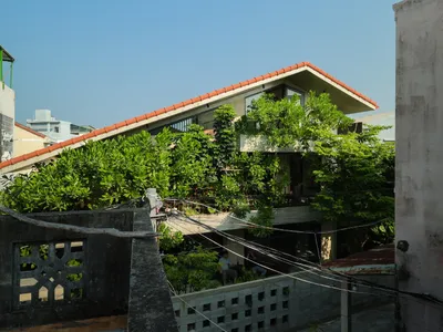
Bao Huynh Watercolor Atelier: A Serene Art Retreat in Hội An
Bao Huynh Watercolor Atelier in Hội An blends multifunctional art spaces, sustainable design, local materials, and family-friendly living in a serene environment.

Explore Architecture Competitions
Discover active competitions in this discipline


The International Standard for Design Portfolios

The Global Benchmark for Architecture Dissertation Awards

The Global Benchmark for Graduation Excellence

Challenge to reimagine the Iron Throne
Comments (0)
Please login or sign up to add comments
No comments yet. Be the first to comment!