

Mario Cucinella Architects Wraps an Alpine University Campus in a Glacier-Inspired Skin
On a former military barracks site near Aosta's historic center, a climate-driven facade and compact massing redefine sustainable campus design.


The Valle d'Aosta region sits at a crossroads of Italian and French building traditions, where scalloped slate shingles and heavy timber construction replace the terracotta and stucco found elsewhere on the peninsula. It is also one of the coldest inhabited valleys in the Alps, shaded by southern slopes in winter and subject to severe daily temperature swings. Designing a university here means confronting a climate that punishes thermal negligence. Mario Cucinella Architects (MCA) responded not with brute insulation but with a building whose very form and skin are shaped by energy analysis, wrapping 7,500 square meters of new academic space in a sinuous envelope that reads like a fragment of glacier calved into the city grid.
The site is the former Testafochi Barracks, a 52,000 square meter military compound originally built for the Alpini, Italy's mountain infantry. MCA's masterplan keeps two of the original four barracks buildings, retrofitting one as a library and another as faculty offices, while demolishing the two longest structures to make way for new classroom buildings and a generous public square. The result is not just a campus but a piece of urban surgery: a strategic strip of land near Aosta's center that was once sealed off by military use is now porous, green, and woven back into the city. What makes the project genuinely worth studying is the rigor with which climate data drove every formal decision, from the tapering volume to the adaptive facade to the geothermal wells sunk beneath the courtyard.
A Facade That Behaves Like a Living Skin

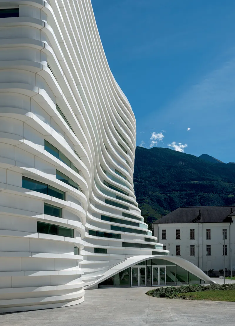
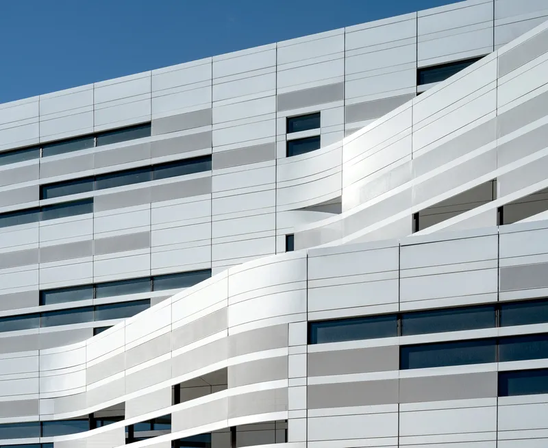
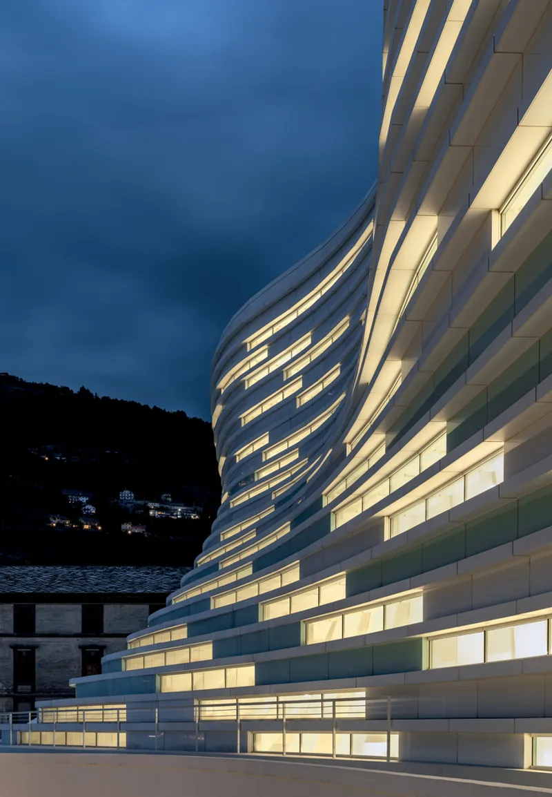
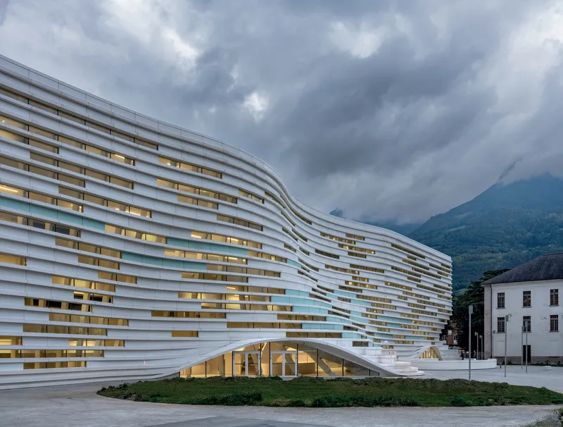
The building's most immediate gesture is its horizontally banded envelope. Metal ribs and Betacryl acrylic stone panels form a framed structure that expands or compresses in density depending on height, orientation, and solar exposure. On the city-facing elevation, the bands are tighter and more opaque, shielding interiors from noise and low-angle winter sun. On the piazza side, the system opens up, becoming semi-transparent and integrating with circulation spaces to let daylight flood the corridors.
MCA has described the inspiration as an iceberg, and at first glance the analogy feels decorative. But the connection is structural: like compacted ice, the facade's layering is a response to pressure, in this case the pressure of a site that receives intense summer radiation on its upper floors while its lower levels sit in winter shadow for months. The skin is not ornament. It is the primary solar control device, and it eliminates the need for mechanical blinds on most elevations.
Compact Form Against Alpine Cold
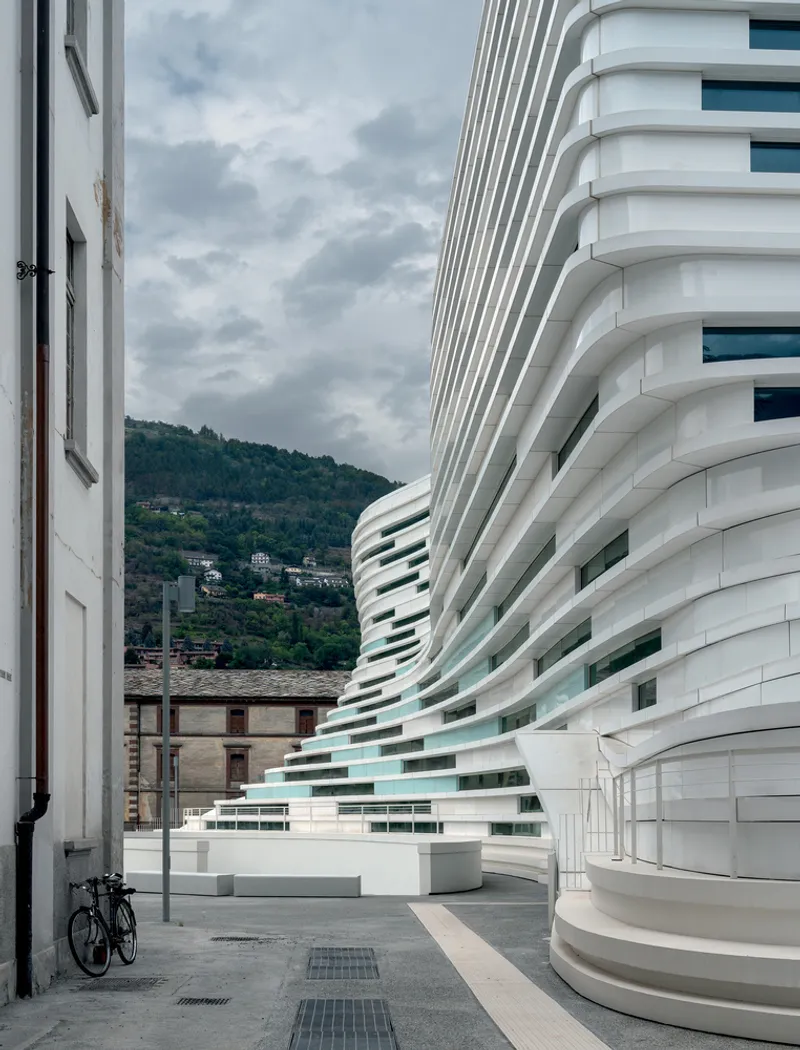


Aosta's valley geography means cold air pools at the valley floor while the surrounding peaks block low-angle sun for much of the winter. MCA's response was a compact, well-insulated volume that tapers as it rises, minimizing the surface-area-to-volume ratio and reducing exposure to prevailing cold winds. The form is not arbitrary sculptural play; it is the direct output of climatic modeling that mapped solar radiation, shading behavior, and wind patterns across the site.
The tapering also serves an urban purpose. By pulling mass away from the skyline, the building reduces its visual impact against the mountain backdrop and avoids the fortress-like presence that a full-height block would impose on the new public square. The curving silhouette references alpine glacier profiles, but its real achievement is diplomatic: it makes a large institutional program feel lighter than its 7,500 square meters would suggest.
The Atrium as Thermal Engine
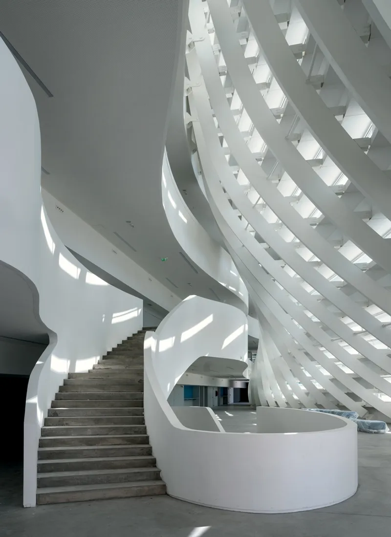

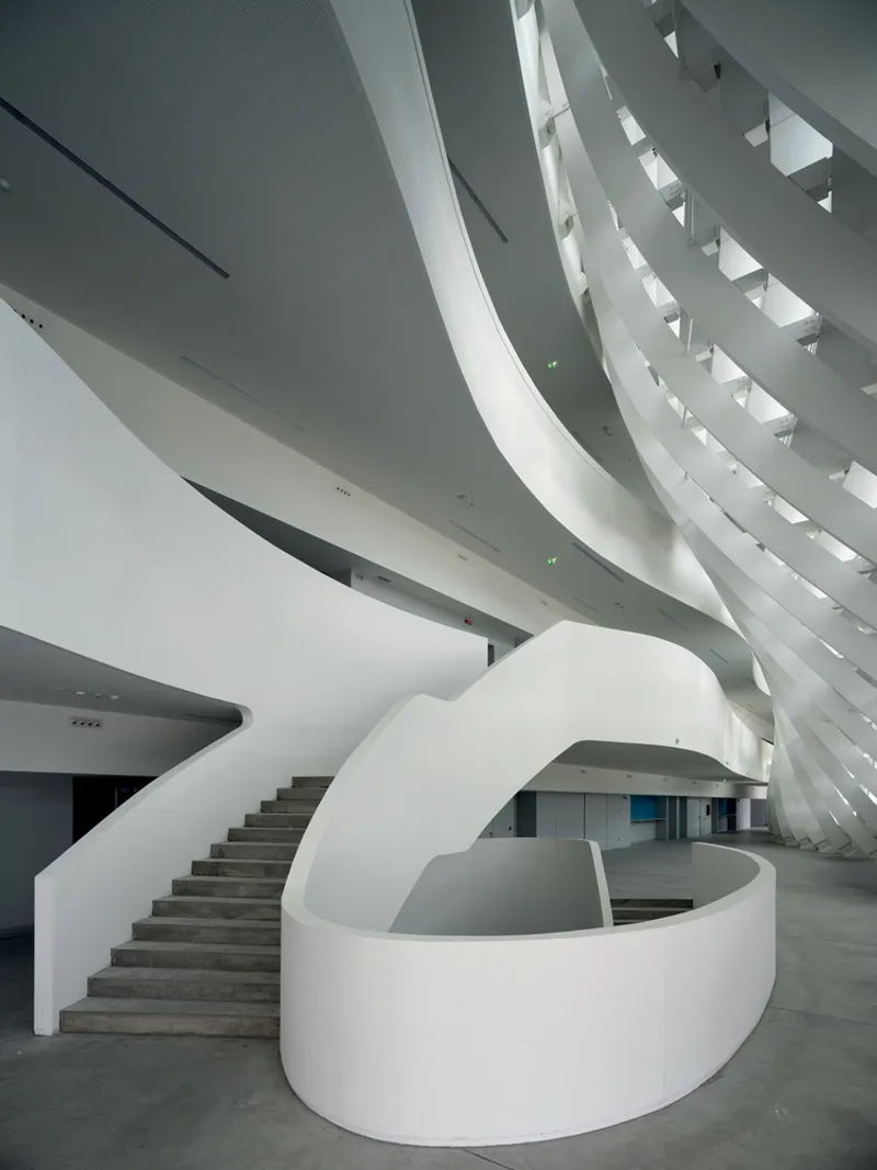
At the heart of the building, a multi-level atrium rises through all four above-ground floors, crowned by geometric skylights that cast sharp, shifting shadows across curved balconies. The atrium is not merely a wayfinding device. It functions as a naturally ventilating chimney, drawing warm air upward and exhausting it through operable roof elements while cooler air enters at the base. In a climate with large diurnal temperature swings, this stack effect can handle a significant portion of cooling loads during shoulder seasons.
The helical staircase that spirals through this void is both circulation and spectacle. Concrete balustrades curve outward at each level, creating overlapping sightlines that connect students visually across floors. Circular ceiling lights punctuate the white surfaces with a rhythm that keeps the space from feeling clinical. MCA clearly understands that a sustainable building still needs to be a place people want to inhabit, and the atrium delivers on that count with a generosity that rivals much larger institutions.
Teaching Spaces That Face the Mountains
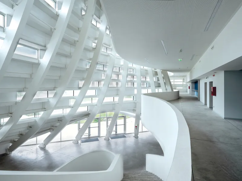

Classrooms and study areas occupy the upper levels, oriented toward the surrounding peaks. Large reinforced concrete slabs span between partition walls, creating open-plan teaching environments free of intrusive columns. The structural logic is straightforward: concrete partitions carry the loads, freeing the facade to do its environmental work without bearing additional structural demands.
At the roof level, white curved arches frame views of the hillside and the historic city beyond. These are not decorative follies; they are the structural ribs that support the topmost layer of the facade system, giving the building its characteristic crowned silhouette. The angled glazing along the corridors admits daylight deep into the plan while the structural ribs outside act as fixed brise-soleils, cutting direct sun in summer when the angle is high.
Burying the Auditorium, Not the Light
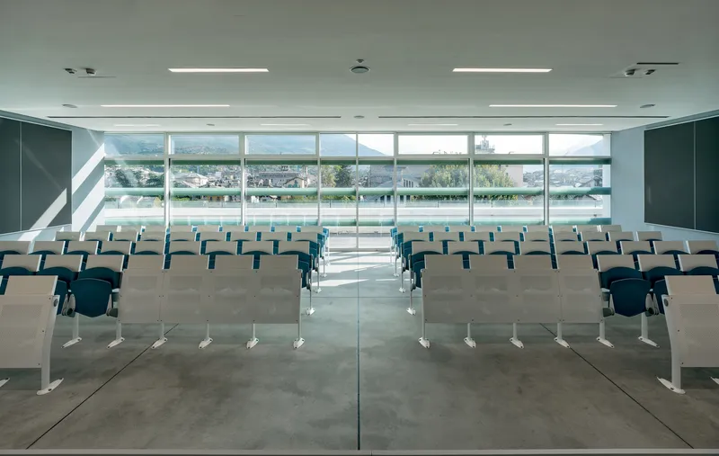
The 176-seat Aula Magna and two computer laboratories are located at basement levels one and two. Burying large-volume, high-occupancy spaces underground is a proven thermal strategy: the earth's mass provides natural temperature stability, reducing both heating and cooling loads. But MCA refused to condemn these rooms to a bunker existence. A large excavated courtyard punches daylight and fresh air into the subterranean levels, turning what could have been a dim lecture hall into a space with full-height glazing overlooking a planted terrace.
The auditorium's rows of blue chairs face that glazed wall, giving a university lecture the improbable quality of an alpine overlook. At dusk, the warm interior glow reverses the relationship: the building becomes a lantern visible from the surrounding streets, signaling the campus's public presence in the city. The dual reading, introverted classroom by day, civic beacon by night, is one of MCA's most elegant moves.
From Barracks to Public Square
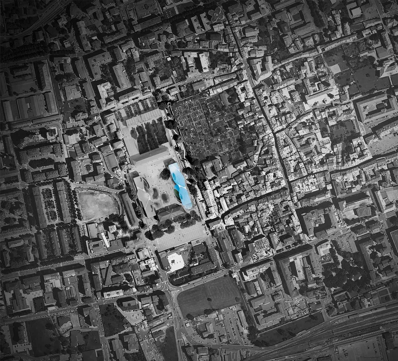
The aerial view makes the urban argument unmistakable. The campus appears as a distinct blue-tinted volume amid the grey grain of Aosta's dense blocks. Where the barracks once formed a closed courtyard accessible only to military personnel, the masterplan introduces open green space and a permeable public square that stitches the site back into the pedestrian network. The ground floor is conceived as a threshold zone: cafeteria, main hall entrance, and social spaces that belong as much to the city as to the university.
MCA's selective demolition strategy is worth noting. Keeping the two shorter barracks buildings for library and office reuse avoided roughly half the embodied carbon that full demolition and new construction would have required. The two new buildings then occupy only the footprint of the demolished structures, maintaining the original courtyard proportions while completely transforming their character. It is heritage preservation in service of carbon reduction, not the other way around.
Plans and Drawings
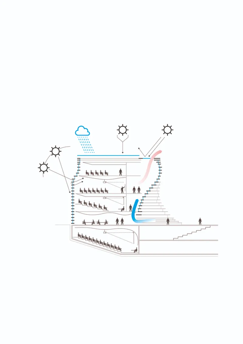
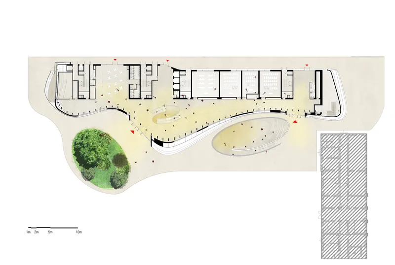
The section drawing reveals the full depth of MCA's environmental strategy in a single image. Geothermal wells descend below the basement levels, sun-path diagrams annotate the facade's shading logic, and rainwater collection symbols mark the roof. The terraced auditorium section shows how the excavated courtyard delivers daylight two stories below grade. It is a drawing that makes the building's 38 percent energy reduction over comparable institutions legible at a glance.
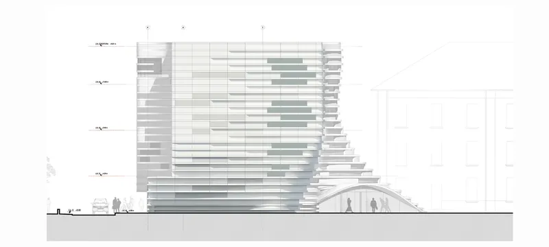
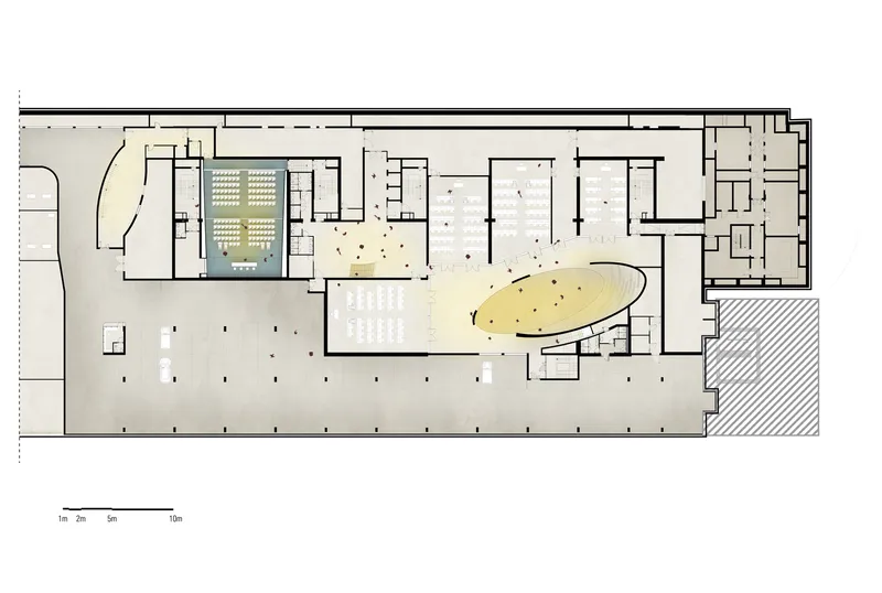
The floor plans at different levels illustrate the program's split personality: formal auditorium and foyer spaces at the lower levels, a curved outdoor garden and more informal social rooms at grade. The elevation drawing of the stepped volume confirms the tapering strategy, each floor slightly smaller than the one below, reducing wind load and solar gain simultaneously. The horizontal layering of the facade reads as a single continuous gesture from foundation to roofline.
Why This Project Matters
Sustainable campus design is a phrase that has been drained of meaning by overuse. Every new university building claims green credentials. What separates the Valle d'Aosta campus is the transparency of its method: climate data shaped the massing, the facade density is a direct function of solar geometry, and the underground program exploits thermal mass rather than hiding from it. The result is a building whose formal identity and environmental performance are genuinely inseparable, not a standard box with photovoltaic panels bolted on as an afterthought.
MCA also demonstrates that adaptive reuse and new construction can coexist on the same site without one undermining the other. The retained barracks give the campus historical weight and reduce embodied carbon, while the new buildings deliver the spatial performance that a 2,000-student institution demands. For any city sitting on decommissioned military or industrial land near its center, Aosta offers a convincing template: keep what works, replace what doesn't, and design the new pieces so rigorously that they justify their own carbon expenditure through decades of reduced operational energy.
Valle d'Aosta University Campus by Mario Cucinella Architects (MCA). Aosta, Italy. Site area: 52,000 m²; gross floor area (Zerboglio building): 7,500 m². Completed 2023. Photography by Duccio Malagamba.
About the Studio
Share Your Own Work on uni.xyz
If projects like this are the kind of work you want to make, uni.xyz is a place to publish your own, find collaborators, and enter design competitions.



Popular Articles
Popular articles from the community


The Ocean Hive: Sustainable Architecture for a Self-Sufficient Civilization at Sea
The Ocean Hive imagines sustainable architecture at sea, where modular habitats, algae, wave power and ocean waste sustain a growing colony.
The Earth Pod: 3D Printed Homes for Resilient Refugee Communities
The Earth Pod reimagines refugee housing through 3D printed homes made from clay, combining resilience, self-sufficiency, and rapid shelter.

Co-life: Sustainable Architecture for Age-Friendly Community Living
Co-life reimagines sustainable architecture for seniors through courtyards, rammed earth, shared gardens, and spaces designed for belonging.

Co-Life: Senior Housing Design That Reconnects Older Adults With the City
Co-Life reimagines senior housing design through healing gardens, shared streets, workshops, and a sustainable community across generations.


Similar Reads
You might also enjoy these articles

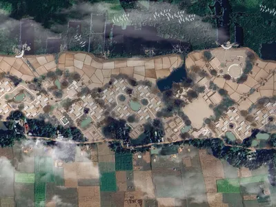
Hodi-Mandai Geram
Project Function: Preservation and revitalization of the Intangible heritage and socio-spatial identity of the Hodi by Housing, Cultural Memory Center, Sacred Grove, landscape, local tourism economy

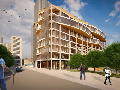
Olio Towers: A Mid-Rise for Performers That Fuses Housing, Rehearsal, and Stage
Located blocks from Houston's Theater District, this modular tower stacks living units around a central performance atrium.
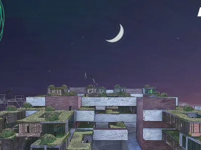
Oasis: Modular Green Housing Carved into Dhaka's Urban Fabric
A shortlisted Plugin Housing entry reclaims unauthorized settlements in Dhaka with stepped concrete volumes, green roofs, and ventilation-driven design.

Black Hole: A Floating Megastructure for the Post-Physical Era
Emiliano Mazzarotto envisions a spherical, self-scaling arena where e-sports, digital hotels, and holographic stadiums replace traditional public space.

Explore Architecture Competitions
Discover active competitions in this discipline



Challenge to reimagine the Iron Throne


Photograph architecture without architects


Illustrate the lost glory of Angkor Wat - Render Challenge


Design challenge to reuse E-waste
Comments (0)
Please login or sign up to add comments
No comments yet. Be the first to comment!