

Various Associates Fits a Flexible White Gallery into a Ground-Floor Shopfront on Shanghai's Yuyuan Road
On Shanghai's century-old Yuyuan Road, a 142 m² renovation uses pivoting white walls, glowing ceilings and deep windows to frame the plane trees outside.

Yuyuan Road is one of Shanghai's century-old streets, lined with plane trees and long associated with the city's elites. It is a hard place to insert anything new, because the street already carries more meaning than most buildings can hold. With FIUFIU Gallery, completed in 2018, Various Associates works with that weight. The studio renovated a 142 m² ground-floor unit in a grey apartment block into a gallery and retail space, and treats the street as the most valuable material on site.
The project is interesting because it takes very little space and makes it behave like a much larger one. A sequence of white corridors, freestanding walls that pivot, and ceilings that glow uniformly turns a modest shop unit into a gallery that can be reconfigured. Deep window reveals bring the plane trees inside as framed pictures. The architecture is quiet, but every move is deliberate.
A Stone Base on a Historic Street


Seen from the pavement, the gallery reads as part of the building rather than an addition to it. The blue-grey stone base follows the curved corner of the apartment block, and two large shopfront windows are cut into it. At dusk the windows become lit display cases, and the rough grey piers between them give the frontage a mass that fits the older fabric of Yuyuan Road.
Branding stays minimal: teal lettering applied directly to a dark stone pier. We like this restraint. On a street where the trees and the buses are the real foreground, the gallery does not need to shout. It only needs to glow at the right moment.
Windows That Frame the Plane Trees


The strongest idea in the project may be the thickness of its openings. The square windows sit in deep reveals, so from inside each one frames a single plane tree, a stretch of pavement or a bus shelter across the road. The street becomes an exhibit that changes with the hour and the season, hung alongside whatever artwork is on the walls.
The long corridor beside the main street window makes this relationship explicit. Pale timber floors and white walls give the sunlit foliage outside the strongest colour in the room, and passersby walk through the composition without knowing it. For a gallery that also sells, this two-way visibility is good business as well as good architecture.
A Gallery Built as a Sequence


Rather than one open room, the plan is laid out as a series of corridors and thresholds. Staggered white partitions set up long sightlines that end at a single small artwork on a plinth, so a shallow plot gains apparent depth. Visitors are always passing through a doorway or turning a corner, which slows the pace of looking.
Repetition does the work here. Rows of freestanding wall panels, matching ceiling treatments and one consistent floor make each corridor feel related to the next, and the blurred figures in the photographs show how people move through it rather than settle in it.
Walls That Pivot


Some of the white walls are not fixed. Freestanding panels pivot, opening or closing passages and changing the proportions of the rooms between them. In a 142 m² space that has to serve as both gallery and shop, this flexibility is essential: the same floor can be a run of intimate cabinets one month and a more open hall the next.
The details stay deliberately plain. A curved wall in the foreground eases the move into a brighter room, and openings cut through the panel rows frame a painting resting on a stool. The walls work as display surfaces and as tools for shaping space, and the design never lets you forget either role.
A Ceiling Made of Light


Overhead, a grid of translucent panels lights the corridors evenly, with solid grey panels and slot vents set into the same module. The effect is close to an overcast sky brought indoors: no hot spots and almost no hard shadows, which suits works on paper and lets the white walls read as continuous planes.
The close-up details show where the care went. Shadow gaps separate wall from ceiling, light panel edges sit cleanly in their frames, and a small triangular notch marks a wall corner. In one narrow room, a single square luminous panel works like a skylight. These are the junctions that decide whether a white box feels crafted or merely painted.
Rooms in Use


The photographs keep showing the gallery being worked: a framed drawing hung beneath the glowing ceiling, an artwork carried across a grey floor, visitors talking in a bright room seen through a doorway cut in a grey wall. The architecture is meant as a backdrop that is set up again and again, not a finished object.
That is the right ambition for a small commercial gallery. The neutral palette of white surfaces, pale timber and glass absorbs whatever is shown, while the sequence of rooms gives each piece its own moment.
Plans and Drawings


The floor plan shows how much of the experience depends on wall thickness. The grey poché is generous, and the dimensioned depths between walls show a layered plan in which the space between partitions matters as much as the rooms they enclose. Corridor junctions, like the one marked by a central white column and a thin vertical divider, are where the plan's logic is easiest to read in person.
Why This Project Matters
FIUFIU Gallery is a useful counterexample to the idea that small retail interiors on historic streets need a loud move to stand out. Various Associates makes almost no gesture on the facade and puts its effort into sequence, light and framing. The result treats Yuyuan Road with respect and still gives the gallery a clear identity.
For architects working on ground-floor renovations in dense cities, the lessons carry over. Thicken the openings so the street becomes content. Make the walls movable so the program can change. Treat the ceiling as a light source rather than leftover surface. At 142 m², the project shows that spatial richness depends more on how a space is ordered than on how big it is.
FIUFIU Gallery by Various Associates, Yuyuan Road, Shanghai, China. Area: 142 m². Completed 2018. Photography by 邵峰.
About the Studio
Share Your Own Work on uni.xyz
If projects like this are the kind of work you want to make, uni.xyz is a place to publish your own, find collaborators, and enter design competitions.


Popular Articles
Popular articles from the community

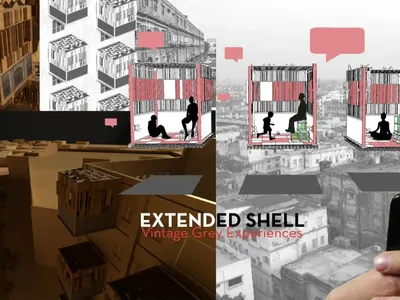
Extended Shell: Retrofitting Kolkata's Balconies as Living Urban Thresholds
A modular retrofit system recovers the social and environmental intelligence of Kolkata's historic verandas for contemporary Park Street residents.

Opera on the Sea: Driftwood Logic Shapes a Timber Opera House on Estonia's Coast
Trevor Orgill's opera house translates the entangled drift of floating timber into a civic building where wood, water, and music converge.
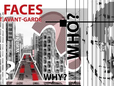
Faces of the Soviet Avant-Garde: Turning Moscow's Street Names into an Open-Air Museum
A network of sculptural installations across a Moscow residential district transforms forgotten architect names into spatial encounters with cultural memor
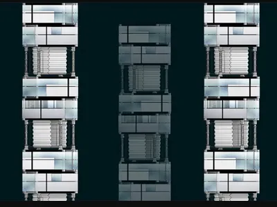
Tsunami Convergenics: Turning Catastrophic Ocean Forces into Underwater Housing Infrastructure
A speculative underwater settlement off the coast of Onagawa, Japan, treats tsunamis and typhoons as energy sources rather than threats.

Similar Reads
You might also enjoy these articles

Pixel Gardens: One Repeated Module Stacked Into a Terraced Social Housing Tower for Famagusta
Salem Bader's shortlisted housing tower builds a vertical neighbourhood from one repeated module, offsetting units to carve terraces, light and air.

Bao Huynh Watercolor Atelier: A Serene Art Retreat in Hội An
Bao Huynh Watercolor Atelier in Hội An blends multifunctional art spaces, sustainable design, local materials, and family-friendly living in a serene environment.

Atelier Macri Concept Store Interior Design by CASE-REAL
Atelier Macri store features a "ko" counter, walnut wood details, cork displays, blending retail, gallery, and seamless customer experiences.

Manuel Vargas Izquierdo Stadium and High-Performance Sports Center: Architectural Excellence in Jalpa de Méndez
The Manuel Vargas Izquierdo Stadium blends sustainable design, inclusive sports facilities, and cultural-inspired architecture, revitalizing Jalpa de Méndez’s public spaces.

Explore Cultural Architecture Competitions
Discover active competitions in this discipline


Challenge to reimagine the Iron Throne

Photograph architecture without architects

Illustrate the lost glory of Angkor Wat - Render Challenge

Bring back Drive In's
Comments (0)
Please login or sign up to add comments
No comments yet. Be the first to comment!