Graphic Design Competitions: From Poster Art to Wayfinding, Brand Identity to Type Design (Updated May 2026)
This is the UNI editorial home for graphic design — the discipline of visual communication through mark, type, image, and system. It is the tradition of Paul Rand's IBM logo, Saul Bass's movie posters, Milton Glaser's I ♥ NY, Massimo Vignelli's NYC Subway signage, Lance Wyman's Mexico City 1968 Olympics identity, Otl Aicher's Munich 1972 pictograms, Josef Müller-Brockmann's Swiss style grids, Pentagram's collective practice, and Chip Kidd's book covers. Graphic design is arguably the most ubiquitous design discipline in the world — every person encounters hundreds of graphic design artifacts before breakfast, most of them so good they disappear into the background of daily life.
UNI is not a general-purpose graphic design competition platform — that role belongs to D&AD, AIGA, and the Art Directors Club. UNI is the platform where graphic design meets architecture — wayfinding, environmental graphic design, exhibition graphics, archigraphia, museum signage, architecture firm branding, architecture publication design, and cross-disciplinary visual communication. That niche is real, defensible, and underserved by the large graphic design awards. This section curates competitions at that intersection, alongside broader graphic design briefs that welcome cross-disciplinary entries.
What Graphic Design Actually Covers
Graphic design is the broadest visual communication discipline. Its sub-fields are numerous enough that most practitioners specialize in just one or two:
- Visual identity and brand design. Logos, brand marks, corporate identity systems, brand guidelines. From IBM (Paul Rand, 1956) to Airbnb (DesignStudio, 2014).
- Typography and type design. Designing typefaces, applying them, and the tradition from Gutenberg through Jan Tschichold and Müller-Brockmann to Zuzana Licko and Matthew Carter.
- Poster design. The oldest mass communication medium still thriving. From 19th-century lithographic circus posters through Saul Bass's cinema posters to contemporary cultural programming.
- Editorial and publication design. Magazines (Neville Brody's The Face, David Carson's Ray Gun), book covers (Chip Kidd, Peter Mendelsund), book design as object (Irma Boom), annual reports, newspapers.
- Environmental graphic design (EGD). The architecture crossover — wayfinding, signage, supergraphics, mural-scale identity on buildings. This is where UNI sits most naturally.
- Information design and data visualization. From Gerd Arntz's Isotype pictograms (1930s) to contemporary infographic journalism.
- Illustration. Editorial, commercial, narrative, character design.
- Packaging design. Product, label, bottle, box — the graphic design discipline most people encounter most often.
- Motion graphics and title design. From Saul Bass's North by Northwest opening titles through contemporary title sequences and animated identity systems.
- Web, screen, and UI/UX design. Adjacent to pure graphic design but increasingly overlapping.
- Exhibition graphic design. Museum signage, wall text, label systems, exhibition identity. A direct architecture crossover.
- Archigraphia. Mural-scale graphic design on buildings — supergraphics, facade typography, architectural branding at building scale.
Why UNI Focuses on the Architecture-Graphic Design Crossover
The graphic design world already has its giants. D&AD (founded 1962) owns the prestige tier — the Pencils and Black Pencils are the field's most coveted awards. AIGA (founded 1914) is the professional home of American graphic design and runs the AIGA Awards and AIGA 365 Year in Design. The Art Directors Club and Type Directors Club are the specialist professional bodies. Pentagram is the most influential design firm. UNI does not claim to replace any of them.
What UNI does claim is that the intersection between graphic design and architecture is under-served by all of them. The graphic design awards focus on advertising, branding, print, and digital work. They rarely celebrate wayfinding, rarely cover architectural publication design in depth, and almost never run competitions explicitly at the architecture-graphic design crossover. The architecture awards do the opposite — they celebrate buildings, not the visual communication that threads through them.
UNI sits at exactly this intersection. We run competitions where the brief involves visual communication in service of architecture, exhibition, wayfinding, publication, or spatial identity. If you are a graphic designer who works on museum signage, architectural firm branding, exhibition graphics, or publication design for architects, UNI is built for you. If you are an architect who thinks graphically — about typography, poster design, or the visual identity of your own practice — UNI is where your work belongs.
The Canonical Figures of Graphic Design
Every graphic designer's library should start with these figures. They are the foundation the entire discipline is built on:
- Paul Rand (1914-1996). The American designer who established corporate identity as a modernist discipline. IBM (1956, with the stripes added 1972), ABC (1962), UPS (1961), Westinghouse. His book Thoughts on Design (1947) remains essential reading. Rand's IBM work, in particular, set the template for American corporate identity for the next 50 years.
- Saul Bass (1920-1996). The American designer who made film title sequences an art form and created some of the most iconic movie posters of the 20th century (Anatomy of a Murder, Vertigo, West Side Story, The Man with the Golden Arm). His logos include AT&T (1983), United Airlines (1974), Warner Communications, and the Continental Airlines globe (1968).
- Milton Glaser (1929-2020). The American designer whose I ♥ NY mark (1977) became one of the most imitated graphic designs in history. Also responsible for the Bob Dylan silhouette poster (1966), the New York magazine identity (as co-founder, 1968), and countless other cultural icons. His 2000s book Art is Work collects his own account of the field.
- Massimo Vignelli (1931-2014) and Lella Vignelli. The Italian-American duo who produced the NYC Subway signage system (1970, with Bob Noorda and Unimark) — still in use today, one of the greatest wayfinding systems ever designed. Their NYC Transit Authority Graphics Standards Manual is a canonical reference document. They also designed identity for American Airlines, Knoll, Bloomingdale's, and countless corporate and cultural clients. Vignelli's famous quote: "If you can design one thing, you can design everything."
- Pentagram (founded 1972). The most influential design firm in the world. A partnership model where 20+ partners work independently under a shared brand. Partners have included Alan Fletcher, Colin Forbes, Michael Bierut, Paula Scher (whose Public Theater posters for New York are canonical), Natasha Jen, Emily Oberman, and many more. Pentagram's partnership structure has been widely copied (and rarely successfully).
- Herb Lubalin (1918-1981). The American typographic designer whose expressive typography defined magazine design in the 1960s and 70s. His U&lc magazine (Upper and lower case) was a canonical publication. He designed typefaces including Avant Garde.
- Stefan Sagmeister (born 1962). The Austrian-American designer whose Sagmeister & Walsh studio pushed experimental, body-centred, provocative graphic design into the mainstream. His book design, album covers (Talking Heads, Lou Reed, Rolling Stones), and personal diary projects redefined what graphic design could say.
- Paula Scher (born 1948). Pentagram partner since 1991. Her posters for the Public Theater in New York are canonical. Scher's typographic exuberance and fearless use of scale made her one of the defining graphic designers of the late 20th and early 21st centuries.
- Michael Bierut (born 1957). Pentagram partner and frequent author. His book How to is a practitioner classic.
- Chip Kidd (born 1964). The book cover designer whose work for Alfred A. Knopf turned book covers into arguments. His Jurassic Park cover (1991) set a new bar for what a book jacket could be.
- Irma Boom (born 1960). The Dutch designer whose book designs treat the book as material object and spatial experience. Her Think Book for SHV (1996) — a 2,136-page tome without page numbers — is the canonical example of book-as-sculpture.
- Neville Brody (born 1957). The British designer whose work on The Face magazine (1981-86) and Arena redefined magazine design in the 1980s. His typographic experimentation shaped a generation.
- David Carson (born 1954). The American designer whose work on Ray Gun magazine (1992-95) pushed typographic deconstruction to its limits, often setting body copy in decorative dingbat faces to make readers work for meaning. His 1995 book The End of Print is a manifesto.
Swiss Style and the International Typographic Tradition
No single movement has shaped contemporary graphic design more than the Swiss style (also called International Typographic Style), developed in Switzerland in the 1940s-50s. The core figures:
- Jan Tschichold (1902-1974). German typographer whose 1928 book Die neue Typographie (The New Typography) codified asymmetric layout, sans-serif type, and functional hierarchy. The foundational text of 20th-century graphic design.
- Josef Müller-Brockmann (1914-1996). Swiss designer whose work and teaching (at Zurich School of Design) systematized grid-based layout. His book Grid Systems in Graphic Design (1981) remains the definitive text on grids. His Zurich Tonhalle concert posters are canonical.
- Armin Hofmann (1920-2020). Swiss designer whose 1965 book Graphic Design Manual is one of the great pedagogical texts of the discipline.
- Emil Ruder (1914-1970). Swiss designer whose Typographie (1967) is another canonical reference for the Swiss style approach to type and layout.
- Helvetica (Max Miedinger and Eduard Hoffmann, 1957). The typeface that became the 20th century's lingua franca. Originally called Neue Haas Grotesk, renamed Helvetica in 1960. Adopted by corporations, governments, and transit systems worldwide. The subject of Gary Hustwit's 2007 documentary Helvetica.
The Swiss style's core principles — asymmetric grid layouts, sans-serif typography, hierarchical clarity, objective photography, and mathematical precision — remain the default grammar of professional graphic design in 2026.
Environmental Graphic Design: Where Graphic Design Meets Architecture
This is UNI's editorial home base. Environmental graphic design (EGD) — also called experiential graphic design — is the discipline that puts graphic design into physical space. Wayfinding, signage, supergraphics, museum exhibition graphics, building identity, public lettering. The canonical projects and figures:
- Massimo Vignelli and Bob Noorda, NYC Subway Signage System (1970). The wayfinding system that turned New York's chaotic transit signage into a coherent modernist identity. Black signs, Helvetica (later Akzidenz-Grotesk, then back to Helvetica-like), colour-coded routes. The accompanying NYC Transit Authority Graphics Standards Manual is one of the great design documents of the 20th century — and it was rediscovered and reissued in 2014 to widespread acclaim. Every transit wayfinding system designed since has been in dialogue with it.
- Lance Wyman and the Mexico City 1968 Olympics. The complete identity system for the 1968 Olympics — logo, pictograms, signage, Aztec-inspired Op Art patterns woven through the city. Wyman created an entire visual language that turned Mexico City into a designed event. It remains the most celebrated Olympic identity in history.
- Otl Aicher and the Munich 1972 Olympics. Aicher's pictograms for the Munich Olympics — simple geometric figures showing every sport — became the universal template for airport signage, transit signage, and public pictograms globally. His rainbow colour palette and rigorous Univers typography gave the 1972 games a distinct modern identity. A founding figure of the Hochschule für Gestaltung Ulm school of design.
- Gerd Arntz and the Isotype pictograms (1920s-30s). Viennese sociologist Otto Neurath and Dutch artist Gerd Arntz developed Isotype (International System of Typographic Picture Education) — the first systematic graphic language for statistical and informational communication. The ancestor of every subsequent icon system, including Aicher's Munich pictograms and contemporary emoji.
- Harry Beck and the London Underground map (1933). Not strictly EGD but the canonical example of graphic design in transit. Beck abandoned geographic accuracy for topological clarity. Every subway map designed since has been in his debt.
- Saul Bass at the Bell System. Bass designed the Bell System logo (1969) and led the identity work for its subsidiaries. His approach to corporate identity extended into the physical environment of the company.
- Pentagram and museum wayfinding. Paula Scher and other Pentagram partners have designed wayfinding for the Cooper Hewitt Smithsonian Design Museum, the Mauritshuis, the New York Public Library, and dozens of other cultural institutions.
- SEGD — Society for Experiential Graphic Design. The professional body for EGD, founded in 1973. SEGD runs the annual Global Design Awards, publishes the SEGD Research Journal, and organizes the annual SEGD conference. The central professional community for wayfinding and environmental graphic designers.
- Supergraphics and archigraphia. Mural-scale graphic design applied to buildings. Barbara Stauffacher Solomon's 1960s Sea Ranch supergraphics established the tradition. Contemporary examples include the typographic facades on institutional and cultural buildings worldwide.
- Contemporary practice. Studios like Base Design (New York/Brussels), Karlssonwilker (New York), Michael Bierut at Pentagram, and dozens of smaller practices specialize in the architecture-graphic design intersection. Their work is often the most interesting in the discipline and the least covered by mainstream design media.
Typography and Type Design
Typography is graphic design's most foundational sub-discipline. Contemporary type design has its own canon:
- Matthew Carter (born 1937). Designed Georgia and Verdana for Microsoft (1996) — the two most-used screen typefaces in history. Also Bell Centennial, Charter, and many more.
- Erik Spiekermann (born 1947). Designed FF Meta (1991) — widely called "the Helvetica of the 1990s." Co-founded FontShop. Author of Stop Stealing Sheep & Find Out How Type Works, a practitioner classic.
- Zuzana Licko and Rudy VanderLans (Emigre, founded 1984). The Dutch-American duo whose Emigre magazine and Emigre Fonts brought digital type design into the cultural mainstream. Licko's Mrs Eaves (1996) and Filosofia (1996) are canonical digital typefaces.
- Gerard Unger (1942-2018). Dutch type designer whose typefaces (Swift, Gulliver, Vesta) were designed for specific technical and cultural contexts — newspaper printing, highway signage, Dutch municipal identity.
- Hoefler & Co. (Jonathan Hoefler, founded 1989). New York type foundry whose Gotham (2000, designed by Tobias Frere-Jones) became the face of the Obama 2008 campaign and then standard-issue for countless contemporary brands.
- Christian Schwartz and Commercial Type. Contemporary commercial type foundry behind many recent identity typefaces including the revived Guardian typefaces and Publico.
- The Type Directors Club (founded 1946). The professional body for type design. Its annual TDC Awards are the highest prize in type design. Tokyo TDC and European TDC run parallel programs.
Open Briefs in This Section Right Now
The competitions currently curated in the Typology: Graphic Design section on UNI:
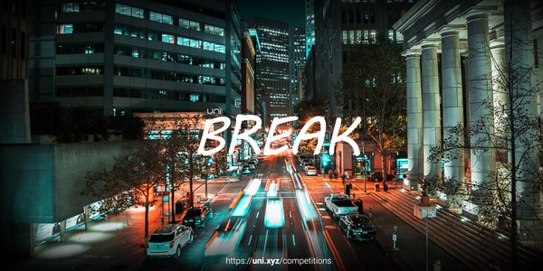
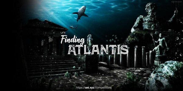
- Of Yore — Illustrate the lost glory of Angkor Wat - Render Challenge
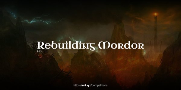
- Rebuilding Mordor — Challenge to imagine architecture inspired by fiction
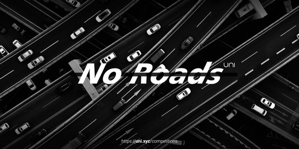
- No Roads — Challenge to visualize a future with no roads
- Lost glory — Challenge to illustrate the ruins of Petra
- One Change — Challenge to illustrate the change you wish in architecture
For more visual communication briefs across the platform, browse all ongoing competitions.
Poster Design: The Oldest Mass Communication Medium Still Thriving
Poster design is one of the oldest branches of graphic design — and somehow one of the most persistently vital. The international poster circuit includes some of the field's most prestigious competitions:
- International Poster Biennale Warsaw — founded 1966, the oldest poster biennial in the world. A canonical platform for Eastern European poster design traditions.
- Chaumont International Poster Festival (France) — one of the most prestigious contemporary poster festivals.
- Lahti Poster Biennial (Finland) — the Scandinavian stronghold of poster culture.
- Colorado International Invitational Poster Exhibition — US-based showcase.
- Mexico Poster Biennial — Latin American poster culture.
- Architecture posters as a subgenre. Exhibition posters for architecture museums (MoMA Architecture and Design, the Canadian Centre for Architecture, the Aga Khan Award), monograph book covers, and architecture school posters form a rich subgenre where graphic design and architecture meet.
Book and Editorial Design
Book design remains one of the most material and craft-intensive graphic design disciplines. Contemporary book design highlights:
- Chip Kidd's book covers for Alfred A. Knopf. The Jurassic Park cover, the All the Pretty Horses cover, and decades of literary fiction covers that redefined what a book jacket could be.
- Irma Boom's book art. Treats books as sculptural objects. Her Chanel N° 5 book (2013) has no ink — it is printed entirely through embossing.
- Michael Bierut at Pentagram — book covers for authors including the New York Review of Books classics series.
- Magazine design legacy. Alexey Brodovitch at Harper's Bazaar (1934-58), Henry Wolf at Esquire, Dugald Stermer at Ramparts, Rudy VanderLans at Emigre, Chris Ware on various covers.
- Contemporary editorial design. The New York Times Magazine, Bloomberg Businessweek, WIRED, and a handful of other publications maintain editorial design at the highest level.
How to Prepare a Strong Graphic Design Competition Entry
- Understand the brief. Graphic design briefs are often more specific than architecture briefs — there is a client, a problem, a deliverable format. Read twice.
- Show process, not just output. Juries for graphic design competitions expect to see sketches, iterations, and refinement. Process documentation distinguishes serious entries from one-shot work.
- Treat the presentation board as a graphic design problem. The worst graphic design competition entries have great work presented on badly designed boards. Your layout is part of what is being judged.
- Know your typography. Bad type choices kill graphic design entries faster than anything else. Use type with intention. Limit yourself to 2-3 typefaces maximum unless the brief calls for more.
- For identity systems, show the system. A single logo is not an identity system. Show the logo in context, in different sizes, in multiple applications, with supporting typography and colour palette.
- For poster design, scale matters. A poster designed to be viewed at 50 cm is a different design problem from one viewed at 3 metres. Show the intended viewing context.
- For wayfinding, show the spatial logic. A wayfinding system lives in space. Show how a visitor moves through the space and what they see at each moment.
- For book and editorial, show multiple spreads. Book design is a series of spreads, not a single cover. Show the inside.
- Cite the canon when relevant. If your work draws from Swiss style, name it. If it draws from Vignelli's wayfinding, reference it. Juries reward intellectual honesty.
May 2026 Platform Snapshot
- 5 briefs currently curated in the Typology: Graphic Design section
- 54 competitions currently open across all themes on the platform
- 767 total competitions hosted on UNI since 2017
- 7334 total entries submitted across all competitions
- 898 jurors have evaluated work on the platform
- 270K+ architects and designers in the global UNI community
- 68 disciplines including graphic design, typography, wayfinding, illustration, and visual communication
Frequently Asked Questions About Graphic Design Competitions
What is the best graphic design competition to enter in 2026?
The most prestigious global graphic design competitions are the D&AD Awards (Pencils and Black Pencils), AIGA 365 Year in Design, the Type Directors Club Awards, the Art Directors Club Annual Awards, and the One Show. For the architecture-graphic design intersection specifically, SEGD Global Design Awards, architecture-focused poster competitions, and UNI's own cross-disciplinary briefs are the most relevant. Students should also look at the Young Ones Student Awards, AIGA student awards, and free student categories in larger programs.
Is graphic design a discipline on UNI?
Yes. UNI hosts competitions across multiple graphic design sub-disciplines including poster design, illustration, typography, visual identity, and environmental graphic design. UNI's editorial niche is the architecture-graphic design crossover — wayfinding, exhibition graphics, architecture firm identity, publication design for architects, and visual communication in service of the built environment. UNI is not a replacement for D&AD or AIGA, but it is the best platform for graphic designers who work at the intersection with architecture.
What is environmental graphic design?
Environmental graphic design (EGD), also called experiential graphic design, is the discipline that puts graphic design into physical space — wayfinding systems, signage, supergraphics, museum exhibition graphics, building identity, and public lettering. The canonical examples are Massimo Vignelli's NYC Subway signage (1970), Lance Wyman's Mexico City 1968 Olympics identity, and Otl Aicher's Munich 1972 pictograms. The professional body is SEGD (Society for Experiential Graphic Design, founded 1973).
What is Swiss style in graphic design?
Swiss style (also called International Typographic Style) is the graphic design movement developed in Switzerland in the 1940s-50s, characterized by asymmetric grid layouts, sans-serif typography (especially Helvetica and Akzidenz-Grotesk), hierarchical clarity, objective photography, and mathematical precision. Its founding figures include Jan Tschichold, Josef Müller-Brockmann, Armin Hofmann, and Emil Ruder. Swiss style principles remain the default grammar of professional graphic design in 2026.
Who are the most influential graphic designers in history?
The core canon: Paul Rand (IBM, ABC, UPS), Saul Bass (film titles, AT&T), Milton Glaser (I ♥ NY, Bob Dylan poster), Massimo Vignelli (NYC Subway, American Airlines), Josef Müller-Brockmann (Swiss grid systems), Pentagram partners (Paula Scher, Michael Bierut, and others), Stefan Sagmeister, Chip Kidd, Irma Boom, and Neville Brody. For environmental graphics specifically, add Lance Wyman (Mexico 1968) and Otl Aicher (Munich 1972).
What is the difference between a logo and a brand identity?
A logo is a single mark — the most compact visual symbol of a brand. A brand identity system is the entire visual language around that mark: typography, colour palette, photographic style, grid systems, application guidelines, tone of voice, and sometimes motion design. Serious identity competitions judge the full system, not just the mark. Paul Rand's IBM work was not just the logo but the entire visual language that accompanied it for decades.
Can architecture students enter graphic design competitions?
Yes, especially for environmental graphics, wayfinding, exhibition design, architectural branding, and archigraphia categories. Many architecture students have strong visual communication skills and benefit from presenting their work in graphic design competitions. UNI explicitly welcomes cross-disciplinary entries, including architect-graphic designer teams.
What is the NYC Subway signage system and why is it famous?
The NYC Subway signage system was designed in 1970 by Massimo Vignelli, Bob Noorda, and Unimark International. It replaced decades of inconsistent, chaotic transit signage with a unified modernist system — coloured route markers, sans-serif typography, clear hierarchy, consistent placement. The accompanying NYC Transit Authority Graphics Standards Manual is one of the great design documents of the 20th century and was rediscovered and reissued in 2014 as a limited edition book to widespread acclaim. Every subsequent transit wayfinding system has been in dialogue with it.
What is SEGD?
SEGD — the Society for Experiential Graphic Design — is the international professional body for environmental graphic designers, founded in 1973. It publishes the SEGD Research Journal, organizes the annual SEGD conference, and runs the SEGD Global Design Awards — the most prestigious awards in environmental graphic design, wayfinding, exhibition design, and architectural graphics.
Are there student-only graphic design competitions?
Yes. The Young Ones Student Awards (run by the Art Directors Club/One Club), AIGA student categories, Type Directors Club student awards, the GLITCH Graphic Design Student Competition (Mississippi State), and student categories in most major international programs are all open. UNI also runs student-accessible cross-disciplinary briefs throughout the year. For the free-to-enter list, see free architecture competitions.
Recommended Reading for Graphic Designers
Start your library with: Paul Rand Thoughts on Design (1947); Jan Tschichold The New Typography (1928); Josef Müller-Brockmann Grid Systems in Graphic Design (1981); Ellen Lupton Thinking with Type; Massimo Vignelli The Vignelli Canon; the NYC Transit Authority Graphics Standards Manual (reissue edition, 2014); Robert Bringhurst The Elements of Typographic Style; Stefan Sagmeister Made You Look; Erik Spiekermann Stop Stealing Sheep & Find Out How Type Works; Chip Kidd Go: A Kidd's Guide to Graphic Design; Irma Boom collected book designs. For the architecture-graphic design crossover, see the SEGD publications, Lance Wyman's Book of Logos, and the Otl Aicher monographs.
Explore More on UNI
Beyond graphic design, explore related sections including art and installation in architecture, typology public spaces (for wayfinding and civic hardscape), narrative and thematic design, and free architecture competitions. Browse all ongoing competitions, see what's trending, preview upcoming launches, or study the past competitions archive. Want unlimited access to every visual communication brief on the platform? Explore UNI Membership.