

Adaptive Boundaries: A Fine Dining Room That Redraws Its Own Distances From the Ceiling
Hanging acrylic screens slide along a ceiling track to set table spacing, letting one dining room shift between distanced and full occupancy layouts.


Most pandemic dining fixes arrived as afterthoughts: a plexiglass sheet clamped to a tabletop, red tape on every other chair, a shower curtain on a rolling frame. They worked, but they treated distance as an obstacle to put up with. This project starts from another premise. If the separation between strangers is going to tighten and loosen with every new regulation, the room should be built to move with it, and the partition should be the most beautiful thing in it.
Adaptive Boundaries, by Neha Sadruddin and Sanjana Paramhans, imagines "a near future where social interaction has evolved to adapt to a new normal of expanded personal boundaries and physical distance." The proposal reworks an indoor fine dining restaurant around a single kit of suspended screens, and it was named Winner at Regen Dining.
A Ceiling Track That Sets the Distance
The core of the scheme hangs overhead. Layers of coloured, translucent acrylic panels drop from metal cables attached to a ceiling-mounted track, grouped into modules that slide open or closed like a stack of curtains. The exploded isometric shows one module at three settings: expanded to six feet, contracted to three feet, and folded down to nine inches. Six feet is the upper limit the designers set, the strictest spacing they planned for, so the same hardware covers everything from tight separation to near-full seating without anyone carrying furniture into storage.
Putting the system on the ceiling keeps the floor clear and lets the screens pull double duty. Hung in rows, the modules also mark out the aisles, so the partitions that divide the tables end up directing how guests and staff move through the room. Leonardo Militello, who judged the competition, raised a question about hygiene but credited how well the system was worked out:

Even though the material used seems not to have the sanitary characteristics that prevent the covid from being spread, the system is very well thought out since it allows for greater social distance through various configurations. The proposal responds from its design to the aesthetics of a fine dining.Leonardo Militello, Co-Founder, Hitzig Militello arquitectos, Buenos Aires, Argentina
Three Plans, One Rectangular Room
The plan studies make the argument clearest. One rectangular dining hall is drawn three times: a Maximum Distanced Plan with tables staggered and screens spread wide, a Reduced Distanced Plan with fewer partitions, and a Full Occupancy Plan where the panels pull in close between neighbouring tables. The walls, kitchen and services stay where they are. Only the density of the red lines on the drawing changes, which is the entire pitch for an operator who has to respond to new rules within days, not months.
Staggering the tables in the distanced layouts is a quiet but sharp move. Offsetting each group from its neighbours cuts down the direct line between seated diners, so the partitions only have to finish a job the layout has already begun. Even in the fullest arrangement the screens stay, which gives some protection at much higher capacity.

Translucent Red Canopies Instead of Clinical Barriers
The interior perspective shows what the drawings can only hint at. Soft, layered red panels hang in folds above the tables, overlapping enough to blur faces at the next table while leaving the hall readable from end to end. Diners stand and sit under something that reads more like a draped ceiling installation than a safety measure, and that is the point: fine dining sells atmosphere, and this proposal declines to trade it away for protection. The project's own survey boards show the stakes, with respondents ranking cleanliness and social distancing among their top concerns while still prizing personal service.
Material is where the scheme draws the most pushback, and the critique is useful. Vanessa Larré, who also judged the competition, praised the research and the modular logic but questioned whether acrylic can stay clear and clean under daily use:

We saw an excellent research, extremely necessary since the theme is new for all of us professionals. The concept adopted for a modular technique reflects these needs that are organic today, we are experiencing a rupture in standards where only our creativity will make the new normal a better world. We saw the need for a more in-depth look at the chosen material, as acrylic will have excessive cleaning and is a material that easily scratches, the transparency of the material should always be maintained to ensure the fluidity of the layout, but we suggest an analysis on translucent screens (fully sealed) acoustics that will have an assertive potential an low maintenance.Vanessa Larré, Architect, Vanessa Larré Arquitetura, Brazil
A Host Desk Turned to Face the Street Differently
The redesign reaches the entrance too, where crowding usually begins. The project boards describe a host station rotated ninety degrees to cut contact between arriving and departing guests, a former waiting area turned into circulation, and a pick-up window next to the arched openings so take-out customers never step into the dining room. In the perspective, a shopper with bags passes under a pink canopy beside a shelving wall, sharing the threshold without having to linger in it.
This is where the proposal shows it understands a restaurant as an operation and not just a room. Delivery and pick-up grew during the pandemic, and giving them a dedicated zone at the front keeps the seated experience calm behind it. The designers also open a view into the kitchen, betting that visibility builds the trust guests now look for before booking a table.

Why This Project Matters
Adaptive Boundaries handles a public health constraint as a design variable instead of a fixed penalty. By routing every change in capacity through one adjustable element on the ceiling, it gives a restaurant the means to tighten or relax its layout as fast as the rules change, while keeping the identity of the room intact. Reading that as an interior design problem, and not only a compliance problem, is what sets it apart from the improvised barriers it was responding to.
The jury's notes on acrylic point to the obvious next step: the system is strong enough that its material deserves the same rigour, whether that means sealed translucent or acoustic screens as Larré suggests. That the conversation lands on refinement and not on the concept itself says a lot. The lasting idea here is that a flexible partition can be both the room's infrastructure and its ornament, and that idea will hold up well after any particular distancing rule has gone.
View the Full Project
Project team
Designers: Neha Sadruddin, Sanjana Paramhans
Competition and award
Winner, Regen Dining
Jury
Leonardo Militello, Co-Founder, Hitzig Militello arquitectos, Buenos Aires, ArgentinaVanessa Larré, Architect, Vanessa Larré Arquitetura, Brazil
Enter a Design Competition on uni.xyz
uni.xyz runs architecture and design competitions year-round that reward proposals with spatial conviction and real site intelligence.


Popular Articles
Popular articles from the community


longwave studio Reorganizes a 112 m² Tainan Apartment Around the Daily Routines of a Family and Two Cats
In Tainan, Taiwan, birch plywood, rust-red furniture and a freestanding plaster wall link arrival, storage, work and family life in one apartment.

GROUP A Strips a 1969 Rotterdam Harbor Headquarters to Its Frame and Wraps It in Timber Louvers
In Rotterdam's M4H harbor district, Ferro Offices reuses a 1969 frame, adds one timber storey and reaches BREEAM-NL Outstanding.

David Macias Steps a Doorless Stone and Plaster House Down a Tropical Colombian Hillside
In the humid hills of Colombia, Threshold House replaces the front door with an open void and terraces its 850 m² down the slope instead of fighting it.

Jaramillo Van Sluys Arquitectura and Urbanismo Turn a Demolished Registry Lot in Quito into an Orchard Plaza
In Quito's Centro Histórico, a 2,800 m² plaza exposes the San Agustín convent wall and redraws its lost Augustinian orchard in volcanic stone.

Similar Reads
You might also enjoy these articles
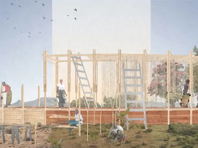
Healing Façade: A Modular Chapel System That Restores Ethiopia's Sacred Forests
Winner of the Eco-Chapel competition, this circular timber façade collects water from air to rebuild soil and reforest degraded Ethiopian landscapes.
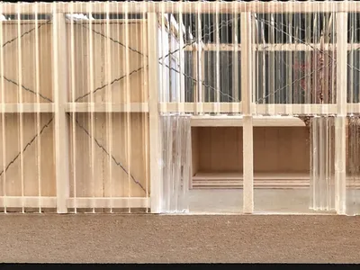
Kaffeebühnen: Where Coffee Shop Architecture Becomes a Civic Stage in Vienna
A linear sequence of timber boxes, transparent shells, and open yards turns the Viennese café tradition into a public performance space.
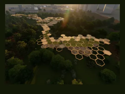
Eco Chapel: A Modular Forest Pavilion That Grows Like the Landscape It Protects
Hexagonal timber modules weave through existing trees, turning a chapel into a living system for prayer, education, and reforestation.


Urban Forest: A Vertical Ecosystem for 5,000 Workers in Singapore's Changi Business Park
Radially stacked pods and layered green decks turn a 7-acre plot into 47 acres of ecological workspace projected for 2040.

Explore Architecture Competitions
Discover active competitions in this discipline

Challenge to reimagine the Iron Throne

Photograph architecture without architects

Illustrate the lost glory of Angkor Wat - Render Challenge

Design challenge to reuse E-waste
Comments (0)
Please login or sign up to add comments
No comments yet. Be the first to comment!