
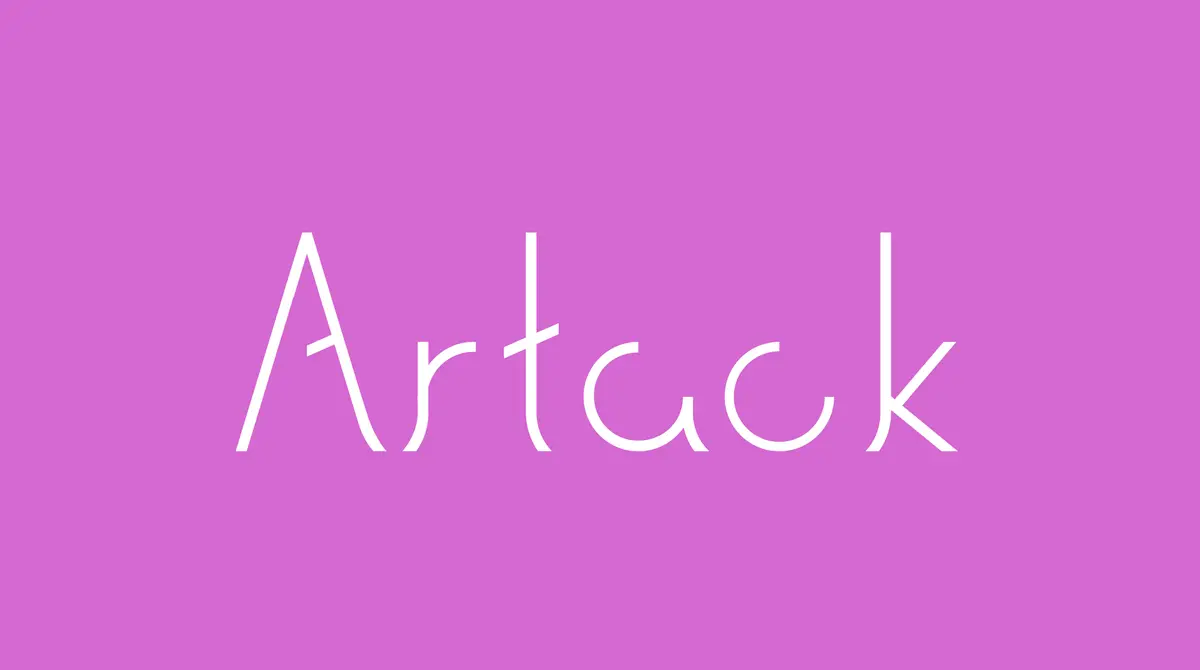
Blueprint of a Letterform: Artack Regular and the Architecture of Type
Exploring the shared language of structure, space, and functionality through Danting Li’s award-winning Artack Regular typeface.

When people think about architecture and type design, they often see them as unrelated disciplines. One shapes buildings and cities, while the other shapes words and communication. Yet beneath their different scales lies a surprisingly similar design logic. Both architects and type designers work with structure, proportion, space, rhythm, and functionality. Whether constructing a skyscraper or drawing a letterform, the challenge remains remarkably similar: creating a system that is both visually compelling and functionally effective.
This relationship becomes particularly visible in Artack Regular, a contemporary sans serif typeface created by San Francisco Bay Area designer Danting Li for SparksGlo LLC's visual identity system. Recognized with an Honorable Mention in the 2026 Hermes Creative Awards, the project demonstrates how typographic design can operate with many of the same structural principles that guide architectural practice.
The Hidden Skeleton
Every building begins with a structural framework. Before materials, finishes, and visual details are applied, architects establish a system capable of supporting the entire structure. Columns, beams, and load-bearing elements determine stability long before aesthetic decisions are made.
Typeface design follows a similar process.
Behind every letter lies an invisible skeleton that governs proportion, weight distribution, alignment, and visual balance. In Artack Regular, this structural framework is intentionally exposed through thin, uniform strokes and geometric clarity. Rather than concealing construction beneath decorative details, the typeface reveals the underlying logic of its design.
The result is comparable to modern architecture, where structural systems often become part of the visual language. Just as exposed steel framing can communicate honesty and precision in a building, Artack's refined geometry allows viewers to see the architectural logic embedded within each glyph.
Danting approached the project not as the creation of isolated letters but as the construction of an interconnected system. Each character had to function independently while maintaining harmony with every other element in the typeface family. This mirrors the way architects design individual rooms, façades, and circulation paths as components of a larger whole.
Designing the Space Between
One of the most important parallels between architecture and typography is the treatment of empty space.
Architects do not simply design walls. They design the spaces enclosed by those walls. Courtyards, atriums, hallways, and rooms are often as important as the structures surrounding them. The quality of a building frequently depends on how effectively these spaces are organized.
Type designers face the same challenge.
Letters are not defined solely by the lines that create them. The empty spaces within and around those lines play an equally important role. The counters inside letters such as "a," "e," and "o" influence readability, rhythm, and visual balance.
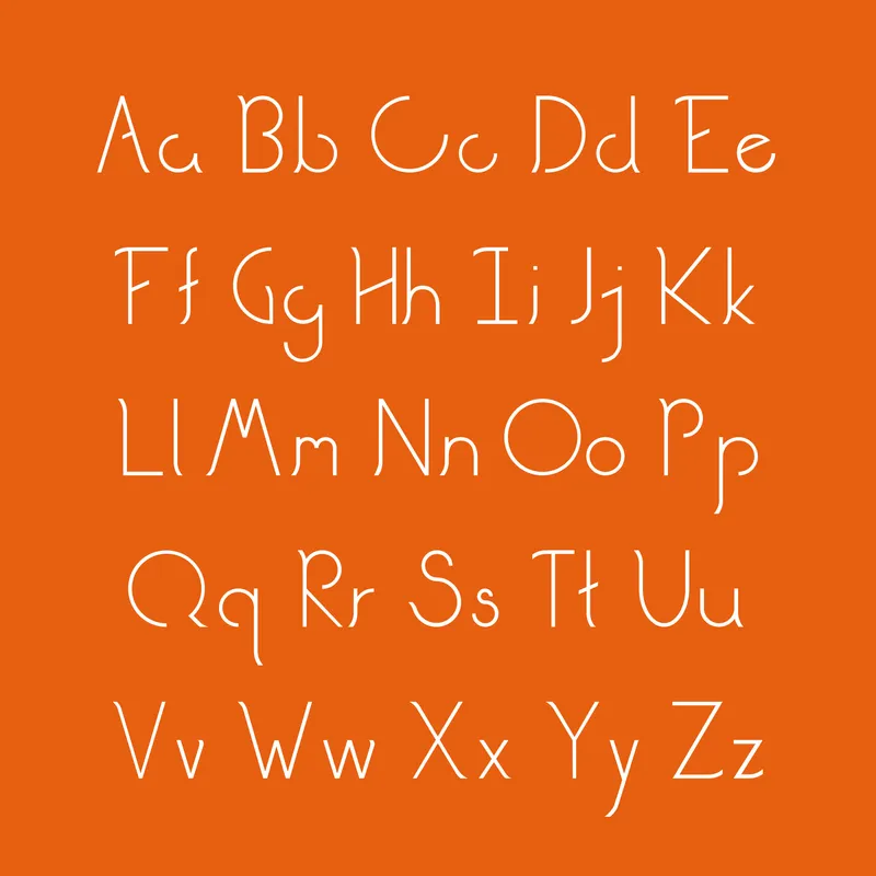
Artack Regular places significant emphasis on these spatial relationships. Rather than treating counters as fully enclosed geometric shapes, the typeface introduces partially open counter spaces in several key letterforms, allowing negative space to flow more freely through the structure. The uppercase "A" exemplifies this approach with its semi-open counter and angled crossbar, which creates a sense of directional movement while maintaining overall balance. Similar diagonal crossbars reappear in letters such as "E," "F," and "H," establishing a consistent structural language across the character set. Much like architectural details that break the monotony of a rigid framework, these subtle variations add rhythm and visual interest without compromising clarity. The spaces between letters were further refined through extensive spacing and kerning adjustments, ensuring that the typeface performs consistently across large-scale displays, editorial compositions, digital interfaces, and extended reading environments.
This careful management of negative space reflects a principle shared by many architectural projects: balance is achieved not by maximizing form, but by creating a thoughtful dialogue between form and void.
Geometry as a Design Language
Geometry has long served as a common language between architecture and typography.
Architects rely on grids, proportions, and modular systems to organize complex structures. Similarly, type designers use geometric frameworks to establish consistency across an entire character set.
Artack Regular embraces this geometric tradition while avoiding mechanical rigidity. Its glyphs are built upon clear structural foundations, yet subtle optical adjustments help maintain visual equilibrium. Straightforward geometric construction is balanced by careful refinements that account for human perception.
This combination of precision and flexibility is essential in both disciplines.
A perfectly mathematical building may appear uncomfortable or disproportionate when experienced in reality. Likewise, a purely geometric typeface can sometimes feel cold or visually uneven. Successful designers understand that geometry provides a framework, but human judgment ultimately creates harmony.
Function Before Decoration
Architecture and typography share another important characteristic: neither can sacrifice functionality for visual expression.
A building must remain navigable, stable, and usable. A typeface must remain readable.
This requirement often creates productive design constraints. Creativity emerges not from ignoring practical limitations, but from working intelligently within them.
For Artack Regular, functionality was a central objective from the beginning. The typeface was designed to perform across posters, websites, magazines, motion graphics, packaging, social media content, signage, and visual poetry projects. Such versatility required careful attention to proportion, spacing, and clarity.
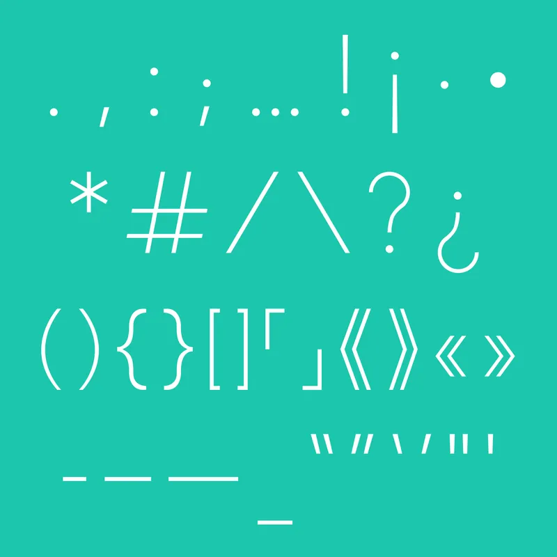
Its thin and uniform stroke width contributes to a refined visual character, yet the typeface maintains strong readability through deliberate structural decisions. The result demonstrates how aesthetic elegance and practical performance can coexist within the same design system.
Architects frequently face a similar challenge. The most successful buildings often appear effortless, even though they are supported by countless technical decisions beneath the surface. Effective typefaces operate in much the same way.
Systems Rather Than Objects
Another connection between architecture and type design is the idea of systems thinking.
Buildings are rarely experienced as isolated objects. They exist within larger environments and support multiple forms of activity. Likewise, a typeface is rarely viewed as a single letter. It functions as a complete system of relationships among characters, words, paragraphs, and layouts.
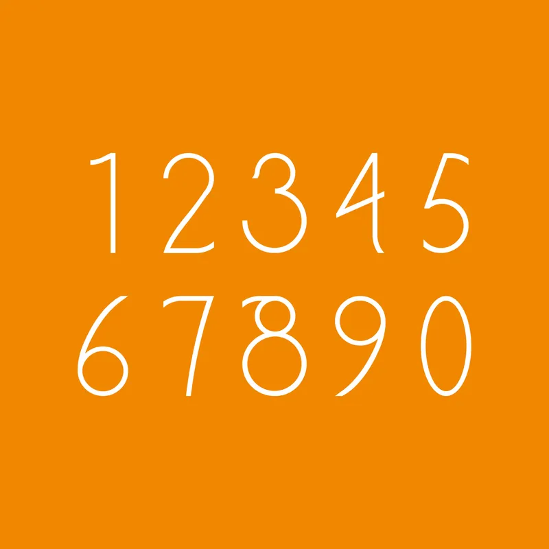
Artack Regular was developed as a comprehensive typographic ecosystem. Uppercase and lowercase characters, numerals, ligatures, punctuation marks, symbols, and diacritical marks were all designed to work together as a unified structure. Consistency across the character set became just as important as the appearance of any individual glyph.
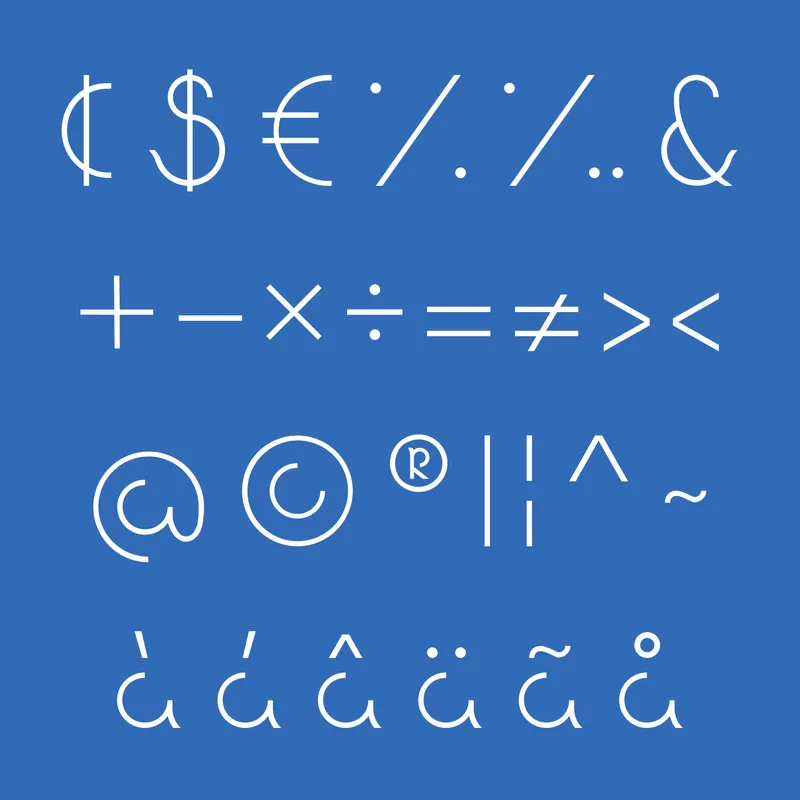
This holistic approach reflects how architects think about buildings as interconnected systems rather than collections of separate parts. Success depends on how elements interact, not merely how they look in isolation.
Typography as Spatial Design
The influence of concrete poetry also plays an important role in Artack Regular's conceptual foundation.
Inspired in part by the work of Austrian artist Anatol Knotek, the project explores typography as a spatial medium rather than a purely linguistic one. Letters become visual structures capable of shaping composition and meaning simultaneously.
This perspective further strengthens the connection between architecture and type design. Both disciplines organize space to guide perception. Architects direct movement through physical environments. Type designers direct visual movement across a page or screen.
In both cases, structure becomes a tool for communication.
A Blueprint for Contemporary Design
Artack Regular demonstrates how type design can benefit from architectural thinking. Through its emphasis on structural clarity, geometric balance, negative space, and functional performance, the project highlights the shared foundations that connect these two creative disciplines.
For Danting Li, the typeface serves not only as a branding asset for SparksGlo but also as an exploration of how visual systems are constructed. Its minimalist appearance is supported by careful structural decisions that echo principles found throughout architecture.
At first glance, a building and a letter may appear worlds apart. Yet both begin with the same fundamental question: how can structure, space, and form work together to create something that is both useful and beautiful?
Artack Regular offers one compelling answer, revealing that the blueprint of a letterform may not be so different from the blueprint of a building after all.

Popular Articles
Popular articles from the community


Opera on the Sea: Driftwood Logic Shapes a Timber Opera House on Estonia's Coast
Trevor Orgill's opera house translates the entangled drift of floating timber into a civic building where wood, water, and music converge.
Extended Shell: Retrofitting Kolkata's Balconies as Living Urban Thresholds
A modular retrofit system recovers the social and environmental intelligence of Kolkata's historic verandas for contemporary Park Street residents.
Opera by the Sea Estonia: Three Shells Dissolving Architecture into Tallinn's Coastline
A winning opera house proposal replaces monumental form with interconnected shells that blur the boundary between building, park and Baltic Sea.

Temporary Home for Dogs: A Reversed Zoo Rethinks Animal Shelter Architecture
In Bucharest, a sinuous corridor and freed landscape flip the logic of containment, designing a shelter that works to make itself unnecessary.

Similar Reads
You might also enjoy these articles

Shakur's House: Exposed Brick as an Interior Organiser in a 168 m² Mashhad Residence
Brick moves indoors in this Mashhad residence, where masonry walls, glass partitions and teal planes sequence a compact home without closing it off.
Day and Night Park: A Time-Based Urban Newsstand in Beijing
A temporary urban newsstand in Beijing blending travel, light, and reading through poetic colors, compact form, and community-focused design.

Modernist Patio Renovation in El Masnou, Barcelona by Oliver Segura Arquitectura + Cebrià Arquitectura
Modernist patio renovation blending tradition and innovation with a movable pool, leveled floors, and Catalan materials in El Masnou.
Alto Residencial Coop: Cooperative Housing Development in Santiago de Compostela by Carbajo Barrios Arquitectos
A linear cooperative housing complex blending white volumes and perforated metal façades, enhancing community living, natural light, privacy, and urban integration.

Explore Graphic Design Competitions
Discover active competitions in this discipline


Design a brochure to showcase the effects of the technosphere

Challenge to illustrate ‘A tale of Two Cities’

Deconstructivism - Illustration Design Challenge

Challenge to illustrate a Contemporary Castle
Comments (0)
Please login or sign up to add comments
No comments yet. Be the first to comment!