


Graphic Design
Visual communication and design systems that solve problems and convey meaning through typography, imagery, and layout.
Graphic design is the practice of communicating ideas visually by arranging type, images, colour and space so that a message reads clearly and quickly. It covers everything from a logo and a book page to a poster, a signage system or an app screen. In architecture, it is the discipline behind presentation boards, diagrams and the signs that help people find their way through buildings.
What is graphic design?
At its simplest, graphic design is visual communication with a purpose. A graphic designer decides which piece of information a reader should see first, which typeface carries the voice of a text, how colour separates one category from another and where to leave empty space so the page can breathe. The result might be printed, projected, built into a wall or shown on a screen, but the job is the same: make meaning legible.
The field is wide. Branding and visual identity give organisations a consistent look across logos, stationery and websites. Editorial design structures magazines, books and reports. Poster and campaign design compress an idea into one image. Information design turns data into charts, maps and diagrams. Wayfinding and environmental graphics apply the same skills to physical space, from airport signs to museum labels. Wikipedia's overview describes experiential graphic design as the application of communication skills to the built environment, also known as environmental graphic design.
Graphic design overlaps with several neighbouring fields but is not the same as any of them. Typography is one of its core tools rather than a separate discipline. Illustration makes images, while graphic design decides how those images sit with text. UX and interface design focus on how a product behaves over time; graphic design focuses on how a message looks and reads at a given moment, although the two increasingly share methods and design systems.
A short history of graphic design
People have combined words and images for thousands of years, but the modern discipline begins with print. The Library of Congress describes the Gutenberg Bible, probably completed late in 1455 at Mainz, as the first great book printed in Western Europe from movable metal type. Uniform, reusable letters made the layout of a page something that could be planned, repeated and refined.

In the nineteenth century, colour lithography turned the street into a gallery. The French lithographer Jules Chéret, a master of Belle Époque poster art, has been called the father of the modern poster. His bright, large-format prints showed how image and lettering could work together at a distance.

The name of the profession arrived later. The American type designer W. A. Dwiggins is sometimes credited with introducing the term "graphic design" in a 1922 article, although the term was already in use before then. In the 1920s the Bauhaus school in Germany pushed typography toward geometry and clarity. Herbert Bayer's Universal alphabet, which the Victoria and Albert Museum describes as a single lower-case typeface based on geometry, was subsequently used for many Bauhaus publications.
In the 1950s and 1960s, Swiss designers carried these ideas forward in the International Typographic Style: asymmetric layouts built on a grid, sans-serif typefaces and flush-left, ragged-right text. Its most visible export reached New York. Massimo Vignelli, a co-founder of the design firm Unimark International in 1965, designed the signage for the New York City Subway while at Unimark, and his 1972 subway map was criticised for sacrificing geographical accuracy for clarity. That trade-off between precision and legibility still sits at the centre of the field.
Key principles of graphic design
Styles change, but a handful of principles hold across posters, books, screens and buildings.
Hierarchy
Hierarchy tells the reader what to look at first, second and third. Size, weight, colour and position all signal importance. On an architecture competition board, hierarchy decides whether a juror sees the big idea before the technical drawings, which often decides whether the rest of the board gets read at all.
Typography
Typefaces carry tone as well as words. Good typography means choosing a small number of faces, setting comfortable line lengths and spacing, and using weight and size changes consistently. Type design itself is a structural exercise, a point a member journal makes by comparing the hidden skeleton of a letter to the frame of a building.

Grid
A grid divides a page or screen into columns, margins and modules so that elements align and repeat. It speeds up decisions and holds a long document together. Vignelli's design manual, The Vignelli Canon, argues that a page is structured by the grid and that the grid helps prevent arbitrary placement of information.
Colour
Colour groups related items, separates categories and sets mood. A restrained palette usually works harder than a large one, especially on diagrams where each colour must mean one thing, such as a programme type, a material or a phase of construction.
Contrast and negative space
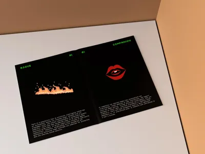
Contrast in scale, weight or value creates emphasis, and empty space gives that emphasis room to register. A member journal on negative space argues that, in graphic and editorial design, removing an element can sometimes have more impact than adding one, and that the same holds for voids and courtyards in buildings.

Consistency
Consistency means the same problem is solved the same way every time: one style for captions, one for headings, one icon set, one colour code. It is what turns individual layouts into a system that people learn and trust.
Graphic design in architecture
Architects use graphic design constantly, often without naming it. A competition entry is judged largely from presentation boards, so layout, hierarchy and image selection carry the argument before any building exists. Diagrams explain circulation, structure, climate strategy or phasing more quickly than plans and sections can. Exploded axonometrics, annotated sections and mapping all depend on line weight, colour coding and labelling to stay readable.
"It is really the white that makes the black sing. White, in typography, is what space is in Architecture."
Once a building is in use, graphic design becomes part of the architecture through signage and wayfinding. Vignelli's career shows how close the two can be: beyond the New York subway, he created the signage and wayfinding system for the Washington Metro. A good wayfinding system uses hierarchy, a limited set of typefaces and colour coding to answer simple questions such as where the exit is, at the moment a visitor needs the answer. Environmental graphics go further, using murals, supergraphics and identity elements to give a place character.

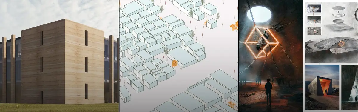
Many architecture projects on uni.xyz sit in this graphic design topic precisely because their boards do the communicating. Peripherique in Movement by Cem Ozbasaran, an Honorable Mention in the Salut Paris competition, proposes an intervention that extends along the Paris beltway from the Petite Ceinture, and lists Adobe Illustrator and InDesign among its tools alongside AutoCAD, Rhino and V-Ray.
Graphic design on uni.xyz
The graphic design topic on uni.xyz gathers more than 280 projects and 50 journals. The projects are mostly architecture and urban design entries whose boards rely on strong layout, while the journals look directly at type, systems and wayfinding.
The most liked project in the topic is DEEP BLUE by Jovana Lucic, a People's Choice Award winner in the Transfarm competition. It brings hybrid agricultural and urban typologies to a natural landscape, using natural water purification to treat polluted water as it flows through the site. Explaining a process like that on a board is an information design problem as much as an architectural one.

CANVA MURAL DESIGN by Harsahib Shergill, Sana Sawhney, Siddharth Mahajan and Seerat Sandhu received a People's Choice Award in the Canva competition, a mural design whose themes span street art, environmental art and visual identity. 01 | Prison by Fabian Gay and Thibaut Servier, a People's Choice Award winner in the Switching Prisons competition, takes the loss of identity in incarceration, where the prisoner becomes a number, as its starting point. Garoa by Studio Projetos BR and Larissa Rutte, an Editor's Choice in the Parasitic Architecture 2020 competition, imagines a parasitic structure that works like a bridge, threading through a dense centre to bring a new home for people in need.
The richest graphic work in the topic is documented in journals. Oil Spill is a Crime describes Tzu Ching Chen's winning entry in the Smudge competition: a poster built as a detective's crime board, with stippled ink drawings of oiled wildlife, newspaper fragments and evidence-like paper that cast humanity as the suspect. Blueprint of a Letterform looks at Artack Regular, a sans-serif typeface by Danting Li for the SparksGlo identity system that received an Honorable Mention in the 2026 Hermes Creative Awards. Another journal by the same author, Translating Intangible Heritage into Contemporary Product Design, follows a blind-box gift that pairs Chinese sugar painting with eleven historical forms of the character for "horse".

Two journals speak directly to architects. Design Systems for Architects argues that the systems thinking behind brand identities can help buildings across a campus or district share materials, proportions and circulation patterns without becoming identical.
"In reality, effective systems create flexibility within structure."
Nick AJ, Design Systems for Architects (uni.xyz journal)
Wayfinding as Brand traces how signage for digital-native companies now carries the same identity as their websites and apps, so that a directional sign answers "who are we?" as well as "where am I?".
Challenges and future directions
Graphic design now has to work across more surfaces than ever. A single identity may need to hold together on a phone, a printed report, a building facade and a moving image, which pushes designers toward flexible systems instead of fixed layouts. Accessibility is a growing responsibility: contrast, type size and plain language decide whether signage and documents work for people with low vision or for readers in a second language.
Generative and template tools have made competent layouts cheap, which shifts value toward judgement: knowing what to leave out, which idea deserves the top of the hierarchy and when a system should bend. In architecture, the shift is visible on competition boards, where polished renders are common and clear diagrams are rarer. Designers who can explain a building's logic graphically stand out. Sustainability also reaches graphic work, from printing choices to the long life of signage systems that must survive changes in occupants and brands.

Graphic design for students and designers
Architecture students can treat graphic design as a thesis subject, not just a presentation skill. Possible angles include a wayfinding system for a hospital or transit hub, an information design study that maps a neighbourhood's data, a design system shared by a group of buildings, or a typeface drawn from local lettering and signage. Each one combines spatial thinking with visual communication.
Competitions are a fast way to practise, because boards must persuade a jury in seconds. Browse open briefs on uni.xyz competitions, and explore the neighbouring topics of art direction, product design and UX design to see how the same principles travel across media.
Frequently asked questions
What is graphic design in simple words?
Graphic design is arranging words, pictures, colour and space so that a message is easy to see and understand. Logos, posters, books, websites, charts and signs are all products of graphic design.
What are the main principles of graphic design?
The principles most designers rely on are hierarchy, typography, the grid, colour, contrast and negative space, and consistency. Together they control what is seen first, how text reads and how a set of layouts holds together as a system.
Who coined the term "graphic design"?
W. A. Dwiggins is often credited with the term because he used it in a 1922 article. Historians have since found earlier uses, so it is more accurate to say Dwiggins helped popularise it.
Do architects need graphic design skills?
Yes. Architects present their ideas through boards, portfolios, diagrams and reports, and buildings in use need signage and wayfinding. Clear hierarchy and typography often decide how well a design is understood by clients and juries.
How is graphic design different from UX design?
Graphic design focuses on how a message looks and reads, while UX design focuses on how a product works and how people move through it over time. The two overlap in interface design and in shared design systems.
References and further reading
- The Gutenberg Bible, Library of Congress
- Proof sheet for the Universal alphabet, Herbert Bayer, Victoria and Albert Museum
- The Vignelli Canon, Vignelli Center for Design Studies, Rochester Institute of Technology
- Graphic design, Wikipedia
- William Addison Dwiggins, Wikipedia
- International Typographic Style, Wikipedia
- Massimo Vignelli, Wikipedia
- Jules Chéret, Wikipedia


Open competitions in Graphic Design
See all Graphic Design competitions

Design a brochure to showcase the effects of the technosphere

Challenge to illustrate ‘A tale of Two Cities’


Blind-judged international awards across 11 disciplines, from architecture to AI-driven design

Deconstructivism - Illustration Design Challenge

The Global Benchmark for Architecture Dissertation Awards
Popular projects
View all 282 projects


Latest journals
View all 45 journals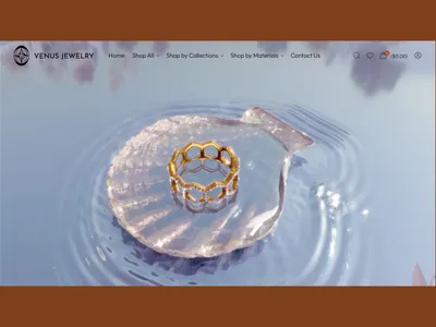
Beyond Recognition: How Danting Li Contributes to the Design Industry Through International Judging
Danting Li brings her multidisciplinary design expertise to international judging, contributing thoughtful perspectives on creativity, innovation, and excellence across design, technology, and business.
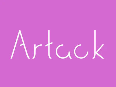
Blueprint of a Letterform: Artack Regular and the Architecture of Type
Exploring the shared language of structure, space, and functionality through Danting Li’s award-winning Artack Regular typeface.
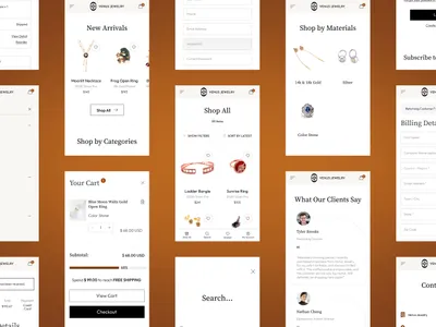
Design Systems for Architects: What Graphic Designers Know That Architects Can Borrow
Exploring how the systems-thinking behind graphic design can help architects create more coherent, adaptable, and human-centered built environments.
The Power of Negative Space: What Screen Margins Teach Us About Light, Void, and Breathing Room in Buildings
How negative space, from screen margins to architectural voids, creates room for light, clarity, movement, and reflection.


