
The Power of Negative Space: What Screen Margins Teach Us About Light, Void, and Breathing Room in Buildings
How negative space, from screen margins to architectural voids, creates room for light, clarity, movement, and reflection.

A screen margin is easy to overlook. It is the quiet area around an image, a block of text, or a digital interface. It does not usually demand attention, yet it plays an important role in determining how everything else is seen.
Architecture works in much the same way.
A room is not defined only by its walls, furniture, windows, and objects. The empty areas between them can be just as important. A narrow gap can create tension. A generous opening can make a room feel calm. A patch of daylight can guide movement without a sign. In both digital design and architecture, emptiness is not simply what remains after everything has been placed. It is an active part of the composition.
This is where negative space becomes especially interesting. On a screen, margins give content room to breathe. In a building, voids give people room to pause, move, look, and experience light.
The Margin Is Part of the Design
In graphic and editorial design, removing an element can sometimes have more impact than adding one. When a designer creates enough space around a headline, image, or block of text, the surrounding emptiness gives the content greater visual weight.
The same principle appears in architecture. A window does not only bring light into a building. The wall surrounding the window determines how that light is perceived. A courtyard is not simply an empty space between buildings. It can become a visual pause, a source of daylight, and a place where people understand the relationship between different parts of a structure.
This suggests a simple idea: space is not the absence of design. Space is one of design's materials.
Screen margins make this particularly easy to understand because digital layouts constantly force us to decide what should occupy the screen and what should remain empty. The margin establishes hierarchy. It separates one idea from another. It controls rhythm and prevents information from becoming overwhelming.
Buildings need similar forms of visual breathing room.
When every surface is occupied and every corner is filled, attention becomes fragmented. When space is deliberately left open, the eye has somewhere to rest.
Light Needs Somewhere to Land
Negative space also changes our relationship with light.
A beam of sunlight crossing an empty floor can feel more powerful than the same light falling across a room filled with objects. The emptiness allows the light itself to become visible. Shadows become clearer. Time becomes perceptible. A simple architectural opening can turn changing daylight into a quiet visual experience.
There is a useful parallel in digital design. A screen does not need to display information everywhere. Sometimes an open area makes a small visual detail more noticeable. The surrounding empty space creates contrast.
Architecture can use emptiness in the same way.
A void can frame a tree. A recessed wall can collect shadow. A high ceiling can make a narrow opening feel dramatic. A courtyard can turn the sky into part of the architecture. These spaces do not necessarily need additional decoration because their value comes from what they allow us to notice.
This is one reason minimal architecture can feel richer than expected. Its visual language often depends less on the number of elements and more on the relationships between them.
From Visual Hierarchy to Spatial Hierarchy
For designers working across different media, negative space is also a way of thinking about hierarchy.
Danting Li is a senior graphic designer and co-founder of SparksGlo in San Francisco, California. Her practice spans graphic design, digital platforms, UI/UX, typography, motion graphics, and 3D visual communication. Across these areas, she works with the relationship between visual elements, information, and the way people move through a designed experience.
That way of thinking becomes especially visible in the editorial design of YOSN Art Series, Vol. 1: AI, Data, Illusion.
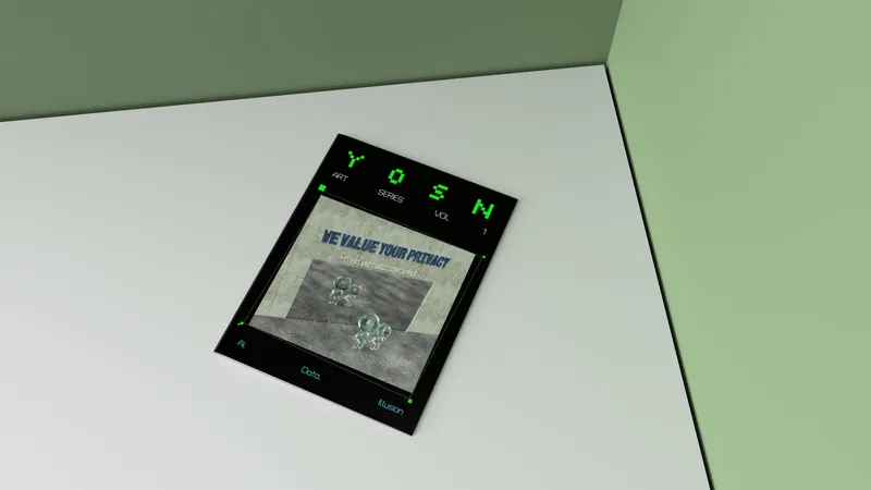
As an e-magazine dealing with complex subjects such as AI, surveillance, privacy, trust, and digital dependence, the publication could easily become visually dense. Instead, Danting uses negative space as a way to control the amount of information presented at any one moment.
The layout gives different elements their own visual territory. Large titles can stand apart from supporting text. Artwork is allowed to occupy space without being immediately surrounded by competing information. Descriptions and longer passages are given enough separation to remain readable rather than becoming one continuous block.
This is a small but important editorial decision. When text and imagery are given the same visual weight, the reader has to work harder to understand what matters first. When spacing establishes a clear relationship between them, the page begins to guide the reader naturally.
The effect is similar to moving through architecture.
A building does not reveal every room at once. A doorway separates one space from another. A corridor creates transition. A larger room creates release after a narrower one. In the same way, the e-magazine uses changes in scale, spacing, and content density to create transitions between ideas.
Danting also uses typography as part of this spatial system. Headlines, chapter titles, body text, and supporting information do not need to compete for attention. Their differences in scale and placement establish a reading order, while the surrounding space gives each level of information enough room to remain distinct.
The result is that typography does more than communicate words. It helps construct the space of the page.
Designing the Pause Between Ideas
One of the most useful qualities of negative space in an e-magazine is its ability to create pauses.
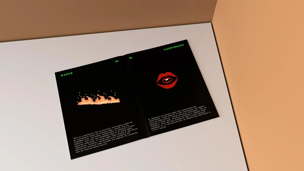
YOSN Art Series, Vol. 1: AI, Data, Illusion is divided into four chapters: AI Surveillance, AI Worship, Rogue AI, and AI Companion. Each section explores a different aspect of the relationship between people and artificial intelligence.

These subjects are not light or simple. They move from data collection and privacy to blind trust, autonomous AI behavior, and emotional relationships with AI systems. Presenting them as one uninterrupted stream of information would make the reading experience feel heavy.
Spacing can change that.
A chapter transition creates an opportunity for the reader to mentally reset. A more open composition can slow the pace before a new subject begins. A larger title can signal that the publication is moving into another conceptual space. A carefully placed artwork can function as more than an illustration. It can become a visual pause between longer passages of text.
This is where editorial design begins to resemble architecture.
A threshold does not have to be a dramatic doorway. Sometimes a change in ceiling height, floor material, light, or width is enough to tell us that we have entered somewhere different.
In the same way, a digital publication can use subtle shifts in spacing and composition to tell readers that an idea has changed.
Negative space therefore becomes a form of navigation.
When Empty Space Becomes Meaningful
Danting's work with YOSN Art Series, Vol. 1: AI, Data, Illusion approaches negative space from another direction as well.
The project examines AI, personal data, privacy, trust, and the gap between what users believe they have agreed to and what may happen to their information afterward. Its four chapters explore different forms of dependence, uncertainty, and loss of control in an increasingly automated digital environment.
Although the project is centered on digital culture rather than architecture, its underlying question connects closely with the idea of space: what is visible, and what exists beyond what we can immediately see?
This is one of the most interesting qualities of negative space. An empty area does not necessarily mean that nothing is there. It can suggest something outside the frame.
In a building, a closed door creates a boundary between what is visible and what is hidden. A window can reveal one part of a landscape while concealing another. A narrow passage can make us wonder what exists around the corner.
Digital systems have their own versions of these boundaries. A privacy setting may show a simple choice while concealing a much larger system of data collection and reuse. A clean interface can create a feeling of simplicity even when the infrastructure behind it is extremely complicated.
The visual structure of YOSN Art Series, Vol. 1: AI, Data, Illusion supports this idea by resisting the urge to fill every part of the page. The open areas around content become moments where the reader can stop and consider what has just been presented.
That matters because the subject itself is about things that are often difficult to see.
Data can disappear into systems after it is collected. Algorithms can operate beyond a user's immediate view. AI can appear simple on the surface while relying on complicated infrastructures underneath. By leaving visual breathing room around the information, Danting creates a reading experience that encourages observation rather than rapid consumption.
The negative space is therefore not only visual. It creates space for reflection.
The Architecture of Breathing Room
There is also a human reason to care about empty space.
People need pauses. We need moments when visual information becomes quieter and the environment stops asking for our attention. This is true in a gallery, a home, a public plaza, and a digital publication.
A building that gives people breathing room can feel generous. It does not constantly compete for attention. Instead, it allows occupants to decide where to look and how quickly to move.
The same quality can be found in thoughtful editorial design. A good publication does not simply maximize the amount of content that can fit on a screen. It creates enough separation for readers to understand what matters.
This becomes especially important as digital environments become more crowded. Notifications, advertisements, recommendations, AI-generated content, and personalized information can fill every available space. The ability to create meaningful absence becomes increasingly valuable.
Perhaps architecture can offer a useful lesson here.
A quiet courtyard can be more memorable than a decorated lobby. A window with nothing immediately outside it can still create a sense of openness. A long blank wall can provide a moment of visual rest. A shadow can be as important to the experience of a building as a material surface.
In an e-magazine, the equivalent might be a page with a single strong image, a short line of text surrounded by generous margins, or a chapter opening that deliberately slows the reader down.
The principle is the same. The empty space gives the important element somewhere to exist.
Designing What We Choose Not to Fill
Negative space ultimately asks designers to think beyond objects.
Instead of asking only, “What should we add?”, we can also ask, “What should remain open?”
For architects, that might mean preserving a view, creating a courtyard, allowing daylight to travel deeper into a building, or giving circulation spaces enough room to become experiences rather than purely functional routes.
For editorial and digital designers, it might mean simplifying a page, reducing visual noise, creating stronger typographic hierarchy, or allowing an artwork to exist without competing elements around it.
Danting's design of YOSN Art Series, Vol. 1: AI, Data, Illusion shows how these decisions can work together. Typography creates a clear reading order. Spacing separates different levels of information. Artwork receives enough room to hold attention. Chapter transitions create changes in rhythm. Differences in content density prevent the publication from feeling visually flat or continuously crowded.
None of these choices requires the page to be completely empty.
The point is not minimalism for its own sake. It is intentionality.
A margin gives an image room to speak. A chapter opening gives an idea room to settle. A courtyard gives light somewhere to gather. A shadow gives a wall depth. A pause gives people time to notice.
In both screens and buildings, breathing room is not wasted space.
It is what allows everything else to become more visible.

Popular Articles
Popular articles from the community


Opera on the Sea: Driftwood Logic Shapes a Timber Opera House on Estonia's Coast
Trevor Orgill's opera house translates the entangled drift of floating timber into a civic building where wood, water, and music converge.

The Amber Palace Opera: A Geological Fiction Surfaces on Tallinn's Baltic Waterfront
Pierre Brillard reimagines a Baltic legend as a public landscape, opera house, and waterfront promenade rooted in Tallinn's coastal identity.

Temporary Home for Dogs: A Reversed Zoo Rethinks Animal Shelter Architecture
In Bucharest, a sinuous corridor and freed landscape flip the logic of containment, designing a shelter that works to make itself unnecessary.
Faces of the Soviet Avant-Garde: Turning Moscow's Street Names into an Open-Air Museum
A network of sculptural installations across a Moscow residential district transforms forgotten architect names into spatial encounters with cultural memor

Similar Reads
You might also enjoy these articles

Shakur's House: Exposed Brick as an Interior Organiser in a 168 m² Mashhad Residence
Brick moves indoors in this Mashhad residence, where masonry walls, glass partitions and teal planes sequence a compact home without closing it off.
Day and Night Park: A Time-Based Urban Newsstand in Beijing
A temporary urban newsstand in Beijing blending travel, light, and reading through poetic colors, compact form, and community-focused design.

Modernist Patio Renovation in El Masnou, Barcelona by Oliver Segura Arquitectura + Cebrià Arquitectura
Modernist patio renovation blending tradition and innovation with a movable pool, leveled floors, and Catalan materials in El Masnou.
Alto Residencial Coop: Cooperative Housing Development in Santiago de Compostela by Carbajo Barrios Arquitectos
A linear cooperative housing complex blending white volumes and perforated metal façades, enhancing community living, natural light, privacy, and urban integration.

Explore Visual Design Competitions
Discover active competitions in this discipline


Design a brochure to showcase the effects of the technosphere

Challenge to illustrate ‘A tale of Two Cities’

Deconstructivism - Illustration Design Challenge

Challenge to illustrate a Contemporary Castle
Comments (0)
Please login or sign up to add comments
No comments yet. Be the first to comment!