

CRYSTALINE
A coalesce of bright minds
THE CONCEPT
In the fast-paced world of 21 century many people go about their life not noticing much of their surroundings. The interiors of common office buildings usually are not personalized, which in turn results in people being less expressive and not showing their true colourful identity. Coworking offices are especially oriented towards the remote workers, start-ups and digital nomads, which in the vast majority consists of people in their twenties and thirties. For some of them this may be the first encounter with the world of working and it may be good to be treated as kindergarten for adults – the beginning of a new era. For others the world events in last few years made remote working easier and as they got used to working at home, their social life suffers. Consequently the design is focused on those people who need an inspiring environment, which can feel like home.
For this reason came Crystaline – the modular office furniture collection aimed at introducing color and expression to the office environment. The main priorities for the interior as well as the furniture were as follows:
1. Individuality - the end user participating in the design of their environment;
2. Non-regular forms;
3. Bright inspiring colors;
4. Modular design - easily change the environment of the office for different needs and occupants;
5. Soft, comfortable materials for the user to feel like home while working.
DESIGN PROCESS
The process of creating something that inspires people began with analysis of the current trends and interests of the target group. Despite the diversity, the opposing topics of postmodernism and monochromatic minimalism were selected as the working ground for the design.
The first steps included trial and error while trying to incorporate the stated principles. The design of the building came together through the profound analysis and function diagrams. The furniture, on the other hand needed multiple iterations, the beginning of which were nowhere near the final design. Through the multiple changes the form of the collection developed and its name crystalline followed as a metaphor of ideas and inspiration being like a crystal – clear and spectacular.
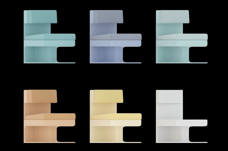
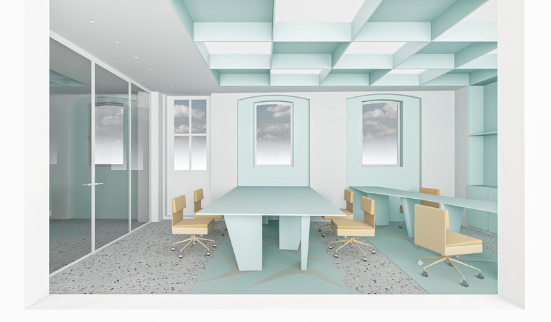
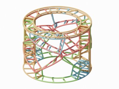
The decision for the materials and colors were according to the initial goals. For that reason five colors, inspired from crystal colors were created – angelite, aquamarine, amber, citrine and amethyst. And for materials synthetic wool and plastic for the furniture to be cozy and comfortable and translucent acrylic boards for its crystal-like look and the interaction with light it provides.
FINAL DESIGN
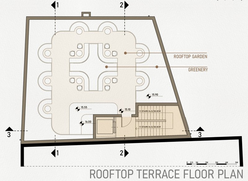
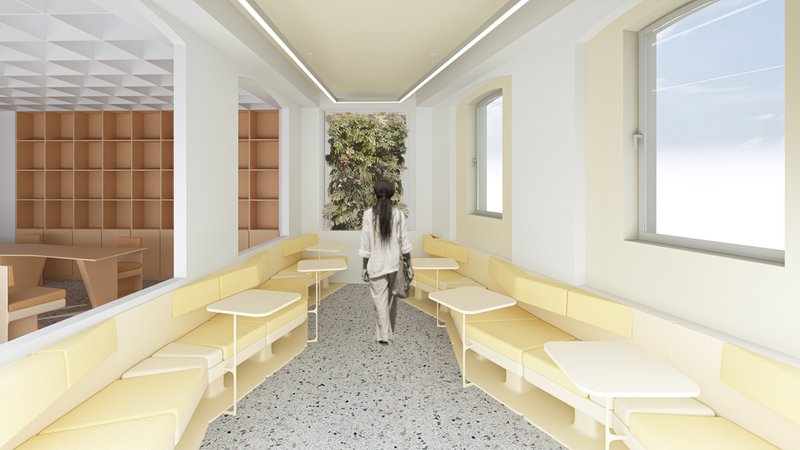
The furniture and the building functionality were developed simultaneously. The analysis of the amenities around the site pointed at the need for adding greenery and places where people could socialize, as well as making the offices accessible and making the entrance visually appealing to attract customers. For this reason, the space around the entrance became a social spot with seating and greenery, making it easy to spot for newcomers and people who pass by. The rooftop seemed to be a good spot for seeing the surroundings and enjoying some time outside and consequently a rooftop garden with seating on multiple levels was adopted.
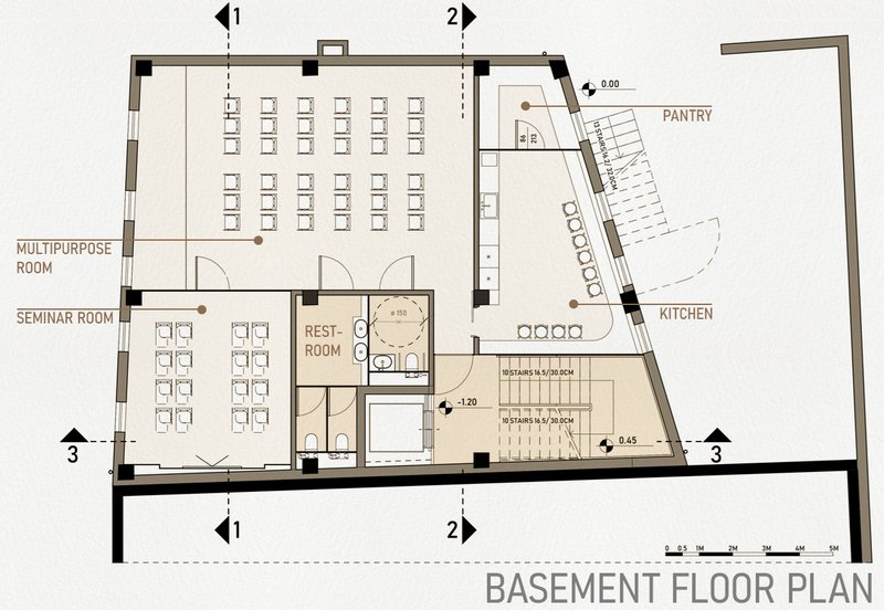
The stairs at the front of the building were changed to accommodate easier flow of the coming people as well as the accessibility for disabled people through a platform ascending from the ground to the first door. As for internal vertical communication, the decision to change the interior staircase was made to safe space and utilize an elevator. The darkest areas of the building were a good spot for the restrooms and pantries, where natural light is not a priority.
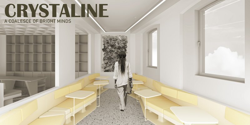
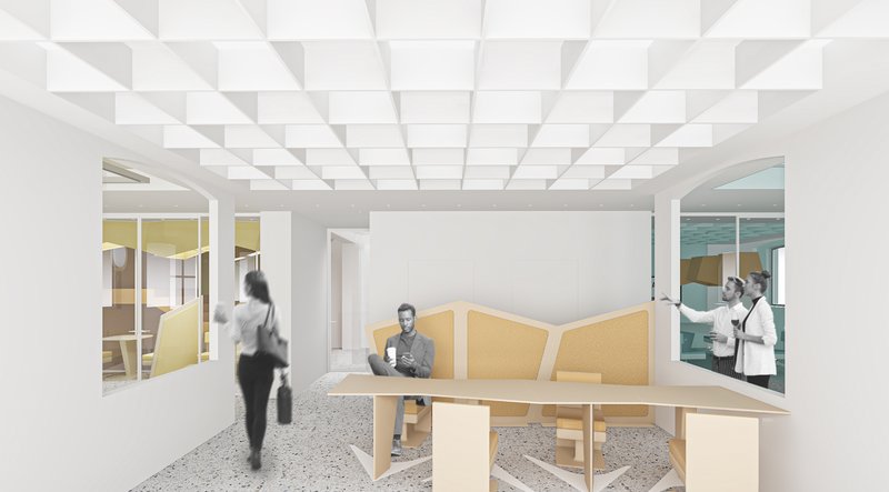
The primary areas were designed to allow freedom to the users on how to arrange their space. The coworking offices had the need of places with fixed computers, places for people to use with their individual portable computers and different types of seating and areas for different activities. As a result, three zones were developed in order to introduce variety and make the area flexible and comfortable. The first zone was dedicated to the fixed computers, and on the opposite side – a conference room for groups to work together or for meetings to be held. The second zone (in the middle) was designed as the transforming one, where people could rearrange their furniture and use it according to their needs. The third zone was called “the canyon” as the shape of the linear configuration of the seating resembled that of a canyon. The meaning behind it was to make the space cozy and to make it non-formal for those who need a place which feels like home, not so much as the office. On the opposite side was situated a small meeting room in order to allow people to take phone calls and small meetings. This room was designed with glass partitions so it could provide natural light for the staircase.
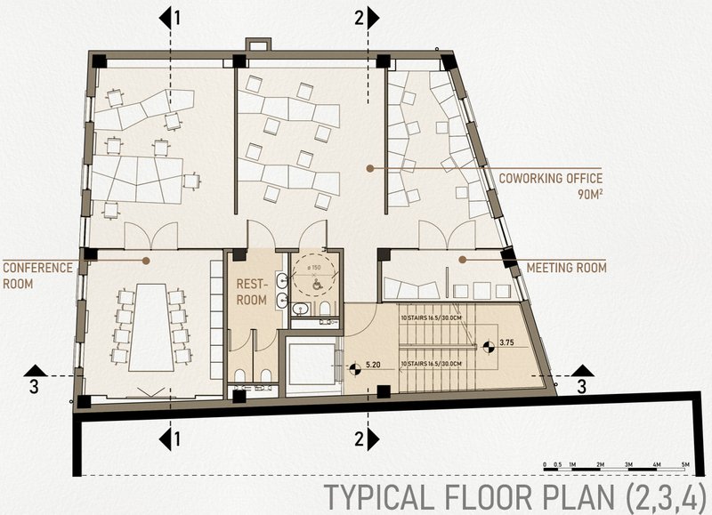
The first and the basement floor were used to accommodate functions, useful to the occupants – a cafeteria and a kitchen for the daily meals and additional rooms where larger meetings and lectures could be held. The multipurpose room was introduced into the design in order to allow again flexibility and adaptability to the differing needs of the users.
PRESENTATION
The purpose of this presentation was to design the sheets as a continuation to the project itself. For that reason, the visuals and graphics followed the color theme of the design. The order of the sheets was curated with the aim to sequentially present the materials for the viewer to navigate effortlessly through the design.

Popular Articles
Popular articles from the community
Atelier Macri Concept Store Interior Design by CASE-REAL
Atelier Macri store features a "ko" counter, walnut wood details, cork displays, blending retail, gallery, and seamless customer experiences.
Flamboyant House by Juliana Camargo + Prumo Projetos
Modern Brazilian house integrating existing tree, pool, and volumes with glass, wood, and transitional spaces blending interior, exterior, and landscape seamlessly.
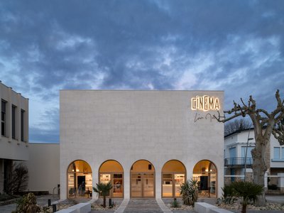
Louis Malle Cinema: A Limestone Cultural Landmark Revitalizing Community Life in Prayssac
Limestone cinema extension with public forecourt, blending heritage and modern design to create flexible cultural spaces and strengthen community interaction.
The Ken Roberts Memorial Delineation Competition (Krob)
As the most senior architectural drawing competition currently in operation anywhere in the world, it draws hundreds of entries each year, awarding the very best submissions in a series of medium-based categories.


Similar Reads
You might also enjoy these articles
Converge Hub – A Human-Centered and Sustainable Mobility Hub at the Urban Edge
Its open and permeable design promotes sustainable movement through walkable connections, green axes, and integrated public transport

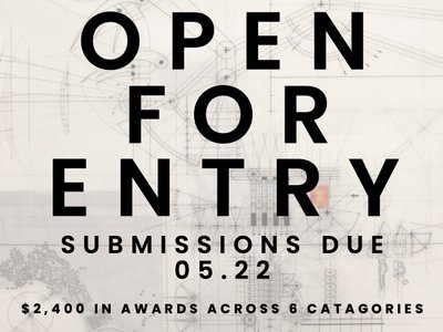
51st Annual KRob - Ken Roberts Memorial Delineation Competition
Join us in celebrating 51 years in excellence in architectural representation! With $2,400 in prize money awarded across 8 categories, this prompt-less competition is accessible to all!

Explore Office Building Competitions
Discover active competitions in this discipline


The Global Benchmark for Architecture Dissertation Awards


Challenge to design luxury tourism on rails


VR headsets Storefront design competition

Designing a staircase for a client
Comments (0)
Please login or sign up to add comments
No comments yet. Be the first to comment!