
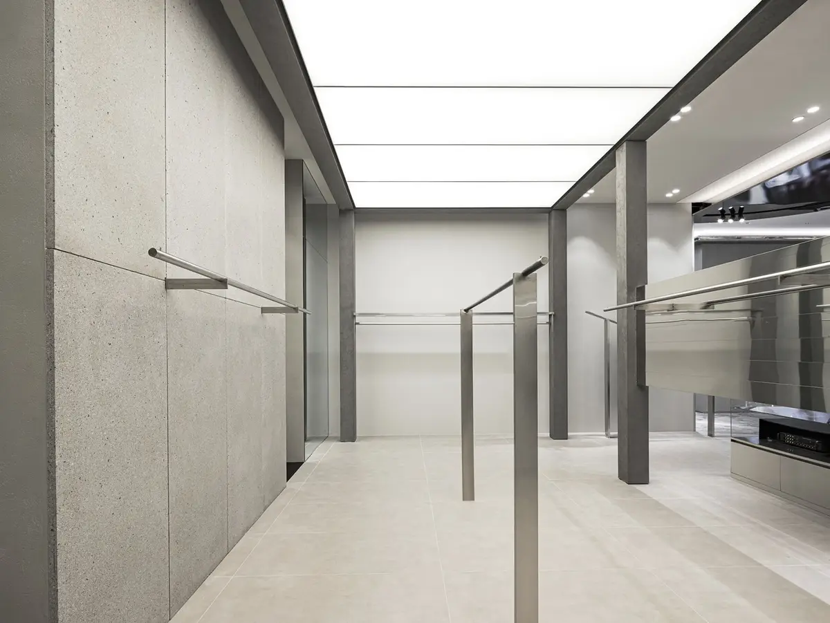
oftn studio Carves a 65-Square-Meter Showroom out of Concrete and Steel in Busan
Diagonal Store occupies the fourth floor of Shinsegae Department Store, turning achromatic minimalism into a spatial strategy.


When a fashion brand relocates from a standalone Seoul address to a department store floor in South Korea's second city, the design brief changes fundamentally. The space gets smaller, the foot traffic gets less intentional, and the architecture has to work harder to assert a distinct identity. For Diagonal's 65-square-meter outpost on the fourth floor of Shinsegae Department Store in Busan, oftn studio answered this challenge not with theatrical gestures but with a restrained material logic and a C-shaped plan that turns a compact retail box into something that feels genuinely spatial.
What makes this project worth studying is how it treats the tension between industrial rawness and optical precision. Six metal support beams double as clothing racks, a stainless steel partition doubles as a mirror wall, and a Barisol ceiling panel doubles as a privacy screen. Every element pulls at least two duties. In a space this tight, that kind of rigor is not decoration; it is the architecture.
The C-Shaped Plan as Circulation Strategy
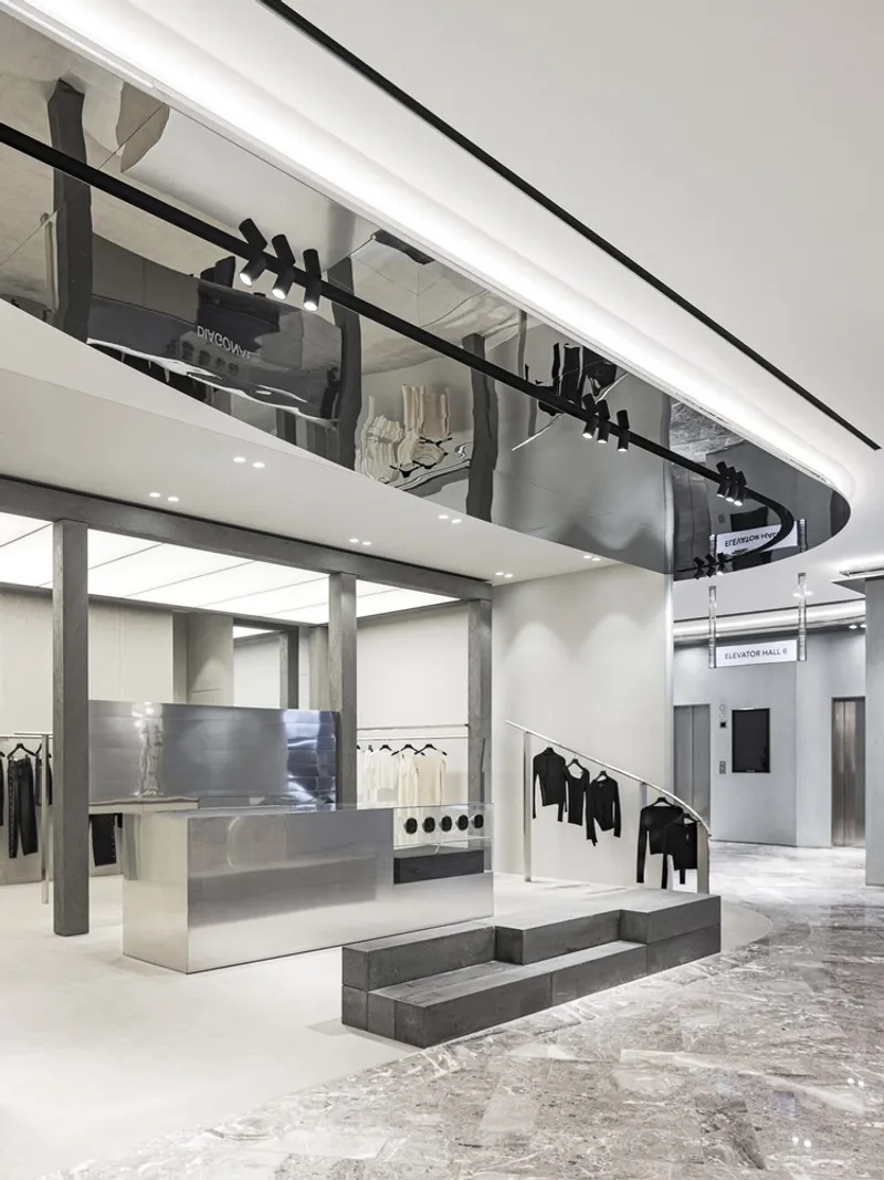
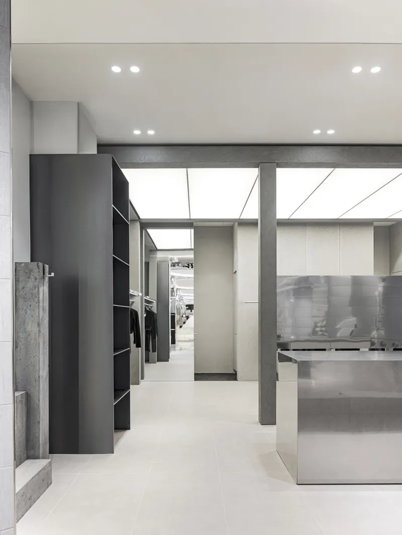
The plan wraps around in a C configuration, pulling visitors from the sales counter at the entrance through a central display zone and back toward a more private counter area at the rear. It is a simple move, but it converts what could read as a dead-end corridor into a continuous loop. The six pillars placed along this path do not merely hold things up; they punctuate the journey, creating moments of compression and release that give the 65 square meters a sense of progression.
At the entrance, a tiered display connects to a concrete pole fitted with a metal hook, establishing the material vocabulary immediately. By the time you reach the back wall, the Barisol ceiling section lowers overhead, quietly signaling that this zone is more enclosed, more curated. No signage required.
Concrete and Metal in Dialogue
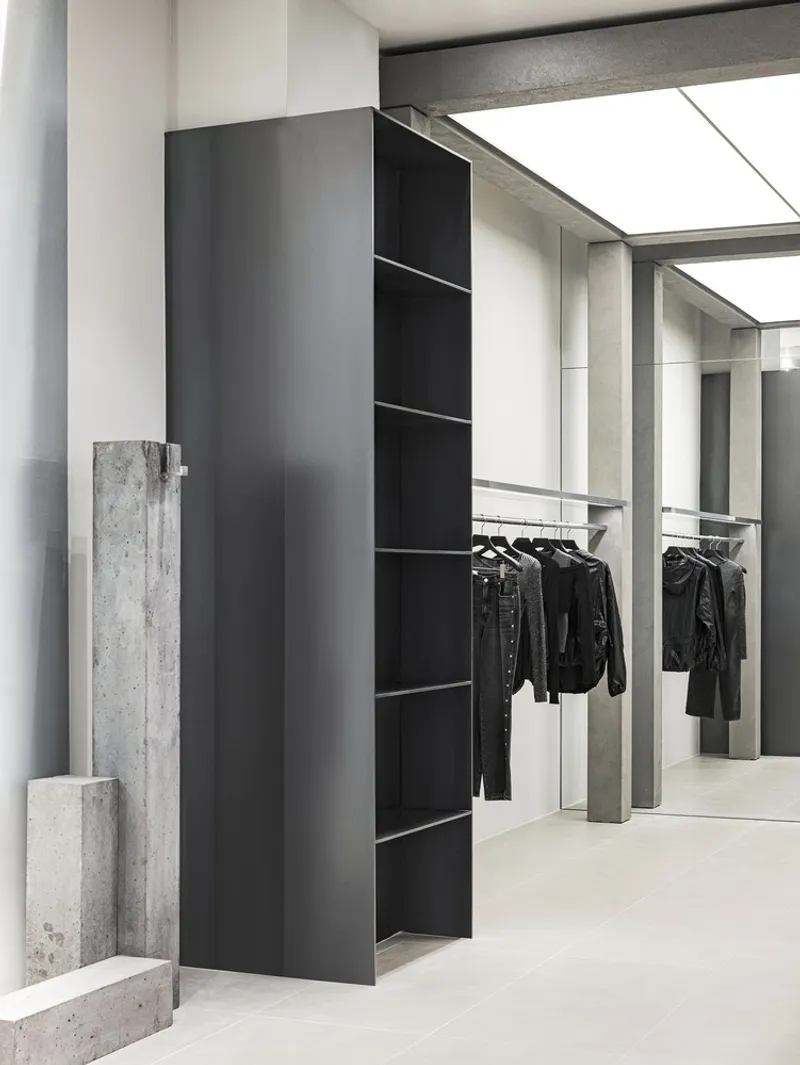
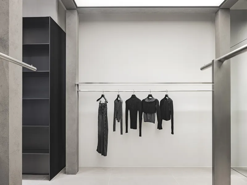
oftn studio built the entire interior around an achromatic palette: concrete slabs, brushed steel shelving, stainless partitions, pale tiled flooring. Nothing competes for attention. The concrete panels at the rear serve as both structural backdrops and textural counterweights to the reflective steel surfaces opposite them. Where one material absorbs light, the other throws it back, and the resulting contrast gives the narrow space a layered depth that belies its actual dimensions.
The black metal shelving unit flanked by raw concrete reads almost like a gallery installation rather than a retail fixture. That is deliberate. Diagonal's brand identity leans on simplicity and formal uniqueness, and the architecture mirrors this by refusing to separate display furniture from spatial structure. The shelf is the wall; the rack is the column.
Mirrors, Light, and the Illusion of Scale
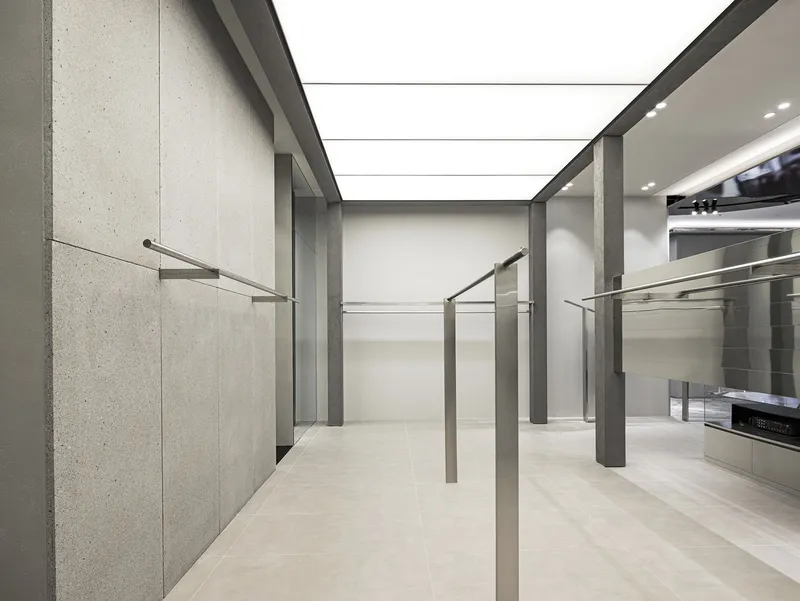
A large mirror mounted on the exterior face of the fitting room is the project's most straightforward optical trick, but it works because the surrounding materials are so controlled. With no color noise to fragment the reflection, the mirror effectively doubles the visible corridor, making the steel clothing rails appear to extend much further than they actually do. Linear skylight panels overhead reinforce this impression by running parallel to the racks, creating a sense of directionality that stretches the eye.
The translucent glass partition near the entrance plays a subtler role. It filters natural and artificial light without blocking sightlines, maintaining visual continuity while allowing the Barisol ceiling zone behind it to register as a separate atmosphere. Light management here is not decorative; it defines program boundaries where walls do not exist.
Details That Do Real Work
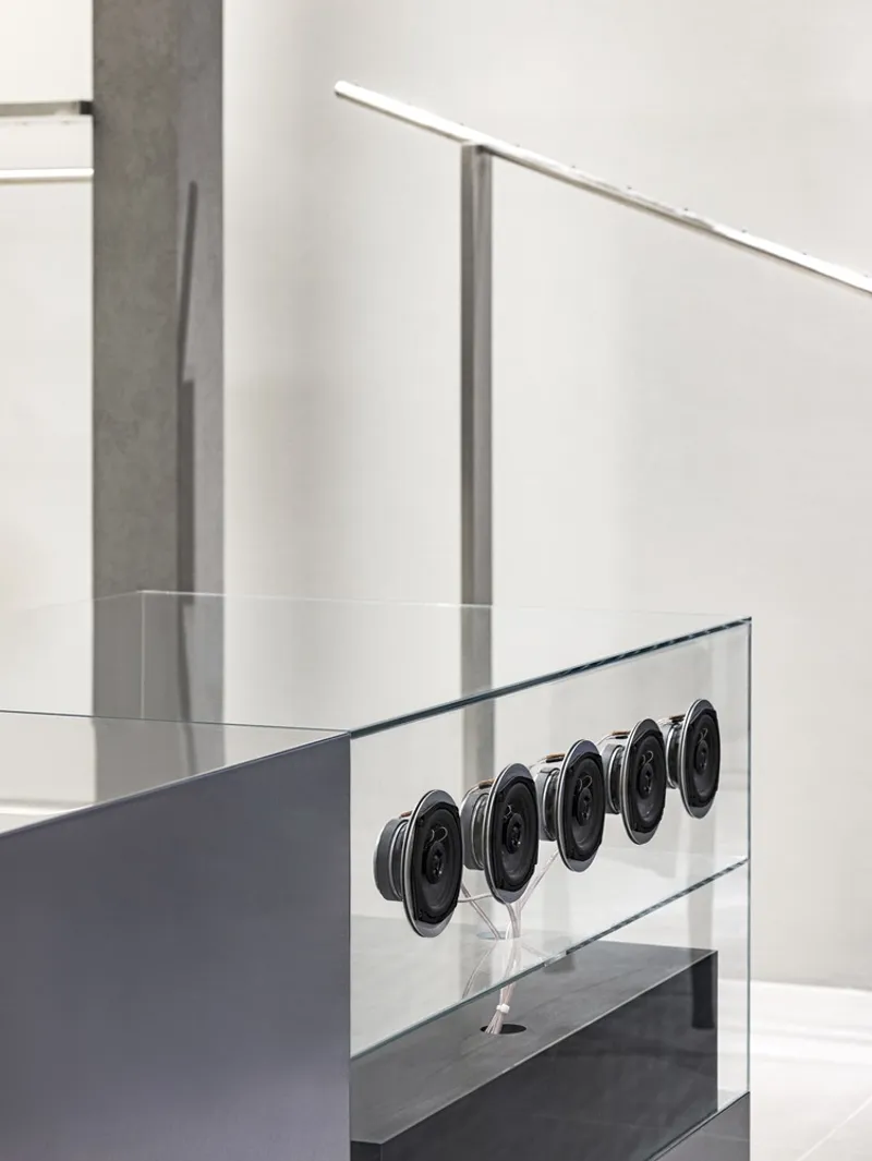
A close look at the sales counter reveals the level of resolution oftn studio brought to this project. The embedded glass extension at the entrance integrates functional speakers, an unusual detail that eliminates the need for freestanding audio equipment. Circular metal buttons set into a clear glass display case demonstrate the same logic: every hardware choice participates in the visual language rather than interrupting it.
The fitting room alcove continues this discipline. A steel hanging rail sits between concrete side walls, with black display shelving built directly into the alcove. There is no curtain rod bolted onto an afterthought bracket here. The fitting space was designed as architecture, not appended as furniture.
Plans and Drawings
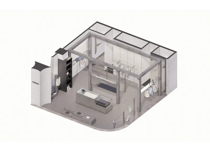
The axonometric cutaway drawing makes the C-shaped organization legible in a way the photos cannot. You can trace the entrance counter, the central hanger zone running along the metal rod spine, and the fitting room tucked into the far corner. What the drawing also reveals is how much of the floor area is given over to circulation rather than display, a counterintuitive choice in a 65-square-meter retail space that pays off by making the shop feel larger than it is.
Why This Project Matters
Retail interiors inside department stores rarely get this level of architectural attention. The typical formula involves a branded partition kit dropped into a leased bay, optimized for square-meter efficiency and nothing else. Diagonal Store rejects that model entirely. By investing in a coherent material strategy, a genuine spatial plan, and details that collapse structure and display into single gestures, oftn studio proves that even 65 square meters can sustain real architectural ideas.
The broader lesson is about economy of means, not economy of ambition. Concrete, steel, and glass are not exotic materials. A C-shaped plan is not a radical diagram. But when every decision reinforces every other decision, when nothing is added that does not also subtract a problem, small projects like this one punch well above their weight. That is the kind of discipline retail architecture needs more of.
Diagonal Store, designed by oftn studio, Shinsegae Department Store, Busan, South Korea. 65 square meters. Completed 2023. Photography by Choi Young Joon.
About the Studio
Share Your Own Work on uni.xyz
If projects like this are the kind of work you want to make, uni.xyz is a place to publish your own, find collaborators, and enter design competitions.


Popular Articles
Popular articles from the community


FCC Arquitectura Expands a Portuguese Granite House with a Board-Marked Concrete Wing
In Portugal, JV House pairs a cleaned-up whitewashed and granite dwelling with a timber-shuttered concrete extension, courtyards and a garden pool.

ETEH Reworks the Shared Spaces of São Domingos School in Brazil Around Timber, Color and Hanging Plants
At São Domingos School in Brazil, 436 m² of hall, refectory and library are recast with timber joinery, a yellow and blue code and trailing greenery.


Opera on the Sea: Driftwood Logic Shapes a Timber Opera House on Estonia's Coast
Trevor Orgill's opera house translates the entangled drift of floating timber into a civic building where wood, water, and music converge.

The Amber Palace Opera: A Geological Fiction Surfaces on Tallinn's Baltic Waterfront
Pierre Brillard reimagines a Baltic legend as a public landscape, opera house, and waterfront promenade rooted in Tallinn's coastal identity.

Similar Reads
You might also enjoy these articles


Hodi-Mandai Geram
Project Function: Preservation and revitalization of the Intangible heritage and socio-spatial identity of the Hodi by Housing, Cultural Memory Center, Sacred Grove, landscape, local tourism economy

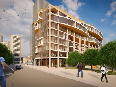
Olio Towers: A Mid-Rise for Performers That Fuses Housing, Rehearsal, and Stage
Located blocks from Houston's Theater District, this modular tower stacks living units around a central performance atrium.

Oasis: Modular Green Housing Carved into Dhaka's Urban Fabric
A shortlisted Plugin Housing entry reclaims unauthorized settlements in Dhaka with stepped concrete volumes, green roofs, and ventilation-driven design.

Black Hole: A Floating Megastructure for the Post-Physical Era
Emiliano Mazzarotto envisions a spherical, self-scaling arena where e-sports, digital hotels, and holographic stadiums replace traditional public space.

Explore Showrooms Competitions
Discover active competitions in this discipline

Challenge to design luxury tourism on rails

Challenge to reimagine the Iron Throne

Photograph architecture without architects

VR headsets Storefront design competition
Comments (0)
Please login or sign up to add comments
No comments yet. Be the first to comment!