
Kerry Kounnapis Packs 800 Daily Coffees into a 43-Square-Metre Melbourne Laneway Bar
Palace Coffee channels Pellegrini's and European standing bars through oxide-red steel and spotted gum timber in a Ridgway Place sliver.


There is a particular genre of Melbourne architecture that exists only below knee height and above eye level: the laneway fit-out. It is a space measured not in square metres but in cups per hour, bodies per square foot, and the speed at which a barista can pull a shot before the next customer steps up. Palace Coffee, designed by Kerry Kounnapis Architecture Practice at the base of Monaco House on Ridgway Place, operates in exactly this register. At 43 square metres, it serves 800 cups a day to a weekday crowd that spills into the lane, turning the act of waiting into a public performance.
What makes the project genuinely interesting is its refusal to treat smallness as a constraint requiring clever tricks. Instead, KKAP treats the tiny footprint as a license to be precise about every surface, every material joint, every sightline. The design draws openly from Melbourne's hospitality landmarks: the oxide-red steel and spotted gum timber of Pellegrini's, the fibreglass ceiling panels of the Nicholas Building. But these references are filtered through a disciplined contemporary language, producing a space that feels both nostalgic and surgically new. The architecture recedes from the street to create a threshold, a zone where the laneway and the bar overlap, and that overlap is the real design move.
The Recessed Threshold
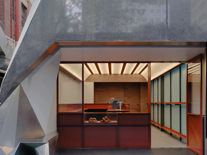
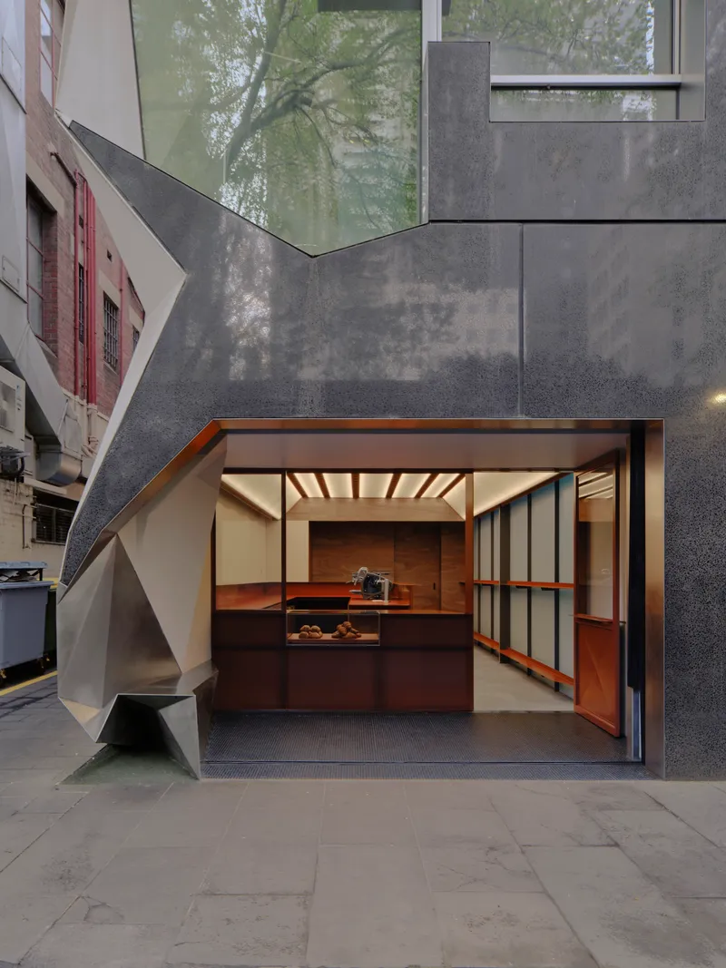
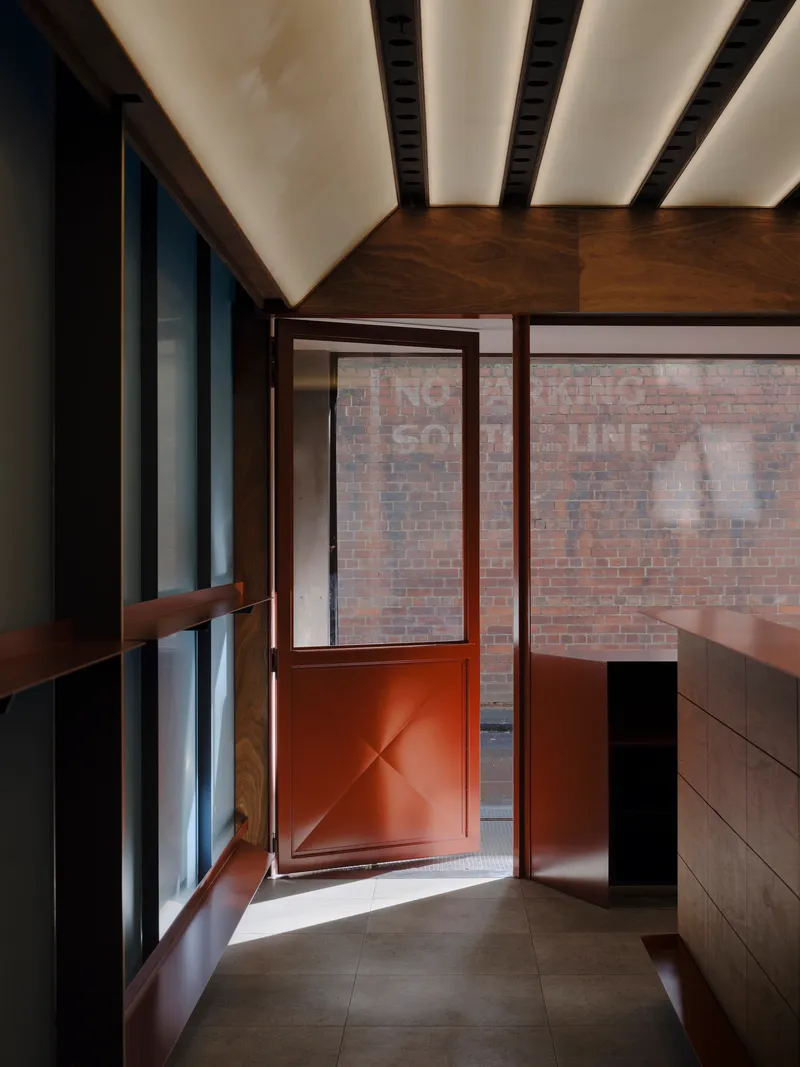
The storefront pulls back from the laneway edge, carving out a few precious square metres of public space that belong neither fully to the street nor to the interior. Folding glass panels open the entire facade during service hours, dissolving the boundary between inside and out. Patrons queuing become part of the spectacle for passersby, and the timber canopy overhead frames the scene like a proscenium. Across the lane sits the Melbourne Club's fortress-like brick wall, making the warmth of the coffee bar's opening all the more theatrical by contrast.
The strategy recalls European standing bars where the counter is the architecture. There are no seats. You order, you stand, you drink, you leave. The recession of the frontage means that this transaction can happen partially outdoors, blurring the line between a building and a piece of street furniture.
Oxide-Red Steel and Spotted Gum
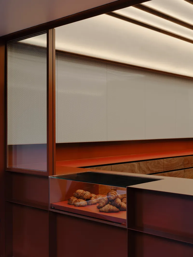
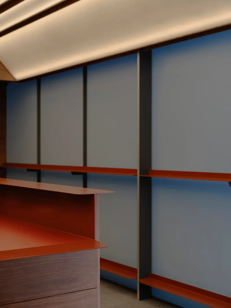
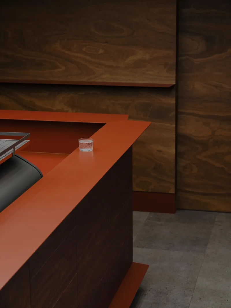
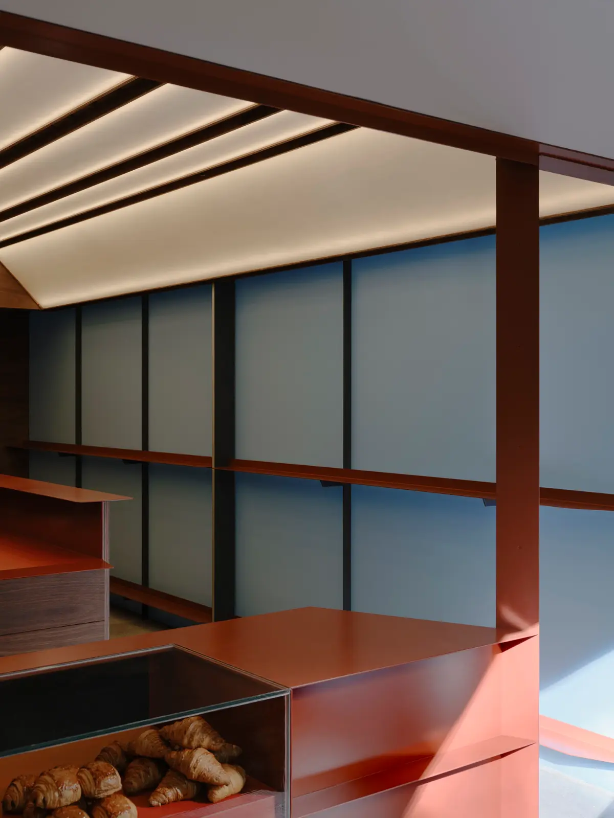
The material palette is tight and deliberate. Dulux Manor Red paint coats the steel facade and counter, giving the shopfront a sculptural weight that anchors it against the grey tiles underfoot. Spotted gum timber appears in the perforated panels and ceiling structure, its grain warm enough to humanize the industrial steel but hard enough to weather heavy daily use. These are not decorative choices. They are direct citations of Melbourne's mid-century hospitality interiors, updated with sharper geometry.
The copper-toned counter and shelving introduce a third material register that reads as somewhere between the red steel and the blonde timber. Where these materials meet, the detailing is meticulous. The copper ledge intersects vertical timber mullions with the kind of precision that rewards close looking, turning a pastry display into a piece of joinery.
The Backlit Ceiling
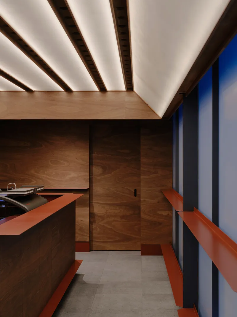
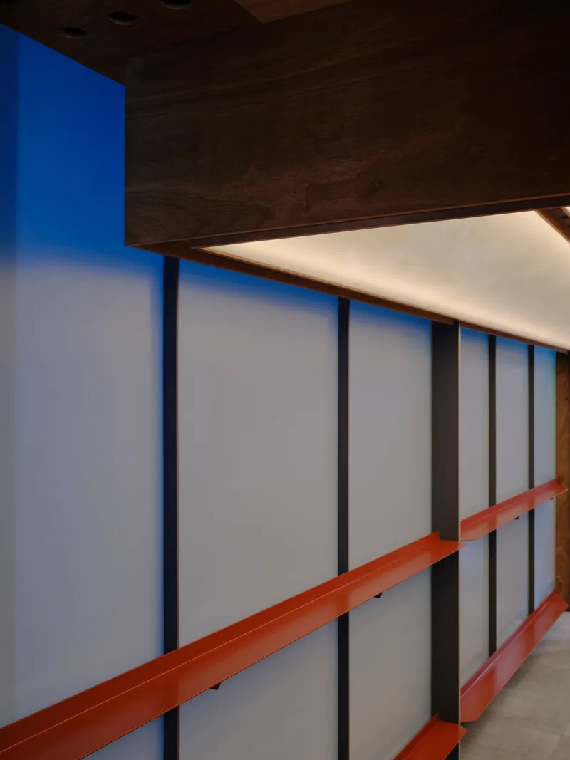
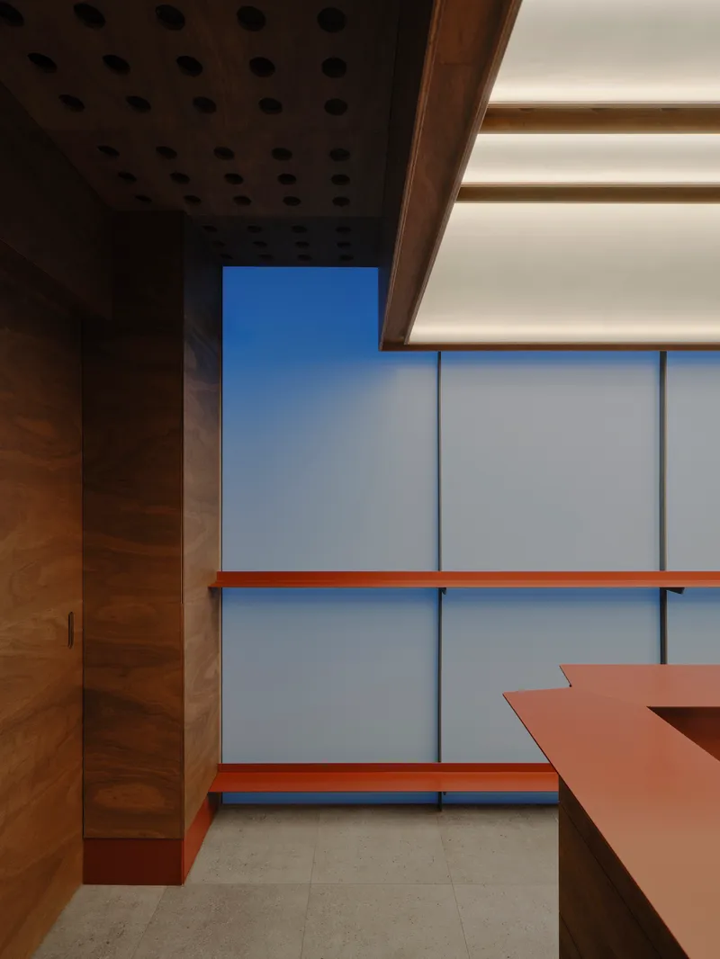
Look up and the fibreglass ceiling panels glow with diffused light, transforming what could be an oppressively low space into something buoyant. The reference to the Nicholas Building's interiors is clear, but here the backlit baffles serve a practical purpose too: they wash the counter with even, warm light that makes the coffee and the act of making it look good. In a space this small, the ceiling is the largest uninterrupted surface, and KKAP treats it as the room's primary architectural gesture.
The dark timber volume that frames and suspends below the ceiling gives the overhead plane its visual depth. Without that framing, the fibreglass would read as a drop ceiling. With it, the ceiling becomes a lantern, lending the capsule-like interior a sense of atmospheric compression that is cozy rather than claustrophobic.
Translucent Screens and Filtered Light
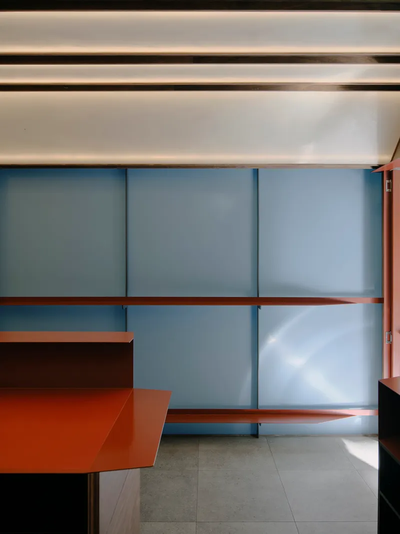
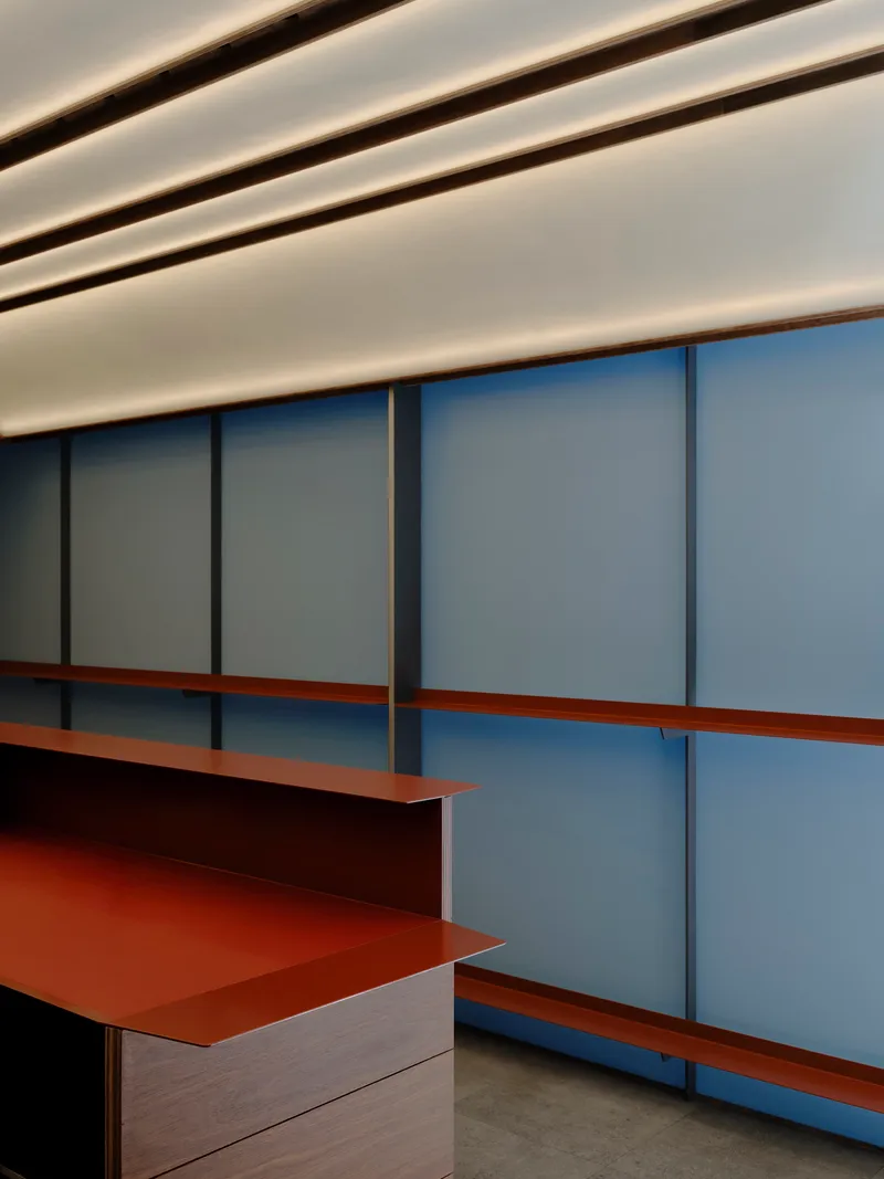
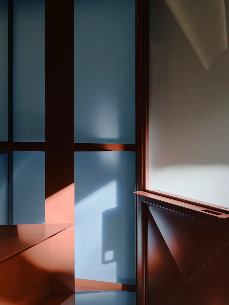
A wall of frosted glass panels framed in timber mullions runs along one side of the interior, filtering afternoon light into a soft, milky wash. The translucent screens serve double duty: they maintain visual privacy for back-of-house operations while keeping the space feeling open and luminous. On the customer side, the red metal shelving reads as a graphic element against the diffused glow, giving the interior a layered quality that belies its modest dimensions.
The sliding mechanism allows baristas to modulate the relationship between front and back throughout the day. It is a small move that acknowledges an operational reality of high-volume hospitality: the boundary between public and private shifts constantly, and the architecture should accommodate that rather than fix it in place.
The Counter as Centrepiece
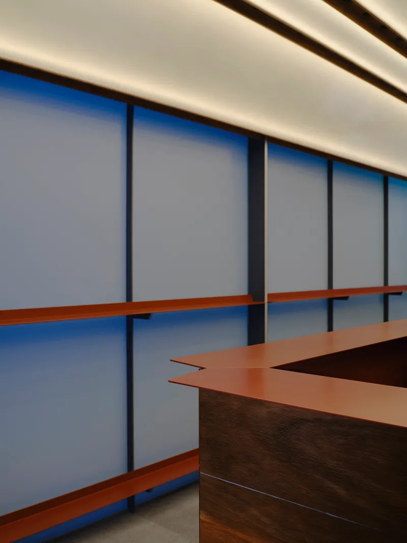
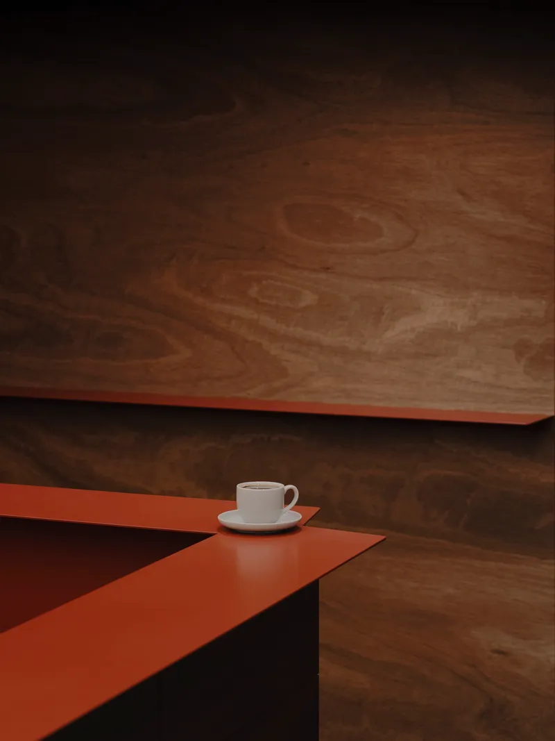
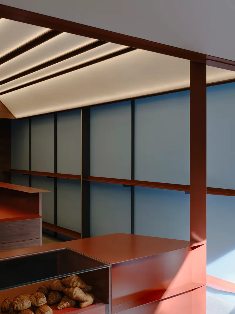
In a standing-room-only bar, the counter is everything. It is the worktop, the serving surface, the bench, and the social interface between barista and customer. Palace Coffee's angular terracotta-toned counter wraps through the space with precise cut-out corners, channeling all movement and interaction along its edge. A La Marzocco machine sits at the center of this choreography, elevated to the status of a sculptural object.
Hidden service elements keep the visual field clean, ensuring that the eye moves from coffee machine to timber ceiling to glowing fibreglass without interruption. The result is a space that feels composed even when packed with the morning rush, which, given the 800-cup daily throughput, is most of the time.
Plans and Drawings
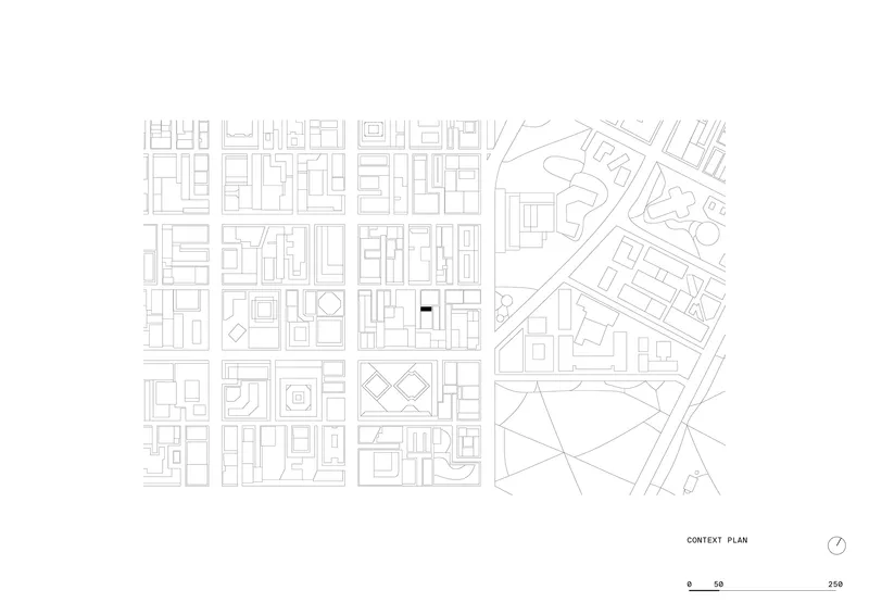
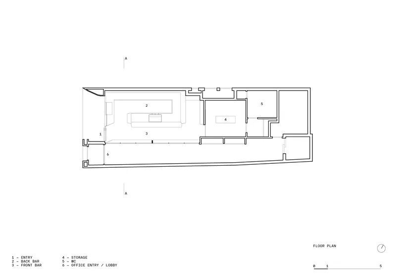
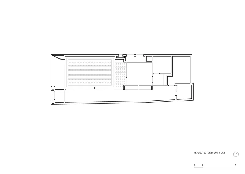
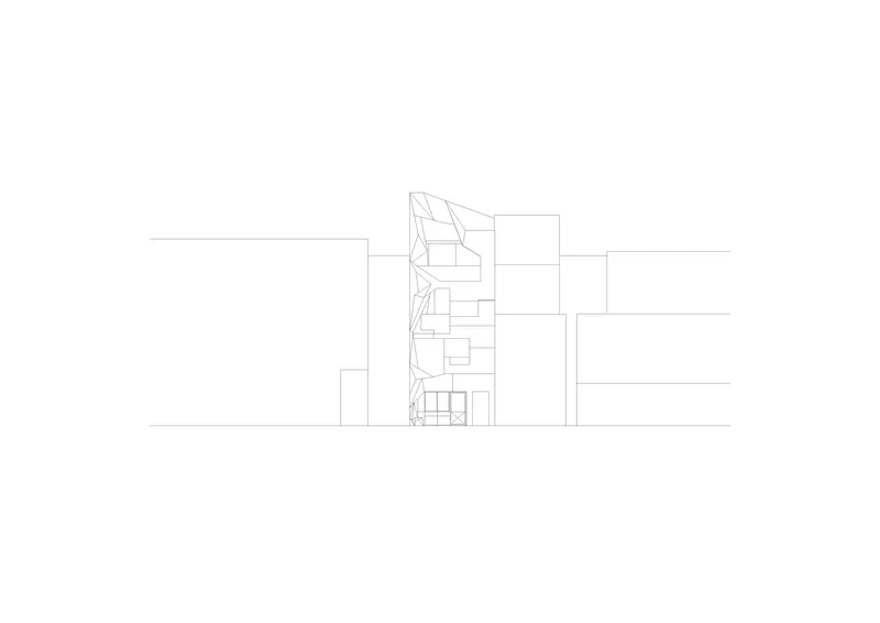
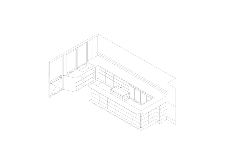
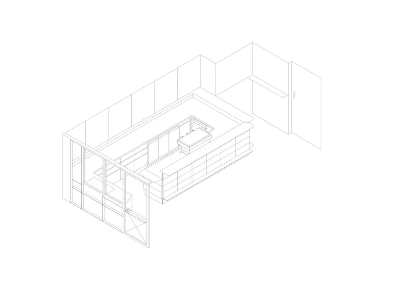
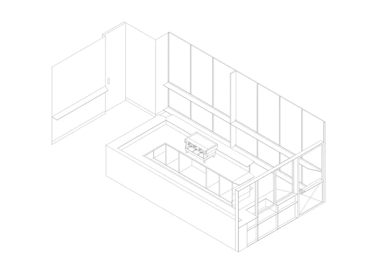
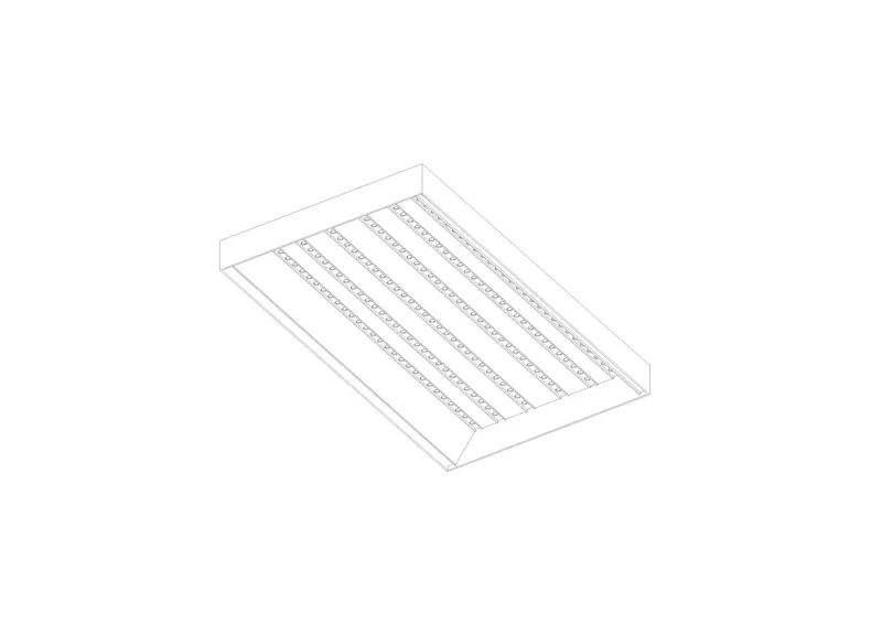
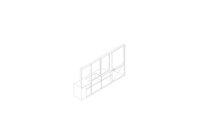
The context plan reveals how deeply embedded the project is within Melbourne's urban block, occupying a narrow slot at the base of a multi-storey building. The floor plan makes the spatial economy legible: entry, front bar, back bar, storage, and a small office all compressed into 43 square metres with no wasted circulation. The reflected ceiling plan shows how carefully the lighting and fibreglass panels are orchestrated to compensate for the lack of natural overhead light.
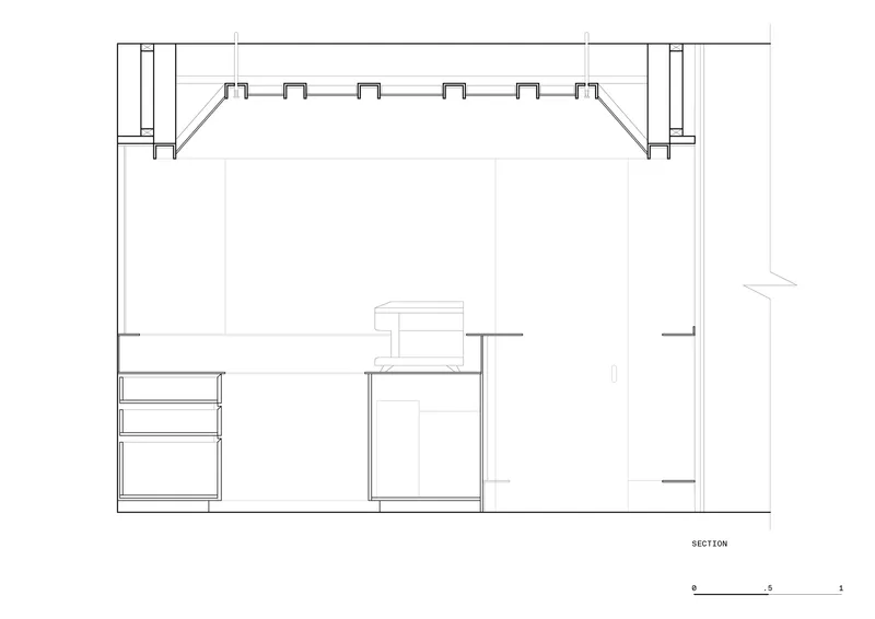
The section and axonometric drawings are particularly revealing. The section shows the timber ceiling beams spanning the full width of the space, with the central kitchen island anchoring the plan below. The series of axonometric studies breaks the project into its constituent systems: the glazed wall, the sliding doors, the continuous counter, the roof panel with its linear slats, and the shelving unit. Each component is designed as a discrete piece of furniture-scale architecture, and the drawings make clear that the project's ambition lies in the resolution of these parts rather than in any grand spatial gesture.
Why This Project Matters
Melbourne has no shortage of small coffee bars, and the city's laneway culture has been mythologized to the point of cliché. What Palace Coffee does well is take that myth seriously as an architectural problem. The recessed threshold, the standing-bar format, the material references to Pellegrini's and the Nicholas Building: these are not nostalgic gestures. They are design decisions rooted in how a specific type of urban hospitality actually works, calibrated for a site that faces a brick fortress and serves an office-district crowd that needs efficiency wrapped in warmth.
At a time when hospitality design often defaults to either raw industrial minimalism or maximalist Instagram sets, Palace Coffee stakes out a quieter position. It argues that 43 square metres can carry genuine architectural intent if every joint, every material, and every sightline is considered. The fact that it was built by Tribeca and Severn Smith with an emphasis on durable materials, energy-efficient lighting, and minimal construction waste suggests that the precision extends beyond aesthetics. This is a small project that takes itself exactly as seriously as it should.
Palace Coffee by Kerry Kounnapis Architecture Practice, built by Tribeca and Severn Smith. Located at 22 Ridgway Place, Melbourne, Australia. 43 m². Completed 2024. Photography by Tom Ross.
About the Studio
Share Your Own Work on uni.xyz
If projects like this are the kind of work you want to make, uni.xyz is a place to publish your own, find collaborators, and enter design competitions.


Popular Articles
Popular articles from the community


Aquadapt: An Underwater Habitat That Rewrites Its Rooms by the Hour
Curved modules ring the seabed while one shell shifts from breakfast room to cinema, farm and football pitch as residents' needs change.

The Amber Palace Opera: A Geological Fiction Surfaces on Tallinn's Baltic Waterfront
Pierre Brillard reimagines a Baltic legend as a public landscape, opera house, and waterfront promenade rooted in Tallinn's coastal identity.

Manzana Morphosis: Stretching Barcelona's Grid into a Living Landscape for 2050
A radical reworking of the Eixample manzana turns density into a tool for generous public space, vertical ecology, and environmental performance.

Singing Woman: An Opera House That Performs Before the Curtain Rises
Ovidiu Cristian Pavel's conceptual opera house translates Estonia's choral identity into a sculpted waterfront landmark facing the Baltic Sea.

Similar Reads
You might also enjoy these articles

LAVA Architecten Gives Vocational Education a Sawtooth-Roofed Face on a Mechelen School Campus
In Mechelen, Belgium, a 2,053 m² STEM school on a 6×6 m grid turns workshops and classrooms into rooms that can be rearranged as teaching changes.

KEMA Studio Turns a Derelict Marvila Attic into a 60 m² Lighthouse Apartment Above Lisbon
In Lisbon's Marvila district, a rebuilt roof, four skylights and two plywood volumes turn an unlivable attic into a bright home facing the Tagus.

Pixel Gardens: One Repeated Module Stacked Into a Terraced Social Housing Tower for Famagusta
Salem Bader's shortlisted housing tower builds a vertical neighbourhood from one repeated module, offsetting units to carve terraces, light and air.

Bao Huynh Watercolor Atelier: A Serene Art Retreat in Hội An
Bao Huynh Watercolor Atelier in Hội An blends multifunctional art spaces, sustainable design, local materials, and family-friendly living in a serene environment.

Explore Coffee Chair Competitions
Discover active competitions in this discipline

Challenge to reimagine the Iron Throne

Photograph architecture without architects

Illustrate the lost glory of Angkor Wat - Render Challenge

Design challenge to reuse E-waste
Comments (0)
Please login or sign up to add comments
No comments yet. Be the first to comment!