
LMOOD Flagship Store: Translating Mood into Architectural Mass
A minimalist flagship store in Seoul where architecture embodies brand mood through balance, material weight, and refined spatial stillness.
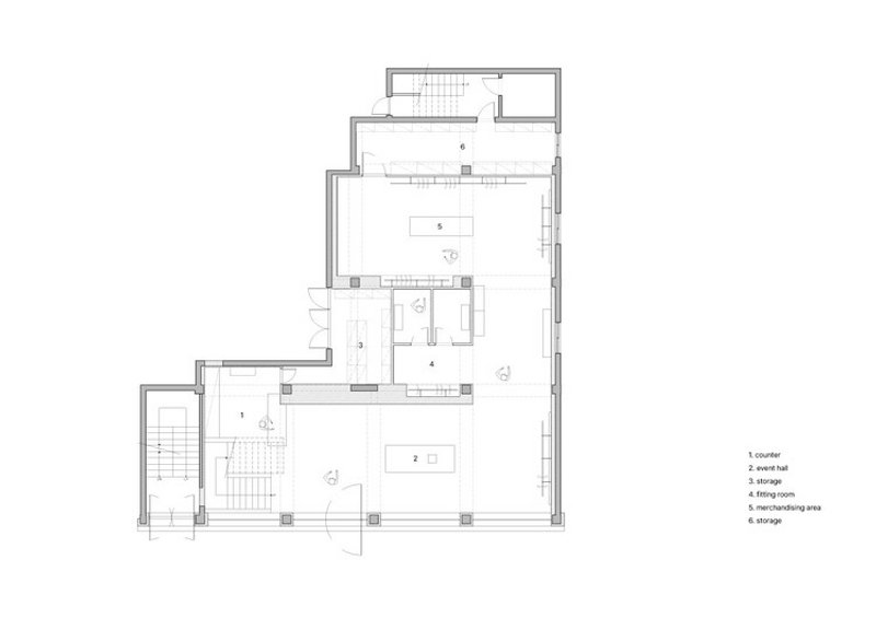
In the rapidly evolving creative district of Seongsu-dong, Seoul, the LMOOD Flagship Store emerges as a carefully composed architectural statement—quiet, restrained, and deeply intentional. Designed by oftn studio and completed in 2025, the 495-square-meter retail space serves as the first physical manifestation of LMOOD’s brand philosophy: “Form and Function are One.”
Rather than relying on spectacle or visual excess, the flagship store translates the brand’s values into space through balance, material weight, and emotional clarity. The result is an immersive environment where architecture does not compete with the product, but instead amplifies its presence by shaping atmosphere, rhythm, and perception.
Brand Philosophy as Spatial Framework
LMOOD is a contemporary brand rooted in minimalism, practicality, and refined sensibility. Its design language emphasizes calm confidence, precision, and longevity—qualities that resist trends and visual noise. For its first flagship store, the brand sought an environment that could embody these values not symbolically, but experientially.
oftn studio approached the project by treating architecture as an extension of brand identity rather than a neutral container. The store is conceived as a spatial translation of mood—an intangible quality expressed through proportion, material density, light, and movement. The aim was not to decorate, but to construct an atmosphere that resonates emotionally with visitors.
Minimal, Refine, Mood: Guiding Principles
Three keywords guided the design process: Minimal, Refine, and Mood. These concepts informed every architectural decision, from spatial composition to material detailing.
Minimalism here is not reduction for its own sake, but a tool for intensifying perception. By eliminating unnecessary elements, the design sharpens attention toward what remains—form, texture, light, and spatial rhythm.
Refinement is expressed through precision and restraint. Materials are carefully selected, proportions are exacting, and transitions are subtle. Nothing calls attention to itself unnecessarily, yet every element contributes to the overall coherence.
Mood, the most elusive of the three, is the project’s central ambition. It is not created through overt symbolism, but through the cumulative effect of spatial balance, gravity, and stillness.
The Concept of “Moodmass”
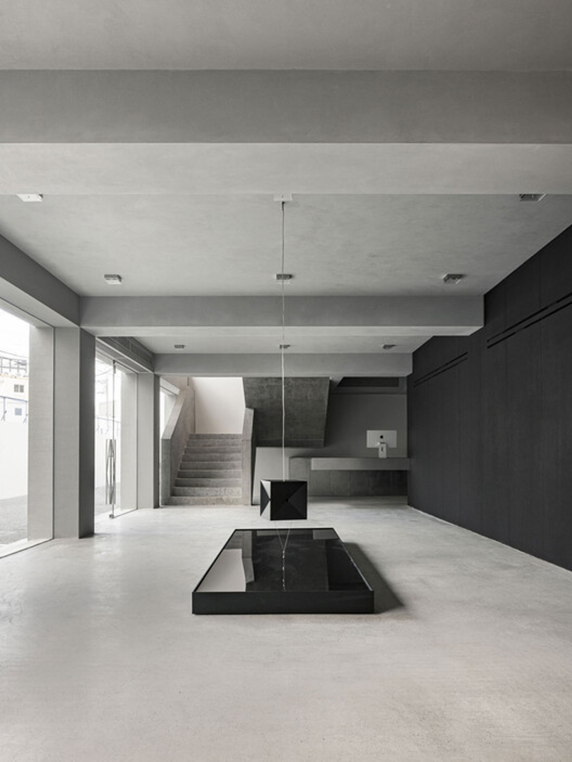
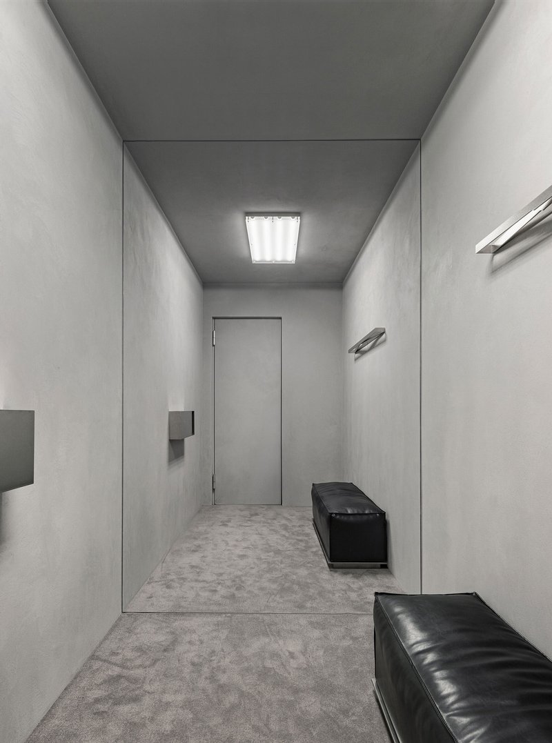
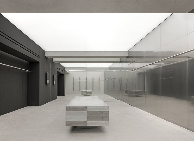
At the heart of the project lies the concept of “Moodmass”—a term coined by oftn studio to describe the physical embodiment of LMOOD’s identity. Moodmass refers to the visual and structural weight of the space: the sense of groundedness, composure, and quiet intensity that defines the store.
Rather than emphasizing transparency or openness alone, the architecture balances solidity and clarity. The space feels anchored and calm, yet never heavy or closed. This equilibrium reflects the brand’s belief that true modernity lies in measured presence rather than display.
Moodmass is expressed through three primary architectural gestures that structure both circulation and perception:
- the staircase
- the black mass
- the acrylic wall
Together, these elements form the spatial core of the flagship store.
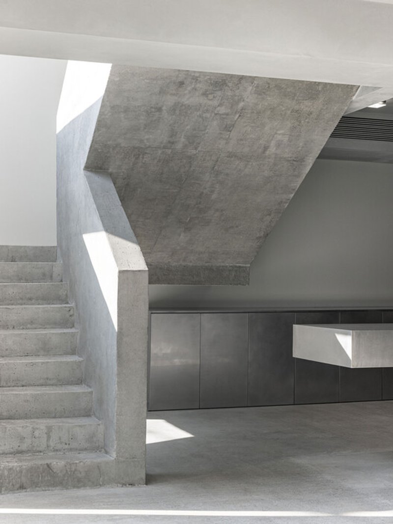
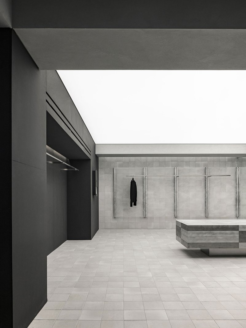
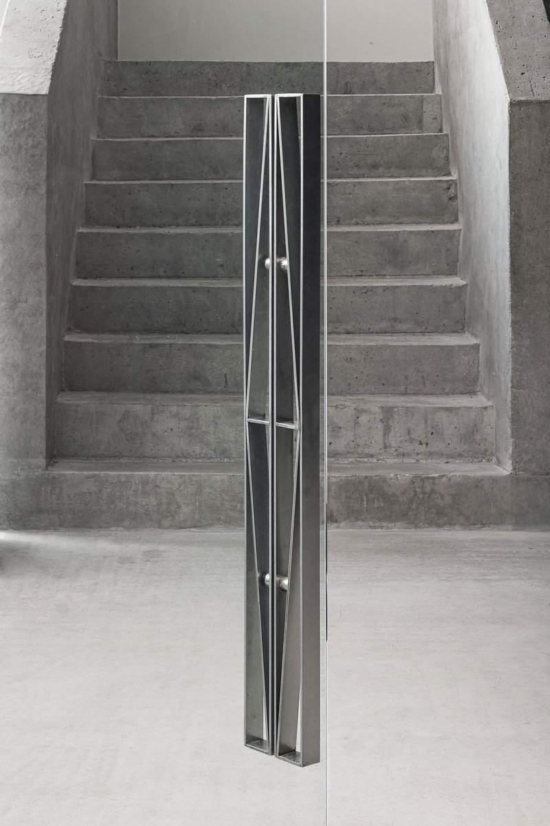
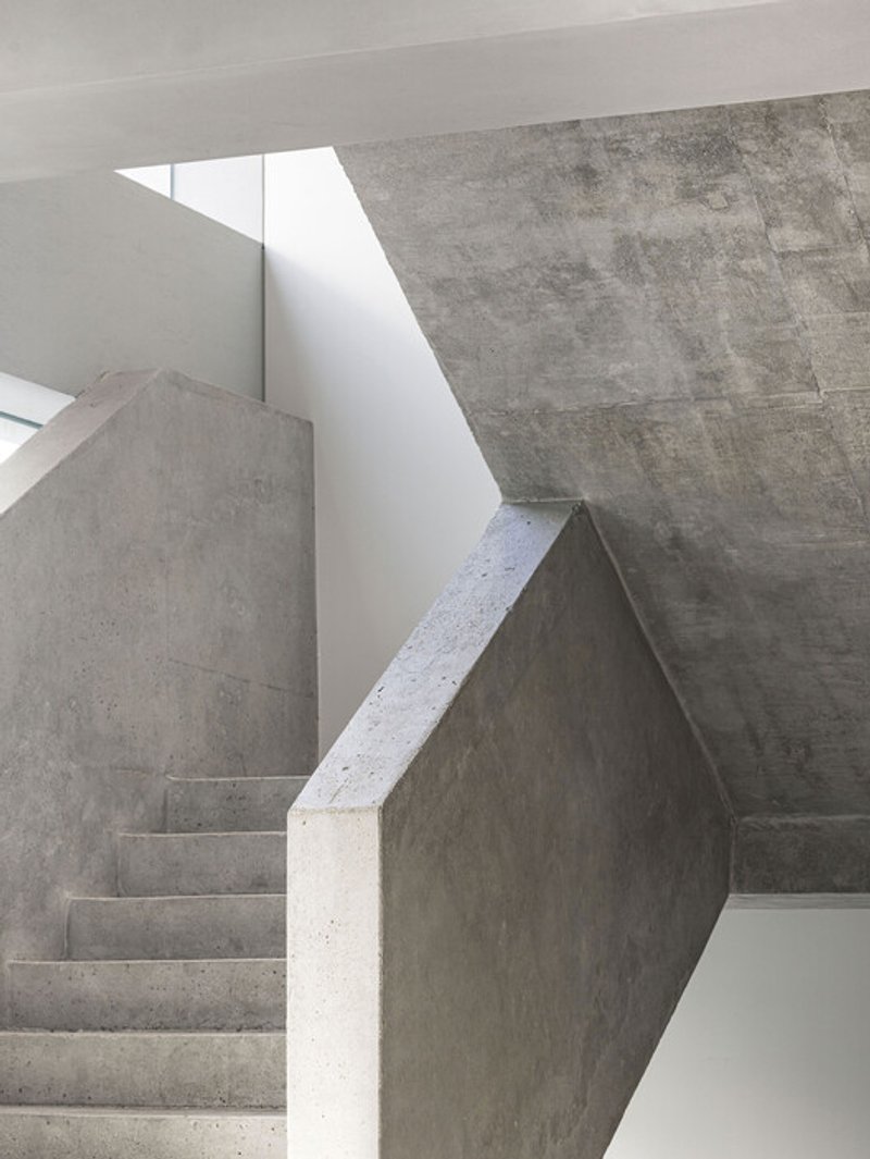
Architectural Anchors: Staircase, Black Mass, Acrylic Wall
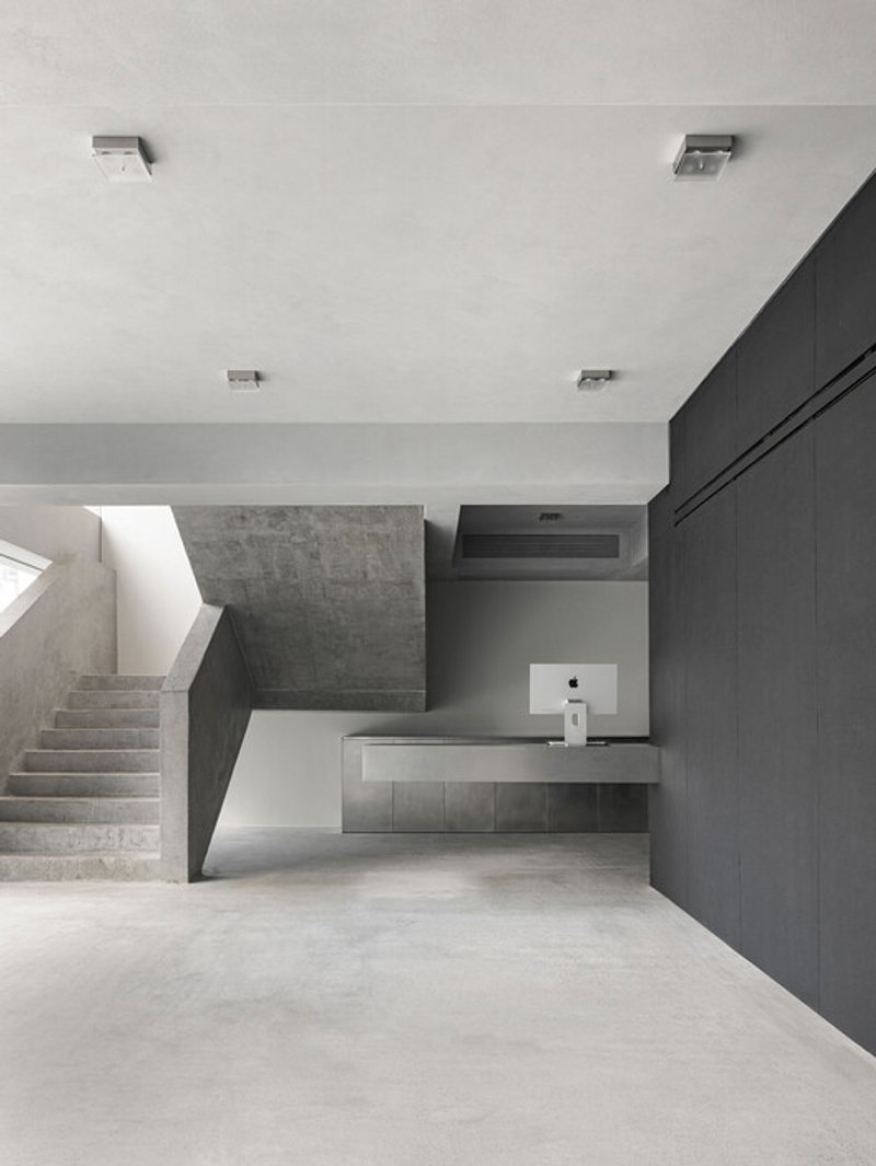
The staircase is more than a functional connector between floors—it is a sculptural element that establishes vertical rhythm and movement. Its presence introduces a sense of progression, guiding visitors through the space while maintaining visual continuity.
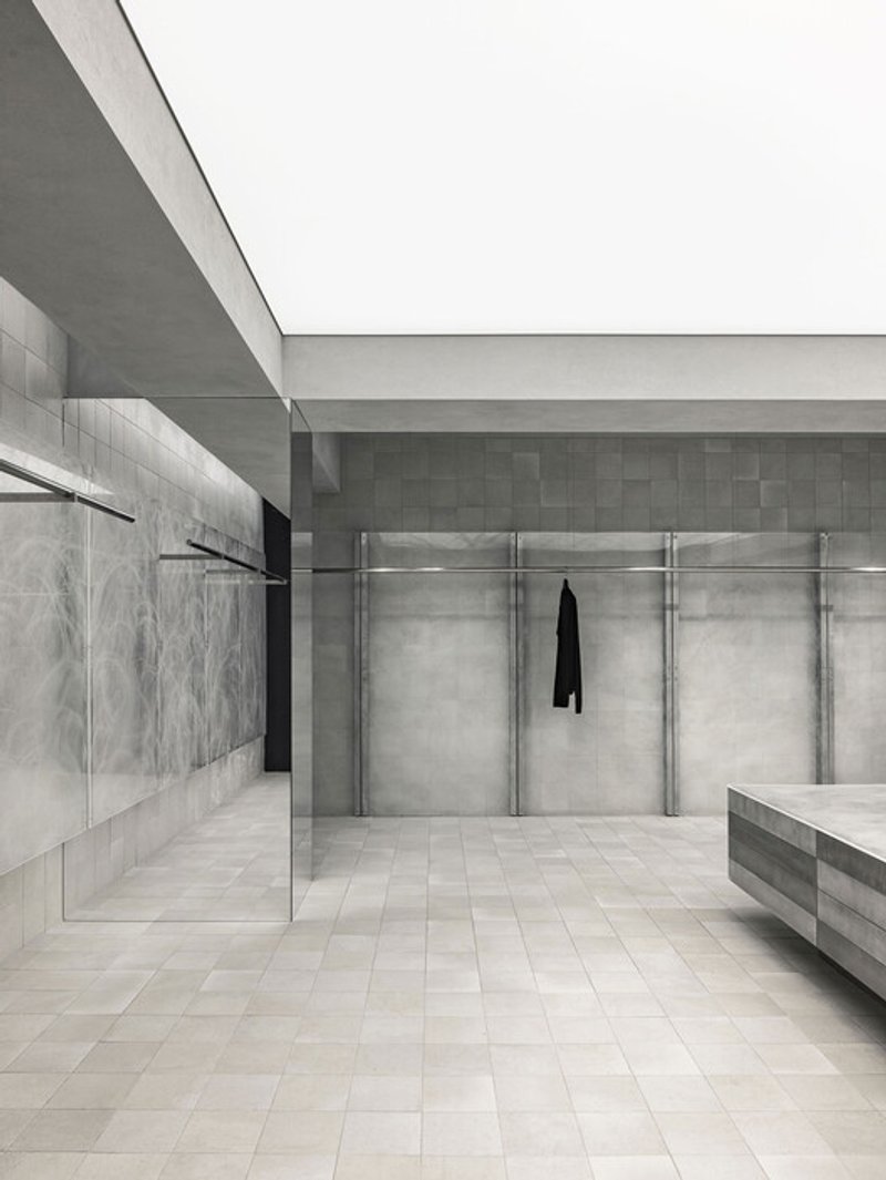
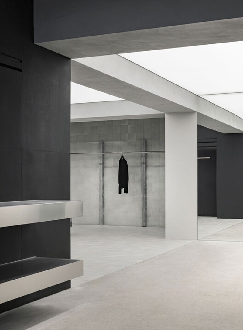
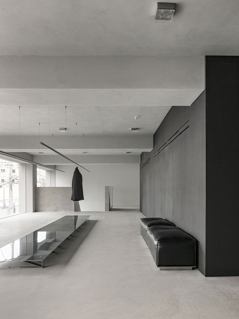
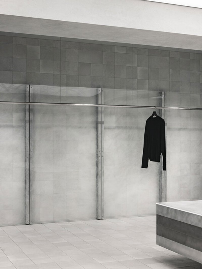
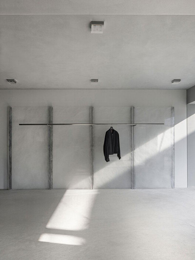
The black mass functions as a grounding element, embodying density, gravity, and stillness. Its dark, restrained presence contrasts with lighter materials, reinforcing the spatial hierarchy and providing a sense of calm focus.
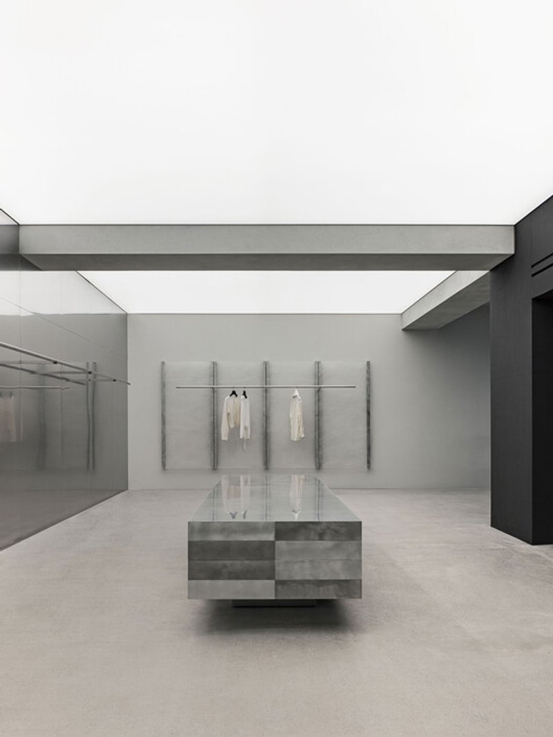
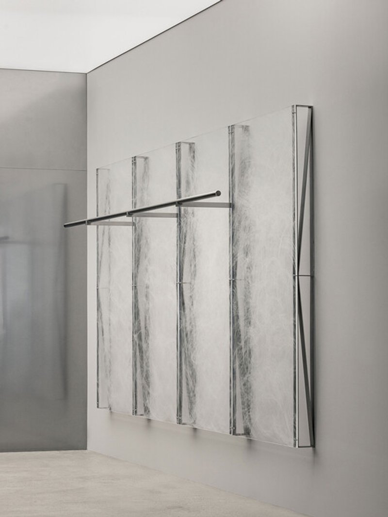
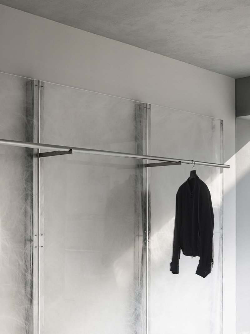
The acrylic wall, hand-finished and subtly reflective, introduces translucency and depth. It filters light rather than reflecting it directly, creating an ambiguous boundary that feels both solid and ephemeral.
Together, these elements articulate the store’s identity as a place where clarity and weight coexist—where architecture feels composed rather than expressive.
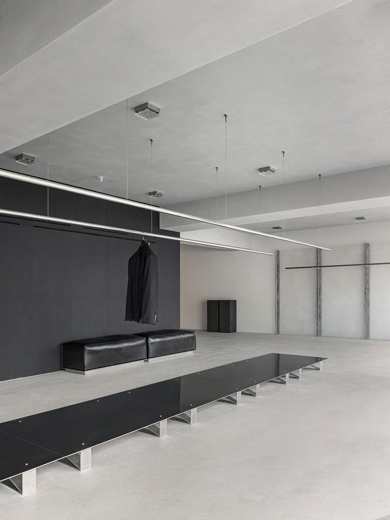
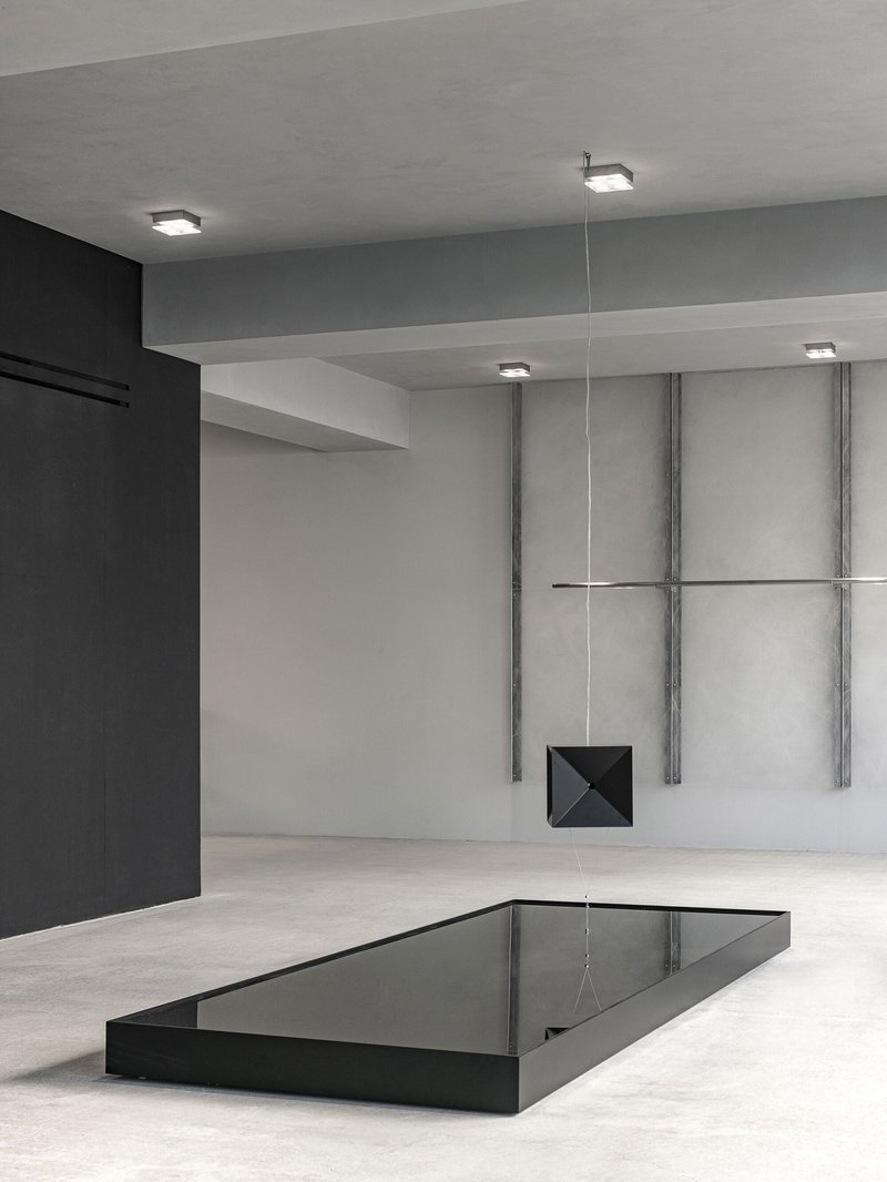
Sculptural Elements and Spatial Tension
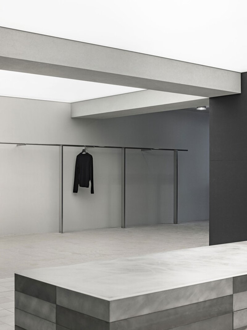
Within the minimal framework, select elements introduce moments of tension and surprise. The floating counter and central speaker appear suspended, challenging expectations of gravity and mass. These gestures are understated yet powerful, creating a quiet sense of intrigue.
Rather than overwhelming the space, these sculptural elements act as anchors of attention, reinforcing the brand’s controlled intensity. Their apparent lightness contrasts with the grounded architecture, producing a dynamic balance that mirrors LMOOD’s design ethos.
Lighting as Narrative Device
Lighting plays a critical role in shaping the visitor experience. Instead of uniform illumination, the store employs a sequenced lighting strategy that unfolds gradually as one moves deeper into the space.
Near the entrance, lighting is open and neutral, inviting approach and visibility. As visitors progress inward, the atmosphere becomes warmer and more intimate. This gradual modulation fosters immersion, encouraging slower movement and deeper engagement with both space and product.
The lighting does not seek to dramatize but to support mood, reinforcing the architecture’s calm rhythm and material presence.
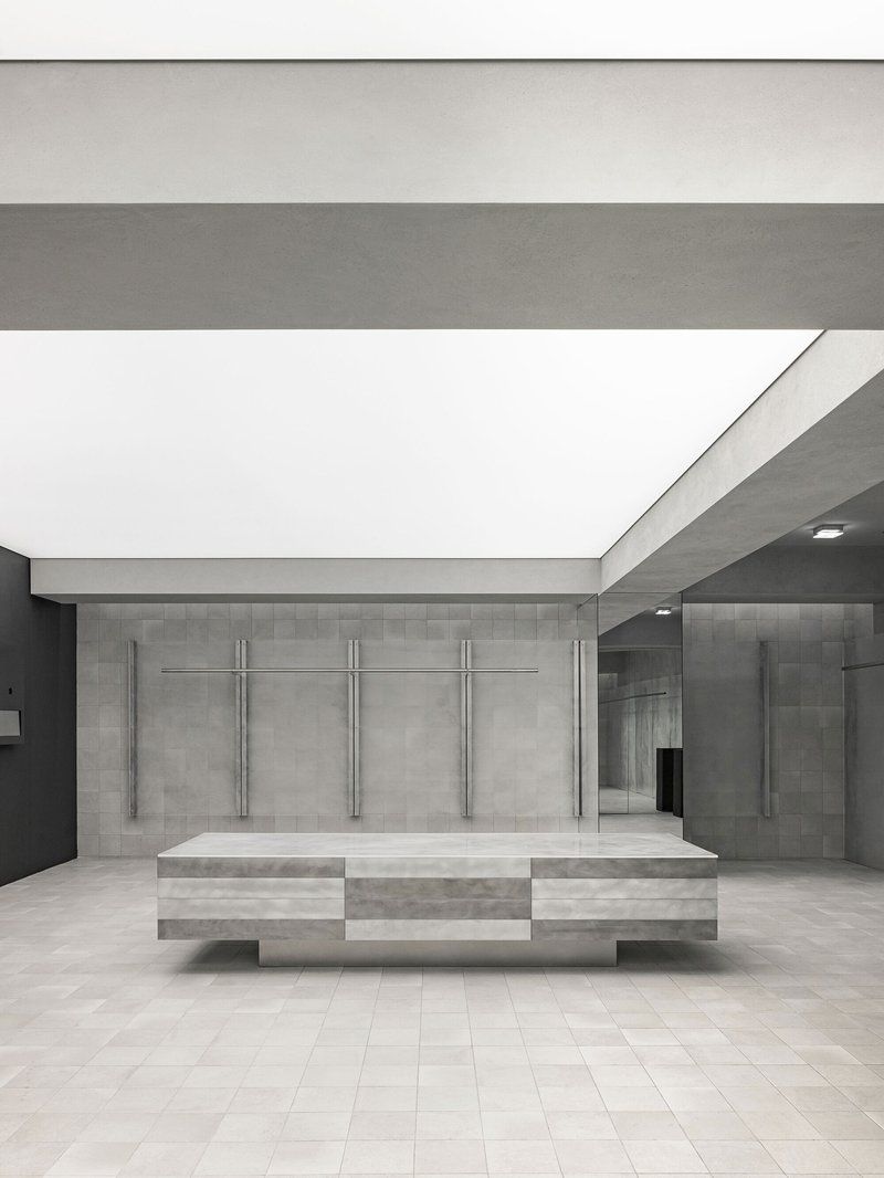
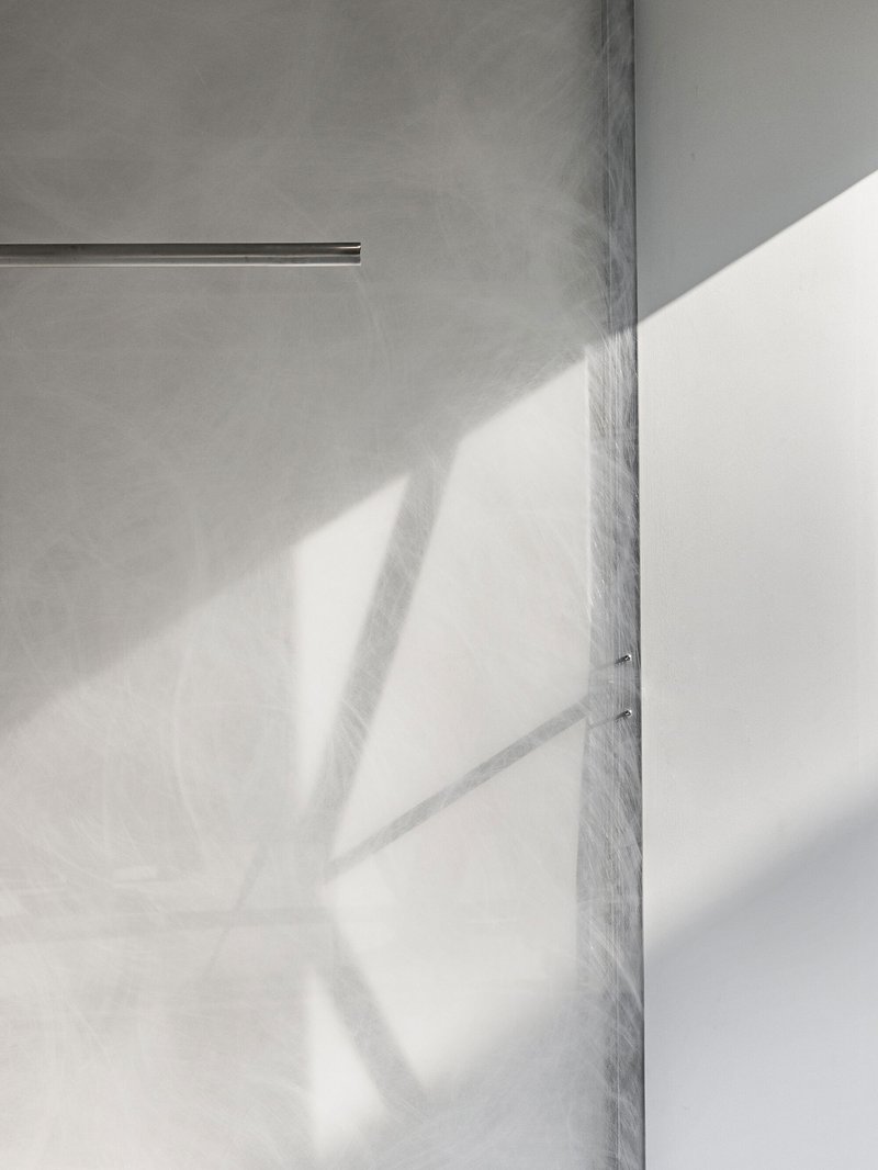
Material Transitions and Tactile Depth
Materiality is central to the sensory experience of the LMOOD flagship store. Rather than relying on contrast alone, the design uses gradual transitions in scale and texture to shape perception.
The polished concrete flooring at the entrance subtly transforms into smaller-format concrete tiles toward the interior. This shift is almost imperceptible, yet it creates a tactile sense of progression and depth.
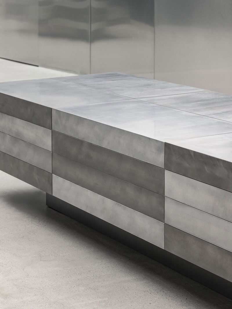
Similarly, metal panels evolve in scale: large and bold near the façade, finer and more intricate closer to the display fixtures. This modulation enhances intimacy as visitors approach the products, reinforcing the emotional narrative of the space.
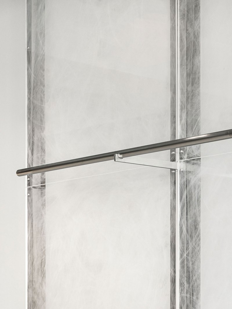
Craftsmanship and Material Honesty
The materials themselves—hand-finished acrylics, brushed metals, and concrete—are chosen not for visual impact, but for their intrinsic qualities. Their subdued reflections and muted finishes reveal depth without spectacle.
Every surface reflects LMOOD’s emphasis on craftsmanship and restraint. The hand-processing of materials introduces subtle variations, ensuring that the space feels human rather than mechanical.
This material honesty aligns with the brand’s belief that refinement is found not in decoration, but in precision and care.
Retail Experience as Emotional Journey
The spatial composition of the flagship store is designed as a journey rather than a static display. Circulation is intuitive yet deliberate, guiding visitors through moments of openness and enclosure, lightness and weight.
Each shift in material, lighting, or proportion corresponds to a subtle change in emotional tone. This choreography transforms shopping into an immersive experience—one that encourages awareness, reflection, and connection.
The architecture does not dictate behavior but gently shapes perception, allowing visitors to engage with the brand on their own terms.
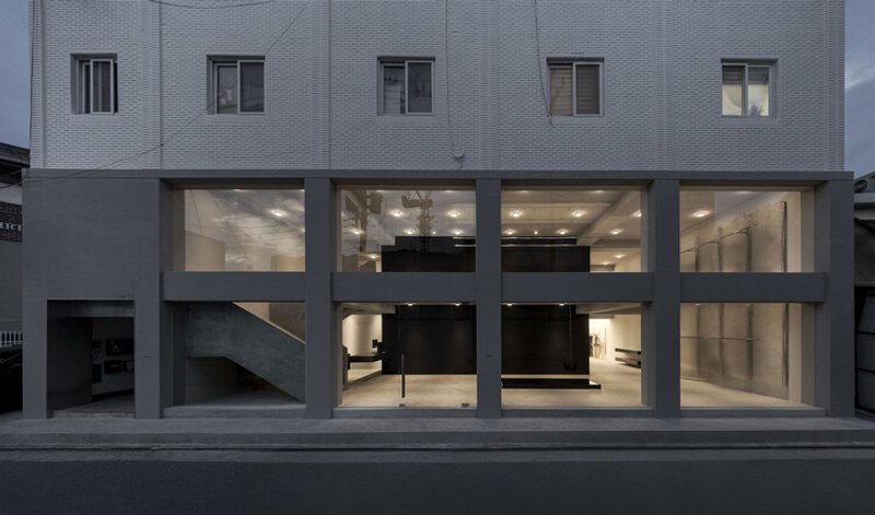
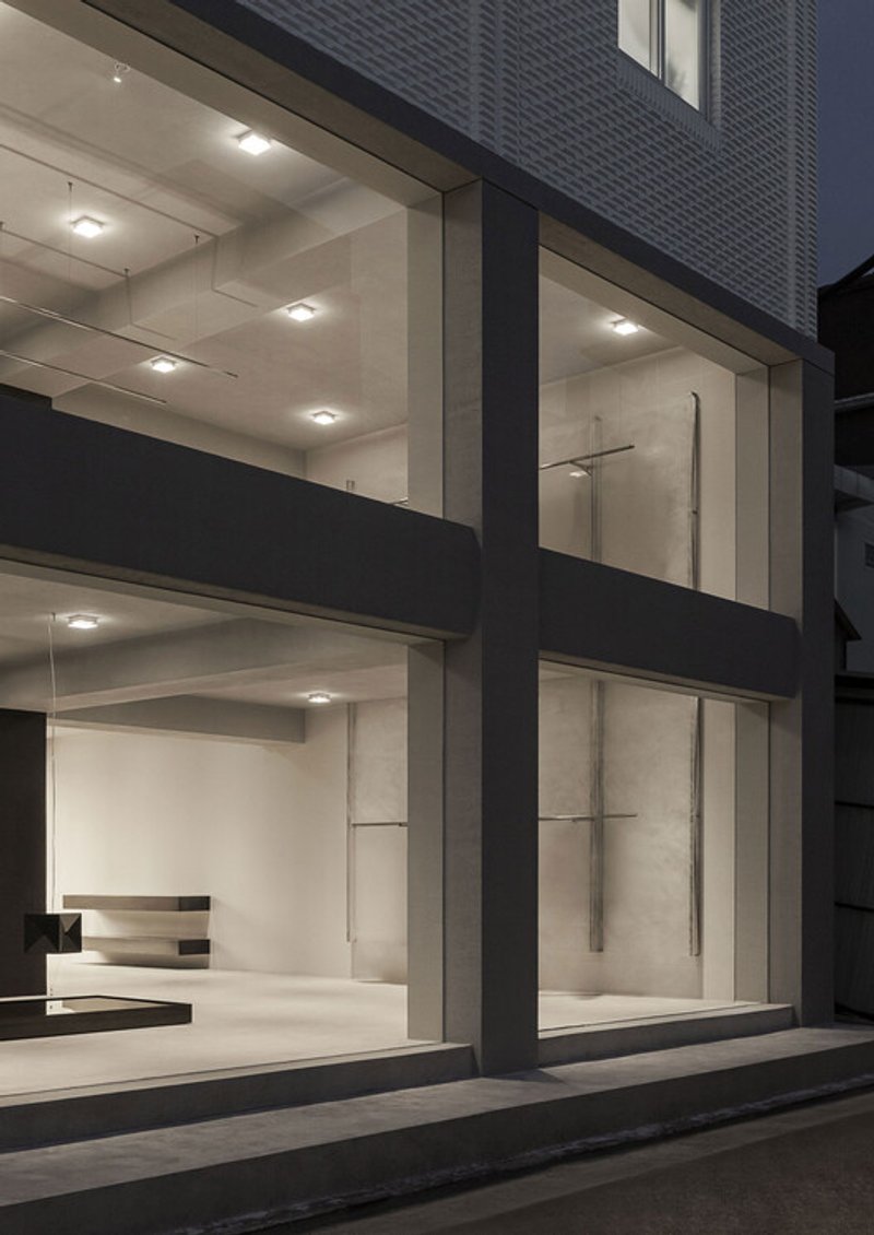
Façade as Display Case
From the exterior, the flagship store presents a clean, composed façade defined by translucent white glass. This envelope acts as a display case, framing the interior’s sculptural elements as objects of quiet contemplation.
Rather than using signage or bold graphics, the façade communicates identity through presence and restraint. Passersby glimpse the internal architecture, sensing the mood of the space before entering.
This transparency reinforces LMOOD’s philosophy: clarity without exposure, openness without excess.
Architecture as Brand Language
The LMOOD Flagship Store demonstrates how architecture can function as a brand language rather than a backdrop. Every decision—spatial, material, and atmospheric—contributes to a cohesive identity that extends beyond visual branding.
oftn studio’s design does not impose meaning but creates conditions for experience. The store becomes a place where form and function truly converge, where emotion is shaped through balance and stillness.
A New Model for Contemporary Retail
In an era when retail spaces often rely on spectacle to attract attention, the LMOOD flagship store proposes an alternative approach. It suggests that quiet intensity, when executed with precision, can be just as compelling.
By prioritizing mood, materiality, and spatial clarity, the project offers a model for contemporary retail architecture that values depth over immediacy and experience over display.
Stillness, Precision, and Intent
Ultimately, the LMOOD Flagship Store is not defined by what it shows, but by how it feels. It is a space where architecture recedes just enough to allow emotion, product, and perception to come into focus.
In translating the brand’s ethos into built form, oftn studio has created a retail environment that embodies modernity through restraint—where stillness carries weight, and intention shapes every detail.
All the Photographs are works of Yongjoon Choi


Popular Articles
Popular articles from the community

Alton Cliff House: A Harmonious Retreat by f2a Architecture in Lake Country, Canada
Alton Cliff House blends corten steel, prefabrication, and sustainable design, creating a luxurious, energy-efficient retreat perched on Canadian cliffs.
Split House: A Compact Urban Home Blending Privacy, Light, and Flexible Living in Japan
Compact Japanese home featuring DOMA space, flexible café potential, passive lighting, privacy zoning, and sustainable urban living design.
Gads Hill Early Learning Center by JGMA: Adaptive Reuse Shaping Community-Focused Educational Architecture
Adaptive reuse transforms fragmented structure into vibrant early learning center with playful façade, natural light, and community-focused sustainable design.


Similar Reads
You might also enjoy these articles

The Ken Roberts Memorial Delineation Competition (Krob)
As the most senior architectural drawing competition currently in operation anywhere in the world, it draws hundreds of entries each year, awarding the very best submissions in a series of medium-based categories.
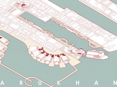
Waterfront Redevelopment and Urban Revitalization in Mumbai: Forging a New Dawn for Darukhana
A transformative waterfront redevelopment project reimagining Darukhana’s shipbreaking heritage into an inclusive urban future.

OUT-OF-MAP: A Call for Postcards on Feminist Narratives of Public Space
Rhizoma Design and Research Lab invites artists, designers, architects, researchers, and students to reflect on how feminist perspectives can reshape public space. Selected works will be exhibited in Barcelona, October 2026. Submissions open until 15 April 2026.

Documentation Work on Buddhist Wooden Temple
Architectural syncretism and cultural hybridity: A comparative study of the Buddhist temples in Chattogram Hill tracks


Explore Architecture Competitions
Discover active competitions in this discipline


The International Standard for Design Portfolios


The Global Benchmark for Architecture Dissertation Awards


The Global Benchmark for Graduation Excellence


Challenge to design locus for the upliftment of human rights
Comments (0)
Please login or sign up to add comments
No comments yet. Be the first to comment!