

20-20 Architekti Turns a Prague Brewery into a 300-Seat Mexican Hacienda
Mexická Restaurant fills the former Holešovice brewing hall with galleries, open kitchens, and Mayan-coded stone carvings across 890 square meters.


A brewing hall is not an obvious shell for a Mexican restaurant. But in Prague's Holešovice district, 20-20 Architekti saw the tall, stripped-back volume of a former brewery and recognized exactly the kind of raw envelope that could absorb the noise, heat, and spectacle of a 300-guest dining operation. Mexická, commissioned by the Together gastro alliance, is the group's most spatially ambitious project: 890 square meters arranged across three floors, three kitchens, and a central courtyard void carved out of the industrial interior.
What makes the project worth studying is not the theme but the structure. Rather than wallpaper a Mexican aesthetic onto existing walls, architect Zdeněk Rychtařík and his team inserted an entirely new steel gallery system into the brewing hall, creating a double-height courtyard condition inside a building that never had one. The result is a spatial type that oscillates between colonial symmetry, street-market rawness, and the vertical drama of pre-Columbian stepped architecture. It is loud, layered, and extremely specific in its material commitments.
A Courtyard That Never Existed


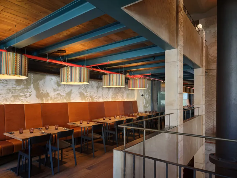
The central organizational move is a void. Two functional levels of steel-framed galleries wrap around an open courtyard that drops through the full height of the former brewing hall. This is not merely a double-height dining room; it is an inward-facing composition where every seat has a sightline to the action below, above, or across the space. The galleries, supported by columns and finished in a bold turquoise blue, read as inserted infrastructure rather than fitted-out decoration. Black steel mesh replaces conventional railings, keeping the visual field open and reinforcing the industrial character of the host building.
Red conduit piping runs exposed along the timber ceiling joists, a deliberate decision to leave the mechanical systems visible rather than bury them behind plasterboard. The effect is honest and functional: the building's guts become part of its atmosphere, lending the kind of rough energy you would expect from a working market hall.
The Staircase as Monument

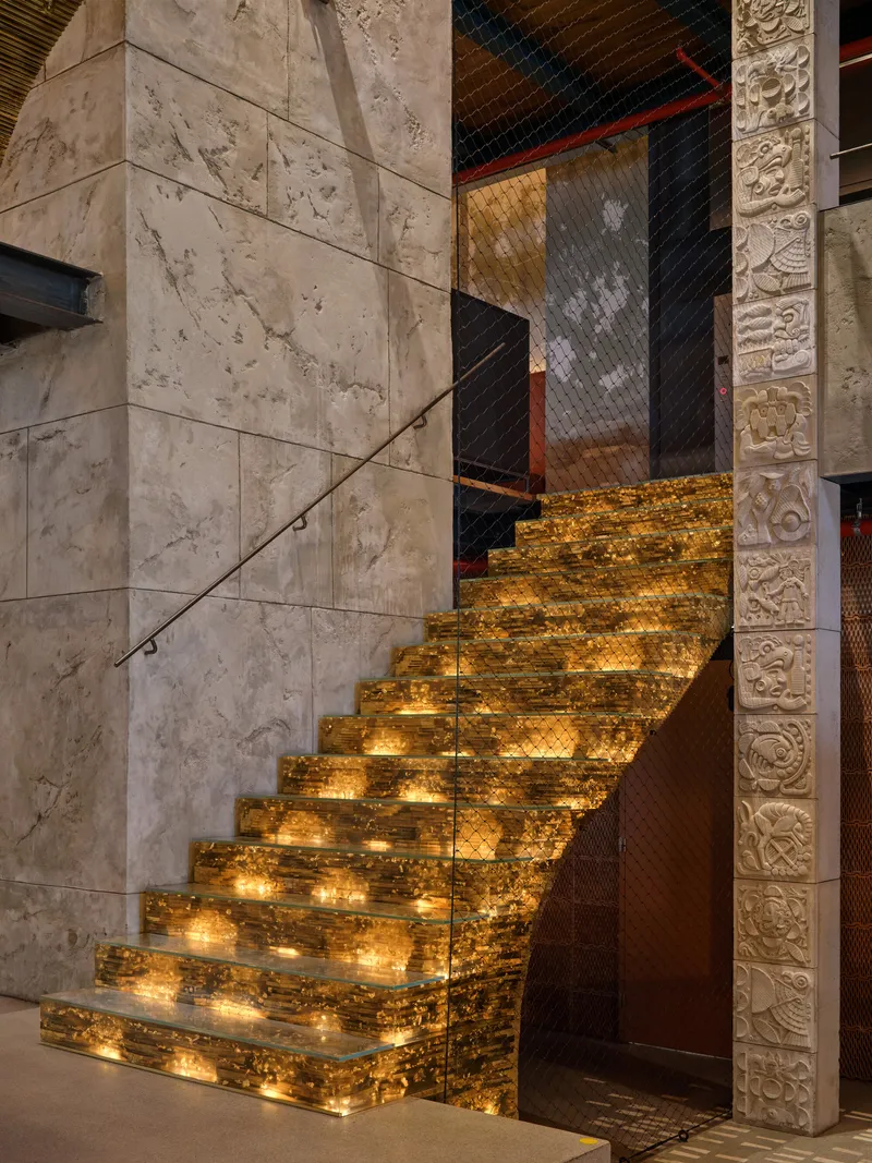
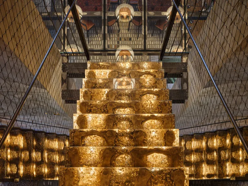
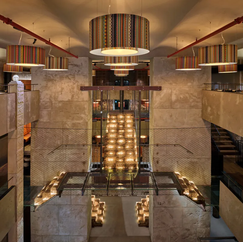
At the center of the courtyard, a multi-armed staircase operates as both circulation spine and visual anchor. Its treads are individually milled wooden boards cast in epoxy resin flecked with gold, then capped with walkable glass. Integrated spot lighting turns each step into a glowing amber panel, stacking upward into what reads, from below, as a luminous stepped pyramid. The upper bridge appears to levitate, its glass floor carried by two slender circular columns.
The Mayan reference is explicit but earned. Rather than apply surface ornament, the architects treated the staircase as a structural event: the geometry, the materiality, and the golden light all reinforce a sense of ascent and ceremony. Flanked by travertine walls and carved stone reliefs, the approach corridor frames the staircase symmetrically, turning arrival into a deliberate architectural sequence rather than a casual walk to your table.
Carved Language on Stone
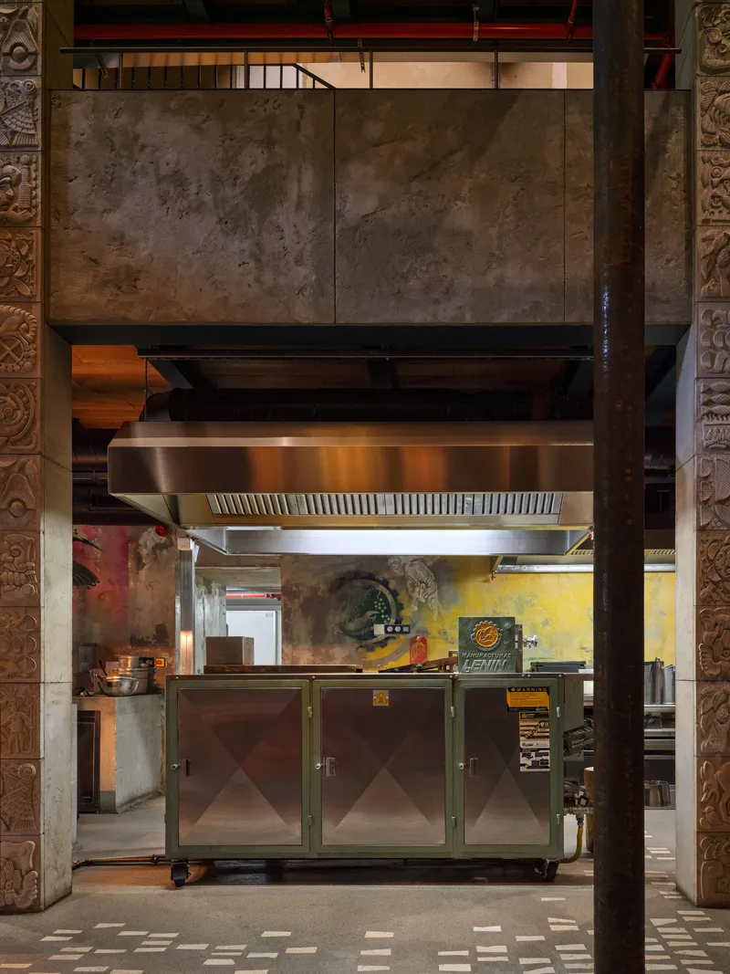
The gallery columns carry sculpted stone reliefs featuring pictographic motifs that look Mayan but are, in fact, entirely original. Graphic designer Petr Štěpán developed a bespoke alphabet in collaboration with the architects and a team of sculptors, producing characters that reference pre-Columbian writing systems without copying them. The distinction matters: this is not a theme park borrowing cultural shorthand. It is a designed visual language, specific to this project, embedded in its load-bearing structure.
The carvings sit on travertine panels alongside the open kitchen stations, so diners encounter them at close range while watching tortillas being pressed or meat pulled from a wood-fired oven. The proximity of craft, both culinary and sculptural, collapses the distance between decoration and function in a way that feels intentional rather than incidental.
Kitchen as Public Theater
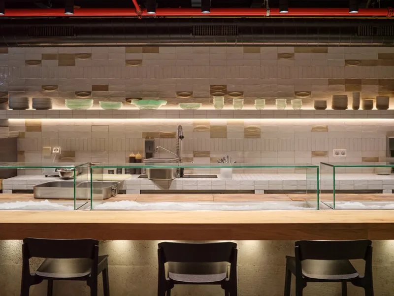

Three separate kitchens serve the three floors, and each is open. Tortilla stations, taco assembly lines, a glassed fish tank for ceviche preparation, and wood-fired ovens by Krby Urban all operate within the dining room itself. Glass sneeze guards and stainless steel hoods handle the practical requirements, but the design philosophy is clear: food preparation is a public spectacle, not a backstage operation. The barrier between diner and cook is dissolved entirely.
Upstairs, a long bar counter with timber base panels sits beneath a glass display wall, housing the cocktail program's ingredients like specimens in a vitrine. The bar echoes the openness of the kitchens below, maintaining continuity of the transparency principle across levels. You always see what is being made and who is making it.
Material Palette and Atmosphere
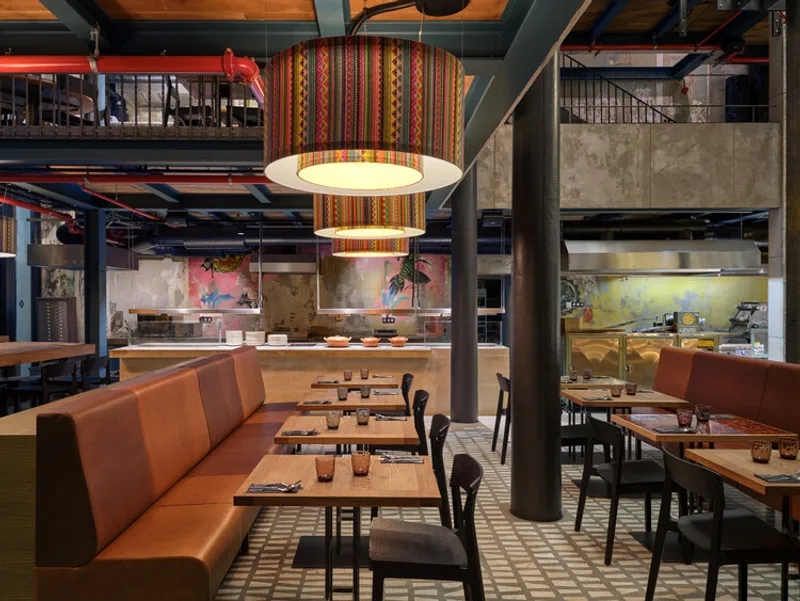

The color strategy is restrained but specific. Turquoise blue coats the steel gallery framework. Red marks the exposed conduit piping and certain structural beams. Orange upholstered banquettes line the dining areas. These are not accent colors chosen from a mood board; they are the saturated, sun-faded tones of Mexican street architecture, applied here to structural and functional elements rather than to wallpaper or soft furnishings.
The reception desk, clad in blue ceramic tile beneath exposed timber and ductwork, sets the tonal contract on arrival: handcrafted surface against industrial skeleton. Oak planks on the gallery floors warm the steel structure underfoot. Striped textile pendants hang from the upper volume, softening acoustics and pulling the eye upward. The material logic throughout is additive: each layer has a reason, and the overall composition gains richness through accumulation rather than uniformity.
Street Presence

From U Průhonu street, the restaurant announces itself with neon pictograms mounted on white plaster: simplified icons of food and drink that glow at dusk like the signage of a border-town taquería. It is a deliberately casual exterior for a 300-seat interior of considerable architectural ambition. The contrast is pointed. You approach what looks like a neighborhood joint and walk into a carved, lit, and structured space that operates at the scale of a civic hall.
Inside, the overhead view from the mezzanine reveals the full organizational logic: travertine walls, textile pendants, the courtyard void, and the gallery structure all legible in a single glance. The building's former life as a brewing hall is still palpable in the ceiling height and structural rhythm, but everything below that ceiling is new, deliberate, and decisively Mexican in its spatial ambitions.
Why This Project Matters
Restaurant design often operates in one of two modes: either a thin veneer of cultural reference draped over a generic shell, or an austere minimalism that treats food as the only permitted expression. Mexická refuses both. 20-20 Architekti committed to a full architectural intervention, inserting new structure, inventing a new graphic language, and treating the kitchen as spatial program rather than service zone. The result is a dining environment where the architecture does not recede politely behind the menu.
The adaptive reuse dimension is equally significant. Converting the Holešovice brewery's brewing hall into a courtyard restaurant required structural invention, not just cosmetic adaptation. The steel gallery system, the floating glass bridge, the staircase as stepped monument: these are serious construction decisions that transform the character of the host building without erasing it. For a hospitality project, that level of structural ambition is rare, and it positions Mexická as one of the more consequential restaurant interiors to emerge from Central Europe in recent years.
Mexická Restaurant by 20-20 Architekti. Located in Prague, Czechia, in the former Holešovice brewery at U Průhonu 800/13, Holešovice. Area: 890 m². Completed in 2025. Design team: Zdeněk Rychtařík, Kristina Sudreová, Václav Červenka, František Vorel, Lukáš Novák. Photography by BoysPlayNice.
About the Studio
Share Your Own Work on uni.xyz
If projects like this are the kind of work you want to make, uni.xyz is a place to publish your own, find collaborators, and enter design competitions.


Popular Articles
Popular articles from the community

Opera by the Sea Estonia: Three Shells Dissolving Architecture into Tallinn's Coastline
A winning opera house proposal replaces monumental form with interconnected shells that blur the boundary between building, park and Baltic Sea.

Manzana Morphosis: Stretching Barcelona's Grid into a Living Landscape for 2050
A radical reworking of the Eixample manzana turns density into a tool for generous public space, vertical ecology, and environmental performance.

The Amber Palace Opera: A Geological Fiction Surfaces on Tallinn's Baltic Waterfront
Pierre Brillard reimagines a Baltic legend as a public landscape, opera house, and waterfront promenade rooted in Tallinn's coastal identity.

Singing Woman: An Opera House That Performs Before the Curtain Rises
Ovidiu Cristian Pavel's conceptual opera house translates Estonia's choral identity into a sculpted waterfront landmark facing the Baltic Sea.

Similar Reads
You might also enjoy these articles

Hodi-Mandai Geram
Project Function: Preservation and revitalization of the Intangible heritage and socio-spatial identity of the Hodi by Housing, Cultural Memory Center, Sacred Grove, landscape, local tourism economy

Olio Towers: A Mid-Rise for Performers That Fuses Housing, Rehearsal, and Stage
Located blocks from Houston's Theater District, this modular tower stacks living units around a central performance atrium.
Oasis: Modular Green Housing Carved into Dhaka's Urban Fabric
A shortlisted Plugin Housing entry reclaims unauthorized settlements in Dhaka with stepped concrete volumes, green roofs, and ventilation-driven design.

Black Hole: A Floating Megastructure for the Post-Physical Era
Emiliano Mazzarotto envisions a spherical, self-scaling arena where e-sports, digital hotels, and holographic stadiums replace traditional public space.

Explore Mexican Design Competitions
Discover active competitions in this discipline

Challenge to reimagine the Iron Throne

Photograph architecture without architects

Illustrate the lost glory of Angkor Wat - Render Challenge

Design challenge to reuse E-waste
Comments (0)
Please login or sign up to add comments
No comments yet. Be the first to comment!