

STUDIO BLUR Channels Ozenfant's Studio in a Wedge-Shaped Art Building for a Quito School Campus
A board-formed concrete art building on a Salesian school campus in Quito orchestrates natural light through sawtooth skylights and raked floors.


School buildings rarely get this kind of attention. On a three-acre Salesian campus in Quito that already held a church, a gymnasium, and a classroom block, STUDIO BLUR inserted a 519 m² art building that does something most educational facilities never attempt: it treats light as a teaching tool. The Art Building for the Cardenal Spellman Educational Unit is a three-storey, wedge-shaped volume in exposed concrete, designed and self-built by the studio's own team, that organizes its program around a diagonal axis and uses sawtooth skylights, ribbon windows, and raked floors to give each discipline its own atmospheric conditions.
The project draws explicitly from Le Corbusier's 1922 studio for the painter Amédée Ozenfant in Paris, a building that proved an artist's workspace could be defined less by its furniture than by the quality of light entering it. STUDIO BLUR takes that premise and recalibrates it for Quito's equatorial latitude, where direct sun is intense and diffusion becomes critical. The result is a building where graphic design students work under controlled openings that maximize daylight while minimizing noise, and painting students occupy a studio bathed in the even, homogeneous glow of three sawtooth skylights. The architecture is not a neutral container; it actively shapes how each art form is practiced.
Concrete as Character

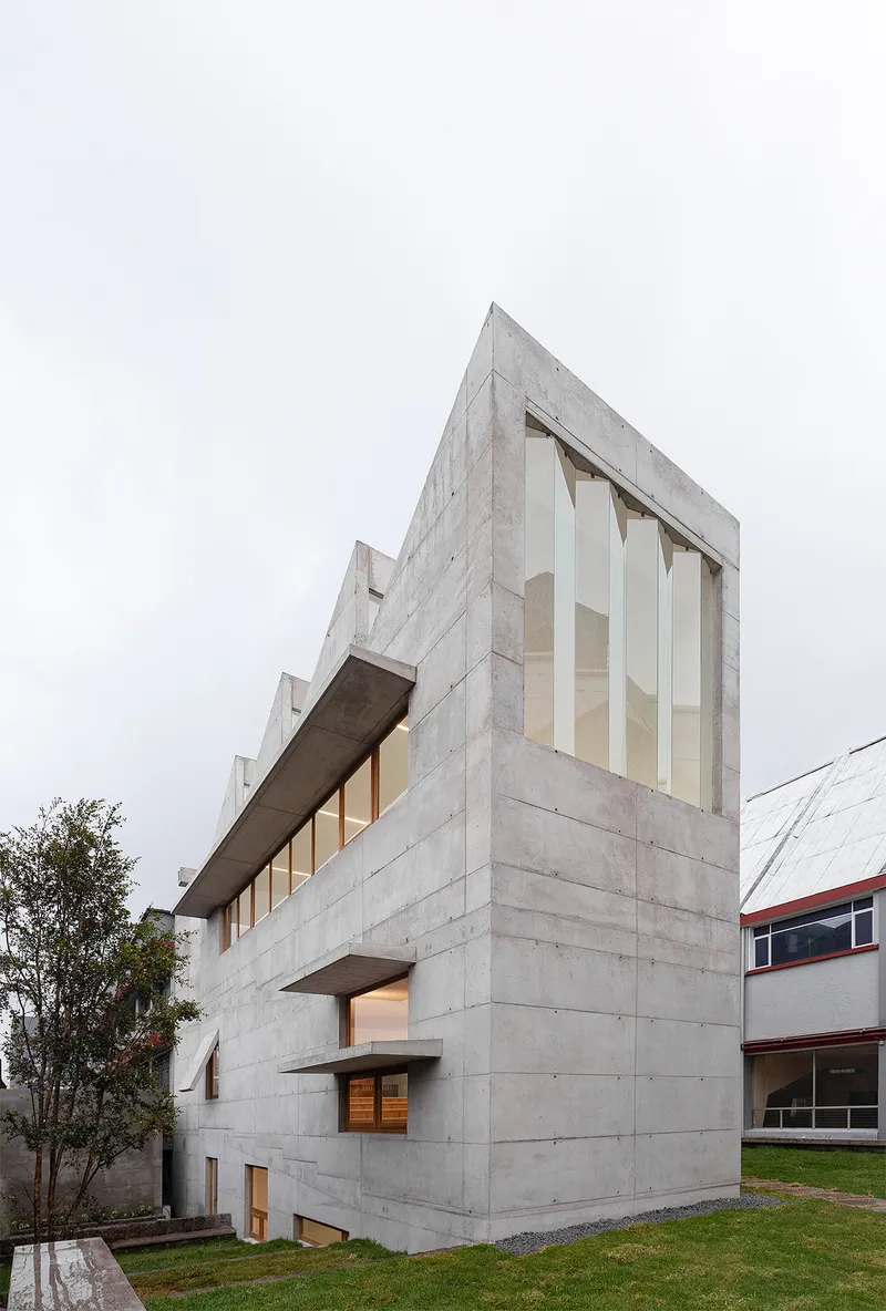

The board-formed concrete facade is the building's most immediate statement. Formwork tie holes, panel joints, and the grain of the timber shuttering are all left visible, giving the surfaces a tactile honesty that reads less as austerity and more as intention. The monolithic concrete structure was chosen partly to minimize long-term maintenance costs for the Sociedad de Madres Salesianas, the Salesian Mothers Society that runs the campus. That is a pragmatic decision wrapped in an aesthetic one: exposed concrete ages well in Quito's temperate highland climate, and its thermal mass helps moderate interior temperatures without mechanical systems.
The stepped roofline is not decoration. It signals the sawtooth profile that defines the painting studio above, and it gives the street elevation a rhythmic, almost industrial identity that distinguishes the art building from its campus neighbors without shouting at them.
The Sawtooth Roof and Light Strategy


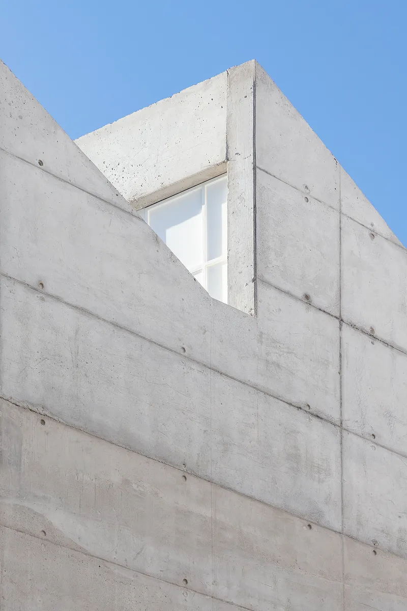
The sawtooth roof is the building's intellectual center. Three north-facing clerestory bays filter diffused, even light into the upper-level painting studio, eliminating the harsh shadows and glare that would make color work unreliable. This is a direct inheritance from the Ozenfant reference, but STUDIO BLUR adapts the geometry for equatorial conditions where the sun passes nearly overhead. The result is a studio where the light remains consistent across the day, a genuinely functional advantage for students learning to see and mix color.
At twilight, the sawtooth profile reverses its performance. Interior light spills outward through the continuous ribbon window below the roofline, turning the building into a lantern on the campus edge. It is a small detail, but it communicates the building's purpose to the street in a way that a flat roof never could.
Ground Floor: The Graphic Design Classroom

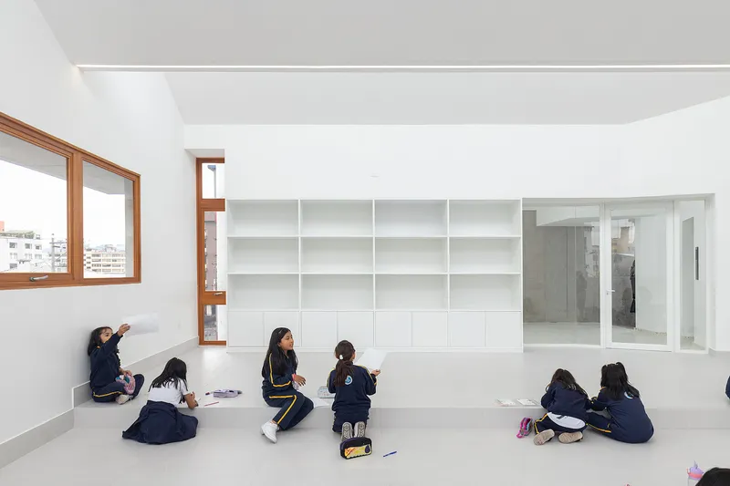

The ground floor graphic design classroom operates under a different logic than the painting studio above. Here the openings are controlled and strategic: timber-framed ribbon windows admit natural light and ventilation while shielding the interior from the noise of the adjacent street and campus circulation. The floor is subtly raked, cascading down toward the teaching and display area so that every student has a sightline to the front. This gentle slope transforms a flat classroom into a loose amphitheater without the formality of fixed seating.
Natural wood floors warm the space and differentiate it acoustically and visually from the concrete envelope. Built-in white shelving and timber wainscoting along the walls provide display and storage without consuming floor area, a small but disciplined move in a room that needs to accommodate both digital work and physical critique sessions.
Thresholds and Circulation


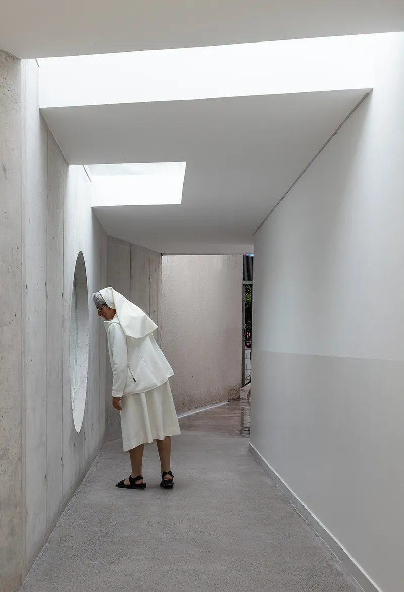
STUDIO BLUR treats circulation not as leftover space but as an extension of the building's light strategy. The entry sequence passes beneath a cantilevered volume, through a covered threshold supported by a cylindrical concrete column, and into an interior world where terrazzo stairs, white slat balustrades, and copper handrails create a refined material palette that contrasts with the raw concrete outside. Strategic openings along corridors and stair landings animate these in-between spaces, pulling light into zones that would otherwise be dark service corridors.
The curved stair volume is both a structural event and a wayfinding device. Its terrazzo treads and angular skylights overhead turn the act of moving between floors into a sensory shift, preparing students for the different atmosphere of each level. It is a small building, so these transitions matter more than they would in a sprawling campus hall.
The Basement Garden and Campus Reconnection
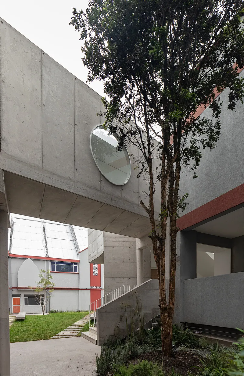

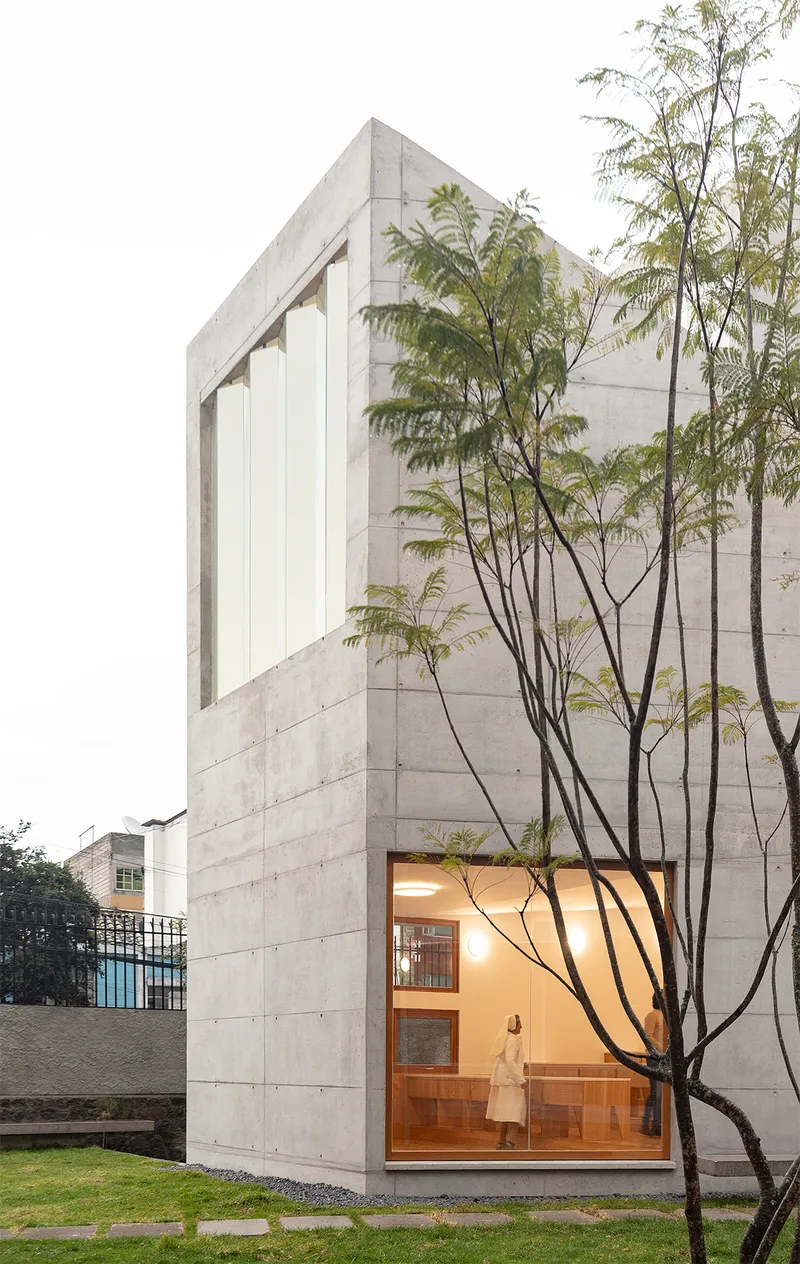
The wedge-shaped plan was not an arbitrary formal gesture. It freed adjacent ground for a stepped garden that serves double duty: it provides outdoor space that reconnects fragmented parts of the campus, and it delivers daylight and views to the basement service spaces that look up and out through it. A concrete bridge overhead, a circular mirror on a courtyard wall, and a young tree growing between the old and new volumes compose a threshold zone that is neither fully interior nor fully exterior.
This landscape strategy is arguably the project's most generous move. Rather than maximizing the building's footprint, STUDIO BLUR sacrificed floor area to reinvigorate the campus as a connected whole. The garden is not residual; it is designed.
Interior Atmosphere and Detail


Inside, the building oscillates between raw concrete and refined white surfaces. A double-height space with a curved white balustrade opens views between levels and allows borrowed light to reach deeper into the plan. The upper terrace, with its clerestory windows casting sharp shadows across polished concrete floors, functions as an informal critique and gathering space, a room defined entirely by the movement of the sun.
One classroom frames a church spire through a large window, anchoring the art building in the campus's institutional history without resorting to pastiche. Students seated on the grey tile floor of the painting studio look outward to a reminder that this is a Salesian school, not a gallery. The architecture insists on context.
Timber Rooms and Reading Alcoves
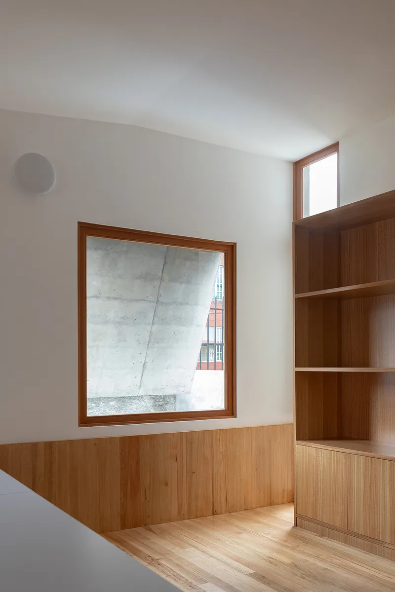


Tucked into the plan are smaller timber-paneled rooms that serve as library nooks and reading alcoves. Built-in shelving, wainscoting, and bench seating create intimate spaces scaled for individual study or small-group work. Square windows punched through the concrete exterior wall frame the adjacent building surfaces, composing deliberate views that remind occupants of the material world outside. These rooms provide a necessary counterpoint to the open, light-flooded classrooms: quiet, warm, enclosed.
Plans and Drawings
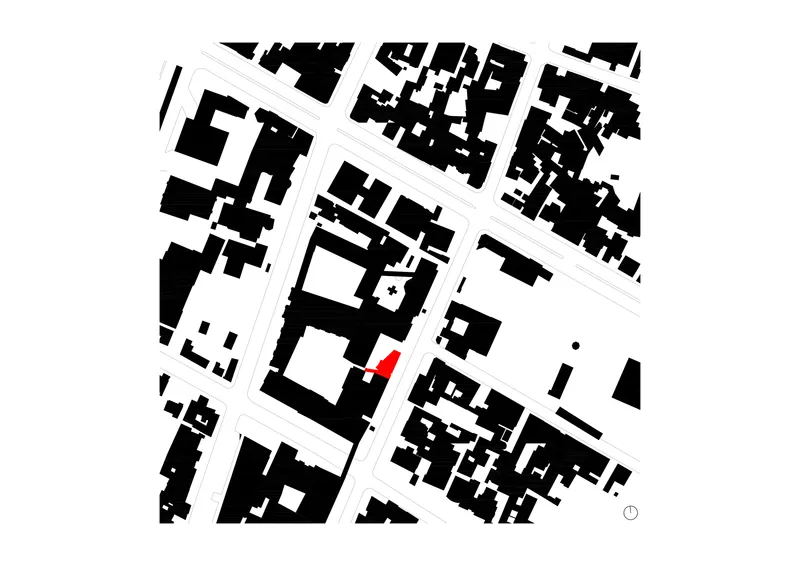


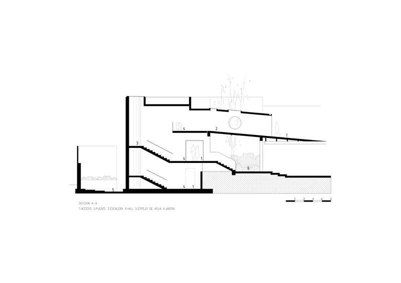

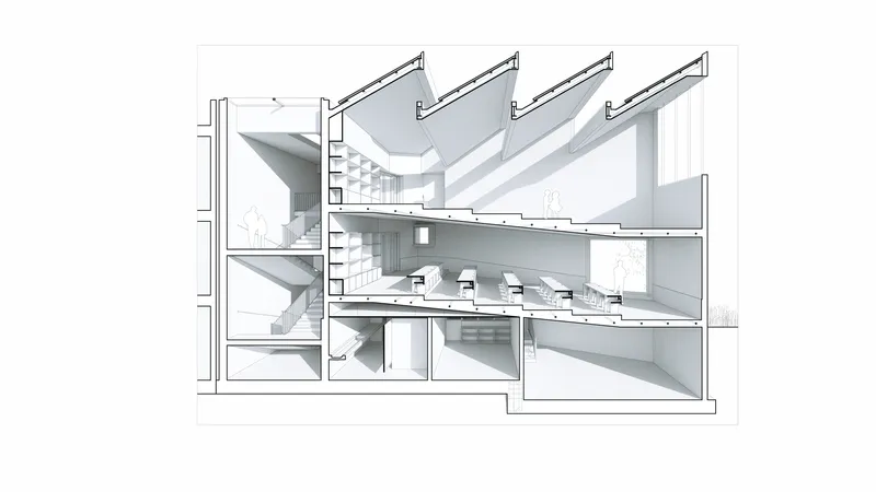

The site plan reveals how the wedge-shaped footprint negotiates its position within the existing campus fabric, carving out the adjacent garden while maintaining street frontage. The floor plans show the diagonal axis organizing circulation and the curved stair volume anchoring transitions between levels. Sections through the building are where the design becomes most legible: the raked classroom floors, the sawtooth roof profile, the relationship between the basement garden and the upper studios. The exploded axonometric makes the stacking logic clear, illustrating how three distinct atmospheres occupy a compact vertical section without competing.
Why This Project Matters
The Art Building for the Cardenal Spellman Educational Unit is a case study in how a small, specific brief can produce architecture of real ambition. STUDIO BLUR did not design a generic classroom block with art supplies inside; they designed two rooms with fundamentally different light conditions, connected by circulation that itself performs as a spatial experience. The explicit reference to Le Corbusier's Ozenfant studio is not homage for its own sake. It is an argument that the principles of that 1922 project, light as a medium, structure as spatial strategy, remain operational a century later and half a world away.
Equally significant is the decision to self-build. STUDIO BLUR's team constructed the building themselves, which collapses the distance between design intent and execution in a way that most architectural practices never experience. The board-formed concrete is not a specification handed to a contractor; it is the studio's own work, and it shows in the care of the formwork detailing and the precision of the sawtooth roofline. For a school building in Quito, that level of craft commitment is remarkable. The project demonstrates that educational architecture in Latin America can be both economically responsible and architecturally serious, a combination that should be more common than it is.
Art Building, Cardenal Spellman Educational Unit by STUDIO BLUR. Quito, Ecuador. 519 m². Completed 2024. Photography by JAG Studio.
About the Studio
Share Your Own Work on uni.xyz
If projects like this are the kind of work you want to make, uni.xyz is a place to publish your own, find collaborators, and enter design competitions.


Popular Articles
Popular articles from the community


The Amber Palace Opera: A Geological Fiction Surfaces on Tallinn's Baltic Waterfront
Pierre Brillard reimagines a Baltic legend as a public landscape, opera house, and waterfront promenade rooted in Tallinn's coastal identity.
Cloaked Colonization: A Mobile Underwater Habitat That Moves Like a Fish
Micah Abaya's shortlisted EHC Pacific entry reimagines ocean settlement as a dispersed network of self-sustaining architectural organisms.

Opera on the Sea: Driftwood Logic Shapes a Timber Opera House on Estonia's Coast
Trevor Orgill's opera house translates the entangled drift of floating timber into a civic building where wood, water, and music converge.
Tsunami Convergenics: Turning Catastrophic Ocean Forces into Underwater Housing Infrastructure
A speculative underwater settlement off the coast of Onagawa, Japan, treats tsunamis and typhoons as energy sources rather than threats.

Similar Reads
You might also enjoy these articles

Pixel Gardens: One Repeated Module Stacked Into a Terraced Social Housing Tower for Famagusta
Salem Bader's shortlisted housing tower builds a vertical neighbourhood from one repeated module, offsetting units to carve terraces, light and air.

Bao Huynh Watercolor Atelier: A Serene Art Retreat in Hội An
Bao Huynh Watercolor Atelier in Hội An blends multifunctional art spaces, sustainable design, local materials, and family-friendly living in a serene environment.

Atelier Macri Concept Store Interior Design by CASE-REAL
Atelier Macri store features a "ko" counter, walnut wood details, cork displays, blending retail, gallery, and seamless customer experiences.

Manuel Vargas Izquierdo Stadium and High-Performance Sports Center: Architectural Excellence in Jalpa de Méndez
The Manuel Vargas Izquierdo Stadium blends sustainable design, inclusive sports facilities, and cultural-inspired architecture, revitalizing Jalpa de Méndez’s public spaces.

Explore Algorithmic Art Competitions
Discover active competitions in this discipline

Challenge to reimagine the Iron Throne

Photograph architecture without architects

Illustrate the lost glory of Angkor Wat - Render Challenge

Design challenge to reuse E-waste
Comments (0)
Please login or sign up to add comments
No comments yet. Be the first to comment!