
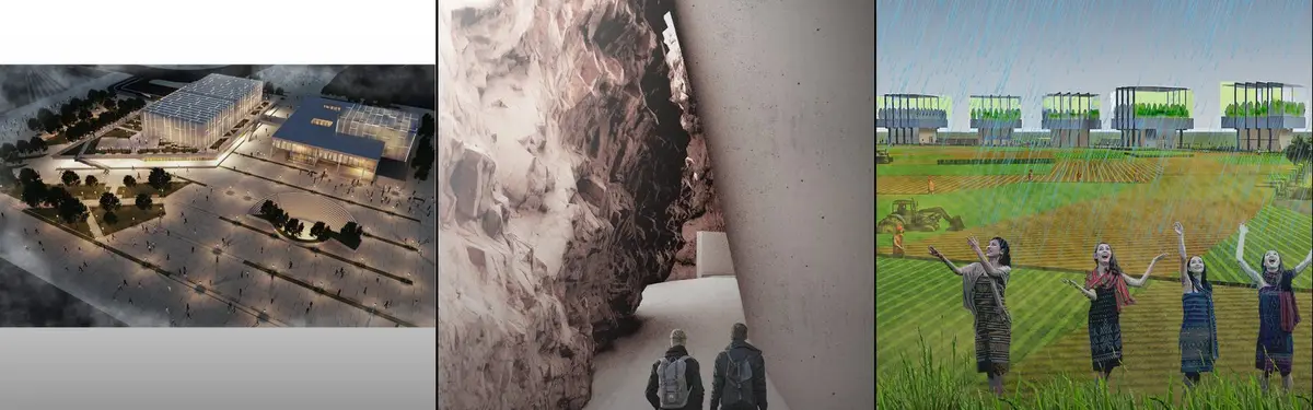


Figure Ground
The relationship between positive and negative space in design, and how figures emerge from or interact with their backgrounds.
A figure-ground drawing is a plan in which every building is filled solid black and everything that is not a building (streets, squares, courtyards, gardens) is left white. By reducing a city or a site to two values, it shows how built mass and open space shape each other, which is why architects and urban designers use it to read urban fabric, test new buildings against their context and argue about what kind of public space a plan will produce.
What is a figure-ground drawing?
The term comes from perception. In Gestalt psychology, figure-ground organisation is how the eye separates a shape (the figure) from what lies behind it (the ground), as when black words read as figures against a white page. Architects borrowed both the idea and the graphic convention. A figure-ground diagram is a two-dimensional map that records only the relationship between built and unbuilt space, and the black building masses are often called poché, the word architects use for the solid, shaded parts of a plan.
It sits between several neighbouring drawings. A site plan carries the same footprint but adds levels, planting, entrances and labels. A cadastral or block pattern map records property boundaries rather than walls. A Nolli plan, named after the eighteenth-century map of Rome discussed below, goes one step further and leaves publicly accessible interiors white as well. The figure-ground is deliberately the most reductive of these: no height, no use, no ownership, only solid and void. That reduction lets a student compare a medieval town, a Victorian grid and a modernist estate at the same scale and see at once which one makes streets and which one scatters objects.
On uni.xyz the drawing turns up wherever members work at the scale of the block or the district, so it overlaps heavily with urban design, urban morphology and the analysis that opens most planned city proposals. It is also one of the first diagrams taught in site analysis, because it is quick to make and hard to argue with.
A short history of the figure-ground drawing
The convention is older than the name. Bufalini's map of Rome of 1551 already shaded built space dark, and Giambattista Nolli (1701 to 1756) followed it when he surveyed the city from 1736 for the Nuova Pianta di Roma, engraved in 1748. Commissioned by Pope Benedict XIV to help fix the boundaries of the city's districts, the map was printed from twelve copper plates that together measure about 176 by 208 centimetres. Nolli oriented it to magnetic north and made it far more accurate than anything before it; Rome used it as a planning base map until the 1970s.

What made Nolli's plan a lesson for designers was one decision: he drew the interiors of public buildings, such as the Pantheon and the colonnades of St Peter's Square, as open civic space continuous with the streets. The map therefore reads Rome as a single network of public rooms, some roofed and some not. It also captured a city on the edge of change.
"Nolli’s map preserves a crystalline vision of a city that began to change again, just as radically, after Rome became capital in 1871."
Jessica Maier, Nolli's Rome / Rome after Nolli, Interactive Nolli Map Website
In the twentieth century the modern movement inverted Nolli's city. Housing set as freestanding slabs and towers in open landscape produced plans in which the white ground dominates and the black figures float. The best-known reaction came from Colin Rowe and Fred Koetter used figure-ground plans as the core evidence of Collage City (MIT Press, 1978). In its chapter "Crisis of the object: predicament of texture" they argued that the city of urban renewal, a jumble of disparate objects in residual space, was as problematic as the dense traditional city it set out to replace, and called for a balance in which building and space hold a dialogue. Rowe and Koetter are usually named as the drawing's earliest advocates, and Roger Trancik later made figure-ground theory one of three approaches to urban design in Finding Lost Space (1986), next to linkage theory and place theory.
Key principles of the figure-ground drawing
Figure, ground and the Gestalt reading
The Danish psychologist Edgar Rubin described the faces and vase drawing that is still the standard example: the same border can belong to either side, and the eye flips between two readings. In a city plan that flip is the useful moment. When the streets and squares start to look like shapes in their own right, as figures carved out of the mass, the plan is telling you that the open space has been designed rather than left over.

Solid and void in balance
Figure-ground theory treats urban design as the manipulation of the ratio between black and white. When building mass outweighs open space, continuous street walls give the voids a clear shape and support walking and mixed use. When open space outweighs mass, buildings drift apart and the leftover ground loses definition, often ending up as surface parking. Reading a plan for this balance is the first thing the drawing is for, and it explains why the dense pochés of older cities fragmented as roads and car parks took over the ground in the twentieth century.
Object in a field
Not every project wants to make street walls. A pavilion in a forest or a building in a park is a deliberate figure on an open field, and the drawing shows how far apart the figures sit and what kind of ground runs between them. INTO THE WOODS visitor center and micro pavilions by Vedrana Djonic, an entry to the WIC competition, presents its scheme in exactly this register: small black volumes scattered across a white woodland ground, tied together only by dotted paths.

Positive and negative space at small scale
Two thesis boards use the drawing much as Nolli did. Continuity Through Change by Bhumika M, an entry in UnIATA '26, maps the historic core of Mysuru in black and white to study how cultural memory and everyday urban life survive change, and Urban Renewal of Historic Core of Vrindavan by Neha Goyal Tater, an entry in UnIATA '20, uses a built-form plan to recover an urban morphology lost to rapid urbanisation.

How to make and read one
Start from a reliable base (a survey, a cadastral map or traced satellite imagery) and keep one scale for every plan you intend to compare. Fill every roofed building solid black, including outbuildings, and leave everything else white; decide in advance how to treat arcades, courtyards and walled gardens, and keep the rule consistent. Crop generously so the site sits inside its fabric rather than at the edge of the sheet. Then read it: look for the grain (fine or coarse), the continuity of street walls, which voids have a clear shape, and where the pattern breaks. Draw the reverse version, with buildings white and spaces black, a method associated with the planner Frederick Gibberd, and the shapes of streets and squares jump forward.
Figure-ground on uni.xyz
The topic gathers proposals where the relationship between a new intervention and its ground is the main design question.
The most liked project in this topic is Meal Minder by harshitha, which won a People's Choice Award in the Urban Meal Mine competition. Its premise is that most of a user's nutritional needs are grown by the urban population and sold on different floor levels, with festivals tied to agriculture activating the space.
Landfill to Landform_A Story of Transformation by Sanskriti Jindal, Manali Jamgaonkar and Linda Elsa Baby also took a People's Choice Award, in the UnIATA '20 competition. It addresses the Ghazipur landfill in New Delhi, whose height has been compared to the Qutub Minar and the Taj Mahal, and its opening board sets the black mass of the landfill against a line map of the surrounding street network.

Art Center in Aleppo by Zsolt Vasáros DLA and wael abaji, entered in the Memory competition, is planned as a gateway to Aleppo Castle with a concert hall, a music institute, underground parking, a green terrace and a plaza. Its concept diagrams name the plaza, the gate and the terrace as the three moves, so the open space between the two main volumes is designed as carefully as the volumes themselves.

Loop Within by pengcheng sun and Shunfan Zheng, a winning entry in the UnIATA '20 competition, describes itself as a cultural loop within three towers: a climate adaptive super block at the Miami River front. Canvas of people by Chalidapha Rueangyot, a winning entry in the Hall of Justice competition, sets out to change the image of the court into a friendlier format that shows the transparency of the judicial system.
Reclaiming Modernity by Studio PKA, an Editor's Choice in the Reclaiming Modernity competition, places a learning centre inside a residential colony in Colombo as a refuge for designers, artists, students, performers and the general public, a public figure inserted into a private residential ground.
Two UNI Editorial journals look at built heritage and parkland through the same lens. YZA Floats a Reflective Canopy Over Ancient Baekje Ruins in Seoul covers Floating Ground, a 200-square-meter canopy by the office led by Hyoung-gul Kook that hovers over excavated remains of the Baekje kingdom, protecting them without enclosing them. The journal frames the problem in figure-ground terms.
"how do you mark the presence of something that has largely vanished?"
UNI Editorial, YZA Floats a Reflective Canopy Over Ancient Baekje Ruins in Seoul

Challenges and future directions
The drawing's strength is also its blind spot. It has no third dimension, so a field of two-storey houses and a field of towers with the same footprints look identical, and a building that steps or bridges reads as a flat blot. It has no use, so a shop, a warehouse and a church weigh the same. And it says nothing about who may enter a white space: a public square, a gated car park and a private garden are all simply ground. That last gap is exactly what Nolli addressed by whitening public interiors, and it is why many studios now pair the figure-ground with a Nolli-style access plan and a section.

Art Garden, an entry to the Art Garden competition, shows why the extra views matter: an outdoor art school of tapering volumes, ramps and a sunken court reads in plan as little more than one rectangle. The second blind spot, ownership, is the subject of the UNI Editorial journal SSdH Slips a Kit-of-Parts Pavilion into Melbourne's Studley Park Eucalyptus Grove, which praises a 115-square-metre pavilion in Kew for building ambiguity rather than a wall.
"a covered ground plane that belongs equally to a café's paying customers and to anyone walking through the eucalyptus grove of Studley Park."
UNI Editorial, SSdH Slips a Kit-of-Parts Pavilion into Melbourne's Studley Park Eucalyptus Grove

Digital models now make it easy to slice a city at any height, so each level can get its own plan. The useful direction is to treat the black-and-white plan as the first layer of an analysis, then add height, use and access.
Figure-ground for students and designers
The drawing is a strong backbone for a thesis. Map a historic core and an adjacent modern extension at the same scale and test Rowe and Koetter's argument on your own city. Trace how a neighbourhood's poché changed across old survey maps, or draw a Nolli plan of a campus to find which interiors actually behave as public space. For competition boards, a figure-ground of the site at the start of the sheet tells a jury in one glance what context you are answering. Browse open briefs on uni.xyz competitions, and see related work under urban fabric and public space.
Frequently asked questions
What does a figure-ground map show?
It shows built and unbuilt space only: buildings in black, everything else in white. It reveals the grain of a place, whether streets and squares are clearly shaped, and how a new building would sit in its fabric. It deliberately leaves out height, use and ownership.
What is the difference between a figure-ground and a Nolli map?
A figure-ground fills every building solid. A Nolli map, after Giambattista Nolli's 1748 plan of Rome, also leaves publicly accessible interiors such as churches and colonnades white, so it shows the public realm rather than just open air.
Who introduced the figure-ground diagram to urban design?
The graphic convention goes back to maps such as Bufalini's 1551 and Nolli's 1748 plans of Rome. As a design argument it is most closely tied to Colin Rowe and Fred Koetter's Collage City (1978), and later to Roger Trancik's Finding Lost Space (1986).
What is a reverse figure-ground?
It swaps the colours: buildings become white and open spaces black. Frederick Gibberd promoted this version because it makes streets and squares read as shapes in their own right.
How do I make a figure-ground drawing for a site analysis?
Trace building footprints from a reliable base at a fixed scale, fill them black, leave the rest white and crop wide enough to include the surrounding blocks. Set clear rules for arcades and courtyards, then add a reverse version and a section to cover what the plan cannot show.
References and further reading
- Figure-ground (perception), Wikipedia
- Figure-ground diagram, Wikipedia
- Giambattista Nolli, Wikipedia
- Nolli's Rome / Rome after Nolli, Jessica Maier, Interactive Nolli Map Website, Stanford University
- Collage City, Colin Rowe and Fred Koetter (library record), Canadian Centre for Architecture


Popular projects
View all 56 projects


Latest journals
View all 2 journals
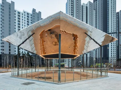
YZA Floats a Reflective Canopy Over Ancient Baekje Ruins in Seoul
A 200-square-meter heritage pavilion in Seoul suspends a mirrored ceiling above excavated remnants of one of Korea's oldest kingdoms.
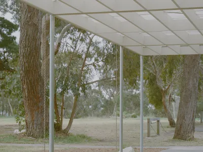
SSdH Slips a Kit-of-Parts Pavilion into Melbourne's Studley Park Eucalyptus Grove
A 115-square-metre canopy in Kew blurs the line between public parkland and private café, built for fast assembly and slow enjoyment.


