

Illustration
Visual storytelling and artistic expression through drawing, painting, and digital media in design contexts.
Illustration is a picture made to explain, interpret or decorate a text, idea or process, from book plates and posters to animation and games. Architectural illustration applies this to buildings and places: drawings and images that communicate what a design is and how it will feel, made by hand with pencil, ink and watercolour or digitally with painting, collage and flat-colour techniques.
What is architectural illustration?
A widely used definition of illustration calls it a decoration, interpretation or visual explanation of a text, concept or process. In architecture, the "text" is the design. An illustration translates plans and sections, which only trained readers can follow, into an image that a client, a jury or a neighbour can understand at a glance.
It helps to separate three kinds of architectural image:
- Technical drawing is a set of instructions. Plans, sections and details must be measurable and unambiguous, and they follow conventions so a builder can work from them.
- Photoreal rendering simulates a photograph of a building that does not yet exist, with accurate light and materials. It belongs to 3D visualization.
- Illustration sits between the two. It is allowed to simplify, stylise and editorialise: to drop the background, flatten the colours, add figures in motion, or cut the building open so you can see inside. Its aim is clarity and character, not measurement or realism.
Illustration also differs from concept art. Concept art explores options before a design is fixed; illustration usually communicates a design that has been decided. In practice the two overlap, and many competition boards contain both. Reference guides to architectural illustration list watercolour images, sketches and collage alongside photoreal renders, and note that some illustrators still work entirely by hand while others combine hand drawing, painting and computer-generated colour or linework.
A short history of architectural illustration
Renaissance perspective. Linear perspective gave architects a way to show a building as the eye would see it. Filippo Brunelleschi is credited with the first correct formulation of it in Florence in the early fifteenth century, and Leon Battista Alberti set out the method in writing in his treatise De pictura of 1435, as the University of St Andrews history of mathematics archive explains. Perspective is still the backbone of most architectural images.
Beaux-Arts rendering. In nineteenth-century Paris, the training associated with the École des Beaux-Arts made drawing central to architecture. According to the overview of Beaux-Arts architecture, it emphasised quick conceptual sketches and highly finished perspective presentation drawings, and students who won a place at the French Academy in Rome were required to send presentation drawings, the envois de Rome, at intervals. Washed elevations and shaded sections from this tradition still shape what a "beautiful" architectural drawing looks like.
Hugh Ferriss and the drawn city. The American illustrator Hugh Ferriss spent, by his own account, some fifteen years working "as Illustrator or Consulting Designer" on buildings for contemporary architectural firms. In 1922 he drew a series of studies showing the maximum mass that New York's 1916 Zoning Law allowed on a city block, later published in his book The Metropolis of Tomorrow (1929). The soft, dramatically lit masses made a legal rule visible.

"It must be understood that the mass thus delineated is not an architect's design; it is simply a form which results from legal specifications."
Axonometric drawing. Parallel projection, where lines stay parallel instead of converging, lets a viewer read true dimensions and see several sides at once. The French engineer Auguste Choisy used it in his Histoire de l'architecture (1899), including cutaway views seen from below. According to the history of axonometric projection, wide acceptance came in the 1920s, when Bauhaus and De Stijl architects embraced it, and Theo van Doesburg's axonometric designs caused a sensation in Paris in 1923.

Collage and flat colour. In recent decades, digital tools have made two styles common in architecture schools: collage, which assembles photographs, textures and cut-out figures into a scene, and flat-colour illustration, which uses simple shapes, limited palettes and stylised people. Both reject photorealism on purpose, so the viewer reads the image as an idea rather than a promise.
Styles and techniques of architectural illustration
Most illustrators combine several of these techniques. Choose by what the image needs to explain.
Line drawing
Pencil or ink line is the most direct form of illustration and the base of the others. Line weight does the work of colour: heavy lines for cut elements, light lines for things beyond. A clean line elevation or section, with one tree or figure for scale, can carry a whole concept. See our drawing page for the fundamentals.

Watercolour
Watercolour washes add light, shadow and atmosphere over a line drawing. They have long been part of architectural presentation drawing and remain popular for site sketches and travel studies, because a few layers can describe sky, stone and vegetation quickly. Digital brushes now imitate the same transparent effect.
Axonometric and exploded views
An axonometric shows plan and height together without perspective distortion, which makes it ideal for explaining how spaces stack and connect. An exploded axonometric pulls a building apart into layers, such as structure, floors, envelope and roof, so each system can be read separately.

Collage
Collage combines photographs, drawn elements, textures and people into one composed scene. It is fast, expressive and good at showing use and atmosphere, but it needs discipline: consistent light direction, believable scale and a limited palette. Our collage page goes further into the technique.

Digital painting and flat colour
Digital painting borrows from concept art: textured brushes, painted skies, strong light. Flat-colour illustration goes the other way, removing texture and shading in favour of clear shapes and a tight palette, often with stylised figures. It reads well on screens and at small sizes, and it overlaps with graphic design.
Diagrams
Diagrams are illustrations with one job: to explain a single relationship, such as circulation, sun path, airflow or phasing. Arrows, colour coding and simplified massing do more than detail. A good board usually pairs one atmospheric image with a few precise diagrams.
Illustration on uni.xyz
Members tag illustration on competition entries and journals where the drawing style is part of the design story. These examples show the main approaches.
MELANGE by Manasi Talkar is the most liked project in this topic and an Editor's Choice in the Brewed 2020 competition. It explores the interaction of modern forms and traditional silhouettes, with a play of volume and exposed structure. The cover is a warm flat-colour cutaway full of people at tables, closer to an editorial illustration than to a render.

Eco Chapel Ethiopia by Andres Felipe Pinzon Holguin was entered in the Eco-Chapel competition, where it received the People's Choice Award. Its statement is four words, "Water as a Source of Life", and its board combines a handwritten-style title, small sketches and a green site plan, using illustration to keep a dense board readable.
From the same competition, Beyond the tree by Clement Chivot and Hugo Despeisses was an Editor's Choice. The team describes the project as an architectural interpretation of the tree:
"The tree becomes a project vector, a tool for designing space, sculpting architecture, orienting the believer and sequencing the path of a new chapel."
Clement Chivot and Hugo Despeisses, Beyond the tree, Eco-Chapel competition entry
TETRISCAPE by Riya Venki, an Editor's Choice in the Earth Made 2020 competition, gathers its programme around a single large courtyard instead of separate blocks. The cover is a sunset-pink section crowded with figures in patterned clothing, a flat-colour style that makes community the subject.

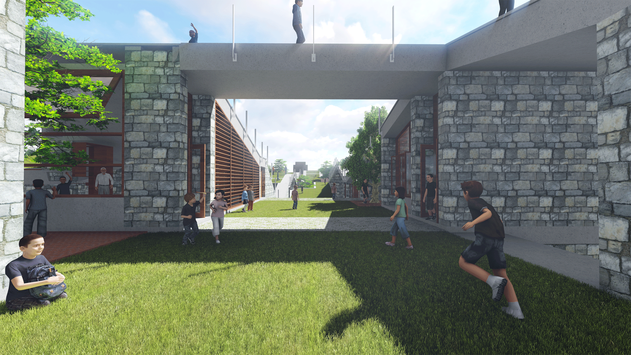
Mineral Cave, by Nicholas Lim, Teresa Liew and Koh Yanhao for the Re-imagining Play 2020 competition, uses the changing sun angle in Samos to create different coloured spaces through the day, for children who have been deprived of a safe and colourful childhood. Its flat, pastel illustration of children climbing simple shapes suits its young audience.
Journals show illustration as a practice in its own right. In Into the red lines, Marianne Torres presents an illustration that goes inside the red lines of Ricardo Bofill's Muralla Roja, rendered as a study of pink planes and stairs. Lana Trajkovic's Tea time! describes a pavilion of lightweight wooden frames and draped fabrics, with micro-environments for tea drinking that represent cultures significant to the history of tea, and presents it through a dense, colourful collage.

Challenges and future directions
Style over substance. Flat-colour figures and pastel skies became so common in student work that they risk becoming a template. An illustration style should be chosen for what it explains, not because it is fashionable. Ask whether the image would still make sense with the colour removed.
AI image tools. Generative tools can imitate any style in seconds, including watercolour, collage and flat colour. They are useful for references, but they cannot decide what a drawing should explain, and they can blur who made an image. Keep your own sketches and layers as a record of authorship, and read each competition brief for its rules on AI.
Hand skills. As modelling software produces views automatically, the ability to draw quickly by hand matters more, not less, because it is how designers think in front of a client or a jury. The Beaux-Arts habit of quick conceptual sketches still pays off.
Accessibility. Illustrations can communicate across languages and to non-specialists, which makes them valuable for public consultation. Clear labels, readable contrast and honest scale help them do that job.
Architectural illustration for students and designers
Illustration is one of the strongest portfolio skills an architecture student can build, because it shows both design thinking and visual judgment. Some practical advice:
- Develop one consistent style across a project, then vary it between projects to show range.
- Pair every atmospheric image with a technical one, such as an axonometric or section, so reviewers see you can do both.
- Include process: sketches, overlays and discarded versions.
- Draw people doing specific things. They tell the story of use better than any caption.

Thesis angles include drawing as research (illustrating a neighbourhood's daily life before designing for it), axonometric storytelling, and illustration for public participation. A related page is sketching. To test your style under a deadline, enter one of the open uni.xyz competitions.
Frequently asked questions
What is architectural illustration?
Architectural illustration is the art of drawing or painting buildings and places to communicate a design. It ranges from hand sketches and watercolours to axonometrics, collages and digital paintings, and it prioritises clarity and character over measurement or photorealism.
What is the difference between an architectural illustration and a render?
A render simulates a photograph with realistic light and materials. An illustration is free to simplify and stylise, for example with flat colour, line work or collage, to explain an idea more clearly.
What are the main styles of architectural illustration?
The main styles are line drawing, watercolour, axonometric and exploded views, collage, digital painting and flat-colour illustration, and diagrams. Most competition boards combine two or three of them.
What software is used for architectural illustration?
Illustrators commonly export line work from CAD or 3D modelling software and finish it in raster or vector editors such as Photoshop or Illustrator. Many still begin by hand, and tablets let them sketch directly over digital bases.
Who was Hugh Ferriss?
Hugh Ferriss was an American architectural illustrator whose atmospheric drawings of skyscrapers and imagined cities were collected in his book The Metropolis of Tomorrow (1929). His 1922 studies of New York's zoning law are among the best-known architectural illustrations of the period.
References and further reading
- Illustration, Wikipedia
- Architectural illustration, Wikipedia
- Mathematics and art: perspective, MacTutor History of Mathematics, University of St Andrews
- Beaux-Arts architecture, Wikipedia
- The Metropolis of Tomorrow (1929), Hugh Ferriss, Internet Archive
- Axonometric projection, Wikipedia


Popular projects
View all 113 projects


Latest journals
View all 6 journals

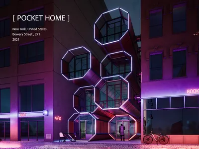
Pocket Home
“In search of lost spaces” Architectural activism against non-places

Into the red lines
An illustration going inside of the red lines of Muralla Roja


The Neglected Feelings are the Roots of Mental Illnesses
Your heart is your mind, listen to it.