
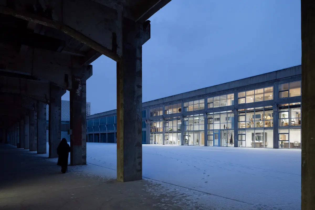
milanesi | paiusco Converts a Beijing Factory into a Multi-Identity Office for a Content Creator
Inside the 798 Art District, a former industrial shell becomes a workspace that accommodates work, filming, and daily life under one roof.


The premise sounds like a riddle: design an office for someone who is simultaneously an entrepreneur, a content creator, a brand founder, and a parent. The answer, delivered by milanesi | paiusco in Beijing's 798 Art District, is not to design separate rooms for each role but to strip an industrial building back to its bones and let the identities coexist in a single open volume. At 854 square meters, the Sundate Office occupies a repurposed factory within the Hengtong International Innovation Park, a cluster of former manufacturing buildings now hosting tech companies, design studios, and the Minsheng Art Museum.
What makes the project worth studying is its discipline of restraint. Rather than gutting the building and filling it with new finishes, the architects preserved the original structural framework, retained the mechanical infrastructure, and concentrated their energy on spatial reorganization. Outdated partitions were removed. The facade was reworked, not replaced. The result is a workspace that reads as both raw and considered, industrial and domestic, open and quietly zoned. It is a project about doing less with intelligence rather than doing more with budget.
A Facade That Faces Inward
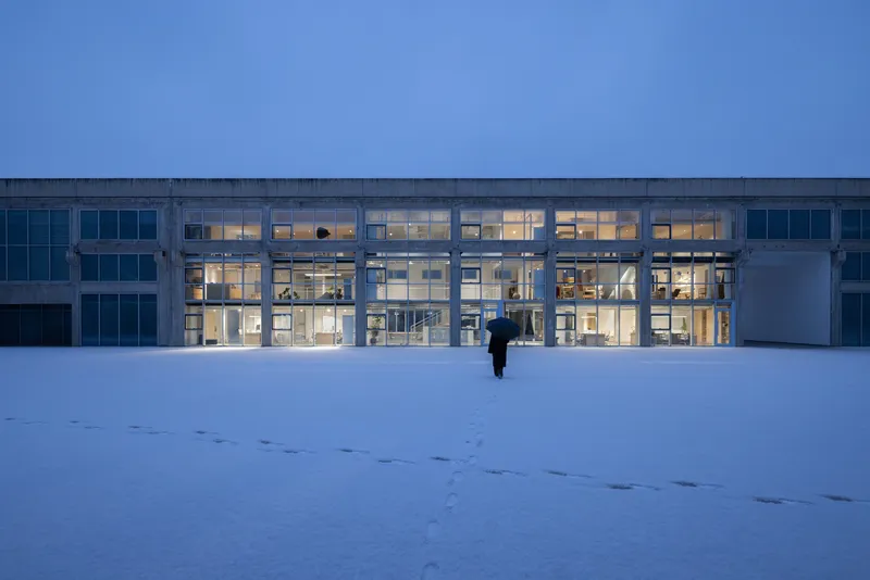
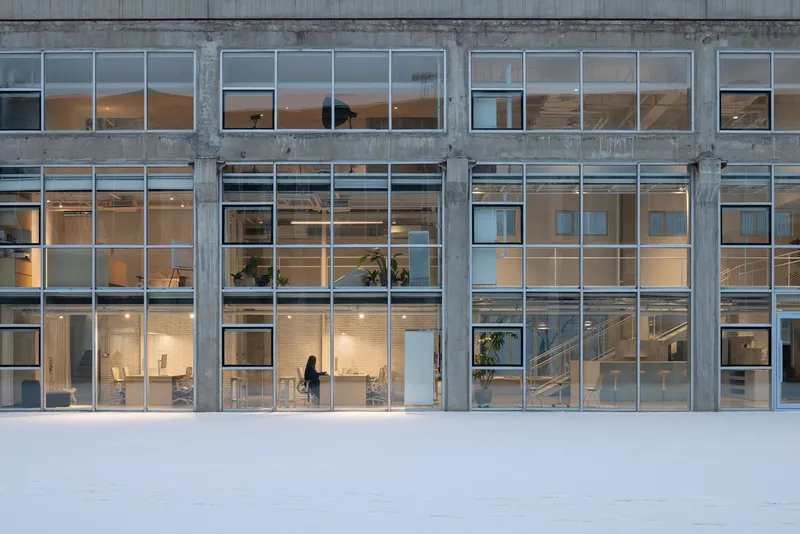
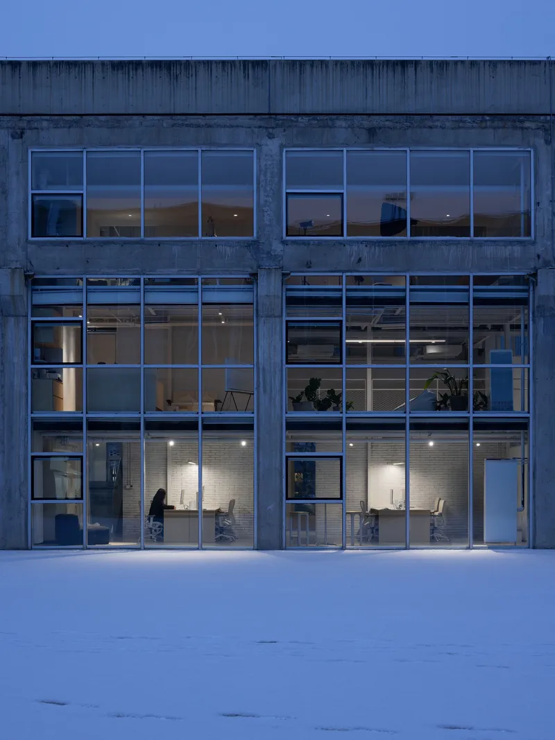
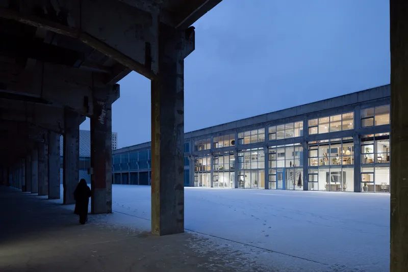
The most striking decision is where the facade directs its attention. Instead of addressing the street, the primary glazed elevation faces the internal plaza, a shared courtyard framed by several industrial buildings. Photographed at dusk under a blanket of snow, the concrete structural frame reads like a grid of illuminated panels, the office glowing from within. The original mullions were reworked to give the facade a lighter, more restrained expression without erasing the building's industrial DNA.
The strategy is site-specific and smart. The plaza hosts exhibitions, markets, and temporary events, so turning the office toward that shared life rather than the anonymous street creates a dialogue between private work and public culture. Large transparent openings pull natural light deep into the floor plate while maintaining visual connection to the courtyard below.
Entering Through Industry
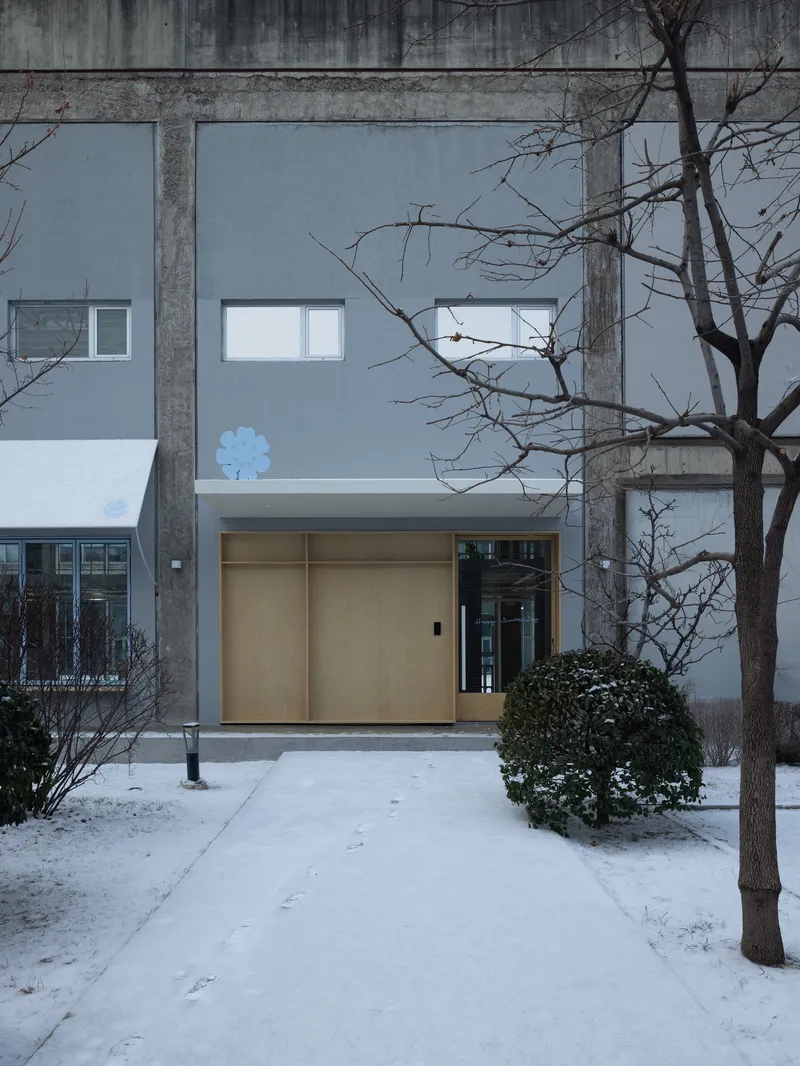

The entrance sequence is deliberately understated. Light wood sliding doors sit within the concrete column grid, flanked by bare winter trees. There is no reception desk theatrics, no branded threshold. You move from the snowy plaza through the structural frame and into the building as if passing between the ribs of something much larger. The concrete columns do the work of announcing arrival, and the sliding panels suggest that the boundary between inside and outside is negotiable.
The Blue Stair as Spatial Engine
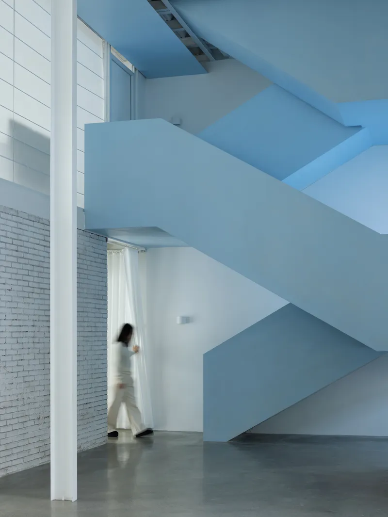

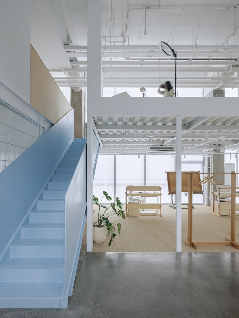
If the building has a single protagonist, it is the pale blue staircase. Its folded geometry cantilevers from a central volume, creating a sculptural object that functions as both circulation and landmark. Seen from below, the stair soffit becomes an angular canopy. Seen from the mezzanine, it anchors the double-height void and provides orientation in an otherwise open plan. The color is not arbitrary: the blue recurs on columns, carpet, and steel elements throughout the project, establishing a restrained material palette that ties diverse spaces together.
The stair connects the ground floor to the mezzanine work levels without the formality of an enclosed stairwell. A figure caught mid-stride beneath its folded planes captures the intended informality: this is a building where movement is visible and fluid, not hidden behind fire doors.
Open Work and Soft Boundaries

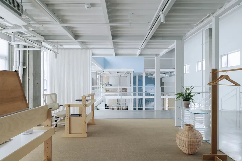

The workspace layout rejects the binary of open plan versus enclosed office. Instead, translucent curtain partitions divide the floor plate into zones that shift according to use. Plywood desk units cluster under the exposed white joists. Vertical white slat screens filter sightlines without blocking them. Photographs clipped to a suspended wire on the curtain dividers hint at the creative work happening inside, turning a functional partition into a display surface.
This soft zoning is essential for a client who films content in the same building where she manages a brand and occasionally brings her children. Hard walls would lock each identity into a fixed location. Curtains and screens allow the space to be reconfigured for a product shoot in the morning and a team meeting in the afternoon.
Domestic Intrusions
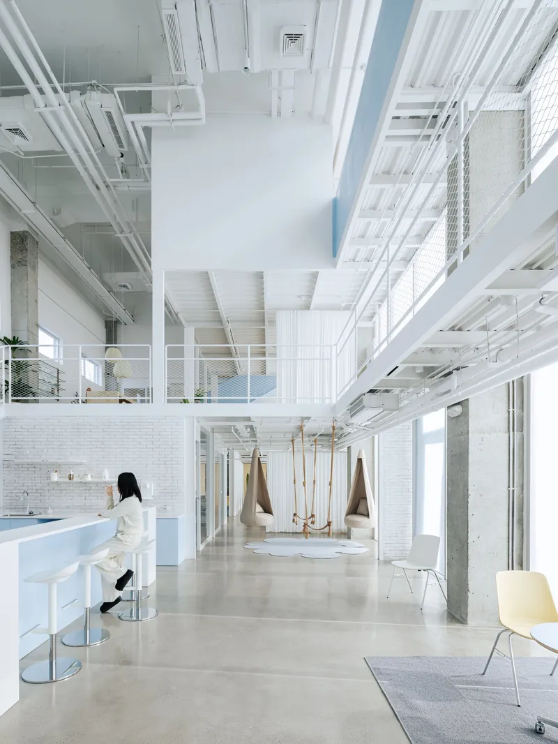

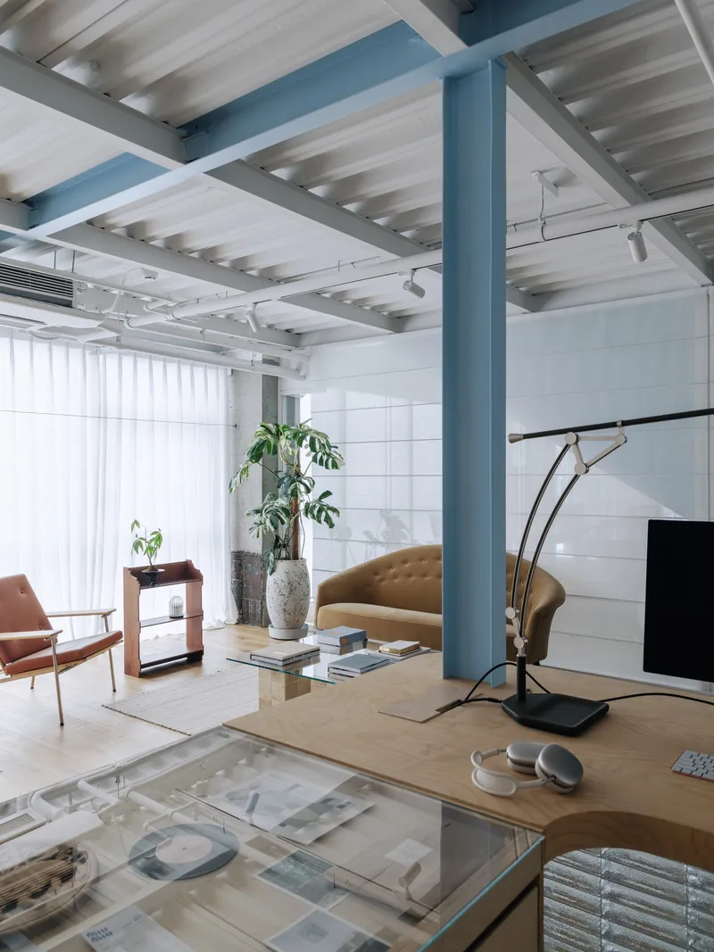
Rope swings suspended from the ceiling beside a painted brick wall: it is not what you expect to find in an office. But these playful elements, along with the high counter seating area and the white tile lounge, signal that this workspace deliberately blurs the line between professional and personal. A blue steel column frames a seating area with potted plants near a tiled wall, creating a corner that reads more as living room than conference zone.
The domestic gestures are not decoration. They serve a real program. A content creator's office must also be a set, and the quality of the set depends on its ability to feel lived-in rather than staged. The swings, the plants, the informal materials all contribute to an atmosphere that performs well on camera because it is genuinely comfortable.
Structure as Finish
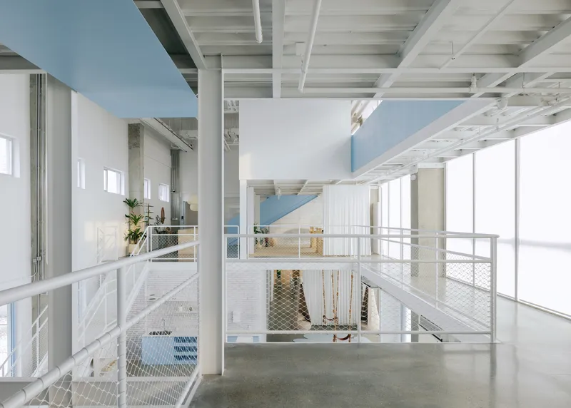
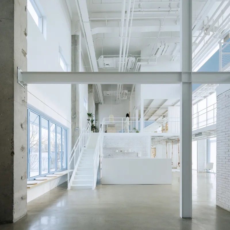

The exposed timber joist ceiling, the white-painted steel structure, the radiating beams overhead: these are not aesthetic choices layered on top of a finished interior. They are the building itself, cleaned up and left visible. The architects' eco-friendly approach minimizes demolition waste and reduces new construction materials by treating the existing structure as a finished surface rather than something to conceal. Polished concrete floors, exposed ductwork, and white-painted mechanical systems form the material vocabulary.
The double-height corridor, lit by natural sunlight and lined with metal railings and potted plants, demonstrates how little new material is actually needed. The white paint unifies disparate structural elements. The mesh guardrails maintain visual openness between levels. The result is generous without being expensive, spatial rather than material.
Meeting Rooms and Studio Spaces


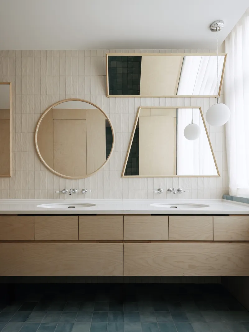
Where enclosure is necessary, it is minimal and specific. A glass-walled conference room with blue carpet provides acoustic separation for calls and presentations. A meeting space with a painted white brick wall and exposed concrete column grounds more informal discussions. Even the bathroom, with its dual sinks beneath round and angled mirrors against a vertical tile wall, is designed with the camera in mind: content creators notice these details.
The studio lighting visible in the corridor, with a figure adjusting equipment near the concrete columns, confirms that content production is not an afterthought but a core function of the space. The high ceilings and open structure accommodate professional lighting rigs without the claustrophobia typical of dedicated studios.
Living with the Ceiling


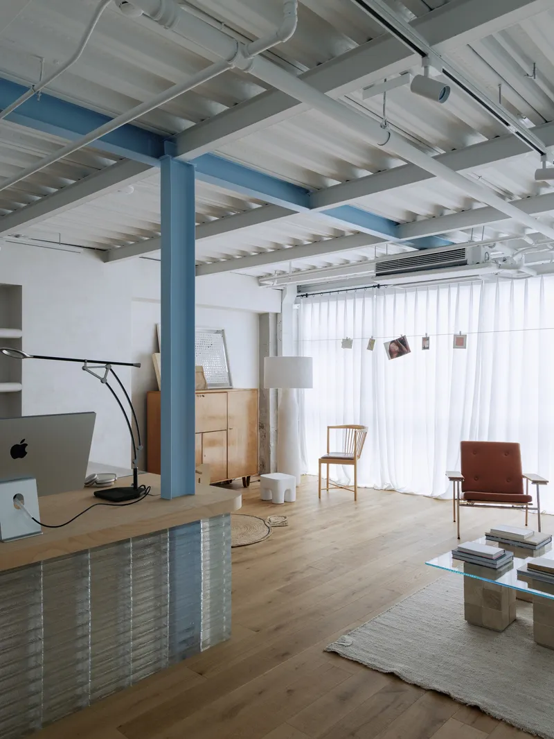
The mezzanine levels, connected by the blue stairwell volume, create layered spatial conditions that a single-story office cannot achieve. From the upper level, you look down through mesh guardrails to the workspaces below. Potted plants in sunlight along the double-height corridor soften the industrial character. The white ribbed ceiling structure above timber flooring in the living area creates a warm, almost residential atmosphere at the upper level.
This vertical layering is the project's quiet strength. By preserving the original structural logic and working within the existing heights, milanesi | paiusco created a building that feels significantly larger than its 854 square meters. The mezzanine does not subdivide the volume; it multiplies the spatial experience.
Plans and Drawings
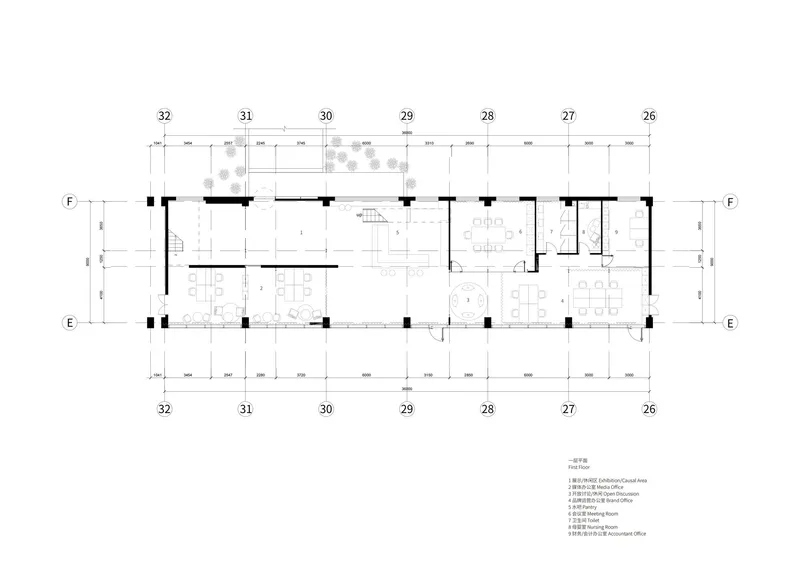
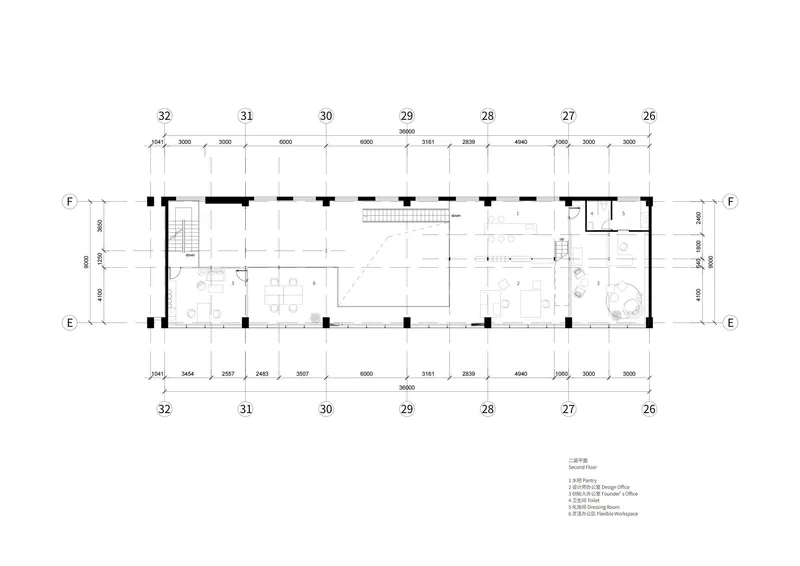

The three floor plans reveal the organizational logic behind the open appearance. The ground floor concentrates social and production spaces around the central blue volume, with the glazed facade opening to the plaza. Upper levels distribute workstations along the perimeter, leaving the center open for circulation and visual connection. Meeting rooms and restrooms are grouped into a compact core, freeing the remainder of the floor plate for the flexible, curtain-divided workspace that defines the project's character.
The minimal partitioning is evident in plan: perimeter stairs, a central volume, and almost nothing else in the way of fixed walls. The architecture is in the voids, not the enclosures.
Why This Project Matters
The Sundate Office is a useful case study in how adaptive reuse can serve genuinely new typologies. The content-creator office is not a coworking space, not a traditional corporate headquarters, not a live-work loft. It requires simultaneous support for production, management, child care, and public-facing brand identity. Rather than inventing a new building type from scratch, milanesi | paiusco found the answer in an old industrial shell, demonstrating that the best container for a fluid identity is often a building that has already been something else.
The project also makes a compelling argument for material restraint as a design position rather than a budget limitation. By preserving the structural framework, retaining the mechanical infrastructure, and minimizing demolition waste, the architects reduced the environmental cost of the renovation while producing a space that is more spatially rich than most new-build offices. In a discipline that still equates quality with quantity of new material, that inversion deserves attention.
Beijing Sundate Office by milanesi | paiusco. Located in Beijing, China. 854 m². Completed in 2026. Photography by Lihao.
About the Studio
Share Your Own Work on uni.xyz
If projects like this are the kind of work you want to make, uni.xyz is a place to publish your own, find collaborators, and enter design competitions.


Popular Articles
Popular articles from the community


GROUP A Strips a 1969 Rotterdam Harbor Headquarters to Its Frame and Wraps It in Timber Louvers
In Rotterdam's M4H harbor district, Ferro Offices reuses a 1969 frame, adds one timber storey and reaches BREEAM-NL Outstanding.

U.GA Architects Wraps an Oval Rooftop Pool in Curved Board-Formed Concrete on Busan's Jeollidan-gil
In Busan's Jeonpo-dong, a 454 m² mixed-use block stacks a neighborhood facility, guest rooms and an oval rooftop pool inside spiraling concrete walls.

Juan García Correa, John González and Claudia Rueda Sink a Circular Amphitheater into a Manizales Engineering Building
On the La Nubia campus in Manizales, Colombia, the S1 Building folds labs and offices into a hillside of ramped lawns that double as a campus route.

David Macias Steps a Doorless Stone and Plaster House Down a Tropical Colombian Hillside
In the humid hills of Colombia, Threshold House replaces the front door with an open void and terraces its 850 m² down the slope instead of fighting it.

Similar Reads
You might also enjoy these articles


LAVA Architecten Gives Vocational Education a Sawtooth-Roofed Face on a Mechelen School Campus
In Mechelen, Belgium, a 2,053 m² STEM school on a 6×6 m grid turns workshops and classrooms into rooms that can be rearranged as teaching changes.

KEMA Studio Turns a Derelict Marvila Attic into a 60 m² Lighthouse Apartment Above Lisbon
In Lisbon's Marvila district, a rebuilt roof, four skylights and two plywood volumes turn an unlivable attic into a bright home facing the Tagus.

Pixel Gardens: One Repeated Module Stacked Into a Terraced Social Housing Tower for Famagusta
Salem Bader's shortlisted housing tower builds a vertical neighbourhood from one repeated module, offsetting units to carve terraces, light and air.

Bao Huynh Watercolor Atelier: A Serene Art Retreat in Hội An
Bao Huynh Watercolor Atelier in Hội An blends multifunctional art spaces, sustainable design, local materials, and family-friendly living in a serene environment.


Comments (0)
Please login or sign up to add comments
No comments yet. Be the first to comment!