

Office Zola Architectes Carves a Courtyard Out of a 44-Meter Industrial Hall in Vannes
A 19th-century complex near Vannes train station becomes a hybrid wellness, work, and culture venue through strategic subtraction.


The most interesting move in the Flow Third Place isn't what was added to this decaying 19th-century industrial complex near Vannes train station. It's what was taken away. Office Zola architectes, led by Laure Gahéry and Edouard Guyard, removed an entire section of the building's roof along the full length of a 44-meter hall, exposing its interior to daylight, planting, and air. Where regulations prohibited punching new openings into the masonry walls, the architects simply peeled back the roof to create a planted patio that now serves as the spatial and social core of a building that combines wellness, coworking, culture, and dining under one address.
The result is a project of what the architects describe as "gentle radicality," and it's an apt phrase. Nothing here reads as a grand gesture. The complex, composed of a house, a long hall, and a glass-roofed vestige of a winter garden, has been transformed through a succession of precise, materially efficient interventions: a reinforced concrete portal frame to stabilize the volumes, locally sourced timber for new floors and workspaces, lime plasters, bio-sourced insulation, and stones salvaged from demolition folded back into new construction. The building was long abandoned and in advanced decay. Now it's been nominated for the 2026 Mies van der Rohe Awards.
Restoring the Facade Without Faking the Past

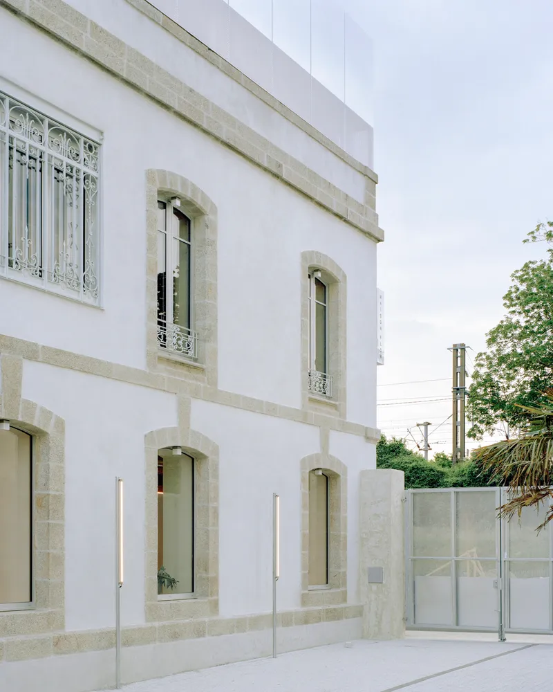

The street facade tells two stories at once. At ground level, the original stone masonry has been carefully restored: arched windows framed in cut stone, decorative wrought iron grilles, white stucco surfaces. It reads as a confident 19th-century industrial building, and it should, because that's exactly what it is. But look up and the narrative shifts. A translucent panel addition sits above the original roofline, clearly contemporary, clearly an insertion rather than a restoration. Office Zola doesn't pretend the new and old are the same material. The difference is legible, and that honesty is the point.
On the rear and side elevations, the strategy loosens further. Metal cladding, vertical glazing slotted beneath slate rooflines, and recessed glass volumes make the additions read almost as lightweight parasites. They gain their authority not from mimicry but from restraint: light colors, controlled proportions, and a refusal to compete with the stonework below.
The Subtracted Roof and Its Planted Heart


Removing a portion of the roof to create an interior courtyard is the single decision that makes the entire project legible. The planted patio doesn't just bring light into the deep plan; it doubles the building's occupancy capacity by turning what was a single dark hall into two activated volumes flanking a shared outdoor room. Young saplings grow against the limestone walls, climbing vines colonize bricked arches, and floor-to-ceiling glazing on the interior faces of the courtyard dissolves the boundary between inside and out.
This is subtraction as spatial strategy, and it works because the original structure was too deep and too enclosed for its new program. Rather than fighting the wall openings that heritage regulations wouldn't permit, the architects simply redirected the question upward. The courtyard now drives cross-ventilation, passive lighting, and visual orientation throughout the building. It is, in the best sense, a void that does more work than any room.
The Winter Garden and the Long Hall


The glazed conservatory space, a vestige of the original winter garden, is one of the most atmospheric rooms in the complex. Steel trusses span overhead, arched openings frame the threshold back into the masonry building, and natural light floods in from above, creating a condition that feels simultaneously industrial and domestic. Scattered seating beneath the glass roof suggests a café, a reading room, or simply a place to pause. The architects have wisely left this space loose, allowing it to absorb whatever social activity the day demands.
Adjacent, the foyer and dining zones deploy polished concrete floors, exposed ceiling ducts, and stainless steel wall panels that bounce light deep into the plan. The material palette is deliberately limited: concrete, steel, glass, timber. Technical networks are left exposed rather than concealed, a move that saves cost and ceiling height while reinforcing the building's industrial genealogy.
Flexible Rooms That Actually Flex
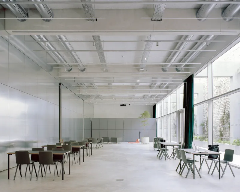
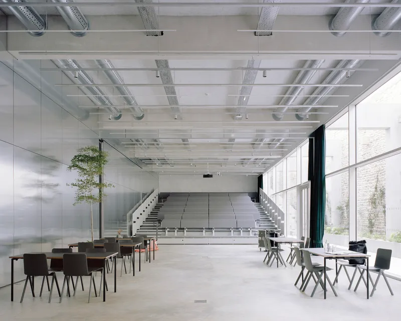

Flexibility is a word architects throw around with abandon, but here it's engineered into the building's bones. The large event hall features a retractable 140-seat bleacher that emerges from the floor, transforming a flat-floor room into tiered seating in minutes. Motorized movable partitions, linked directly to the fire safety system, allow rapid reconfiguration without compromising code compliance. Folding stainless steel panels can close off or open up the courtyard-facing rooms depending on the event.
This isn't token adaptability. The floor plan drawings reveal multiple spatial configurations that genuinely alter the building's capacity and character. A single hall becomes two rooms becomes a theater becomes a banquet space. The mechanical ingenuity is hidden in plain sight: the partitions, the bleachers, and the operable panels all read as clean architectural elements rather than bolted-on equipment.
Workspaces Under the Trusses

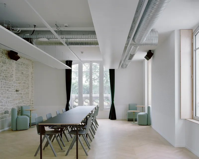

The coworking and meeting spaces occupy the upper reaches of the building, tucked into roof slopes with open views of the city. Perforated sliding panels flank arched windows, allowing occupants to modulate daylight and privacy. In the meeting rooms, exposed stone walls sit alongside suspended ductwork and long white tables, creating a tension between the raw heritage fabric and the clean new insertions. Green upholstered seating adds a domestic softness that keeps these rooms from feeling like stripped-back lofts.
The timber-framed workspaces, constructed from locally sourced wood, sit under the original trusses. Perforated acoustic ceiling panels manage sound without dropping the ceiling height, preserving the generous volume that makes these spaces feel generous despite their compact footprints. It's a good example of the project's broader approach: solving performance problems without erasing the spatial qualities that make the building worth saving.
Material Economy and Quiet Detail
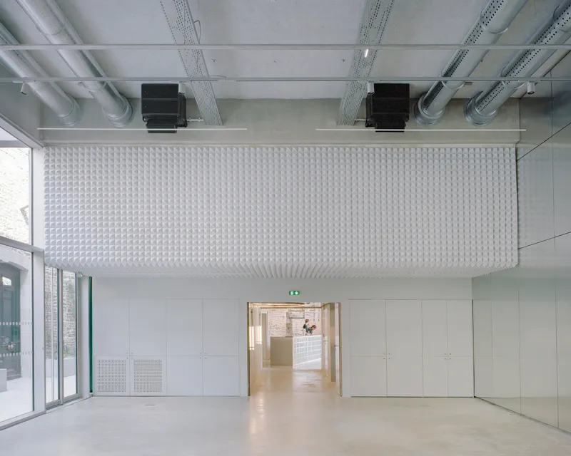

Office Zola's commitment to reducing superfluous finishes is evident in every room. Textured acoustic panels, breathable lime plasters, and polished concrete floors do the work of a dozen more expensive finish materials. The palette is deliberately pale, enhancing passive daylighting performance while creating a calm backdrop for the exposed mechanical systems that run overhead. In the darker, more intimate treatment rooms on the house elevation, pairs of rounded chairs face windows that frame sunlit stone walls like paintings, a simple staging that requires no ornament.
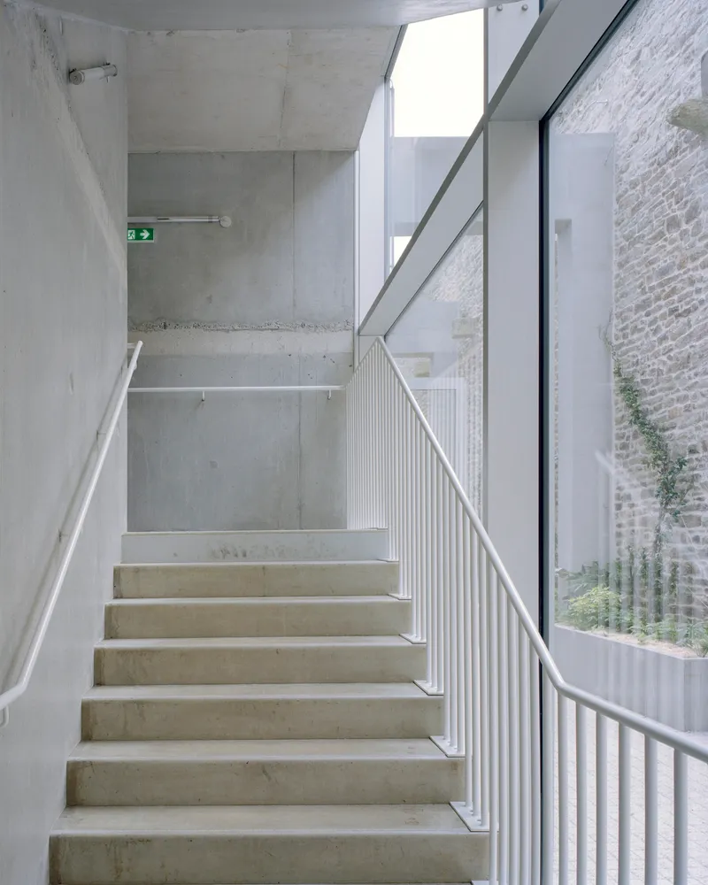
The concrete staircase with its white metal balustrade and skylight above is a case study in economy of means. Diffused daylight washes down the stair, the railing is thin and precise, and the concrete is left unfinished. It's not austere; it's simply honest about where the money went. Stones from demolition were reused in construction. Bio-sourced insulation fills the walls. Rainwater is captured and reinfiltrated. None of this is advertised with signage; it's simply how the building was made.
Plans and Drawings


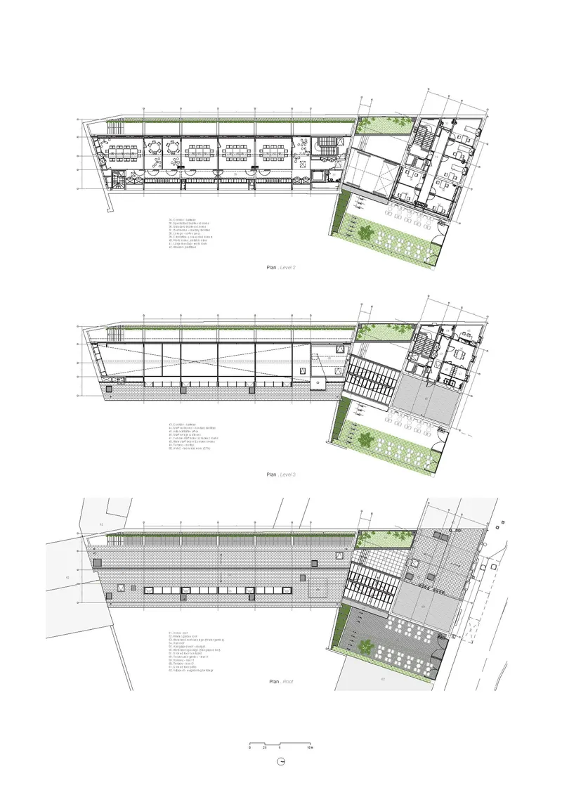

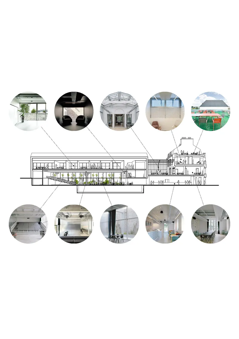



The drawing set reveals the full ambition of the project. Exploded axonometrics show five stacked floor levels with color-coded program zones: wellness below, work above, culture and dining threaded through the middle. A three-phase axonometric diagram illustrates how the existing structure was stabilized, subtracted from, and then extended with new timber volumes. The longitudinal section, annotated with circular photographic vignettes, reads almost like a graphic novel of the building's spatial sequence from the house through the hall to the winter garden.
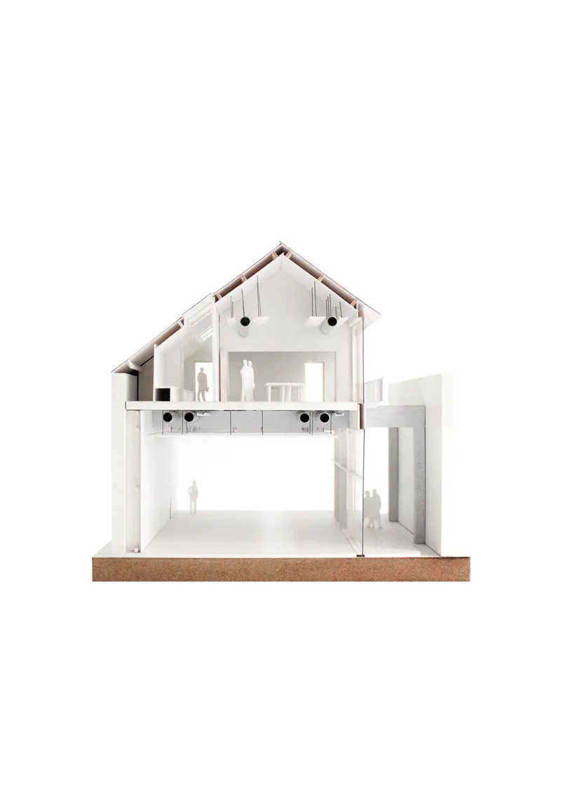
The site plan locates the complex squarely within Vannes' dense urban fabric, directly opposite the railway lines. Floor plans across six levels show the planted terraces, the angled building geometry at the street corner, and the remarkable variety of room sizes that the architects have coaxed from a constrained footprint. The section model of the pitched-roof gabled house, with its miniature human figures, gives a clear sense of the intimate scale that persists even within an 1,800 square meter program.
Why This Project Matters
The Flow Third Place matters because it demonstrates that heritage rehabilitation doesn't require choosing between preservation and transformation. Office Zola architectes found a third option: removing just enough of the existing building to make it perform better than it ever did in its original life. The planted courtyard, carved from the roof of a 44-meter hall, is the kind of spatial move that seems obvious in retrospect but requires genuine conviction to execute. It solved daylighting, ventilation, circulation, and capacity in a single gesture, without touching the protected walls.
The project's nomination for the 2026 Mies van der Rohe Awards is well deserved, and not because the building is photogenic (though it is). It's because the work exemplifies a kind of intelligence that the profession needs more of: compact, modular, flexible, materially honest, and rooted in the specific constraints of a specific place. In an era when adaptive reuse too often means either gutting a building beyond recognition or embalming it in heritage aspic, Flow shows that the most radical thing you can do to an old building is trust its bones and then cut a hole in its roof.
Flow Third Place by Office Zola architectes (Laure Gahéry, Edouard Guyard). Vannes, France. 1,800 m². Completed 2025. Photography by Maxime Delvaux and Office Zola architectes.
About the Studio
Share Your Own Work on uni.xyz
If projects like this are the kind of work you want to make, uni.xyz is a place to publish your own, find collaborators, and enter design competitions.


Popular Articles
Popular articles from the community

Cloaked Colonization: A Mobile Underwater Habitat That Moves Like a Fish
Micah Abaya's shortlisted EHC Pacific entry reimagines ocean settlement as a dispersed network of self-sustaining architectural organisms.

Manzana Morphosis: Stretching Barcelona's Grid into a Living Landscape for 2050
A radical reworking of the Eixample manzana turns density into a tool for generous public space, vertical ecology, and environmental performance.
Opera by the Sea Estonia: Three Shells Dissolving Architecture into Tallinn's Coastline
A winning opera house proposal replaces monumental form with interconnected shells that blur the boundary between building, park and Baltic Sea.

The Amber Palace Opera: A Geological Fiction Surfaces on Tallinn's Baltic Waterfront
Pierre Brillard reimagines a Baltic legend as a public landscape, opera house, and waterfront promenade rooted in Tallinn's coastal identity.

Similar Reads
You might also enjoy these articles

Pixel Gardens: One Repeated Module Stacked Into a Terraced Social Housing Tower for Famagusta
Salem Bader's shortlisted housing tower builds a vertical neighbourhood from one repeated module, offsetting units to carve terraces, light and air.

Bao Huynh Watercolor Atelier: A Serene Art Retreat in Hội An
Bao Huynh Watercolor Atelier in Hội An blends multifunctional art spaces, sustainable design, local materials, and family-friendly living in a serene environment.

Atelier Macri Concept Store Interior Design by CASE-REAL
Atelier Macri store features a "ko" counter, walnut wood details, cork displays, blending retail, gallery, and seamless customer experiences.

Manuel Vargas Izquierdo Stadium and High-Performance Sports Center: Architectural Excellence in Jalpa de Méndez
The Manuel Vargas Izquierdo Stadium blends sustainable design, inclusive sports facilities, and cultural-inspired architecture, revitalizing Jalpa de Méndez’s public spaces.

Comments (0)
Please login or sign up to add comments
No comments yet. Be the first to comment!